Categories
Project 1: Animation

Olive’s Animation

Gif of my animation

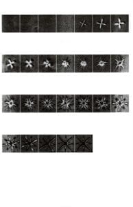
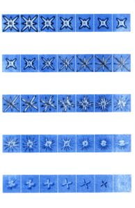
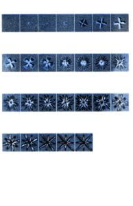
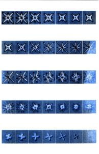
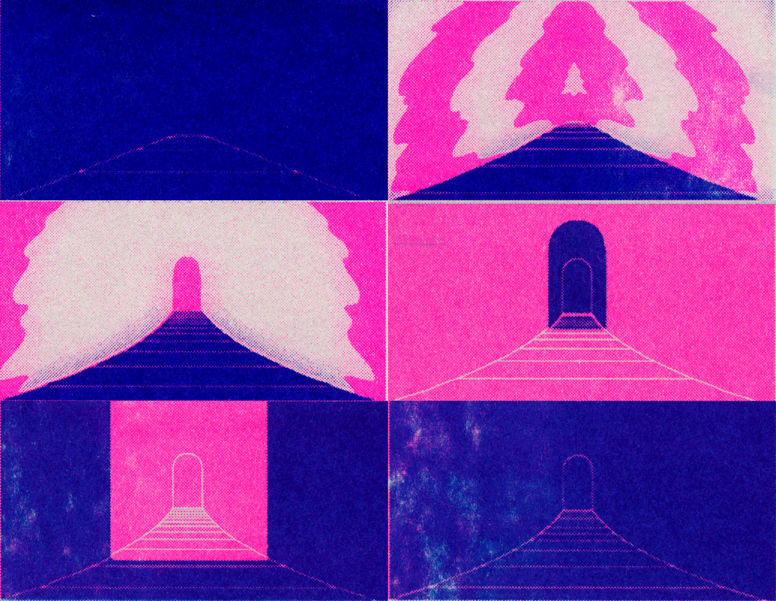
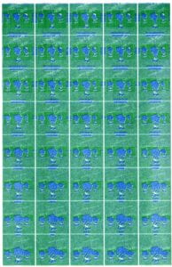
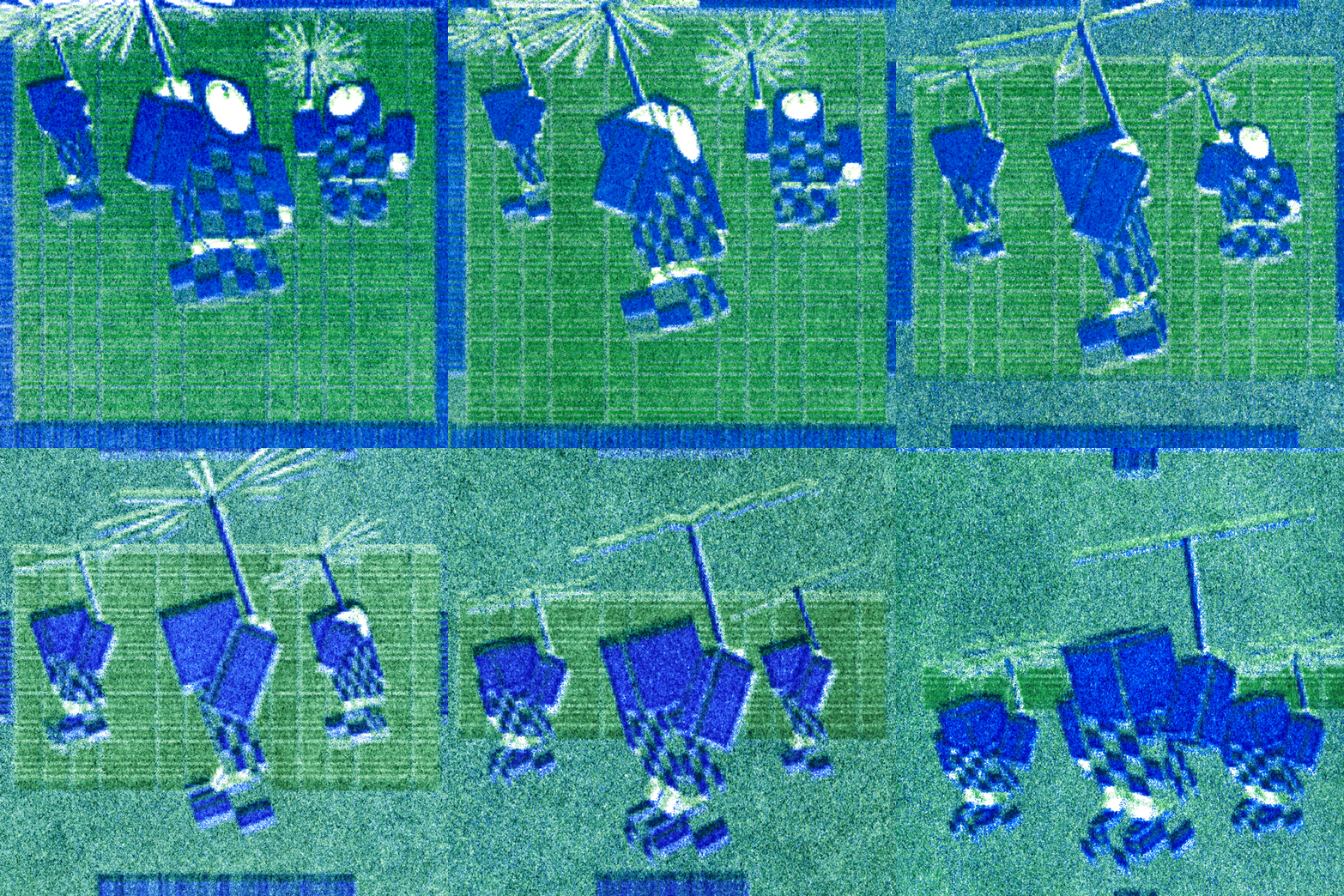
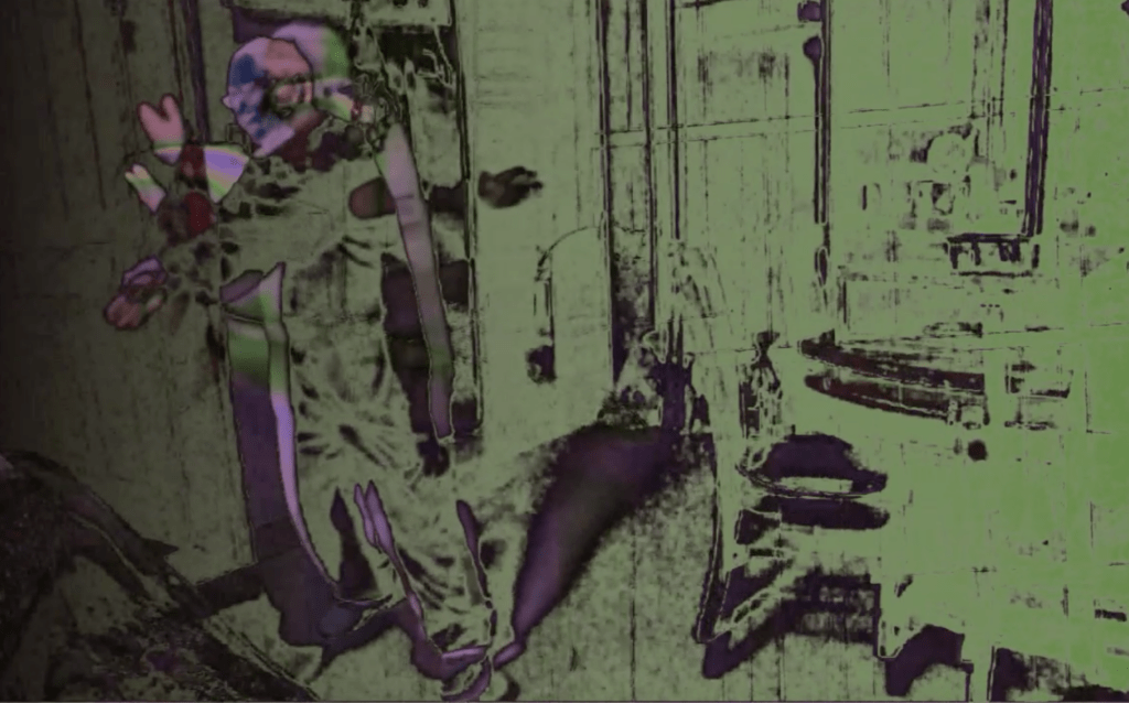
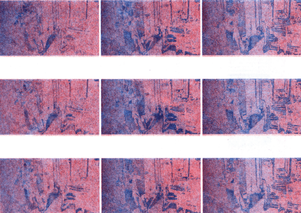
For this project, I created an animation from a graphic gif my friend, Stefan, made in photoshop. In their personal process, they create each frame graphically and print them out with a regular printer and scan them to create an animation. I was inspired to translate their work into a riso animation using a similar process, but with a different type of printer and paper. I’m really happy with how it turned out and I hope they like it too. 

Below is a screenshot of the frame from the original photoshop file. The other images are the scans of my riso contact sheets where I tried different color iterations of the same animation. 

Categories
Project 1: Animation

Bridget’s Riso Animation

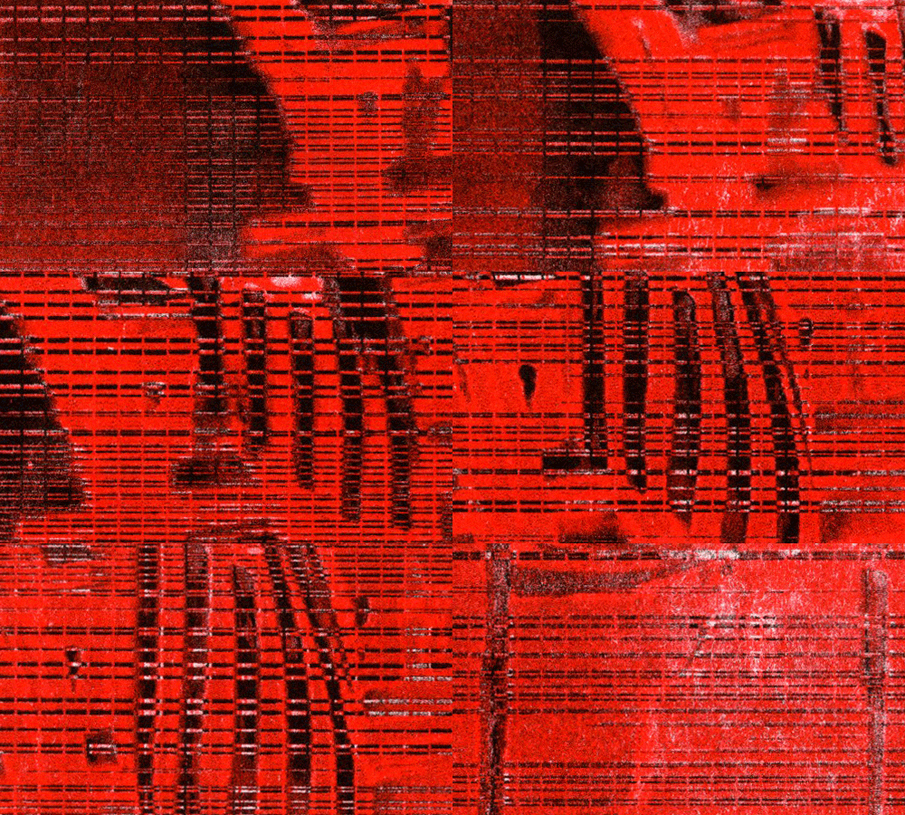
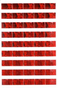
The process of creating this animation was more time-consuming than expected, but I learned a lot. I plan to recreate this assignment using a different animation because the animation I chose originally is quite subtle when printed, which my color choices didn’t help. Next time, I would choose more contrasting color choices and print several more copies of each color so I have a higher chance of getting a really good print with minimal errors. 


UPDATE: 11/16/23

I redid this assignment using a different animation and it came out much better! It was a bit disappointing that I couldn’t get the print to print completely evenly even after doing 20 test prints on scrap paper for each contact sheet. However, I still think I got a pretty good result.

Categories
Project 1: Animation

lita post >.>

school post reso 

Categories
Project 1: Animation

Ella Tang – RISO Animation

For this assignment, I used an animation clip from my old coding on p5.js. The original clip has a solid black background, which resulted in paper jam many times when I started printing. With the help of the technician at the Design Lab, I added adjustment layers in Photoshop to make the background not as solid as it was and reprinted many times. However, the two contact sheets still turned out a bit different in color vibrancy.  

Categories
Project 1: Animation

Patricia Aguilar – riso print animation

  • This is a gif from the film The Last Unicorn, it depicts a herd of unicorns running away from a glowing growing mass.

Overall I enjoyed the printing process, given that it’s an older hand drawn animation the quality wasn’t the greatest but I was able to alter it significantly and got some nice effects. I experimented with different color combinations and this is the one that came out the smoothest. But I was also having issues with the ink not printing evenly, the blue is concentrated in some areas more than others.

Categories
Project 1: Animation Uncategorized

Michelle’s Riso Flower

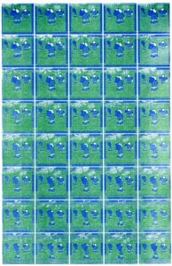
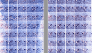
I used a 3d flower texture animation created in cinema4d. I wanted my animation to be really grainy so I intentionally made each frame on the contact sheets extremely tiny. The green and pink turned out pretty well, and I like the slight registration mark that distinguishes the two color on the flower.

Categories
Project 1: Animation

Miaoye’s Animation

For this assignment, I worked with a sequence from Princess Momonoke. This is the original gif:

https://d2w9rnfcy7mm78.cloudfront.net/5823778/original_d1a40f648c9f2143fcdbf1dfd51a2fa5.gif?1578093494

I used green and orange for my riso. Interestingly, the colors are very different from sheet to sheet, perhaps due to the misalignment between two prints? This is the final result for my riso animation:

Categories
Project 1: Animation

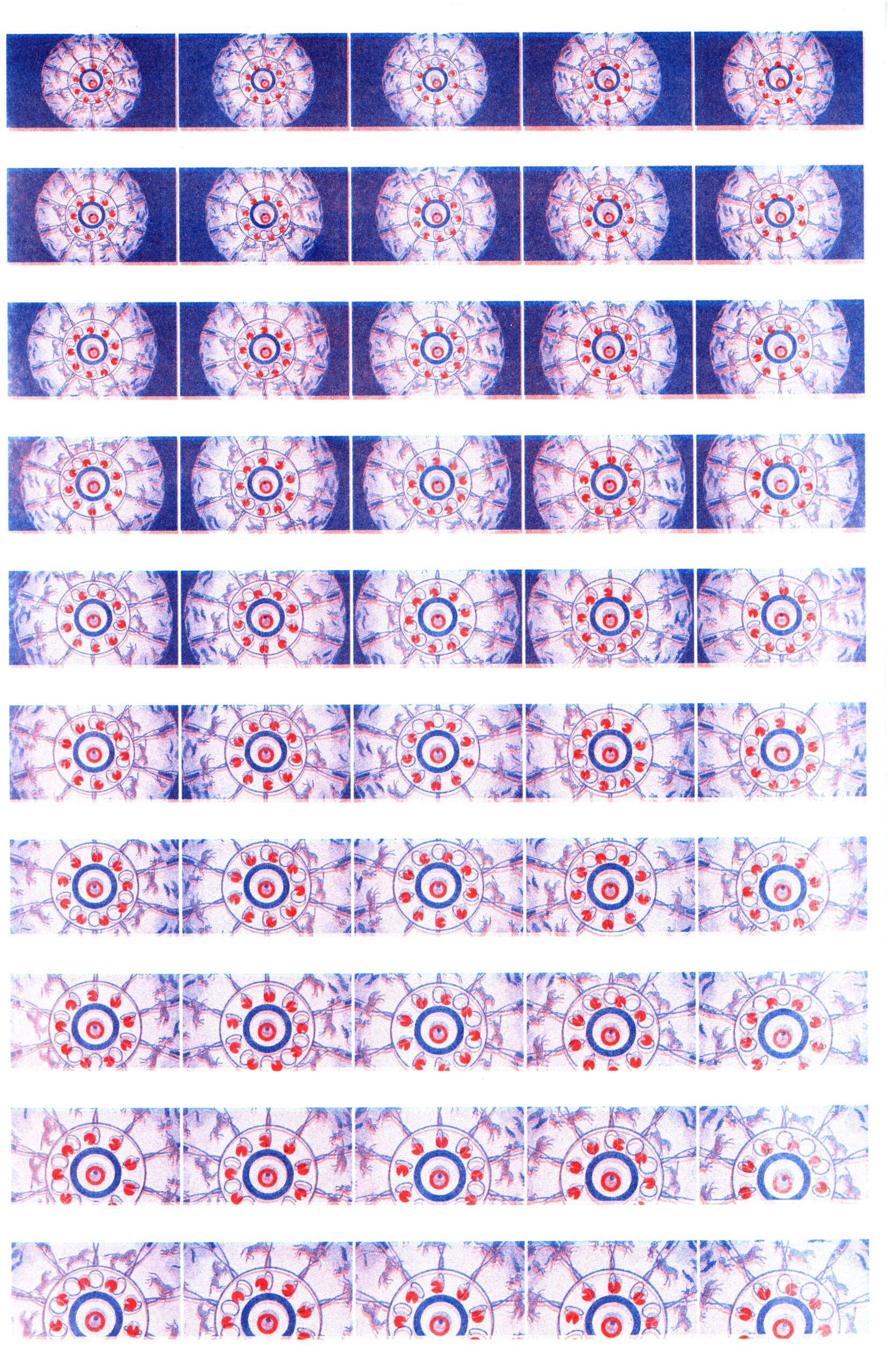
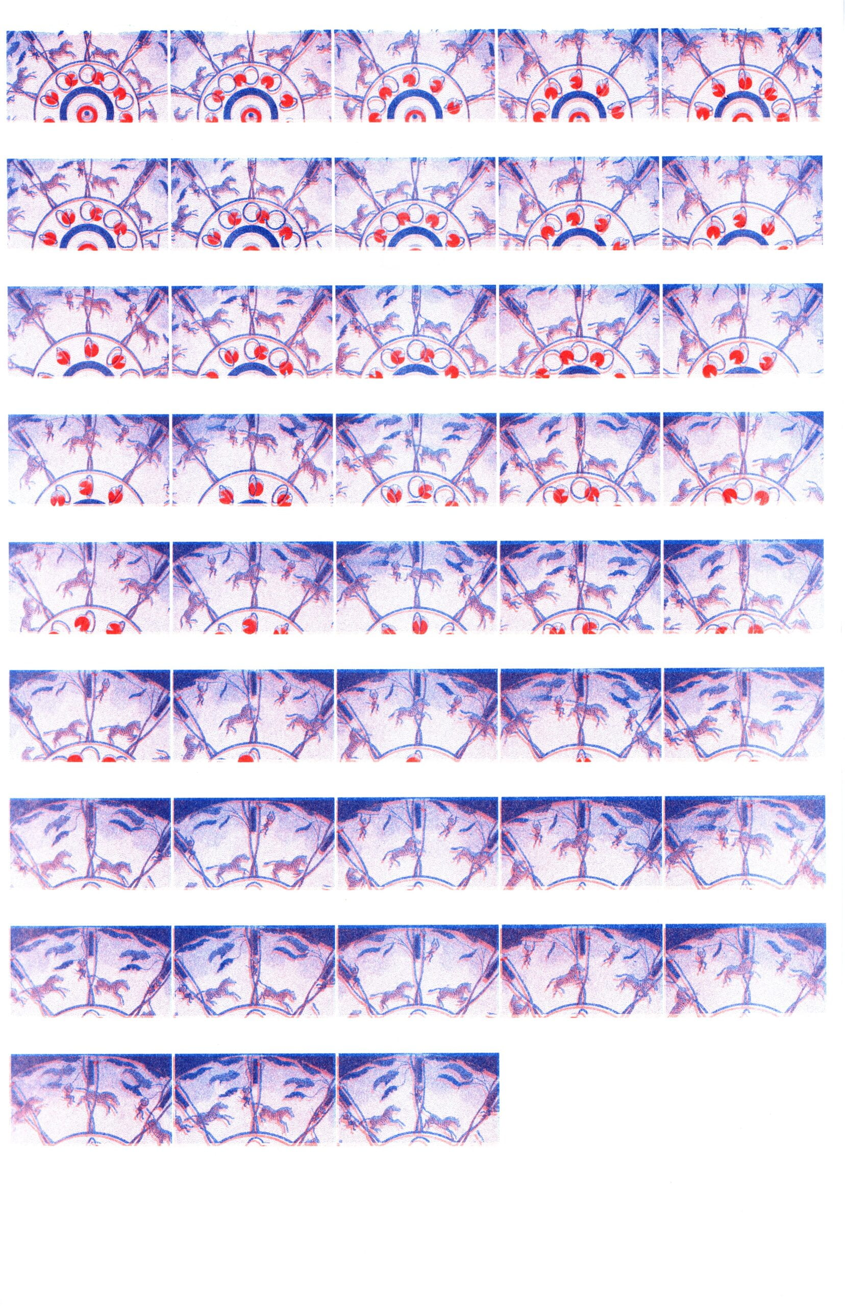
Aditi’s Animation


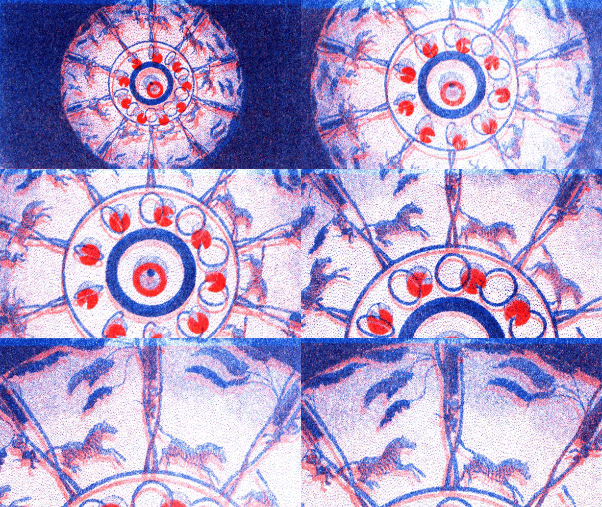
I chose the animal sequence from McLean’s Optical Illusions (1833). The contact sheets were printed using orange and blue on tabloid size paper. I made four of each contact sheet and chose which frames to use based on how sharp the still images printed. I like the contrast between the orange and blue and like that the graininess of the background makes the more densely inked shapes stand out. 

Categories
Project 1: Animation

Zoe’s Animation


This is my first time using Riso to print. I found it a little more time-consuming than I initially imagined. However, it’s been an interesting process. I realized after I finished with the prints that the color separation in the early stages would largely impact the final print outcome. Last week, I printed two animations, but the results were not very satisfying.
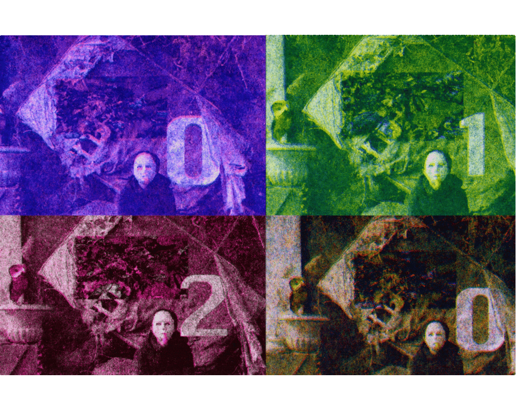
Therefore I switched to using a high-definition video, where I was wearing a mask and tring to inflate a balloon in front of a piece of woodboard. The printed results had a somewhat vintage look, like old newspaper photographs, possibly because the cool/warm color layers were relatively uniform without distinct, contrasting values.

I experimented with various color combinations, including using fluorescent pink and orange, as well as yellow for the lighter parts and layering black, blue, and green for the darker parts. I also tried combinations of yellow with fluorescent orange and green, because at first I printed with only the warm colors and realized they did not contrast so well.  To enhance the visibility of the animation details, I created two contact sheets to increase the single image size. A persistent issue was uneven coloring on some color drums, where the colors in the upper left corner appeared darker than the lighter colors on the right side. I attempted several color combinations to try to address this issue.
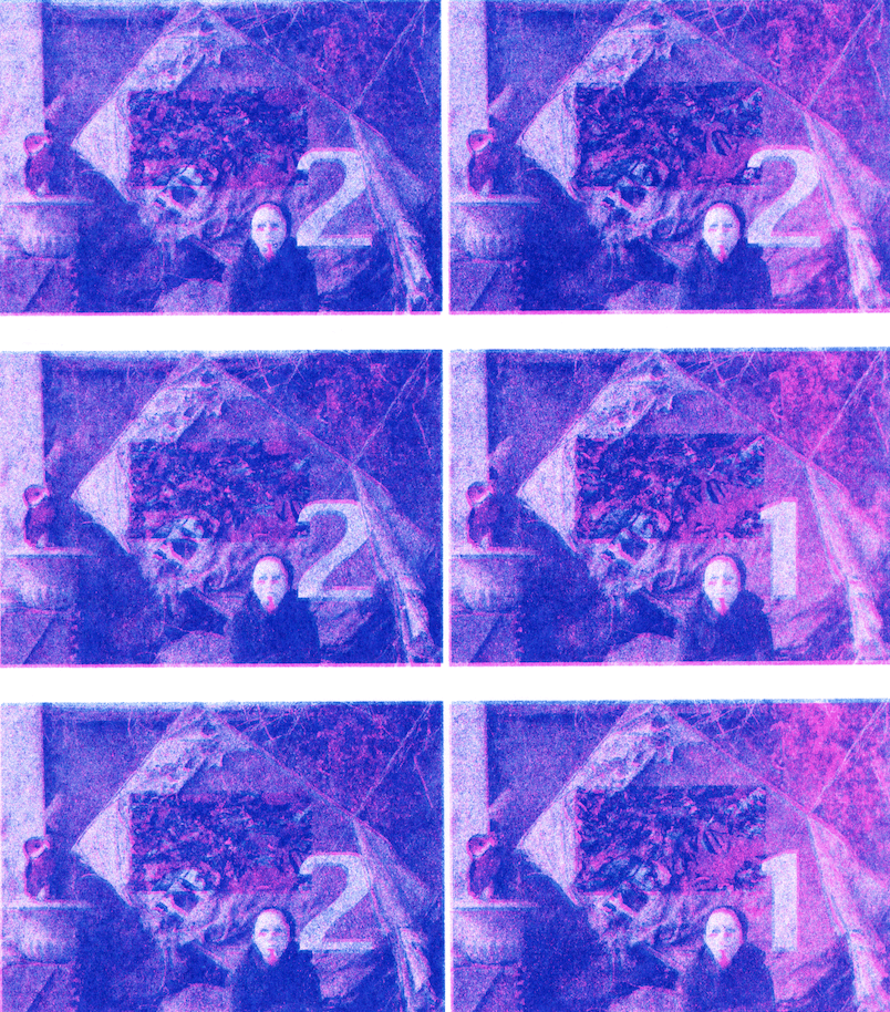
For this animation, I wanted to showcase the diverse range of colors I experimented with, so I combined them into a single composition. For future prints, I would like to separate the channel layers of different colors more distinctly and use dithering to achieve more interesting varying colors in highlights, shadows, mid-tones, etc.
Categories
Project 1: Animation

Project 1: Riso Animation -Elif

First Riso Animation!!!

I had fun during the printing process and realized that I needed to print multiple times to get the best output. Now, my first prints are a bit smudgy because the colors were not vertically aligned. And I had issues with the red drum. I increased the density of the color but it didn’t make any difference. Below is the original video I took during the summer and the riso version. 

Another main issue was my prints were larger than 10.5, 16.5 inches and not straight. After I set up the guide, some frames were bigger and some were smaller – which makes my animation not consistent. (you can see above.)

I added adjustment layers and played with the opacity to get rid of the empty white areas but it didn’t solve the problem.

Next time, I’ll definitely print more sheets and make sure that the squares align-well! – Elif