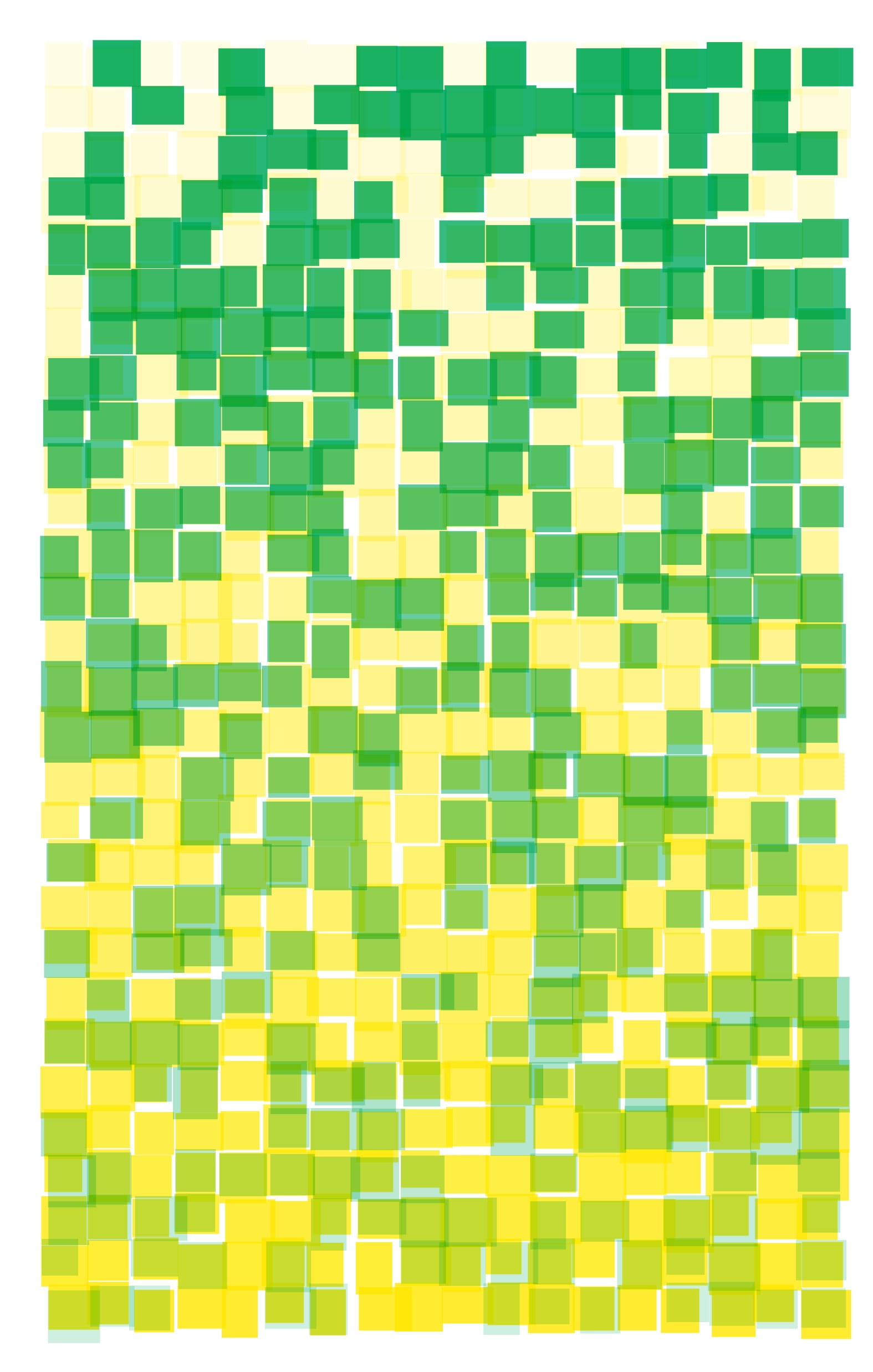
I worked with rectangles on a grid. I have a bottom layer where the rectangles increased in transparency as it moves down the canvas. The top layer does the opposite—it also omits about 40% of the grid.

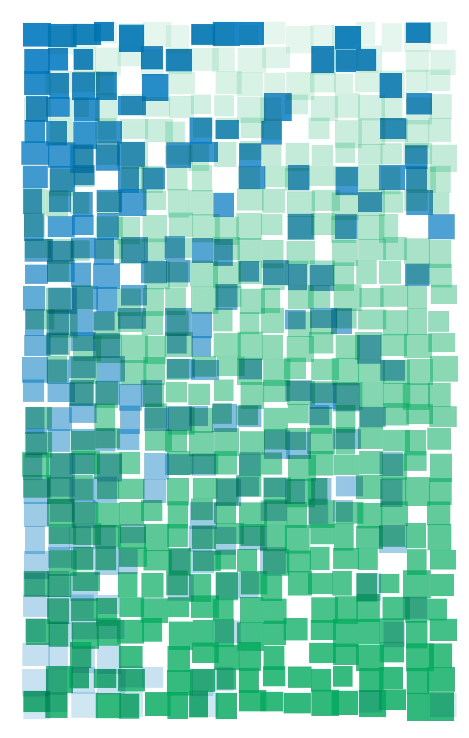
On darker colors, what worked better was having the top layer (blue in this case) both increase in transparency as it goes down the canvas, and decrease in frequency of appearance across.
