Categories
Project 1: Animation

Lorca’s Animations

For Project 1, I tried a lot of different things. First, I chose to print two animations by one of my favorite artists, Iris Wildros – they are flower and apple.

1. FLOWER

Here’s the original animation:

I chose blue and pink for the print – blue for the background and pink for the spinning ovals. I used dithering on the background. As you can see, the spinning ovals ended up getting a bit purple, and since the print wasn’t perfectly aligned, they show a stunningly unique overlay effect. This was the most satisfying of all my attempts.


2.APPLE

Here’s the original animation:

This time I chose to print in yellow and pink – yellow for the background and pink for the apple. To my surprise, the yellow and pink colors layered together to create a fluorescent orange-red color visible to the naked eye. But I think the yellow ink is too light, making the uneven print stand out even more. But the orange-red color is great, especially for apple.


3. DRAFT

This is just a draft. When I was in the experimental stage, I printed a yellow background for the apple, then I took this paper and printed random flowers. But it seemed to work so well that I went ahead and animated it as well. The yellow background going through the canvas is very much like film rewinding.


4. BIRD

Just for fun, I also printed and animated my favorite comic by False Knees (Instagram @falseknees). I printed three separate sheets in blue-green, blue-pink, and blue-black (all color combinations matching the storyline) and then inserted a random mix of different colored frames while editing. It’s not as dynamic as real animation, but it’s cool.


It actually took me a long time to figure out how splitting channels worked (I was really confused as to why only two of the four channels needed to be printed!) But eventually after many attempts with different materials I gradually got the hang of matching colors to channels. I’m much more flexible in playing around with colors, layers and channels now, and I think that’s the biggest thing I’ve learned.
Categories
Project 1: Animation

Syeda’s Animation

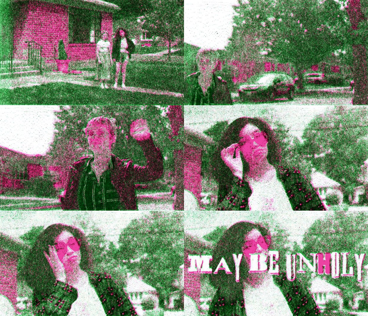
Risograph animation of three roommates meeting outside in front of their home

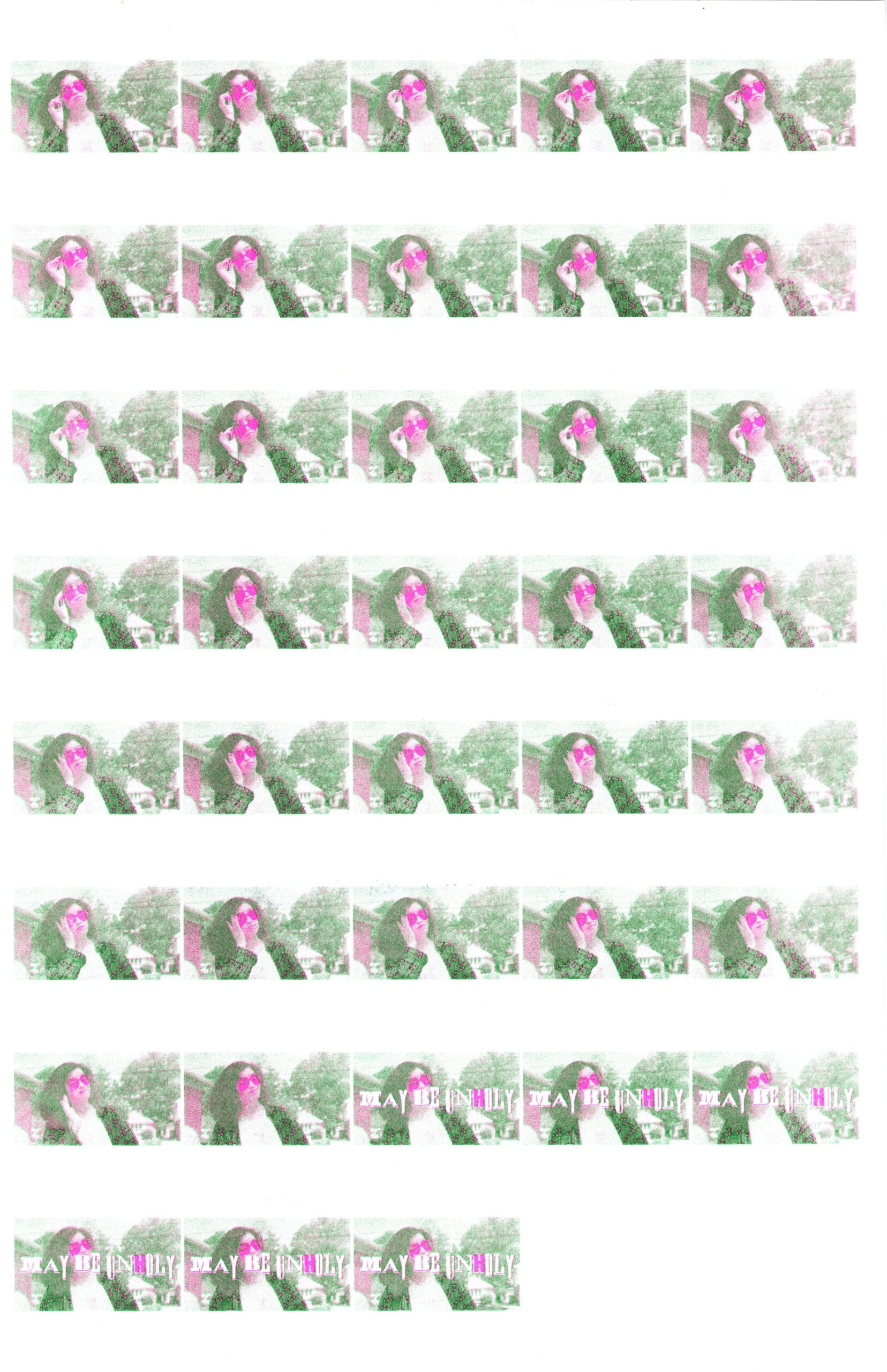
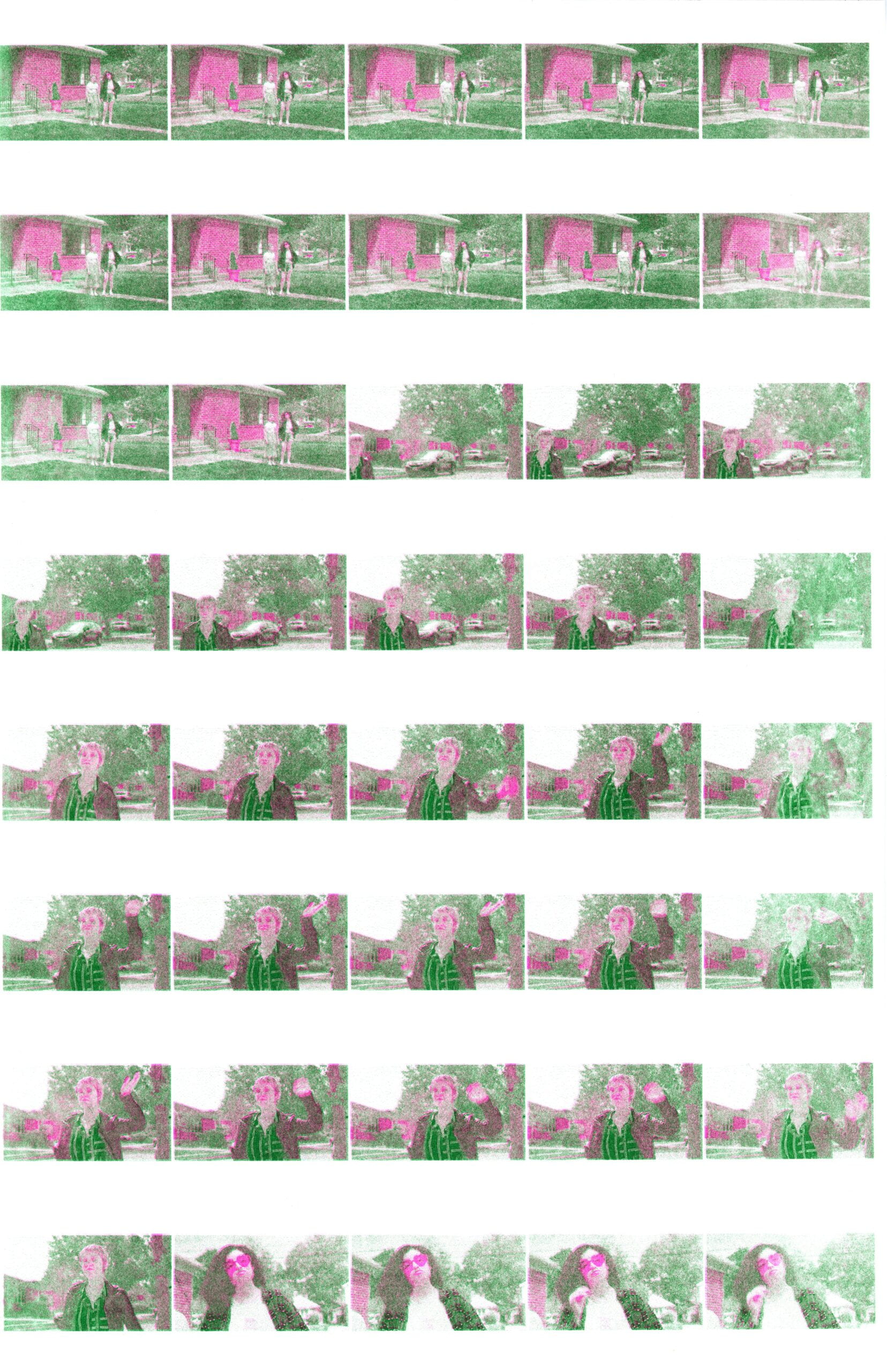
Rows of small thumbnails of frames
First contact sheet for May Be Unholy opening scene
Rows of small thumbnails of frames
Second contact sheet for May Be Unholy opening scene

For this animation assignment, I chose to work with the opening scene of a short film I directed, May Be Unholy. This was a film I worked on while I was a Post-Baccalaureate Fellow at Barnard College’s Media Center. This project was especially memorable, because I got to work with my friends and we were a team of women and non-binary filmmakers.

This was my first time ever printing with the Riso. I actually used a different clip originally, which was the last scene of May Be Unholy. I used cyan and red as my print colors and grouped the warm and cool channels separately on Photoshop. Unfortunately, the printer kept jamming and whatever managed to print came out as a big blob. I think this happened, because the footage itself was quite dark and I didn’t think to brighten it in Photoshop.

For my second attempt, I switched over to the opening scene instead (the one shown above). I brightened the footage in Premiere and further readjusted the levels in Photoshop. I grouped the channels the same way as before, but I used magenta and green inks this time around. This was because most of the outdoor scene was greenery and I wanted the heart-shaped sunglasses to really pop out. This attempt was much more successful!

Reanimating the frames in Photoshop was fascinating. I had no idea how everything would come together with just the frames from our physical contact sheets. I was surprised by how misaligned and washed out the contact sheets were. Thankfully, the color correction and frame alignment tools fixed a lot of it. I was also surprised by how much the frames differed in size; in class, I learned that the sheets must’ve been converted to 11” x 17” at some point in the prep process, throwing off the original 10.5” x 16.5” dimensions. In addition, the process of resizing individual frames to flow slightly better became a tedious process, though I think it was definitely worth it.

In all, I think the final animation is really cool, even if the output is really grainy and jumpy at times. Plus the overall process wasn’t as daunting as I thought it would be. I shared the GIF with some of the folks on set and they all loved the animation!

Categories
Project 1: Animation

Test Animation: Nuclear Testing on the Bikini Islands

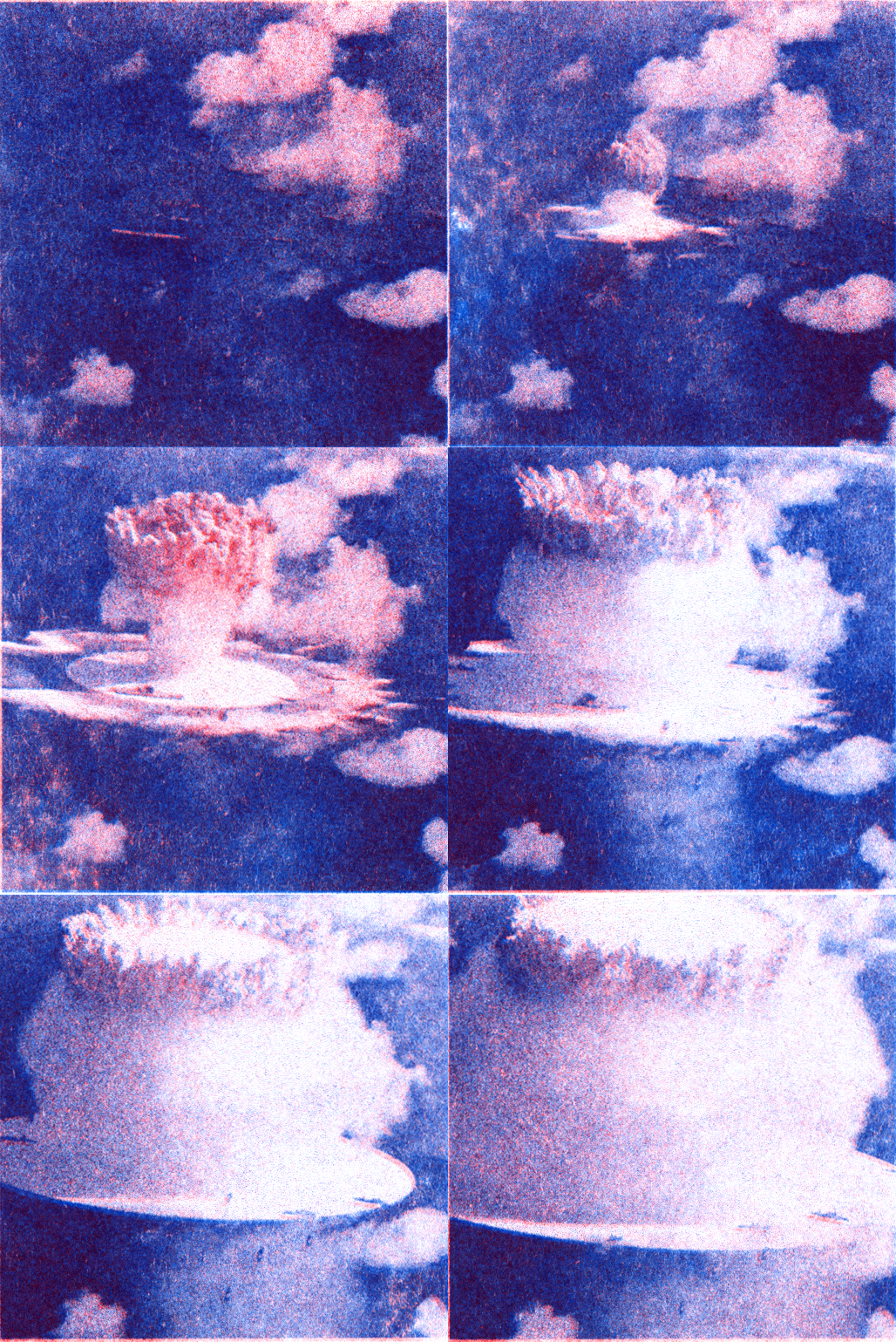
Here is a test riso animation of one of the nuclear tests carried out by the USA in the Bikini Islands. Between 1946 and 1958, the United States detonated 23 nuclear devices at Bikini Atoll, including 20 hydrogen bombs. These tests were well documented in video.