About NYUAD campus signage

  The phrase “In Map We Trust” has come up often in our class, suggesting that the user relies heavily on maps automatically assuming their guidance is reliable. But what about signs? Do we trust them the same way we trust maps? This question came to my mind after an incident at the NYUAD Arts Center.

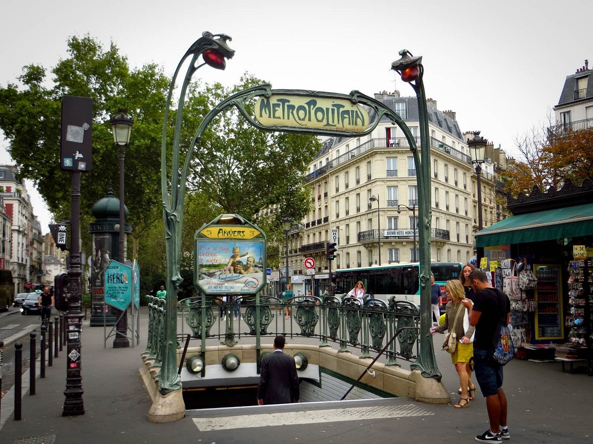
There was a sign on a side door saying “THIS IS NOT AN ENTRANCE. THE DOOR DOES NOT OPEN”. If I generally believed signs, I would never try to pull this door, but I did —and it opened! This means that anyone who followed the sign would have gone all the way around to the main entrance unnecessarily. However, there are certain signs at NYUAD, like those on emergency doors, that I would never test. On our campus, using an emergency door triggers a loud fire alarm, which will sound at any time (even when the actual fire alarm is on as well!). Using these doors by mistake has taught me to be very cautious about emergency exit doors and to take these signs very seriously. Ironically, when we were studying away in Paris, the staff had to specifically tell us not to be afraid to use the stairwell doors in the building, even though the signs indicated they were emergency exits. 

These various interactions with signage has led me to wonder about the overall reliability and accuracy of signs. How many of them are outdated, different, or simply wrong? Remaining in place just because they have always been there? 

This raises further questions about the feasibility and necessity of ensuring all signs are reliable. Is it realistically possible for every sign to be consistently reliable? Moreover, do all signs need to strictly adhere to guidelines and rules, or is there room for some flexibility depending on the context and environment? 

Take our campus as an example: the Arts Center, the Library, academic and residential buildings, all of which have different signage. For example, the Arts Center has unique neon signs which none of the other departments on campus have, the Library relies heavily on roll-up banners, and residential buildings are a lot influenced by students (handwritten notes like “do not remove my clothes from the dryer” are very common and shape the feel of each building). Even though there might be a general plan for campus signs, “life happening” is inevitable. For example, signs on residential buildings were recently installed to replace the old ones. The new plaque’s dimensions do not match the old ones, meaning the new signs don’t perfectly fit over the slots in the wall made in the past. This small but noticeable detail catches my eye every time I enter these buildings. For someone who pays close attention to details, these differences stand out and potentially hurt…

The sign for AIM lab in A1 


Another set of details is the aftermath of the “COVID signage” left around campus, which reminds me of those challenging days. Most of them are marks from the stickers that were installed back then. While they look quite strange, they remind COVID students like me about the struggles of the pandemic and how we collectively overcame it. The signs themselves are gone, but they still keep the memory alive… it’s funny to think that younger classes will never know their meaning.

However, these inconsistencies are not a significant problem for finding your way around campus. They simply add character and reflect the ongoing changes and adaptations within our relatively young campus environment. While it might be ideal for all signs to be completely reliable and uniform, our diversity in signage adds a unique touch that reflects the lively community of NYUAD. Questioning the signs we follow is crucial to reaching our destination, especially when they might lead us in the wrong direction. This is especially true in unfamiliar places where following the wrong sign can have more serious consequences!


Reflection on the Variety of Navigational Challenges

Continuing my first post about Paris navigation, another incident happened in the metro. I was on the way to the NYU Paris building when the speaker made an announcement and the train stopped at a station. The issue was that the announcement was only in French so I did not understand anything. I did not leave the train since this happens frequently in Paris and the train usually continues after some time of waiting. However, the train went in the opposite direction and I had to exit at a station that did not have a direct transition between the platform sides. So I had to leave the station, cross to the other side, and pay again to enter the station and get on the same side of the platform I left.

Another challenge happened when I was on the Dubai metro for the first time. The station I was supposed to leave the train at was Al Khail. There was an announcement saying “The next station is Al Khail”, at the moment right before the train reached the platform. I was thinking that this announcement was for the next station, therefore I stayed on the train. Turned out it was an announcement for THIS station which make sense as it is repeated twice on the way to the station. As a result, I missed the stop. 

And once, while trying to get back from Madinat Zayed in Abu Dhabi at night, I found myself in a bit of a navigation dilemma. I needed to catch bus 170, so naturally, I thought the bus stop would be on the other side of the road the bus stopped at. However, as I approached the road, there were no clear signs, just two traffic lights equally distanced from me on either side. I decided to head left and soon discovered an underground crossing. It wasn’t marked by any signs, and even Google Maps had no indication of it.

 I happened to visit Al Ain Oasis last semester. Despite having a good navigation system with a map, QR codes, and consistent signage around the entire complex, we got into navigational trouble. We aimed to see the “Al Ain Museum”, therefore we followed the signs that even showed the estimated time to reach (!). The “Al Ain Museum” was on the other side of the site where we were walking obediently following the signs just to find out that the entire area was under construction…

A banner on the entrance
3D map
Directional signage

Reflecting on these instances, made me consider what truly defines a good wayfinding system. Is it more crucial to prevent people from getting lost, or should the focus be on helping them find their way quickly if they do get lost? Each experience I’ve shared highlights a different aspect of this question. For example, my return from Madinat Zayed was confusing due to unclear information. There was no sign informing users about the underground tunnel, especially visible at night. In Dubai, the metro announcements were supposed to help passengers prepare to exit, but their timing was so close to the station stops that it was easy to miss your exit, as I did, which is a result of misinterpretation (?)

These situations point out specific failures in design principles that could have made navigation easier. The incident in the Paris metro is a perfect example: a lack of forgiveness to reach another side of the same platform. Furthermore, the lack of announcements in multiple languages was a significant oversight, disregarding the needs of non-French speakers.

This shows the importance of considering all users in public transportation systems, especially in areas with international visitors or residents.

However, the purpose of this post is not just to criticize but to recognize the complexity involved in creating effective wayfinding systems. Many factors can influence how well these systems work, including cultural differences, language barriers, technology limits, and unexpected changes like construction. For instance, even though Al Ain Oasis had a well-planned navigation system, it still led to confusion when part of the area was unexpectedly under construction. 

Reflecting on these experiences has helped me understand the critical balance needed between consistency and flexibility in wayfinding systems. It’s clear that while we can’t predict every obstacle, improving the clarity and thoroughness of navigation aids is crucial. As cities grow and become more diverse, wayfinding systems must evolve to meet the future needs of all users. This is essential not only for convenience but also for ensuring safety and accessibility.


(UN)REAL SIGNAGE

Signs are everywhere, guiding us through complex environments and helping us understand rules in public spaces. They are crucial in helping everyone find their way and stay safe.

According to Gibson, there are different types of signage:

According to David Gibson Identification Signs are crucial for labeling and recognizing specific places within an environment, like rooms, buildings, or facilities, helping users confirm they have reached the right location. Directional Signs guide visitors towards their destinations efficiently, using arrows and concise directions to crucial points like exits or services. Regulatory Signs enforce rules and ensure safety, displaying legal requirements such as no-smoking zones or speed limits, while Orientational Signs provide a broader context within the space, helping users orient themselves in complex environments like hospitals or campuses, often incorporating maps.

As Gibson mentions: “the unifying language of a refining system creates a public narrative of how people witness read and experience a space”

Signs can not only play practical roles; some signs are designed specifically to entertain and engage with the audience. These signs often go beyond the basics of wayfinding to become interactive or visually captivating features that enhance the ambiance of an area and make it more memorable.

Cultural Significance

Signage can also reflect and enhance the cultural significance of a place. For example, the distinctive sign depicting a man in a kandoora crossing the road is not just a practical navigational aid but an integral part of the visual and cultural identity of the region. This sign does more than direct traffic; it reflects the local culture and attire, connecting the area’s traditions with its modern infrastructure. Such signs contribute to the urban tapestry, showcasing the region’s unique character and history, and often become beloved symbols of the locale.

Practicality and humor

Combining practicality with a touch of humor can make everyday signage both engaging and memorable. A playful example of this is a traffic sign that reads, “Santa sees when you’re overspeeding.”  The effectiveness of such signs lies in their ability to make the mundane memorable. By adding humor, signs like “Santa sees when you’re overspeeding” not only promote safety but also enhance the driving experience, making the message stick with drivers longer than a typical traffic sign might. This method of combining useful information with entertainment can make public safety messages more impactful and broadly appreciated.

Another example of using a play on words to tell people  that the escalator isn’t working. This kind of sign can make the disruption less of an annoyance and enhance the user experience.

Some of them might not even have the practical meaning…

From a commercial perspective, entertaining and attractive signs are powerful marketing tools. They attract customers and help businesses stand out. In competitive commercial environments, unique signage can be a decisive factor in attracting foot traffic and influencing consumer behavior.

Hollywood is synonymous with grandeur and spectacle, and its signage plays a crucial role in branding the entertainment capital. The Hollywood sign itself acts as a massive landmark, not just for the film industry but for Los Angeles as a whole. It communicates a message of dreams, stardom, and cinematic history, drawing millions of visitors annually who want to connect with the magic of Hollywood

Creating Visual Landmarks with Signage

When signs are thoughtfully designed and placed at a site known for a particular activity or aesthetic, such as a “kissing spot,” they do more than just provide direction—they create a visual landmark. This sign becomes a focal point, inviting visitors to engage with the location in a specific way—by taking a photo, for instance. The sign adds a layer of interaction, offering visitors not just a view but an experience that is active and participatory.

Becoming a Must-Visit Destination

Over time, as more people post their experiences online, the site transitions from being just another part of the city to a must-visit destination. This can lead to increased foot traffic, which can boost local businesses and enhance the area’s economic and cultural vitality. The sign itself, initially just a wayfinding tool or a decorative element, becomes synonymous with the location, adding to the city’s identity and charm.


Reflection on Wayfinding Principles, Signage and Navigation Systems in Paris

Prior to the start of the semester, I was already familiar with the concept of wayfinding from students’ discussions of the class and posters scattered throughout the art center. The wayfinding mindset was slowly getting into my observational and thinking process. However, it was mostly associated with the challenges of navigating the NYUAD campus. Recalling my first weeks on campus, I remember experiencing wayfinding difficulties since the signage was different from what it is now. On top of that, COVID-19 pandemic influenced the way we had to navigate campus. For example, regulations for the entrance of buildings, in particular, C2 could only be accessed through the main door on the ground floor. Entering through the side doors (Baraha and Marketplace) could result in a fine. 

In contrast to the challenges I encountered on the NYUAD campus

After discussions about maps and transportation systems in class, I decided to reflect on my experience of wayfinding on a bigger scale, in Paris, where I did my Study Away semester and spent a couple of months, analyzing signage, maps, and navigation systems. In my opinion, the transportation system in Paris is well organized and allows individuals to reach almost any point of the city with public transport. The navigation system is generally straightforward, with clear signs providing directions. However, on my very first day in Paris, during my first interaction with the system, I encountered a small issue. I was trying to get back to my dorm from the city center, via the metro. The metro station I was supposed to take was Notre-Dame, so I used Google Maps to find the directions to get there. I followed Google Maps’ directions to the supposed station, but there was none there for the metro. There were only bus stations nearby with the same name. The station I was supposed to go to was another station nearby that got the double name Saint-Michel-Notre-Dame. I think because the underground Notre-Dame station is now closed, this second station was also assigned that name. Fortunately, I found my way, but you can see the signage of this station below…

The name of the station on the map
The name of the station on the train platform
The name of the same station outside

I found the navigation maps of the transportation system to be quite clear. However, a new thing for me was that a train line can have different branches. Additionally, some of the trains may have a final stop halfway through the line. These complexities apply also to trains traveling outside the city, which intersect with stations used by city-bound trains. As a result, navigating railway stations where both types of trains stop can be quite confusing to get the right train, in the right direction, with the right final stop. 

RER A, the line with multiple branches

Besides, I noticed how different metro stations are in terms of decoration. For some reason, certain stations feature thematic design elements (see picture 4). Additionally, the choice of font used for the ‘metropolitan’ signs situated above the station entrances changed depending on the subset of stations and this truly captured my attention. As was discussed in the last class, sans-serif fonts are predominantly used and are considered “ideal” for signage due to their perceived clarity and legibility. Yet, these signs deviated from that convention

Paris Metro - All You Need to Know BEFORE You Go (with Photos)

Another place I had struggled to navigate was the Louvre Museum in Paris, one of the largest and most famous museums in the world. I have been there several times and I can confidently say that I do not understand the layout of it. The museum’s size and multitude of entrances and exits, one of them leading to the metro, make it difficult to grasp. With numerous sections spread across different floors, it was so easy to get disoriented amidst different halls with artworks and historical artifacts. Despite my best efforts to navigate throughout the building, I had to ask the security guards for assistance. Although the Louvre does have some signage to help visitors, I have found it to be extremely insufficient in certain areas. One area in particular that I struggled with was finding the exit. The maze-like corridors and many ways to leave the museum was extremely overwhelming for me. 

In conclusion, I should say that as more topics we cover in class, the more details I start noticing related to wayfinding. Moreover, not only observing new places I go to but also rethinking my previous experiences as those described in this post 🙂