It’s not every day that I get the opportunity to write about meeting legends in the Wayfinding field, but somehow, I’ve had the chance to write about my bona fide experience chatting with Andrew Mead just a few weeks ago. Let’s rewind a bit.
I first encountered Andrew Mead’s work through a book featuring different metro maps in the classroom. During the drafting process, I had originally completely omitted geography. I felt that due to Abu Dhabi’s nature as a collection of islands, it would be difficult to accurately adapt its geography in proportion and represent all the islands.
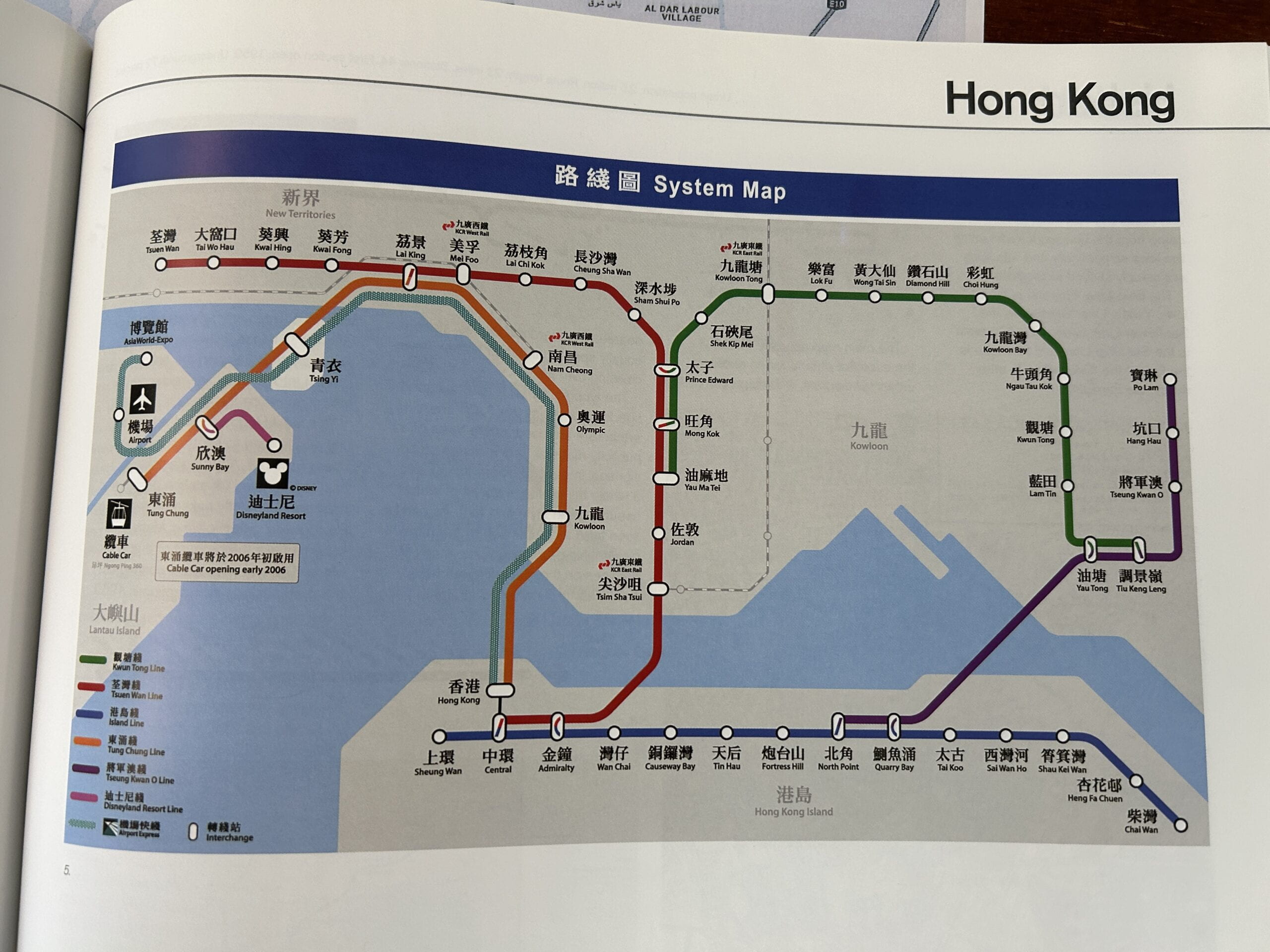
I couldn’t quite grasp how I could cleanly depict the geography so I decided to flip through some map design books. As I flipped through these pages filled with elaborate lines and geometry, one out of who knows how many dozens stood out to me: the MTR System Map of Hong Kong.
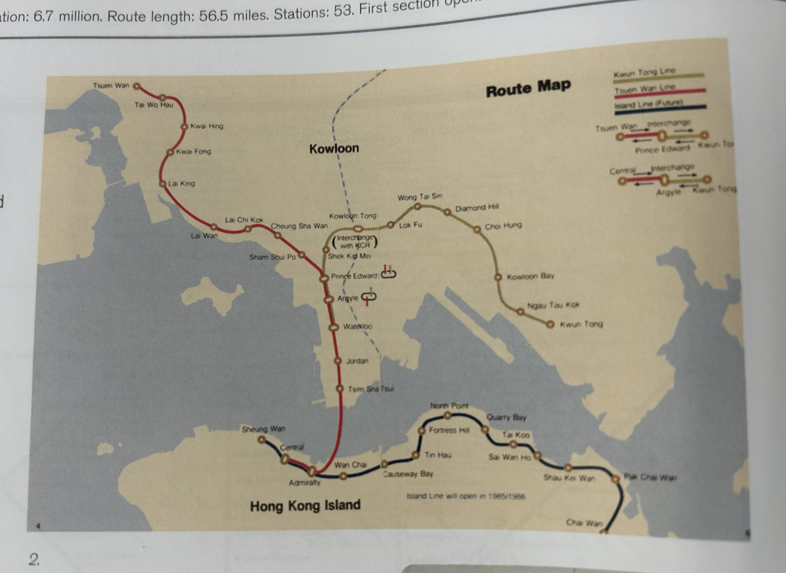
While I took some elements from maps like the Taipei metro map and the Paris metro map, Hong Kong was the map that likely had the greatest effect on how the final product felt.
While I initially planned to leave out geography completely, studying the evolution of the Hong Kong metro map inspired me to implement geography into what I can only call a “polygon” style. What started as a very geographically became something much friendlier to the reader as more and more lines got added. From the density of the lines and the distances between station, everything was altered in a way I really appreciated. This evolution inspired me to make my own metro map in likeness of it. My map would be a distorted version of the Abu Dhabi islands that served as a simple backdrop for the metro lines. Its primary use would be to indicate which island the user was traveling between.
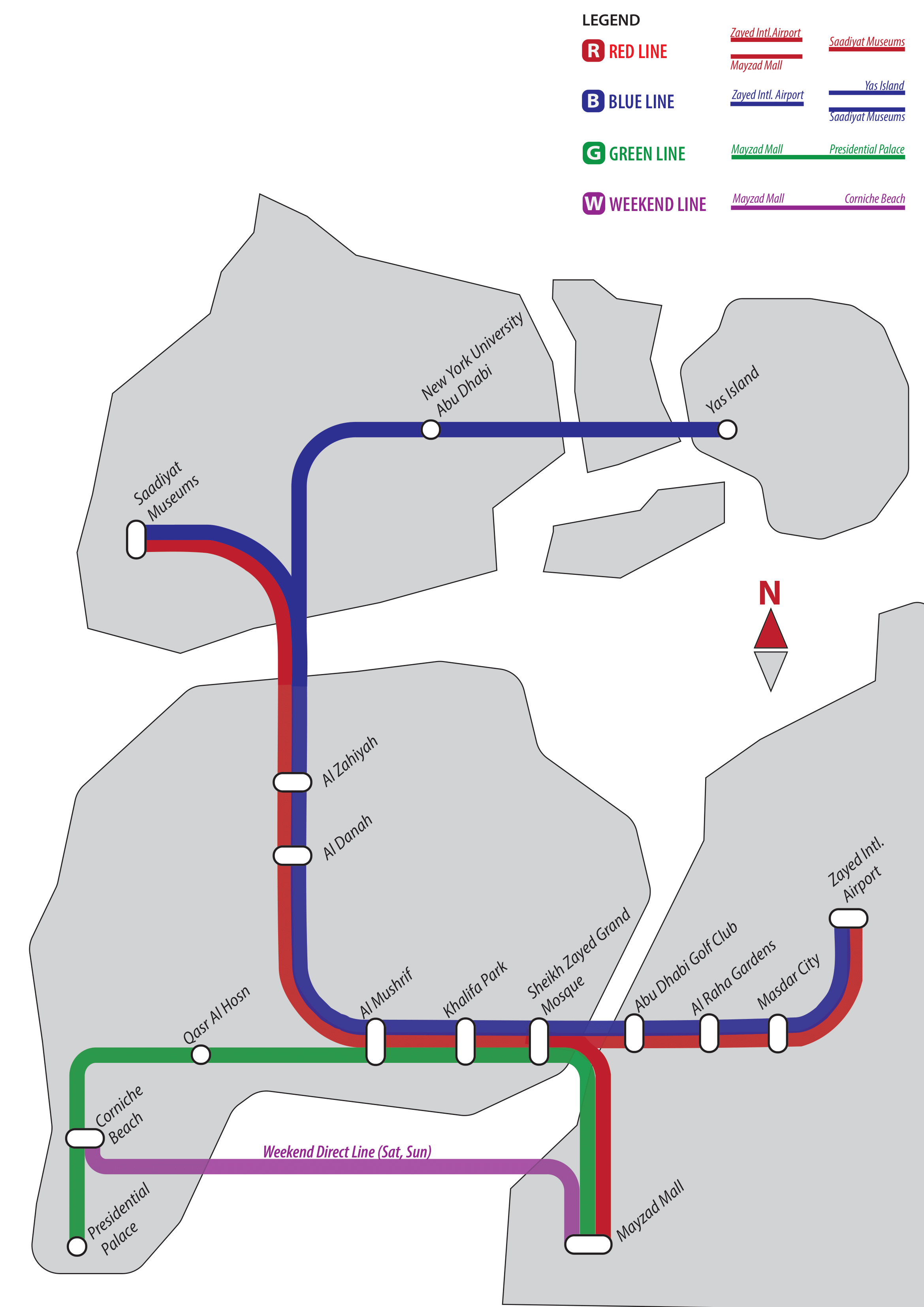
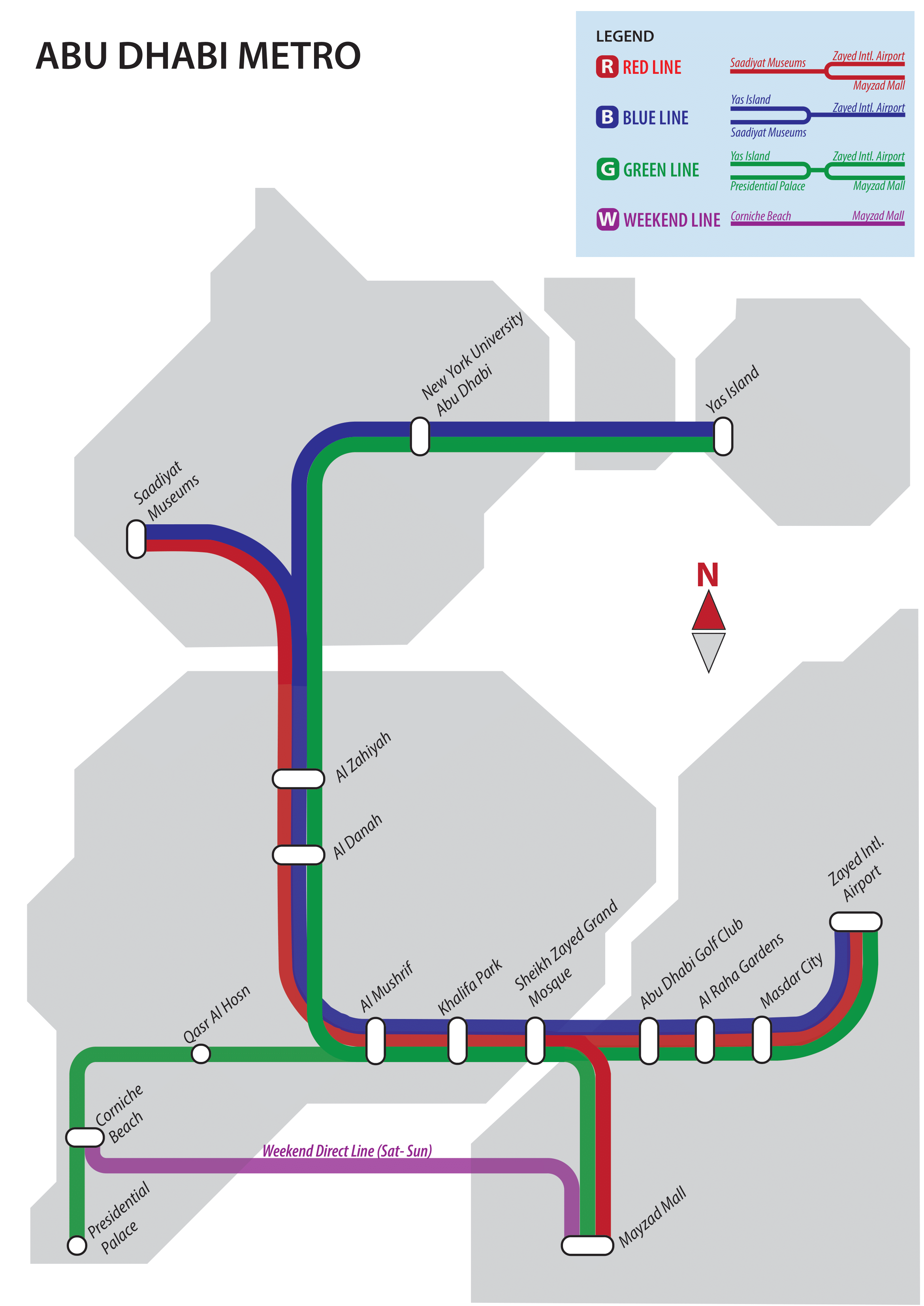
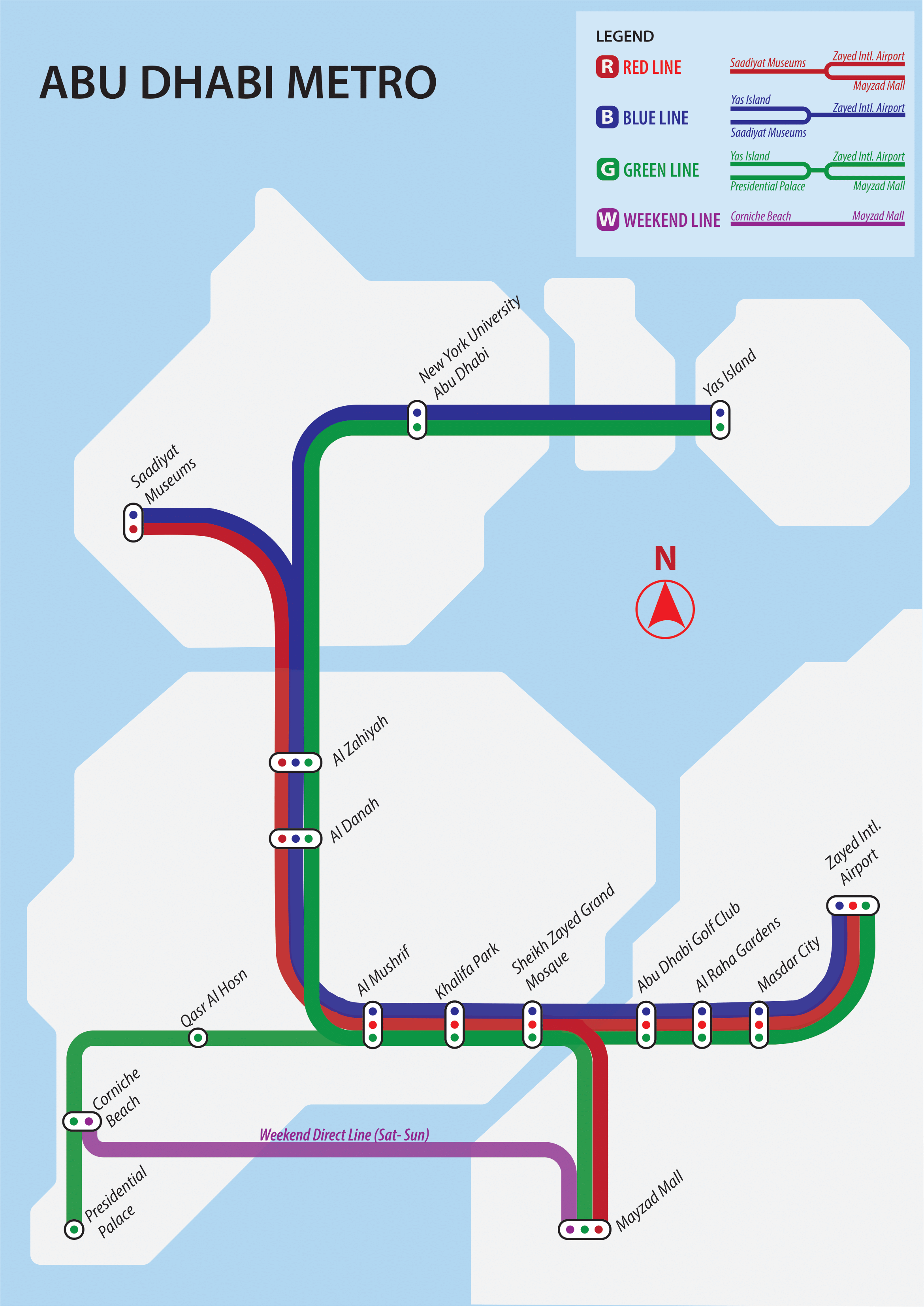
As I designed and redesigned multiple drafts, I would continuously make the angles of each landmass more consistent, eventually sticking to just 45 degree angles. When I started my map side-by-side with the MTR Map, I felt like I was missing something important, and that’s when it hit me: COLOR. Because I had been working with just pencil sketches prior to adapting them to adobe illustrator files, the only color I would have would only ever be on the metro lines themselves. Upon this realization, the map was privileged with colors beyond the greyscale.
Designing the metro map for the Abu Dhabi metro assignment was a very fun experience in a lot of ways. It really challenged me to understand how a user of the metro perceives the reality of the metro system, but never did I think I’d actually get to MEET Andrew Mead.
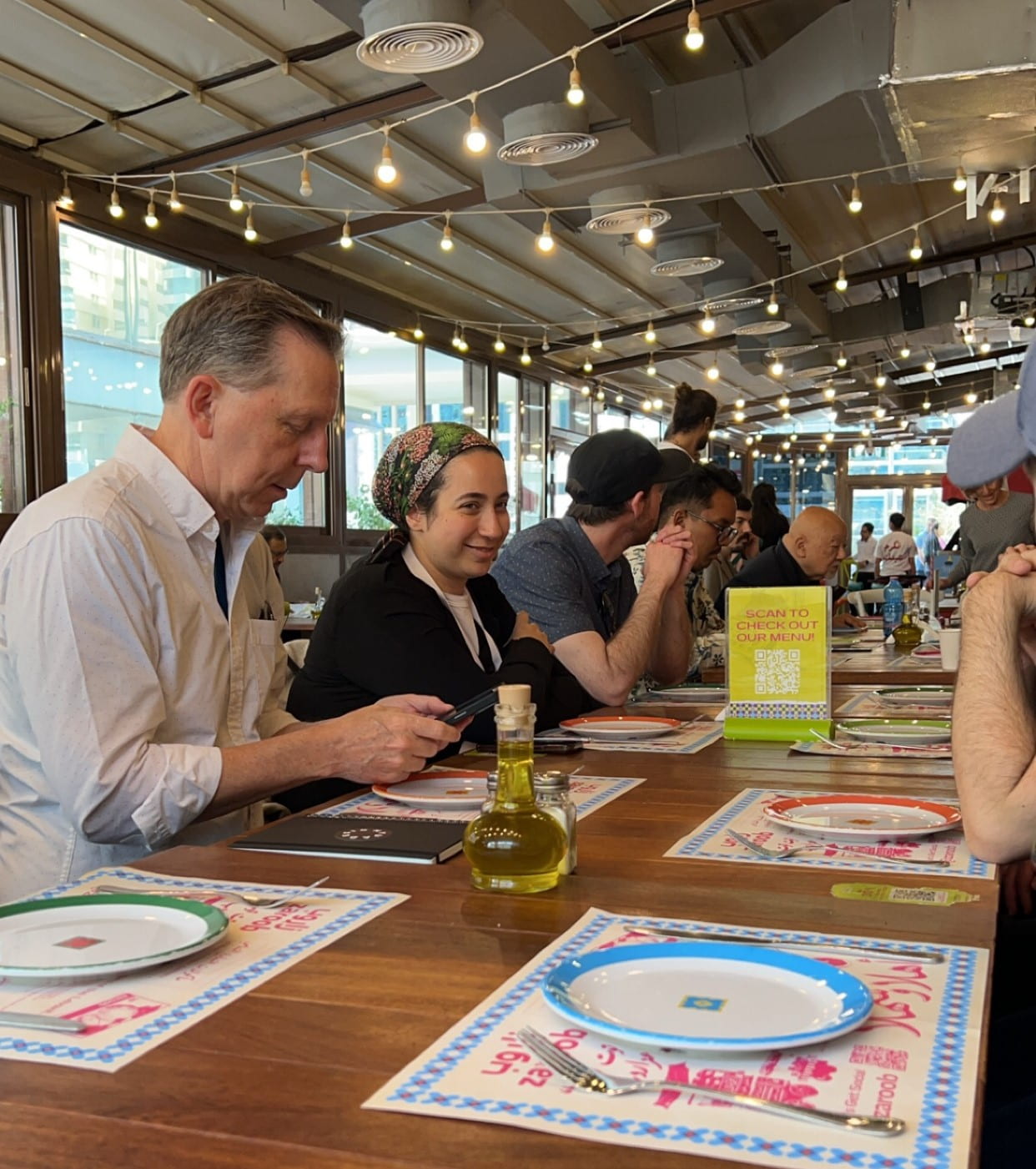
It was only during Mr. Mead’s panel when he mentioned Hong Kong did I realize I was looking at the guy I based my metro map upon. It was a pretty surreal experience meeting the man who not only designed the Hong Kong MTR map I took so much inspiration from, but also to hear him discuss the various projects around the globe he worked on. His panel easily became my favorite talk out of the whole symposium, which is impressive considering I learned over Lebanese food that he threw together that PowerPoint presentation more or less last minute before the symposium.
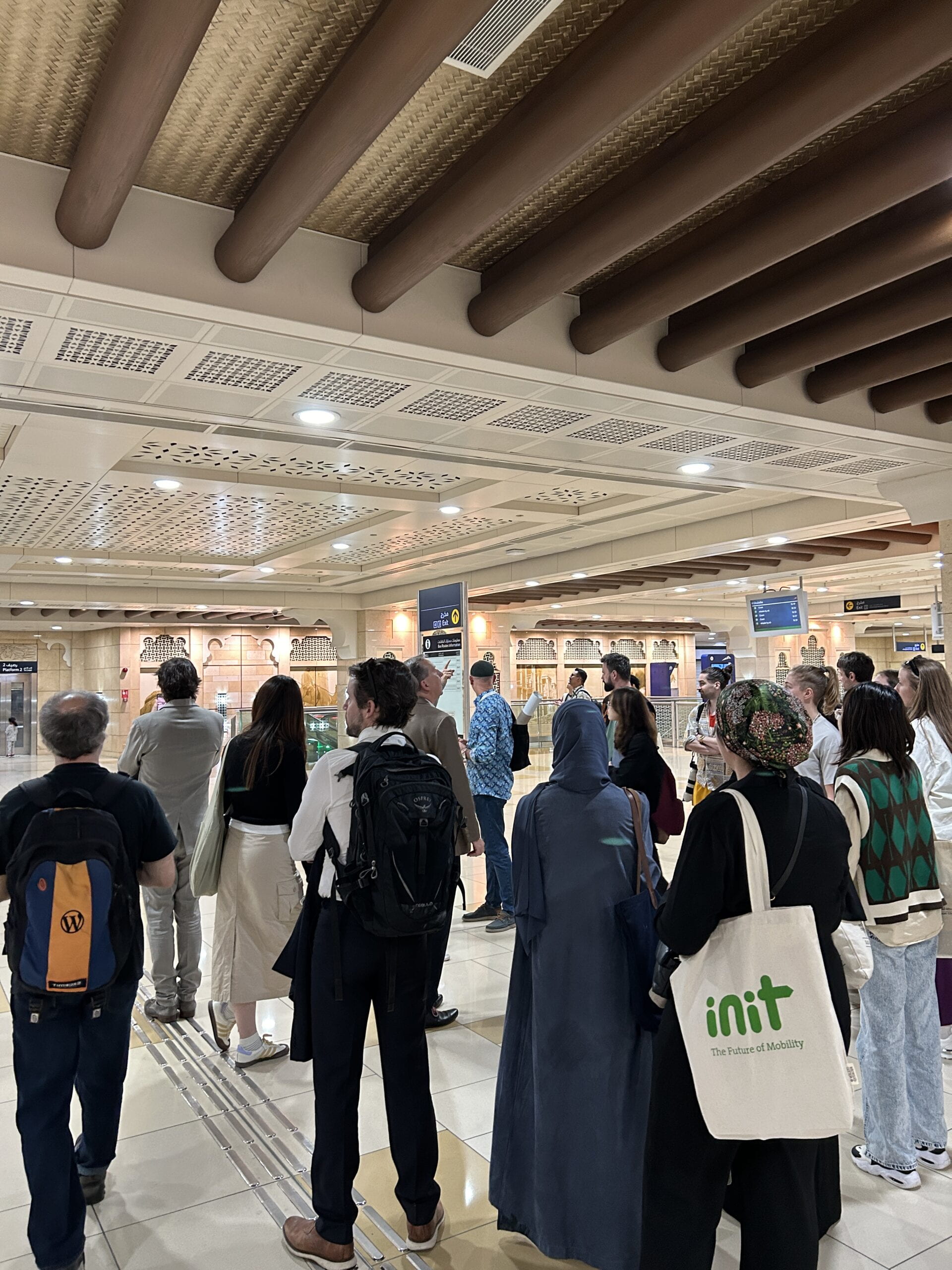
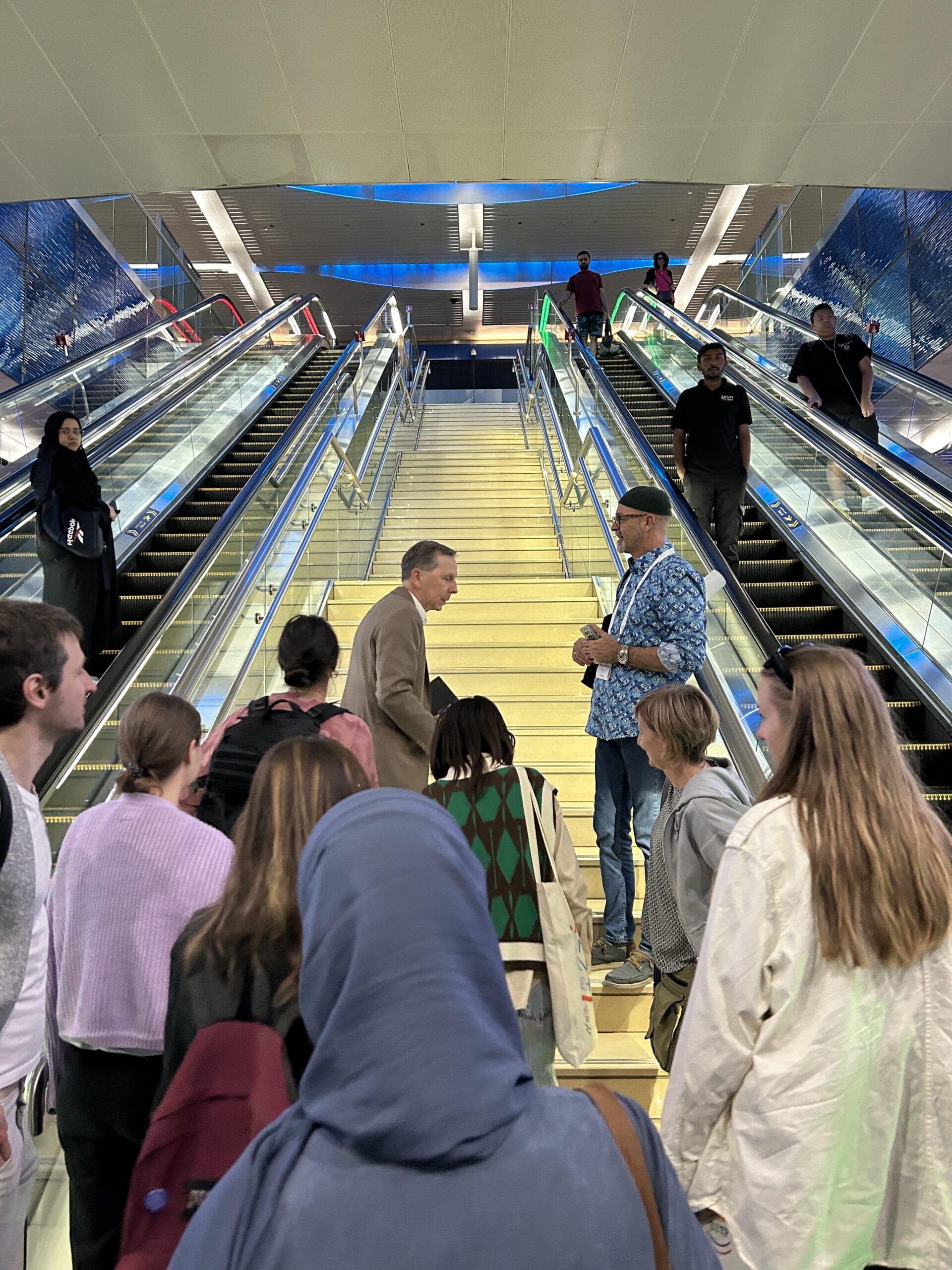
Getting a tour from Mr. Mead around the Dubai metro and even getting squished into the cold interior of the Dubai metro with him was truly a remarkable experience. We had an insightful conversation about several aspects of designing the Dubai metro as a mass of bodies filtered our own to the cold metallic metro doors.
Not only did I get to hear exactly what he thought when he designed each station, but also how he disagrees with certain changes that were made to the metro system since he left the job. He also expressed his dilemma with the hand grips being absent near the doorways. He said while he understands the idea of wanting to nudge passengers to walk deeper into the metro cart rather than standing by the doorway as they enter, this meant passengers standing at the doorway during rush hour would have nothing but the walls and each other to hold onto. Of course he said this as he was squished against the same doors he was referring to.
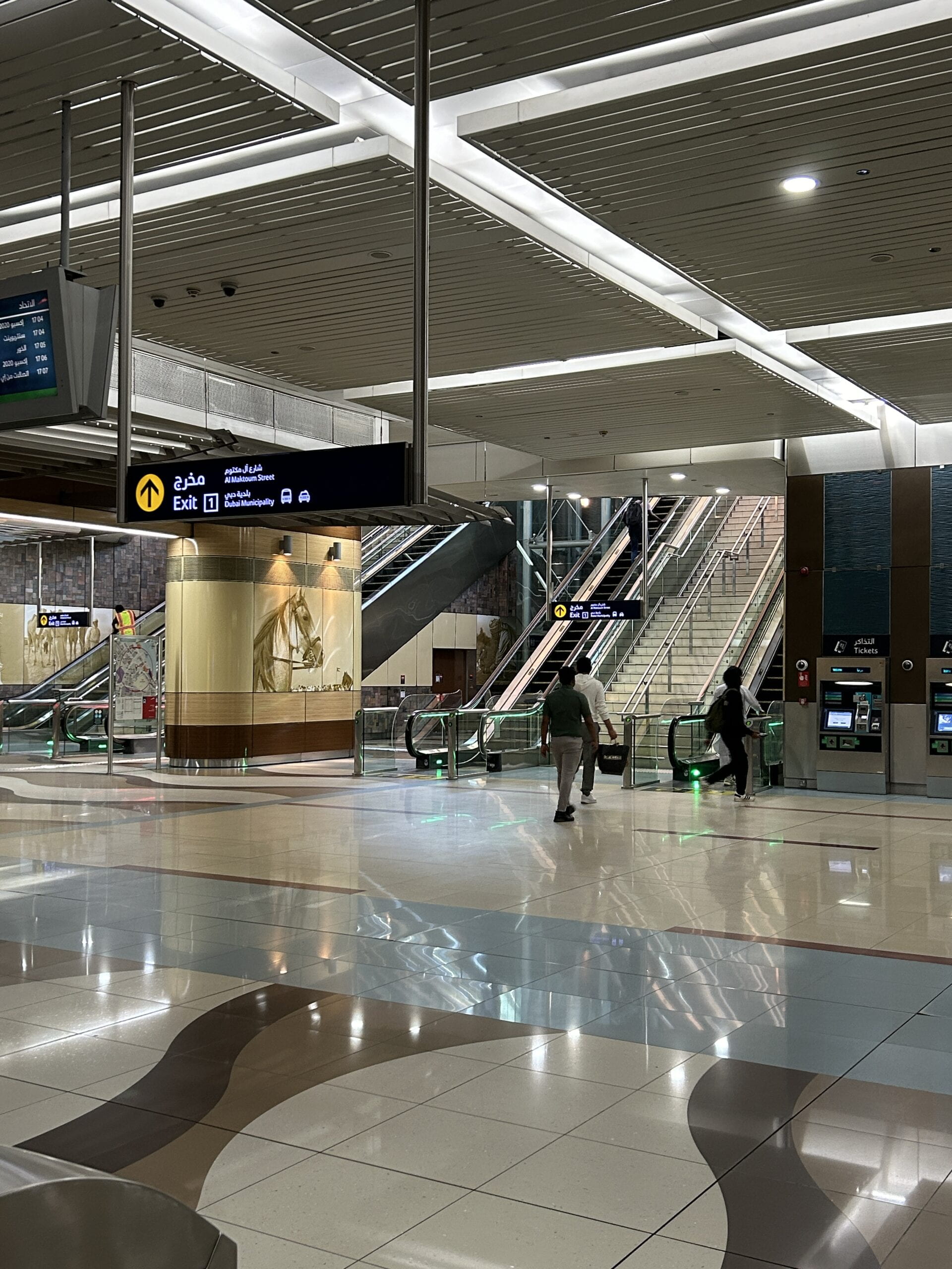
It was rather unfortunate I didn’t take any notes or photos during our conversation; however, as we passed each station, Mr. Mead would describe how he interpreted the client’s instructions and what aspects of the station he really wanted to emphasize. For example, his famous use of art in stations across the world was also reflected in Dubai. From the jellyfish lanterns to the simple horse looking up to the exit, there’s a lot I admire in his work, often times simple on the surface, but goes a long way in our day to day routines in these places “people don’t wanna be in” as Mr. Mead says himself.
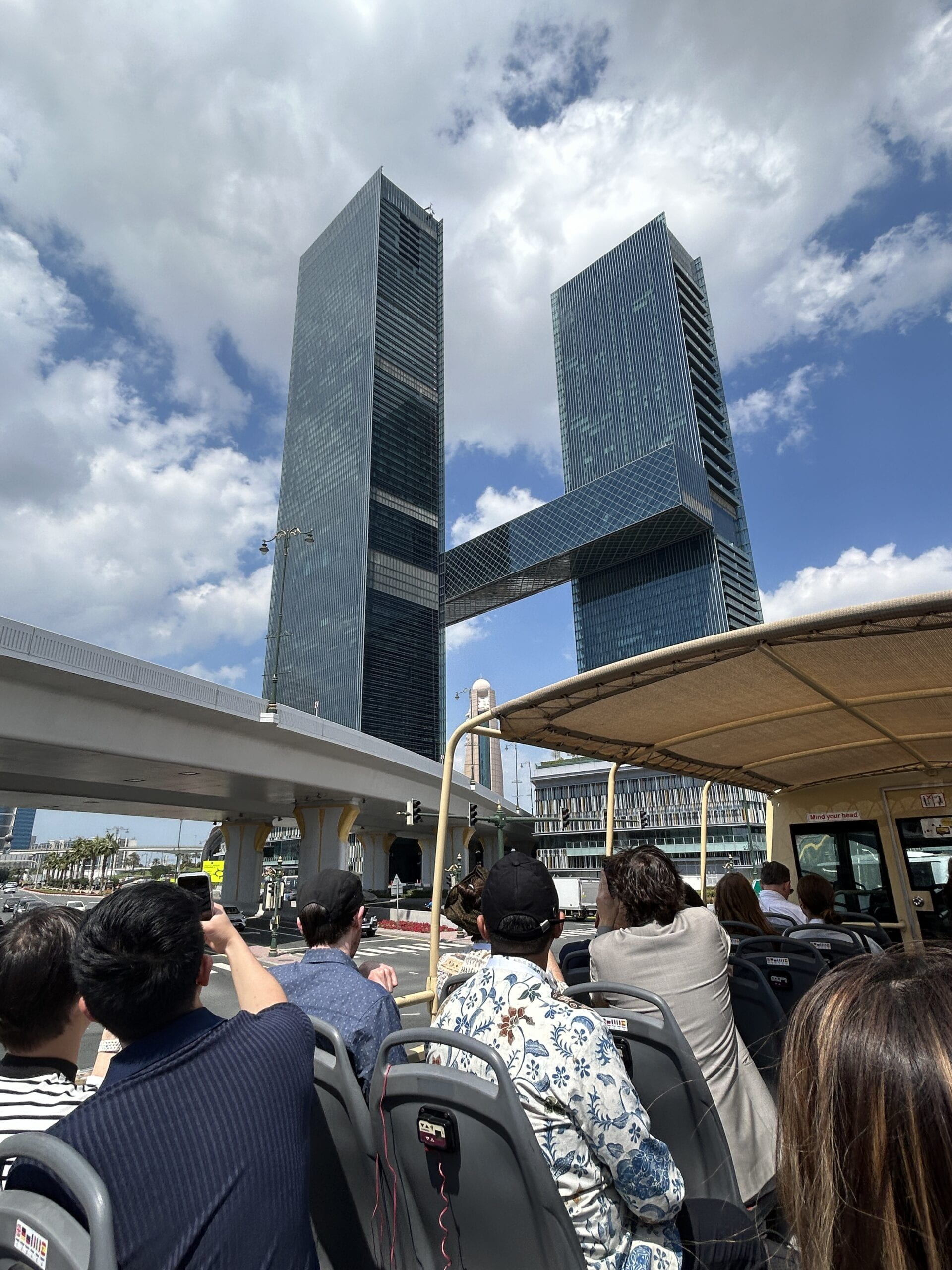
I’m very glad to have been part of the class this semester and gotten to attend this once-in-a-lifetime opportunity to sit at the back of a double decker bus with Jug Cerović and and being pushed against the metal doors of Dubai metro with Andrew Mead. I even got to hear Mr. Mead’s humble origin story while eating great Lebanese food.
Wouldn’t have it any other way, really.
I don’t know if my favorite part is that you got squished with such a big name in wayfinding or the progress and effort that you have put in your Abu Dhabi Metro Map. I think going out of your way to learn about more effective map design strategies and getting inspirations from other great pieces of work are definitely felt on your final product!
This was a great read because even though I experienced this day with you, you picked up on things I didn’t see at first, such as the horse. This reading also caused me to reflect on how much Mead really does involve art in his planning. He really, really cares about how art is able to make a place “people don’t want to be in” significantly more tolerable. I have a feeling some other metro and urban planners prioritize function over form and build for efficiency rather than for people. Seeing Mead’s passion for his work and the people he’s serving was refreshing, touching. I really liked reading about how you emulated his process, draft after draft. This was a great read!
This blog was so much fun to go through! Since I wasn’t able to go on the trip, this was a really fun read. I absolutely love the way Andrew Mead uses artwork for wayfinding and placemaking.
As someone who has been leaning towards designing schematic maps, I think the way Andrew and you designed the maps to be somewhat geographic is so fascinating – using such clean angles for the islands still keeps the clean look that I like with schematic maps, while also adding a layer that allows the user to orient themselves within the islands. I would love to explore this style of mapmaking myself!