🪥Toothbrush
 It was a bit of struggling to model the toothbrush even after watching the tutorial. The interfaces are every different because of different versions. Thanks a lot to Command that makes the searching process much easier. And I am getting more and more used to check the left bottom corner for error detection 🙂
- I had 3 drafts actually, because I was doing the modeling work while watching the tutorial. It wasn’t a good idea.;; A few problems I met during modeling (and got it solved myself:
- Control points can be added to the curves by doing the “Edit — Rebuild — point count“


- I also had a lot of trouble editing the surface. One trick I learned during office hour is that I can create a line, and extend the separate curves that are supposed to be together to that line. In this way, I can make sure the two curves can be joined into one. For the control points that pop up from no where during the office hour, I realize I can just delete them 🙂

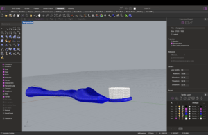
- I also encountered some problems with the cylinder, because I couldn’t find any metric to figure out the height of the cylinder. but the copying/ paste/ array I learned in this process was really helpful!! And I learned that more functions can be found in the “transform”

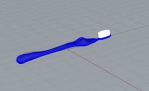
- This is what the toothbrush looks like in the end (tho I am pretty sure it looks nothing like a toothbrush 🙂


🎧 Podcast: Feminist Data Visualization with Catherine D’Ignazio | link
Data visualization is a way of communication and can be used to answer questions. It is, as Catherine D’Ignazio put it, “the view from above”, meaning that it is the view from a different body perspective. People try to use data visualization to present an objective truth away from human judgment, but in fact, the truth presented is partial, the data selection process might include problems like accessibility, truthfulness of the data. That’s why bias is unavoidable. To prevent bias, looking at the group of people datasets cover is very important. D’Ignazio points out that there are so many underrepresented people. However, I think it in a sense shows the great potential of data visualization. ⛓️
As a rhetorical act, data visualization for me encompasses both the aesthetic value and practical value. However, if a project is deemed as useful, it may focus more on presenting the data, and there might not be much space to have different personal interpretations of the project. On the other hand, a project which is more “beautiful”, or has more aesthetic values, people may have a more diverse interpretation of the project. The potential drawback of such project comes to my mind is that some audience may not understand the ideas behind the project, thus the communication of the thought might be affected. But overall, wither being more aesthetic of more useful, data visualization facilitates the interaction between data and human being. ✨
In this podcast, what I find most interesting is the definition of feminism. Catherine D’Ignazio mentioned that feminism is more than gender. It could also be race, ableism, power dynamics and so on. I think this definition reminds me to be more open-minded when paying attention to the data in our daily life. The significance of using a feminist perspective to visualization can go beyond my current understanding. 🫡
Leave a Reply