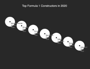
For this project, we were working with data visualization and implementing JSON data files into the code. I decided to visualize the rankings of F1 constructors and drivers based on the 2020 race results.

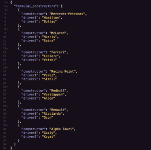
The first steps I took were uploading the JSON files and setting up the normal setup() functions. As shown above, I set the data as Mercedes-Petronas, McLaren, Ferrari, Racing Point, Redbull, Renault, and Alpha Tauri, as well as their main drivers. While there were other teams, I decided to exclude them as they were doing too poorly during this season.

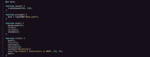
I then set a preload() function to load the data in the JSON files and a draw() function to show the shapes I will be drawing later. I then set the title() function for the title at the top of the drawing, and set the attributes for the text such as the font (Helvetica), text size, and color.

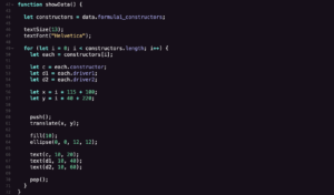
The next step was to create the ellipses for each category to go into. To create the diagonal striation to differentiate the rankings and constructors, I set the ellipse coordinates and set all the dimensions the same.

This part was harder for me to figure out. This makes the data appear and show up on the final product. I set a for() loop and set the variables for each constructor, Driver 1, and Driver 2. The text() function differentiates and makes sure that the text for each data point isn’t all in one string on each circle.

The last part was the most challenging for me, as I couldn’t figure out how to make the data points even appear at first. However, with Moon’s help, by adding the console.log() function for the attributes that we set to the variables constructor, driver1, and driver2, as well as setting the values for the x-value and y-value (xconstructor and yconstructor) respectively, we allow the values to properly show up on the project.
In the future, I would expand on this by adding more striation, and maybe even using other JSON data to input more accurate data such as the points earned by each team and driver. I would also add an interactive element to it, such as making it an interactive timeline to see the progression over the years (2016-2020?). Overall, I learned a lot from this project.
Here is the final code: code
