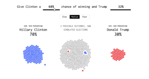
For this case study, I am trying to explore data visualization. The project I chose explores the election results from 2016, Hilary Clinton vs. Donald Trump.

This utilizes the data and categorizes the voter election turnouts based on who voted for who as well as who is predicted to be undecided or voted for. This is based on the popularity vote, as opposed to the electoral college vote. 
The animation utilizes the data and categorizes them to create the percentages for each canditate’s turnout. The bounces for the balls gravitates towards the outer clusters from the inner cluster, which slowly changes colors as the votes change.
For my own project, based on this, I can utilize the 2020 election data and try to instead of making the balls bounce from cluster to cluster, just make the colors simply change in a single cluster. By implementing the JSON data, we will be able to get it to visualize and I think it would turn out well.
Here is the link: case study 2