[Design Project] Diptych
Diptych
Designer | Joyce Weng
Concept
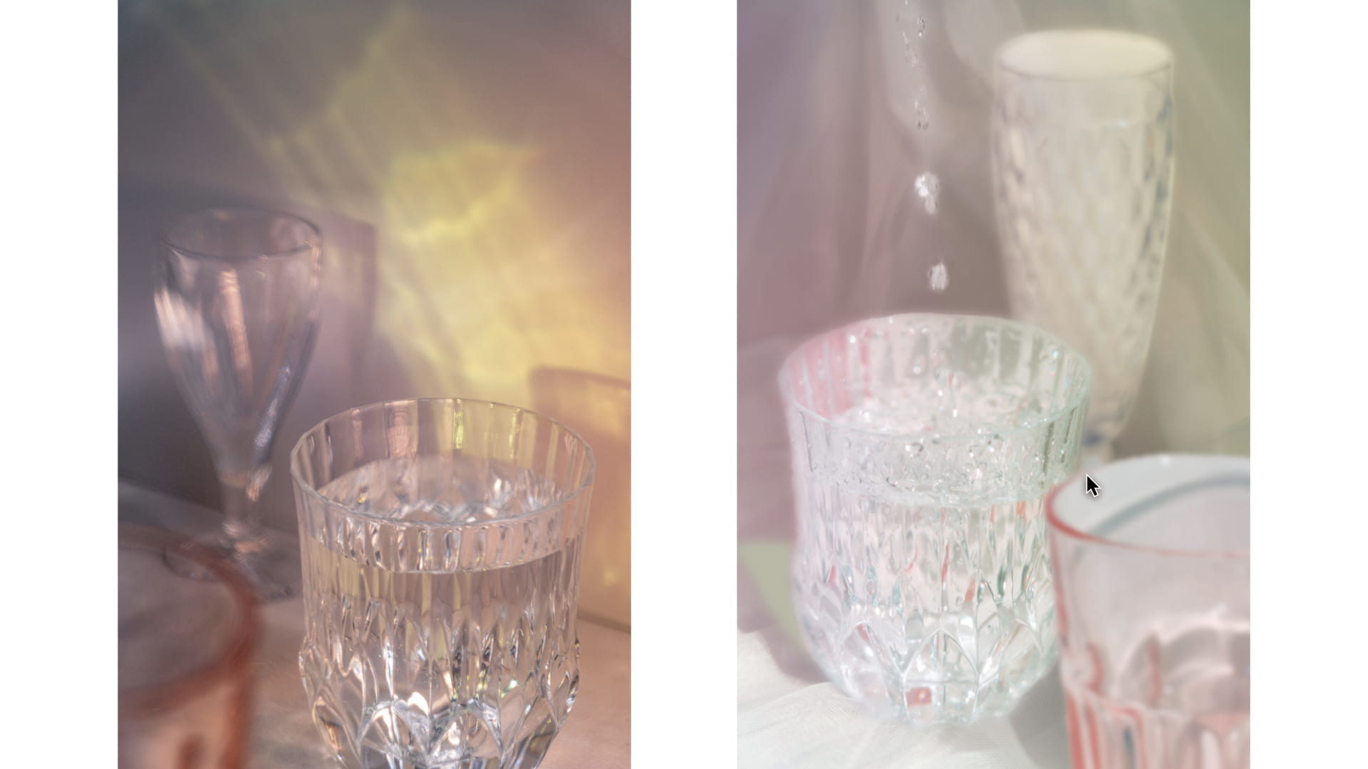
By looking at my diptych only, can you tell at first glance which work is from Part 1 and which is from Part 2?
I hope the answer could be “no,” because this is linked to the main concept of my diptych — I wanted to make it unclear to distinguish which one is the original photo and which one has been processed by Photoshop. In this project, I wanted to explore how photos become unreliable and how technology deceives people’s eyes in this digital era.
My inspiration came from an online photo exhibition that I visited in one of my other classes. The exhibition was called Reconsidering Icons, where artists based their works on historically iconic images, and then used various ways to deconstruct and recreate the so-called “icon”. As far as the “deconstruction” mentioned in the exhibition was concerned, I thought about how the progress of Adobe Photoshop related technologies could help us manipulate photos.
In modern times, it is easy to modify a picture without even letting the viewer know that it has been modified. For example, when you take a selfie, you might enlarge your eyes and make your face smaller. With the help of some advanced applications, the effect is so natural that viewers might not know that you have modified your face. Therefore, in my diptych, I wanted to deceive my audience of what is real and what is fake.
As a result, I would make Part 1 of the diptych look artificial and manipulated, while using my Photoshop skills to make Part 2 as real as possible.
Process
Part 1
In Part 1 I wanted to play with natural light, so I chose a sunny day to shoot. I used the windowsill of my room and an empty layer of a bookshelf to create the setting. Besides, I took off the curtains of the room and prepared them for use.
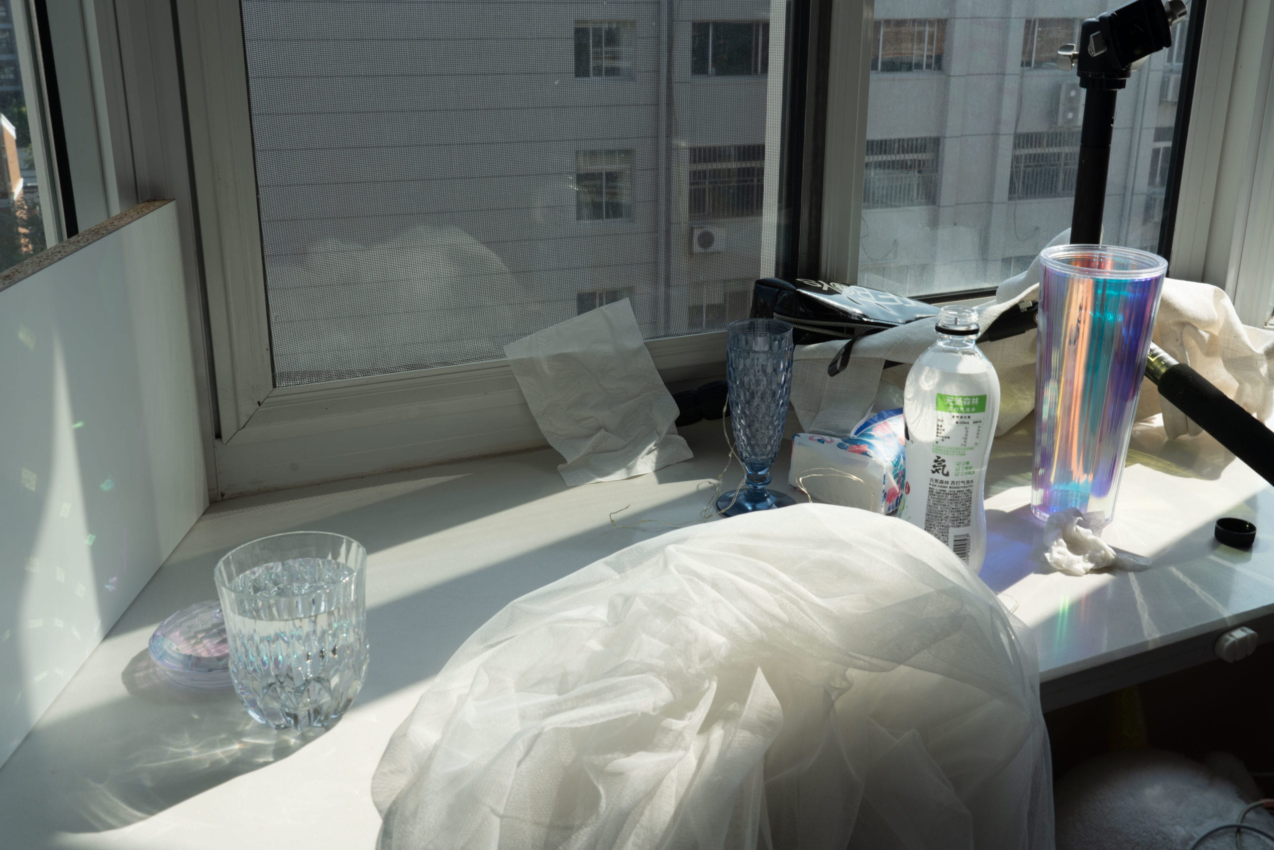
At first, I wanted to shoot light tracks with long exposure. Since the sun is very bright, I knew that even after I adjust the aperture and ISO to as dark a level as possible, the photographs would still be overexposed if I used a slow shutter. Therefore I planned to use an ND filter at first. However, since the deadline was very close and I didn’t have time to borrow one, in the end I covered a half-transparent black pencil case in front of the lens as a substitution.
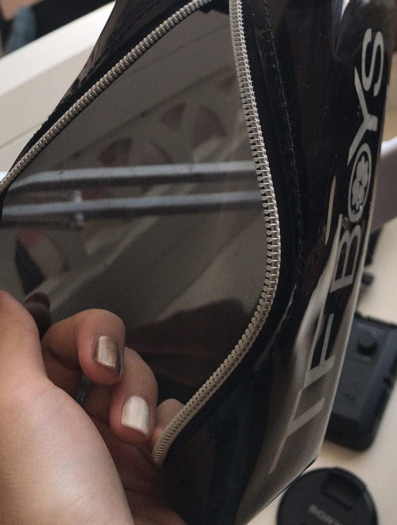
Surprisingly, the accidental use of pencil case gave me amazing results. Since the case was old with lots of scratches on it, when shooting pictures through the case, it naturally created a blurry effect, which added texture to my photographs.
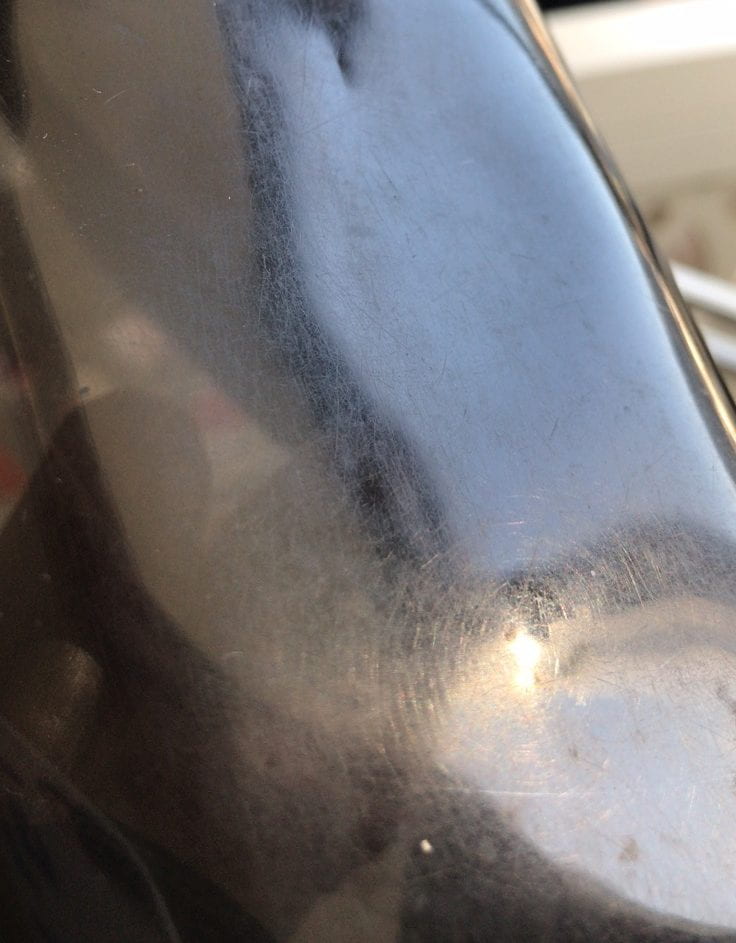
In order to make the picture look more manipulative, I used a colorful cup cover to reflect colorful light to the background, and adjusted the shutter speed to a faster level, so that the light could be seen easily. In the end, although the light was actually a reflection of the natural light, it looked like artificial lighting because of its unique shape and color.
Part 2
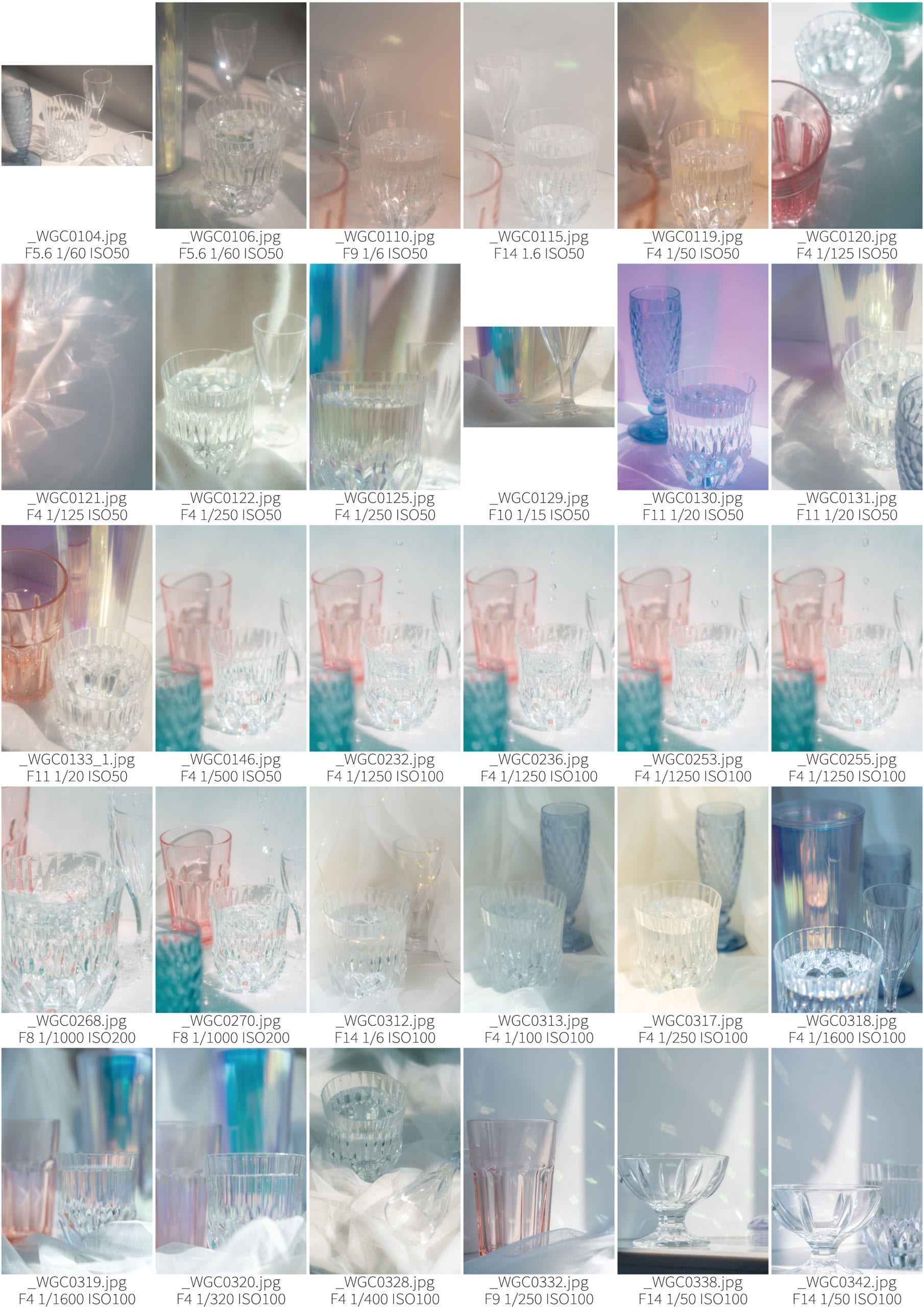
In Part 2, the cups and background actually came from different images in my contact sheet. I cut the elements out from their original photos and combine them into a new picture. This was the biggest challenge I face in Part 2 — trying to combine the different elements naturally.
I used the “feather” function to blur the edge of each element, and reduced the “clarity” and “dehaze” the picture so that everything looked more like a whole. To add the water droplets, I used “blend mode” and “mask” to make it natural in the background. In addition, I also used “blend options” to recreated the light and shadow of each element, so that the lights appear to come from the same direction.
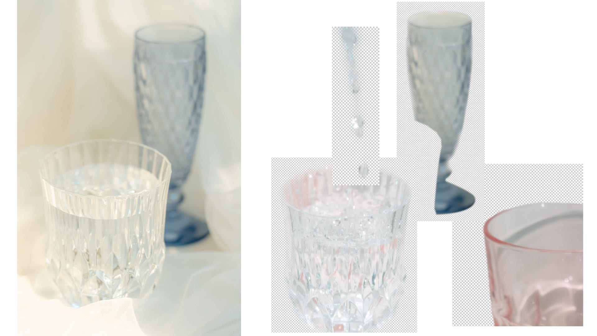
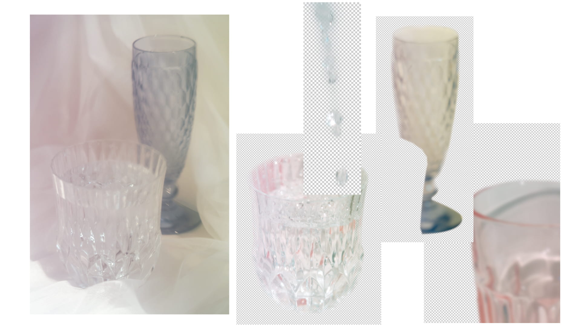
Finally, I intensionally added an arrow on the picture, so as to hint the audience that this image had actually been photoshopped.
Conclusion & Improvements
ND filter
If I had more time to improve my project, although the use of that pencil case gave me really amazing results, I still want to borrow a ND filter and experiment with the long exposure and light track. I really want to explore different effects in my project, because I think it is very interesting. Also, since you cannot see a light track with human eyes, I believe this experiment will contribute to the unrealistic feeling I wanted to convey in Part 1. Therefore, if I had more time, I am willing to give it a try.
More photos with single cups
In my current contact sheet, I put lots of efforts on trying different cup compositions, so the cups always overlap each other in the final pictures, which made it difficult for me to separate the cups from other cups and the background. This added difficulties to my Part 2 process. However, if I could do this project again, I would take more photos with only one cup in the picture. Therefore, it would be much easier to separate the cup from the background, thus making the result of Part 2 more realistic.
Synthesize skills
In the diptych, the biggest challenge I faced was the synthesis process in Adobe Photoshop. It was difficult to cut different cups out of their original photographs and combine them on a new canvas, while still making everything look like a whole. In fact, the printed version of Part 2 picture looked so real that when I was at the printing shop, one of my classmates who saw my work even asked me which of my two pictures was for Part 1 and which was for Part 2. However, when looking at a clearer version on the computer, you could easily see the traces of being Photoshopped. After this assignment, I realized that there is still lots of room for improvement of my Photoshop skills.
