[Design Project] Typography Poster

Designer | Joyce Weng
Inspired by the music | Meteor 流星
Artist of the music | Karry Wang 王俊凯
Concept &Design
Concept
When I began designing my poster, I thought about two aspects that might inspire me.
One is the background information of the music I choose. The song was published in 2019 after the artist’s twentieth birthday and it expresses his life attitude as a twenty-year-old young man. Since the singer became famous at a very young age, his life has always been displayed under the spotlight and watched by the public. Whatever he does or speaks, there are always people who comment on or criticize him. His words and actions are over-magnified by the public. However according to the music, Karry shows his indifference towards all the voices around him. He firmly states that he is not afraid of the all the comments. Instead, he will bravely face the challenges and difficulties that he ought to overcome, and take his own road.
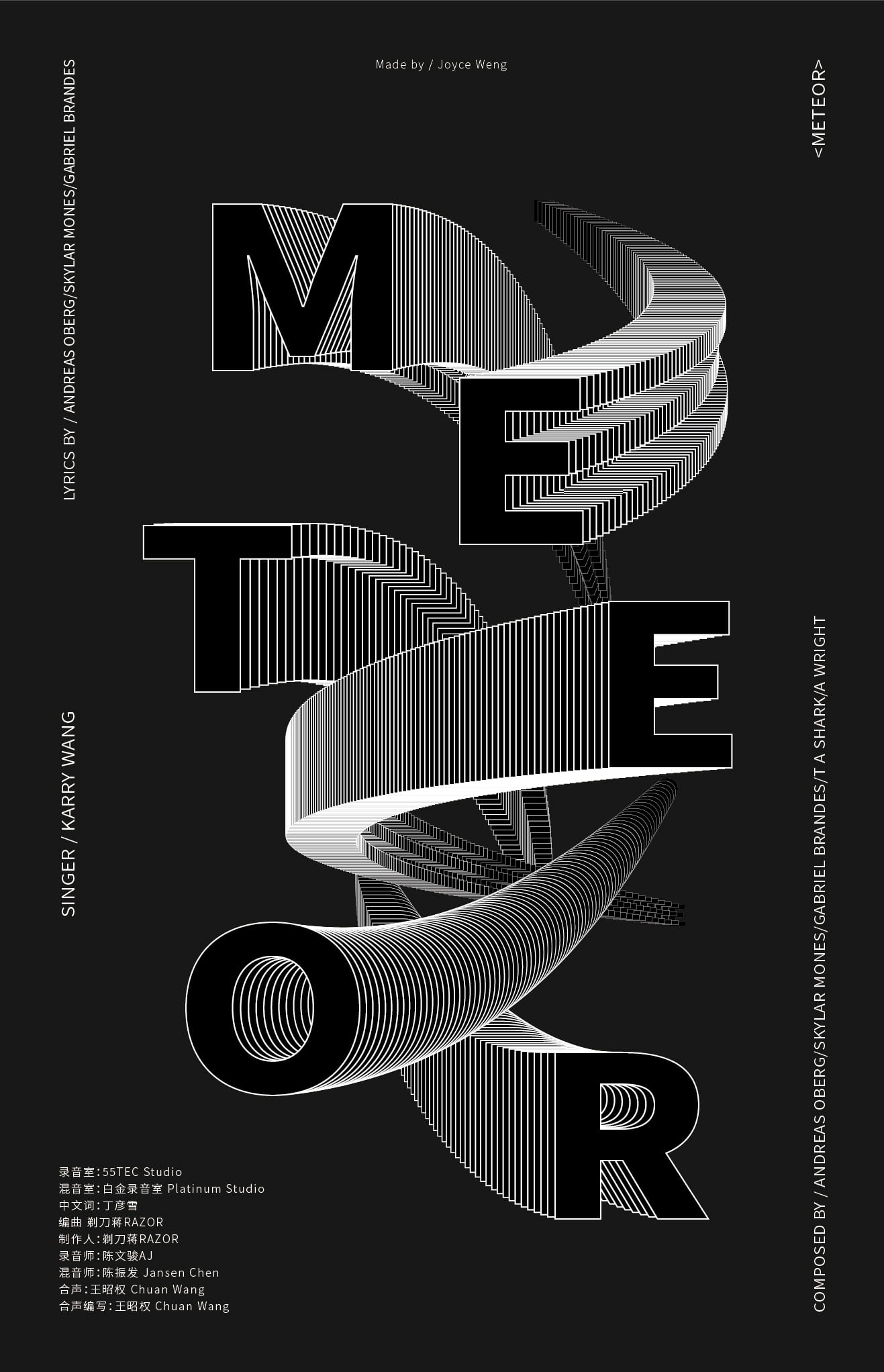
The other is the feelings the music itself gives me. The song has a strong rhythm and I feel like I am punched by the beats when I listen to it. That is why I used bold and right-angled fonts instead of thin and rounded ones. In the music, I cannot hear the original sound of any music instrument, so it is more like an electronic music piece. The song also gives a sense of illusive and psychedelic. Therefore I apply repetition to the letters “M, E, T, E, O, R” to illustrate the feeling.
Applying Gestalt Theory
Similarity: Take the element in the poster, the letter “T”, as an example, in my poster there are tens and hundreds of letter T where one overlaps the other. However instead of perceiving that there are that much “T”s, people tend to see the “T”s as a group and believe there is one single “T”.
Continuity: Still using the letter “T” as an example. In the 2D planar, the letters follow a specific path and changes from big to small. However the viewer is more likely to perceive a 3D feeling from the poster. Applying continuity in Gestalt theory, the letter goes from a place close to the view towards somewhere far away and will continue going that way.
Process
First Draft
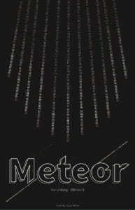
My first draft looks like this. I wanted to illustrate the strong rhythm and punching feeling I perceived from the song so I used a bold and right-angled font. I also wanted to use characters to simulate the feeling of shooting star falling to the ground, so I designed the upper part of the poster. However I realized in the mid-critique that I am not allowed to use gradient. The poster should be only black and white.
Final Version
As a result I changed my design entirely in the final version. I followed some of the designs I included in the first draft, for example the bold and strong texts, as well as changed the designs to better illustrate my concepts, for example instead of using gradient, I used repetition to show the shape of the shooting stars.
Reflection
According to the teachers, my work is more like a standardized advertisement for the song instead of an art work that reflects the feelings I get from the music. If I get more time to revise the poster, I would like to emphasize more on the feelings.

