Assignment 10+11 – More on Rams’ 10 Principles

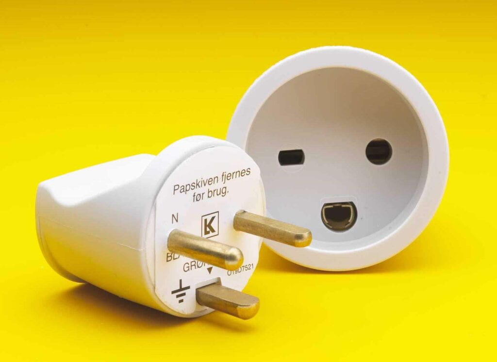
As mentioned in a previous blog post, both Philippe Starck and James Dyson are very different in their “design thinking”. Both take everyday products and turn it into something cool, but Starck’s designs are somewhat impractical with an artistic intention while Dyson’s designs are logically created with an intention to solve a certain problem. In terms of Rams’ 10 Principles of Good Design, I feel like Dyson checks off most, if not all, of the principles. Starck also does have good design principles in his works, but I think the one principle that throws people off is how understandable (or not) of some of his products, like Hot Berta and Alessi Lemon Squeezer.

Continue reading “Assignment 10+11 – More on Rams’ 10 Principles”
Assignment 9 – Dieter Rams’ 10 Principles of Good Design

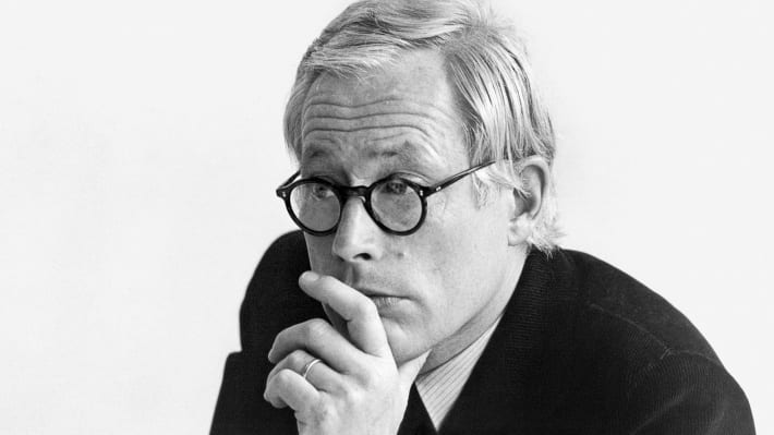
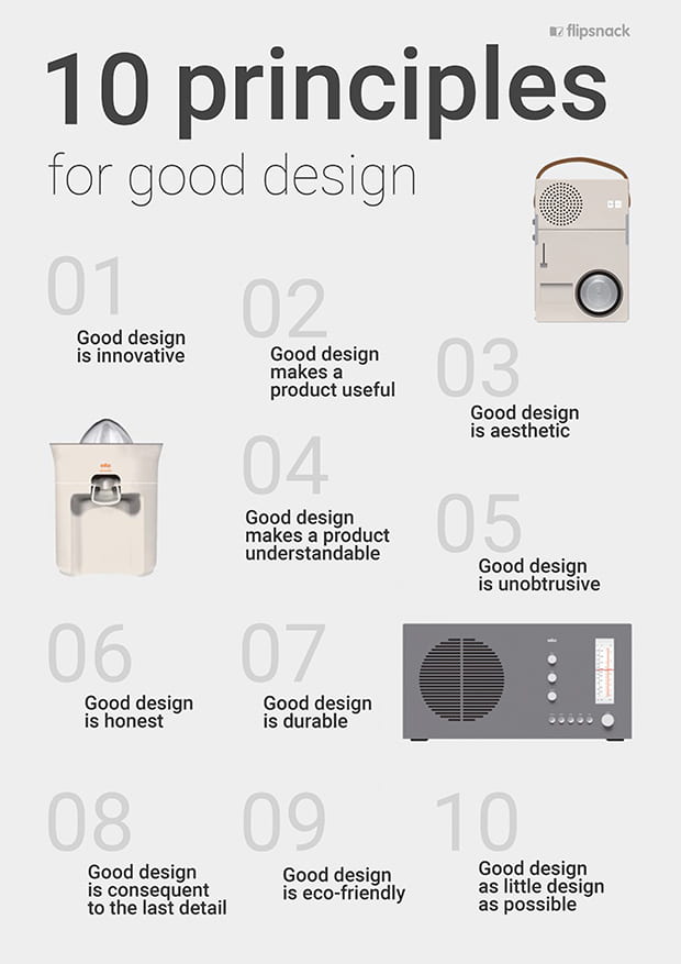
 After reading this article, “Dieter Rams designed products to last a lifetime — and he’s horrified by how we throw things away“, I feel like Dieter Rams’ 10 Principles of Good Design sparked the minimalism era in design. Designers like James Dyson and Philippe Starck still illustrate Ram’s principles and his ideology of “less is better.” Therefore, the 10 Principles of Good Design are still very much relevant in modern design today.

Continue reading “Assignment 9 – Dieter Rams’ 10 Principles of Good Design”

Challenge 3 – Galaxy Buds Case

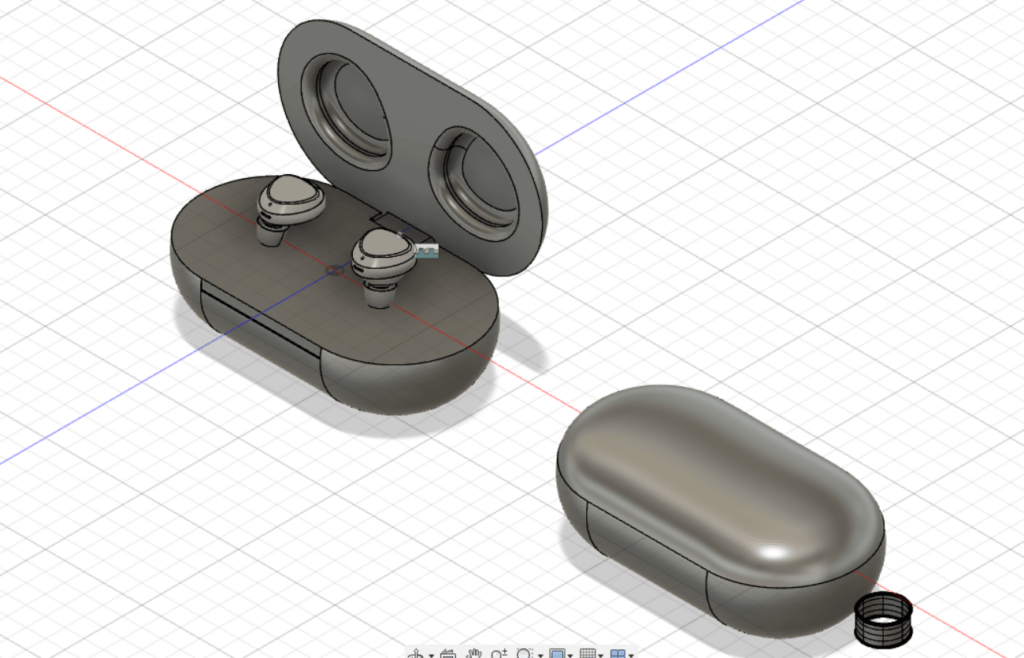
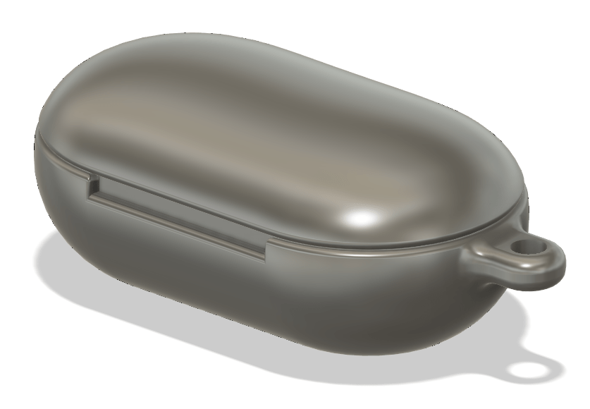
I want to create a realistic Samsung Galaxy Buds+ case, since compared to Airpods cases there isn’t a lot of variety and the Galaxy Buds cases are a lot more expensive. For this week’s update, I added some details, like the front indent of the case, the earbuds hole in the lid, but I spent most of my time working on the hinge of the actual case of the Galaxy Buds. There was a lot of trial and error in creating the hinge, but I managed to get it to move the way I want it. However, there’s still a lot of fixing to do because the hinge is too big so it isn’t flush when the lid closes.

Continue reading “Challenge 3 – Galaxy Buds Case”

Fusion 360 – Rendering

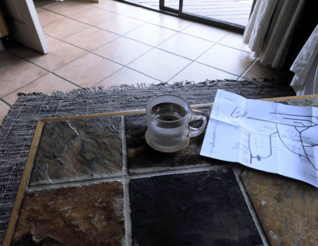
This is my rendering of the mug from class. I tried searching for the enamel material, but I don’t think I had it so I ended up using frosted glass. I actually rendered this twice on my laptop and it took probably 6+ hours to do both renders. So for the Grabcad model, I used a computer and each render took roughly 10 minutes. Since it was way faster, I was able to test out different positions and backgrounds and render multiple times.

Continue reading “Fusion 360 – Rendering”

Assignment 8 – James Dyson


James Dyson is a very logical and practical inventor who puts a ton of research and thought into his creations. After watching the video “James Dyson discusses innovation, bringing new products to market and more“, most of his products were made because he found an annoying aspect to it and wanted to improve it. For example, the Ballbarrow was created because he didn’t like how wheelbarrows were designed– the wheel sunk into the ground, the metal pieces would damage your house, and cement would stick onto it. The Dyson vacuum cleaners were also inspired by his frustration towards a bagged vacuum and the technology behind how a vacuum cleaner collects dust. James Dyson emphasized the idea of interaction and improving in small increments, as well as the idea that failure can be an exciting process of inventing. It shows how he is someone who strives to create a product that is nearly perfect.

Continue reading “Assignment 8 – James Dyson”

My Problem, My Solution! Update 3

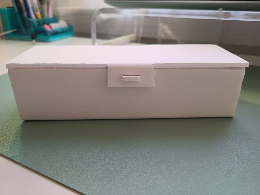
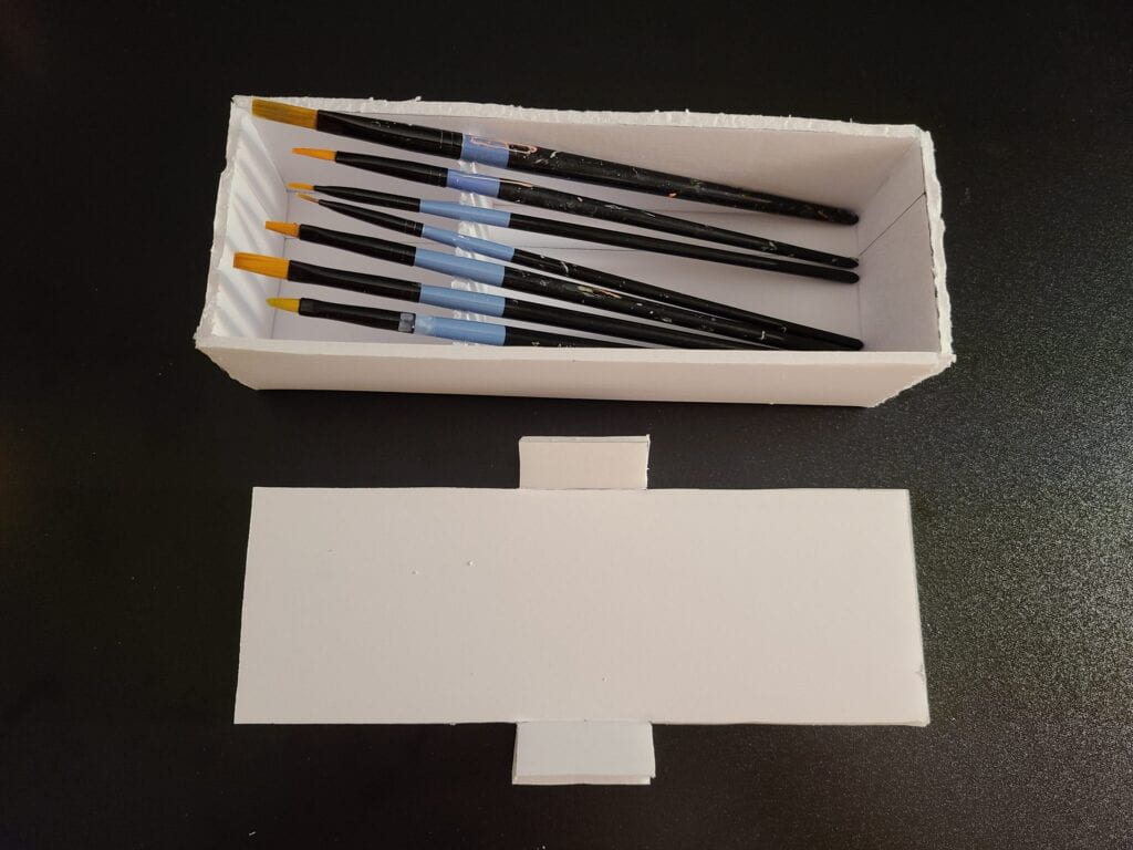
Not much has changed since the last prototype. I actually recreated the box so the edges were cleaner and I also tested out the latch idea for the lid. For the edges of the box, I tried cutting out bits of one of the edges so when it folds up it’s more flushed (unfortunately I forgot to take pictures of this process). For the flap, I cut out a small rectangular hole in the lid flap and then attached another rectangular piece of foam core onto the box. The rectangular hole was about the same size as the foam core thickness, so I just had to figure out how big the latch on the box should be. It’s kind of difficult to get both sides in the latch, so this lid design needs further improvements.

Continue reading “My Problem, My Solution! Update 3”

Assignment 7 – Philippe Stark

From designing furniture to architecture, Philippe Starck has created so many different things throughout his career. After watching the video, “The Habits of a Creative Genius“, Starck just seems like a someone who is passionate about his work and loves to create. He doesn’t consider himself a genius like everyone says. A few points that I thought were interesting was when he talked about living like a monk and disconnecting from the world helps your creativity. He also places a lot of emphasis on love, which can be seen in his website as well where he says, “Love is an endangered species” and “In my architectural work I create scenarios with the vocation of creating more confident, more beautiful and more in love.”

Continue reading “Assignment 7 – Philippe Stark”

Assignment 6 – Smart and Emotional Design


After watching the two videos on Smart Design and Emotional Design, it makes me appreciate and recognize how much thought is put into making a product more than just functional. Before watching the videos, I thought that Smart Design was mainly designing technological products, like Nest’s thermostat or iRobot’s Roomba. But the video made me realize that it also includes products that are ergonomic and focus on human-product interaction as well as functionality. On the other hand, it seems like Emotional Design relates more to digital products, since in the video Bill Moggridge talks about how he realized that he wasn’t focusing on the physical design of the laptop, but more so on the software of the product.

Continue reading “Assignment 6 – Smart and Emotional Design”