INSPIRATION
I was inspired by multiple works, such as Casey Reas. In particular, I remember watching Casey Reas’ talk on chance operations, which I took a little bit of inspiration from. Additionally, some other inspirations I drew from are the Fibonacci patterns in general and biology (which Casey Reas also elaborates on in his talk).
Later on I was also inspired by Into the Spiderverse colors, but it’s not really reflected in my final sketch. I also went to TeamLab Borderless, where there was a specific room that made me think about how I could use vectors to recreate something similar. However, I went pretty late on Wednesday before class, so there wasn’t enough time to recreate it in code, but if there was more time I would definitely want to experiment with that.
CODING PROCESS
The coding process was basically me just experimenting with the vector math and other functions until I got my final result.
Draft 1
While the one on the left does look visually appealing, I felt like something was missing; it seemed a bit too orderly so I added some randomness:
e_pos.add(random(-2, 2));
Which created the one on the right. I experimented with different levels of randomness, but I felt like anything higher than 2 was too much. I also added an opposing direction in the complementary color and got this after letting it run for a bit:
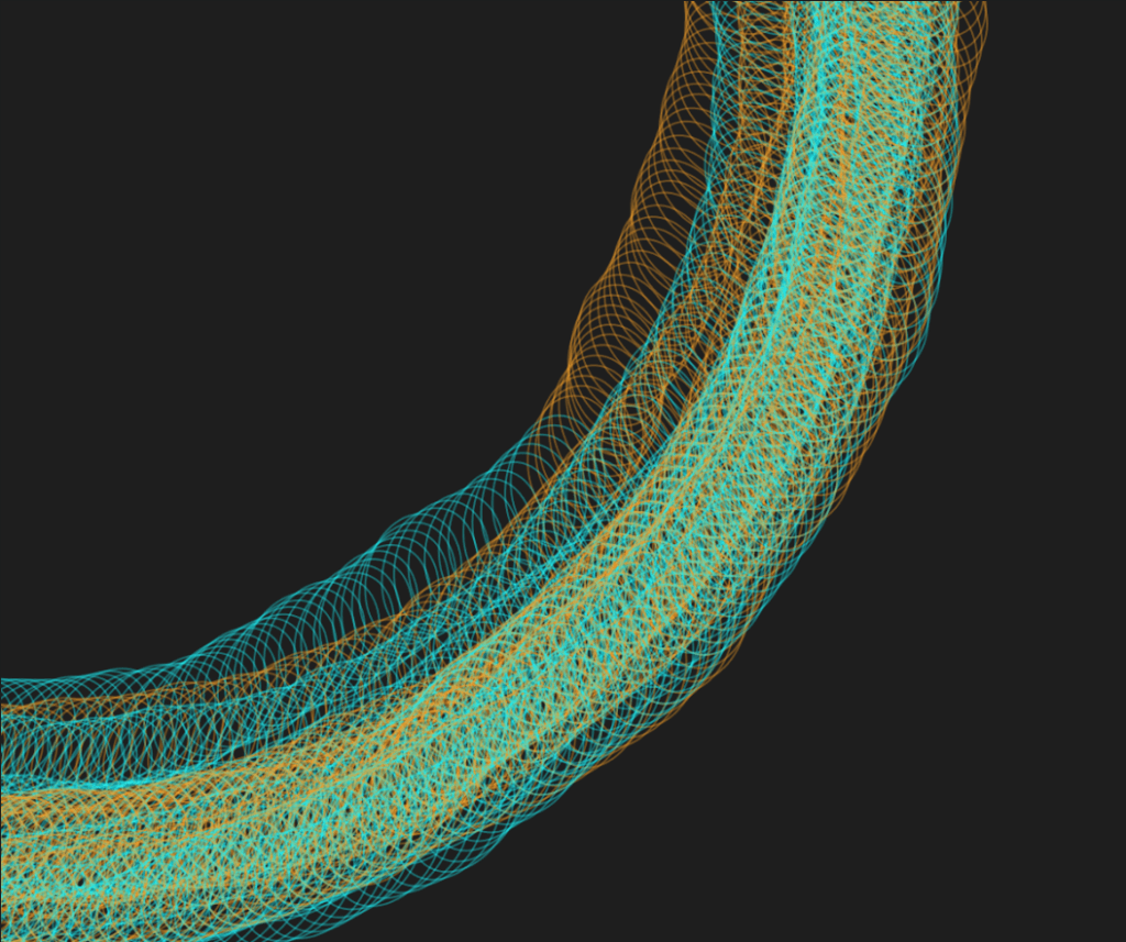
Another iteration used translate. Since I created the ellipse vector position at the middle of the canvas, I tried making to origin the center, but I subtracted 50 because without that it would only appear in the corners:
translate(width/2 - 50, height/2 - 50);
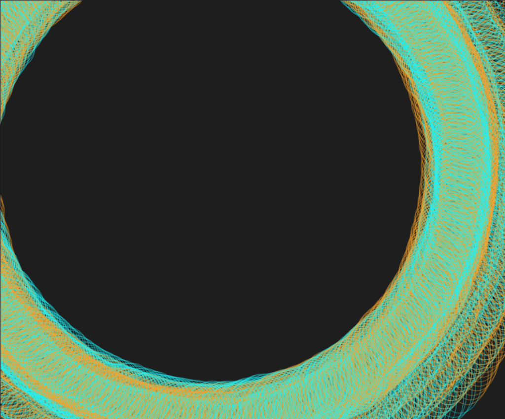
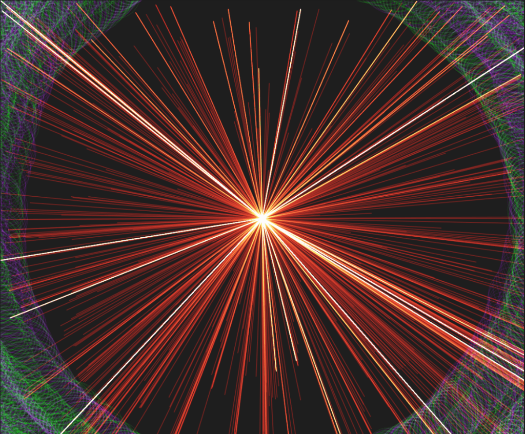
I then decided to change the colors to purple and green. I then tried to add lines to the sketch, since the middle looked empty. I started off by using mouseX and mouseY as the end points of the line because I wasn’t sure how to get this effect with just math:
draft 2
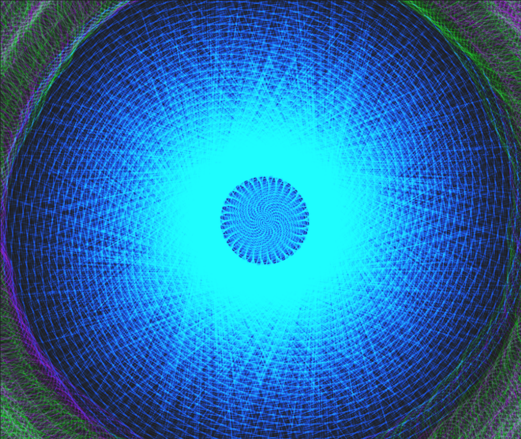
After looking at “Demo 03 transformation applications,” I tried experimenting with rectangles instead. I played around with the height of the rectangle by changing the mod (%) value of it. At first there was no mod and it was just frameCount for the height, but then I experimented with mod because the height would just keep increasing if I didn’t have some sort of constraint. I did try to use constrain(), but it didn’t really work the way I wanted it to. Here is the difference between constrain() and mod:
So when it was mod, the rect would always go back to the center and expand again, whereas constrain() it would stop when it reaches the highest point. I liked the effect of mod more, so I kept that instead of using constrain.
final Version
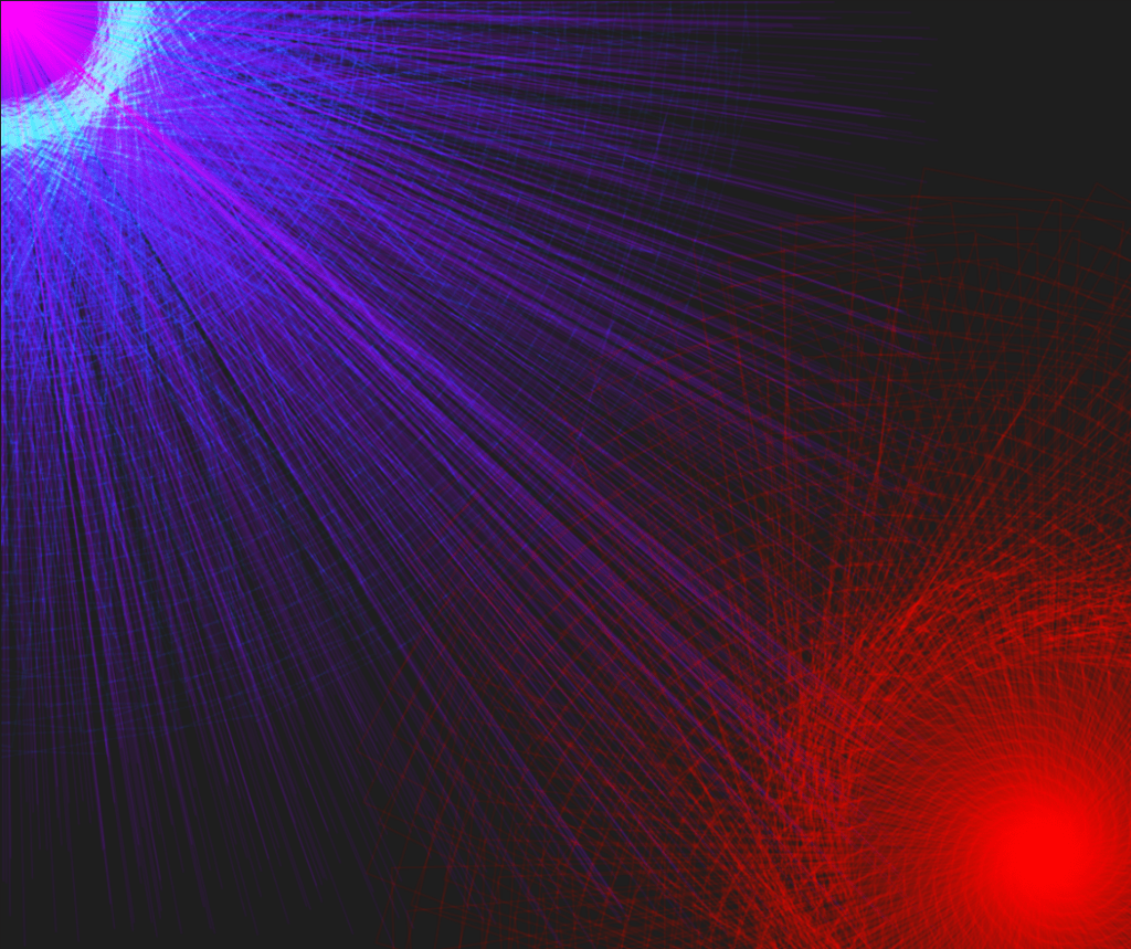
This is the “final” version. Instead of having the blue in the center like the last one, I moved it to the corner and added a second rectangle in the other corner. I also got rid of the ellipses. The interesting thing was that the blue and red were at first the same code, but the red had a different pattern.
I also added purple lines coming from the corner and attempted to include mult(). This type of sketch does reach a point where it draws too many times, which makes it look like one giant blob, so I added a mousePressed() function to stop the loop so I can take screenshots when it looks cool.
REFLECTIONS/LESSONS LEARNED
I’ve done quite of bit of coding with JavaScript/p5.js throughout my college career and I never really incorporated much math when I made something, so this was definitely a different direction and pretty challenging. I wasn’t sure how to incorporate more math functions in the final sketch, and I feel like if I could do something differently it would be a whole new concept. Honestly, technically speaking the code isn’t that complex, but it did take a lot of trial and error for me to think of a sketch and experiment around. There were also a lot of other failed sketches that I didn’t include in my documentation.


