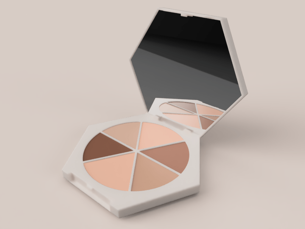
For this week I decided to recreate the Em Cosmetic’s eye shadow palette. I felt like the hinge component of this palette was pretty straightforward, but since there weren’t any good reference images I struggled a bit with creating an accurate representation.

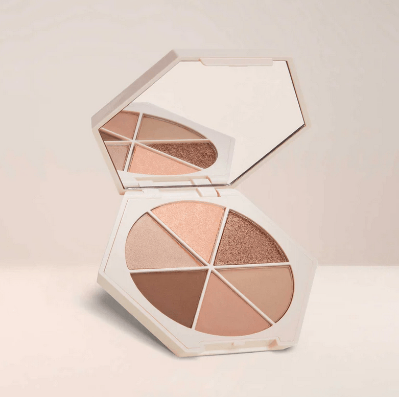
This is the reference image I used. It’s a very simple, but clean design. I didn’t get all of the details, but I tried focusing on how the joint worked.

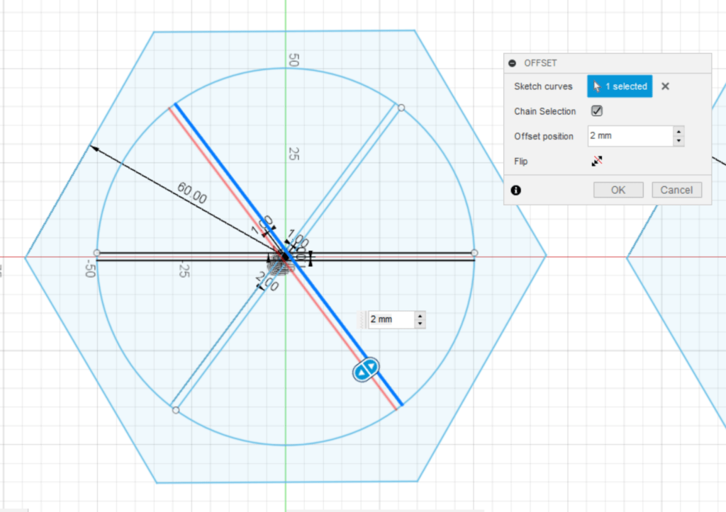
I began with the base shape, which is the hexagon. Then I added the circle and divided it with three lines. To create the thickness of the lines, I offset on both sides from the existing lines that I drew. I did the same technique later on with the logo on the top of the palette.
The model was basically a bunch of extrusions, cuts, and fillets. I did multiple sketches for the latch and the notch where you open the palette. I then extruded those sketches and joined the bodies.
I did the same thing with the top half of the model as well. To create that, I made an offset plane and projected the base sketch, then extruded.
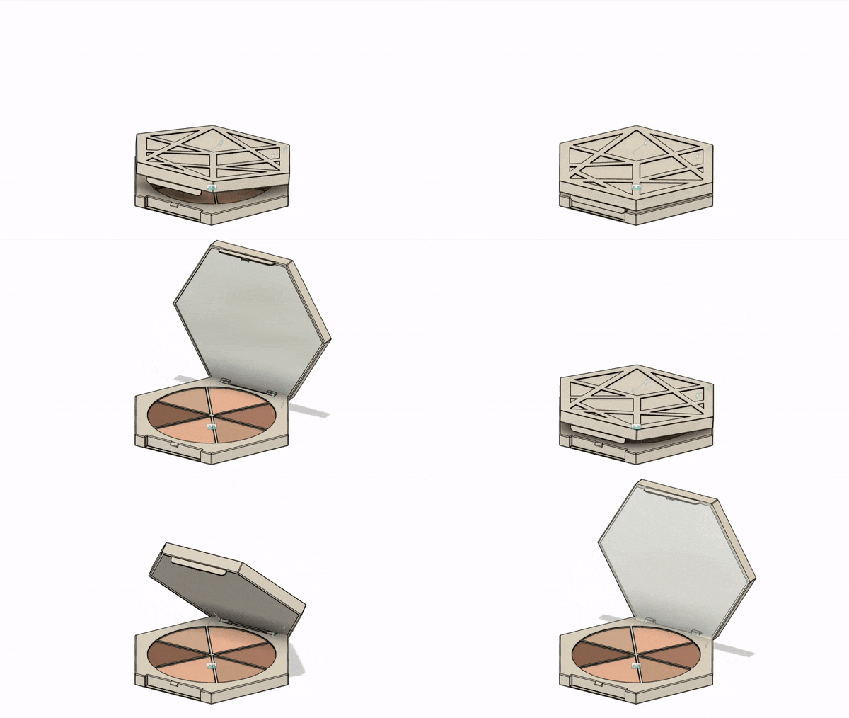
The hinge/joint part was a bit difficult because I wasn’t exactly sure how it worked (there weren’t any references). I did a bunch of searches and looked at YouTube videos of people using the palette, but none showed them opening and closing it. Therefore, I had to guess how it worked. First, I created a left and right pin by cutting hole and then creating an extrude. I made sure to keep these pins as new bodies.

Then I split the body of the top half using the pins as the splitting tool. After that, I added the joints. The pins and bottom half joints were rigid, while the top half and pins joints were revolute.
After that I decided to add the details of the logo to the top of the palette. This was a bit tedious because it was a bunch of offset lines or me redrawing lines and adding sketch dimensions. With the circular palette part I didn’t use constructor lines, but here I did to keep things centered. After adding the thickness to each line, I had to trim excess pieces which got a little confusing.
Then I decided it would be nice to render the palette. I used the reference image for the colors. The case was a plastic material and the eye shadows were powder coat material with different colors. I couldn’t figure out how to add sparkles to the material though. It’s also kind of a shame that you can’t see the logo in the rendered images.
It would also be cool if I could get an render of the animation!
Final Proposal
Finals season is coming but I still don’t have a clear idea of what I want to do. I want to create an asset for my other class’s final project, but I don’t have an idea for that class so I can’t really come up with an idea for a model for that project. Perhaps I’ll try to model Howl’s Moving Castle again using sculpt and surface, but it still seems pretty challenging.
It would also be really cool to make something and fabricate it. Another idea would be creating a set of prototype products (for example, makeup or stationery) that could theoretically be used in the future.
List of possible ideas:
-
- Asset for Unreal
- Howl’s Moving Castle pt 2
- Prototype product line (makeup set, stationery set)
- Tea set (teapot, cups)
- A toy
- Gumball machine
- An instrument: violin, piano…
- Gundam (super detailed, super challenging, but an idea)


