It should go without saying that access to place-based data and maps which bring this information to life are absolutely integral for those interested in bringing justice to those affected by rising rates of displacement, both through direct action and academic channels.Over the course of my time with Right to the City, I’ve seen groups utilize mapping tools in a number of unique ways which seem to speak to the work I’m doing with RTC as well as my personal research project historicizing Baltimore’s current plight.

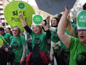
Members of PAH at a 2013 action in Barcelona
As recorded in NYU professor Sophie Gonick’s 2016 piece “From Occupation to Recuperation: Property, Politics and Provincialization in Contemporary Madrid,” members of Madrid’s Platforma de Afectados por la Hipoteca (PAH), a housing rights group from which RTC’s Homes for All campaign has drawn much inspiration, have used databases of empty housing units created by the country’s banks (who own a significant amount of real estate throughout the city as a result of foreclosure) to pinpoint potential squatting locales for families who have been evicted from their own dwellings, repurposing a tool meant to exclude into something more positive.
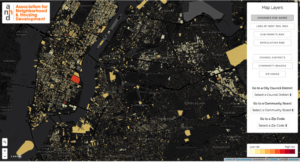
New York’s Association for Neighborhood and Housing Development (ANHD) oversees the Displacement Alert Project, a digital map of building-based data that aims to predict where tenants are likely to face future displacement by analyzing indicators of speculation, gentrification, and displacement, like the number of stabilized units, construction permits, complaints issued and more in order to determine overall risk level. DAP has helped housing organizers in New York intervene on behalf of tenants earlier in the displacement process and determine where their services are most needed, proving itself a valuable resource.
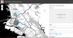
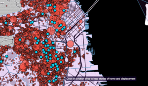
Finally, Anti-Eviction Mapping Project (AEMP), a grassroots collective primarily based in the Bay Area, has become one of my favorite resources for visualizing the land and housing movement. With maps covering everything from historical context surrounding the Bay Area’s housing crisis, the links between the rise of Silicon Valley and the displacement of native San Franciscans, attempts to make black and brown Bay Area residents feel like outcasts through police violence and surveillance, stories and crowdsourced data from those affected by gentrification and more, the AEMP has done a beautiful job of depicting the need for justice in the region, as well as how its residents are fighting back and sustaining themselves. My first two examples highlighted how mapping can be used to bolster organizing in an action-oriented sense (helping people find homes or help groups determine where they need to focus their direct actions), but the AEMP really gains its power from being able to tell stories, to humanize an issue whose heart can often get lost in abstract data, to help inform a group’s strategy.
What’s great about these three examples is that, save for the databases accessed by PAH, the success of these mapping efforts isn’t dependent on location. In fact, ANHD had a workshop at last week’s HFA Renter Power Member Assembly where they helped members from groups hailing from all parts of the country become familiar with data tools similar to the ones used to develop the DAP that they could use in their own local work. The AEMP has the same relative universality in that the project could be replicated with any city, making a perfect model for compiling my research on the history of Baltimore’s discriminatory practices.
That being said, my analysis of the field doesn’t come without its critiques. For one, much of what I’ve presented here is largely inaccessible to grassroots groups with little funding, let alone individuals interested in sharing their own stories/data.
Just going off of my knowledge of the costs of Right to the City’s new ArcGIS account, I know that it’s expensive to access mapping tools, rendering them largely inaccessible to groups who can’t afford to allocate as much of their budget towards something that doesn’t have an immediate influence on their efforts. Additionally, the datasets themselves aren’t always open to the public. Open data sites provided by cities can slightly offer aid to those looking to cut costs in the absence of institutional ties that would offer them easy access to certain information but for the most part are unable to provide all of the information desired.
In some ways, I can see how a model similar the one we used to populate the HFA member maps could create opportunities for more open mapping, as it only requires that the user fill out a Google Form with the relevant information for it to be incorporated into a map. On the other hand, this model is only accessible to those within the HFA member network, which means that in an effort to document the work of a national network of local organizations, plenty of relevant informations from non-member groups stands to fall through the cracks.

A screenshot of the AEMP’s crowdsourced Oakland Power Map, which invites users to identify places in the city that help sustain community spiritually, culturally, and creatively. On the right, one can see the submission form required to add a point on the map.
Ultimately, crowdsourced ArcGIS maps similar to the ones put out by the AEMP seem to be superior in having as few barriers for participation as possible (save for a link to the map which offers the ). While the limitations of ArcGIS’ crowdsourced maps prevent groups and individuals from sharing more complex data (hard to analyze in real-time), crowdsourced models would seem to eliminate barriers in sharing the more human data that often gets left out of these datasets, which is exactly what we’ve been aiming to do with the HFA member census.


Bear with my critique of mapping, please, despite my excitement over your discoveries! Mapping is so interesting to me because there’s a way in which maps totalize information and eliminate nuance from the way we actually experience space. For example, we can see a map on-line and feel as if space tells a clear story, but then when we step out of the subway into a neighborhood we don’t know, space seems a lot less straightforward. But then we have our phones to help us! Just the fact that we use the GPS on our phones to navigate on a regular basis is one way in which we relate to space as something conquerable, knowable. We are living in a romance of the birds-eye view that is an extension of our ‘personal command center’ approach to the world. We live as if all things are knowable, legible, measurable. But, as the AEMP demonstrates, some geographies are mappable and some geographies exist outside of maps and inside the stories we tell. So I’m totally impressed by the maps these different organizations have produced and the ways in which they start conversations, but I also want to caution all of us to be wary of what maps can do.