Evoking emotions through typography
As I mentioned in the previous blog post, I am taking an Interactive Media course called the Temporary Experts that overlaps a lot with Types of Art and Yes, Logo in terms of its contents. In the last few lectures in the IM course, I was working on producing an advertisement or campaigns to promote and raise awareness in the overuse of plastics. As I was creating these posters, I was fascinated by how typography plays a role in evoking emotions from the audiences. Taking these courses together at once has really given me the opportunity to appreciate the significant roles that typography plays in bringing out the public’s attention. I can now relate to the very first reading assignment we had; the metaphorical analogy of typography being portrayed as a balloon that gives the text its shape-meaning. The texts carry different emotions and tones according to the typeface it is used to display them and I think it’s fascinating that we can all relate to it.
Typography is such an important element in graphic design and knowing how to bring out emotions through typography is such a useful skill to have as a graphic designer. So I decided to explore the common typographies that are used in websites and the characteristics they carry.
Personal and Human
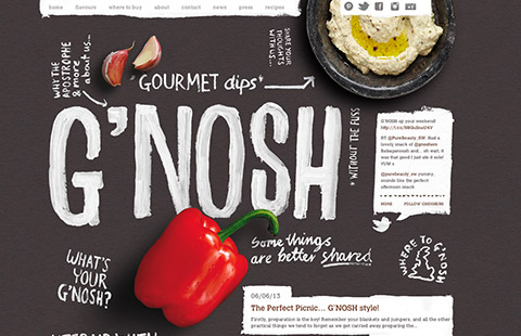
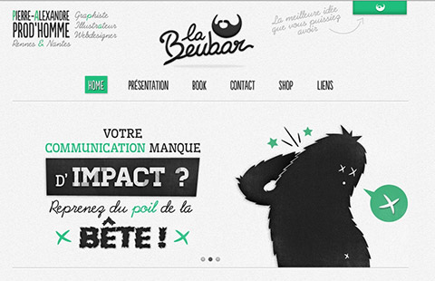
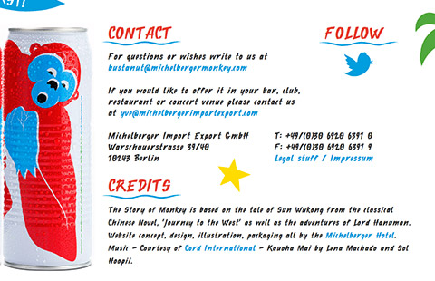
In order to bring out the emotions of ‘spontaneity, friendliness and authenticity’, script or handwritten typefaces are used. The first two are very good examples of nailing this correctly, but if you look at the third image, the script typeface is used all over the website that it reduces the legibility and readability. In order to create an impact, it is important for all graphic designers to be aware of the optimum size and context the typeface is used in, in order to achieve this.
Fun and informal
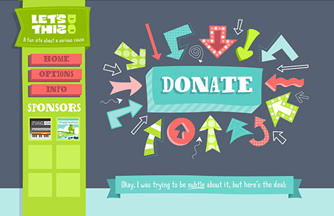
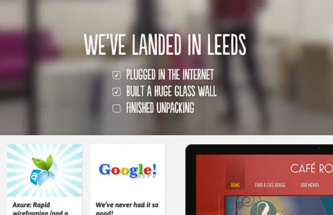
The wide typeface used in the first image shows happiness, humor, joy and exuberance. Similarly to the last example, this website was only successful in achieving this because the designer was aware of the context. A more consistent way of achieving this is shown in the second image. Irregular sans serif font is used so that the tone that is applied on the typeface doesn’t appear too formal yet too informal. Personally I think it’s more readable while having a friendly and easily approachable tone to it.
Formal
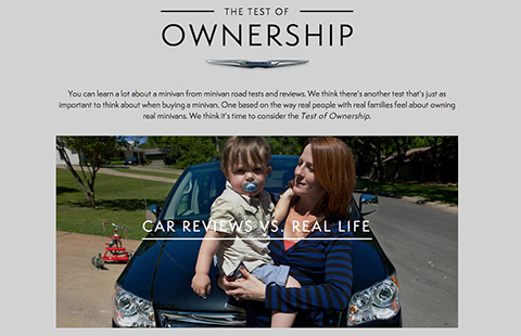
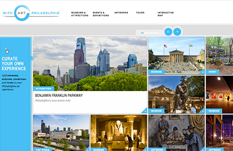
The mood to aim for when designing websites that should appear to users as more formal is seriousness, professionalism and credibility. In this case, using wide, irregular and bubbly typeface will be inappropriate. Most of the time, no more than 2 typefaces (usually the classic serifs and sans serifs) are used on the website to establish the consistency and the tone of formality. In this case, colors used on the website is also minimized to maximize the effects of hierarchy; texts that need to be emphasized.
The examples above specifically looks at the most common typeface personalities used on websites, but this is apparent everywhere, from logos to billboards and posters. Different typefaces used in different environments elicit different emotional responses from people; they allow users to personally connect to the brands.
There was an interesting experiment carried out by Rosalind Picard and Kevin Larson on the effects of typography on cognitive performance and how typeface affects reader moods. 20 participants were divided in groups of 10, and were left to read one of the issues of the New Yorker on a tablet device set in different typefaces for 20 minutes. Some were given the issues set with a proper typeface version, and some with badly typeset versions. The groups were randomly interrupted and were asked to conjecture how much time had passed since they started reading. This may be obvious but people had a positive mood experience underestimated the time. How obvious this may be, the experiment clearly showed the positive effect of good typography on the moods of the readers.
I am becoming more fascinated and appreciative of typography and typefaces as the days go by and I am glad that I’m beginning to look at signs and logotypes in a more ‘graphic designer’ way.
How Typography Plays With Consumer Moods: A Dance of Letters!
http://joogpot.eu/knowledge/16-webdesign/57-evoke-emotion-through-typography
On Typeface for Dyslexics
During our class on April 1st, 2019, we learned of the new and innovative attempts to make typeface more accessible for more people. The basic idea behind typefaces such as Frutiger was to increase the legibility and help people process the information presented flawlessly and effortlessly. However, as we have learned, for those who are more dyslexic than others can have hard time perceiving the delivered information.
Dyslexia is a learning disorder which leads to difficulty reading due to issues decoding the letters and words. Those who suffer from dyslexia, when their brains process visual information, can often subconsciously switch, rotate, and mirror letters, which makes them harder to identify the characters (Fernandes). Their brains perceive two-dimensional letters as three-dimensional objects that can be manipulated in the three-dimensional space. Therefore, the letter “b” can easily be manipulated in its perception to a “d” or a “p” or a “q”.
This is partly due to the fact that, in traditional typefaces, letters are made to be as uniform as possible. If the letter “d” looks same as a “d”, a “p”, and a “q”, or if the arch of an “h” looks same as that of an “n”, the typeface can achieve a clean and harmonic look (Gray). However, when these letters share the same characteristics, it becomes easier for those with dyslexia to subconsciously manipulate the letters in their brain and confuse them.
One effort to remedy such issue and truly achieve an accessible typeface design is change in the fundamental ‘rules’ of the typeface and creating a new font that can be read easily for the dyslexics. Designer Christian Boer who was diagnosed with dyslexia at the age of six has made such effort and created a typeface Dyslexie, aimed to overcome the problems those like him can have when reading (Gray).
This font, which we also learned during the Monday lecture, includes some key features which Boer claims makes the font more accessible for those who suffer from dyslexia. First, the symmetry and uniformity of the letters are abandoned (Gray). Namely, the vertical strokes such as the stems, ascenders, and descenders are not unified. Some letters have longer strokes while others do not. Further, the x-height differs from letter to letter. Letters that look alike, such as “v”, “w”, and “y” have different heights giving them distinct identities.
The serifs are also manipulated (Gray). They can make the letters harder to read for dyslexics as they can obscure the shape of each letter, so the Dyslexie discarded almost all serifs; at the same time serifs stayed in the letters like “u” and “n” with differed length of the stroke in order to make those similar letters distinguishable.
Lastly, Boer made the capital letters bolder in order to make them more stand out compared to lowercase letters (Gray).
I was astounded by the meticulous technicalities that went into the making of this font and was inspired by the good deed involved. According to the BBC, 10% to 20% of the population have some form of dyslexia and more than 700 million children and adults in the world are at risk of lifelong literacy and social exclusion as a result of the condition (Gray). If typeface such as Dyslexie can help that large chunk of the population, we could uncover new talents and perspectives so direly needed in the world.
However, I was disappointed to find that such effort might have been futile, as of yet. According to Dr. Guinevere Eden, a director of the Center for the Study of Learning (CSL) at Georgetown University, “dyslexia-friendly fonts”, although they have gathered considerable media coverage in recent years, are not founded on any scientific research (Eden). Dyslexie which was the result of a thesis project of the then graphic design graduate student Boer, although designed with features aiming to aid dyslexics, did not find itself on a scientific basis. On the contrary, there have been three sound, peer-reviewed scientific research on the subjects, done in 2016, 2017, and 2018, that all concluded that the Dyslexie or Open Dyslexic font “have no measurable benefits or deliver any reading gains” (Eden).
While it is disappointing to see that the project started off a good intention has indeed made no actual progress towards its goal, I think it teaches us two important lessons. First, peer-reviewed researches are important (and often depressing). Second, making something so ingrained in us in its usage such as font that we do not question ways in which, in its conditions of possibility, could be improved in an extremely helpful way, actually better is extremely difficult. Nonetheless, the effort should continue and it is indeed at least comforting to see such efforts being made.
References:
A Short Introduction To the Life of Hermann Zapf

Hermann Zapf, his goal in his life was “to create beautiful letters,” one of his students was quoted saying (Weber, 2015). It is well known that Hermann Zapf is one of the most admired and important calligraphers in history, creating fonts that would serve as a guideline and inspiration for many fonts to come. However, Zapf had not always planned to be a calligrapher, he started out dreaming to be an electrical engineer.
The life of Hermann Zapf started in chaos. He was born into the German Revolution of 1918 – 1919 and the remnants of World War I. Unfortunately, misfortune did not end there, Zapf later found himself in widespread famine. Fortunately, the school that he was enrolled in and attended, provided meals. Much to his mother’s relief. It was there that Zapf found his interest the technical subjects of school. He found himself most intrigued by an annual science journal titled, Das neue Universum (“The New Universe”), At an early age, Zapf spent his days tinkering with electrical objects with his brother, building things like an alarm system for the house and a crystal radio. Even at this early age, Zapf had already started playing around with type, creating an alphabet in order to communicate with his brother in a secret language.
Though he initially wanted to be an electrical engineer, due to a new political regime, Zapf was unable to pursue this dream. Fortunately, his teachers had noticed his aptitude for drawing and advised him to try and become a lithographer. However, even this proved to be difficult for the adolescent Zapf because in each interview, he would be asked political question and though he was complimented on his work, he was ultimately rejected. He found his first job in 1934 as a photo retoucher and began his four-year apprenticeship. He became interested in typography through the works of Rudolf Koch and started to teach himself calligraphy through books. As a calligrapher his most popular works were Palatino, Optima, Zapfino and Zapf Dingbats.
Palatino was created in 1949 and is described as a detailed font where even “small details as the serifs were carefully scrutinized” (Hermann, 2016). It is an old-school serif font named after the gifted Italian writer, Giambattista Palatino.
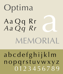
Optima is my personal favorite and is a beautifully designed, sans serif font which has such masterfully created variation in aperture that it almost hints at a serif. It was designed in 1952 and released in 1958. It was created after Zapf was inspired by the lettering on an old Italian grave during a vacation. It was inspired by the Romanic looking alphabet on this grave and was later developed to be more of a display typeface.
Zapfino is a complicated yet beautiful calligraphic typeface created to showcase the luxury and elegance that type is capable of displaying. It was initially designed in 1944 but due to limitations in type technology, it was released in 1998. One of the key aspects of Zapfino is that its lettering has multiple variations per glyph, each designed specially to complement its sister letters in specific compositions.
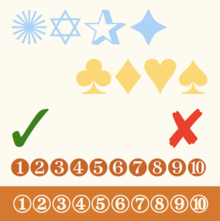
Finally, Zapf Dingbats is a collection of glyphs and symbols that were popularized when they were used by Apple printers.
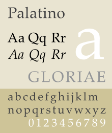

(Image Sources: Wikipedia)
Though Hermann Zapf has passed, his legendary fonts continue to influence the development of type to this day. Many will continue to be inspired and guided by his expertise and practiced hand.
BIBLIOGRAPHY
History Graphic Design. “Hermann Zapf.” History of Graphic Design, 2018,
Weber, Bruce. “Hermann Zapf, 96, Dies; Designer Whose Letters Are Found
Everywhere.” The New York Times, The New York Times, 21 Dec. 2017, www.nytimes.com/2015/06/10/arts/design/hermann-zapf-96-dies-designer-whose-letters-are-found-everywhere.html.
Zapf, Hermann. “I’ve been asked to tell you about myself and my types” (PDF). Linotype.
Retrieved 26 March 2016.
Start to Finish
I had to write a blog entry for another class that Professor Goffredo teaches, which is called Yes, Logo. To sum it up, I basically wrote about the design processes in creating a unique logo that gives a brand its identity and meaning. Since I have to write another blog entry for Types of Art, I decided to explore more about the design processes in designing a typeface and how they differ from designing a logo.
- Design a brief
When designing a logo, designers usually get the design brief from the clients where the clients specify exactly what they want and expect. However, when designing a typeface, designers have to come up with their own design brief. They need to ask questions like where and how it will be used as these questions will allow the designed typeface to have a purpose.
2. Make fundamental choices
Before designing a typeface, designers need to make some fundamental choices. They need to decide whether their designs will be a serif or sans serif font, if they will be of writing implements or geometrical shapes, and if they will be designed for academic writing or posters. For beginner type designers, it’s better to work with serif fonts because ‘the features that provide these typefaces [sans serif] with their identity are much more subtle’.
3. Use your hands
Some people who are more keen on using computer softwares to initiate their designs as typographers might not like this but it is so much better and more time effective to sketch curves and shapes on paper. What’s surprising is that we tend to draw smoother lines and curves on paper than on software!
4. Start with ‘Control Characters’
Lowercase control characters are ‘n’ and ‘o’ and Uppercase control characters are ‘H’ and ‘O’. Designing these letters first will help the designers to set an overview of the typeface’s style, and bring other letters into harmony. In our studio hours, we worked on ‘adenos’ but ‘adhesion’ is also a good word to tackle except ‘c’ will replace the letter ‘s’ due to its complexity in designing.
5. Move to your computer
There are different ways to go about it and there’s certainly no right or wrong answers but most type designers sketch a letter that they are satisfied with, trace it manually using a fine tip pen and scan it through a scanner to transfer the manual drawing onto the computer.
6. Choose your software and draw some letters
There are many type designing software like Glyphs and Robofont. Digitalize the scanned and traced letter by using Bezier curves. In order to work more accurately and precisely, place the points on the extremities of the curves on the letter form.
7. Move into text view mode and test out some words
Using glyphs, try typing in some words and edit the shapes of each of the letterform to make them look great in harmony, and not just separate individual letters.
8. Scale it down, explore different styles and widths
The style of the typeface may look different when viewed on a large scale and on a smaller scale. This is when type designers experiment the most as they try out different styles and widths of the letterform to achieve the look they are looking for. Just like how letterforms look different when magnified and when they are looked from far away, try printing on a page to see how it really looks on a hard copy! You may notice some areas of your design that needs more refining that you weren’t able to catch on screen.
9. Add special characters and put it to usage!
This is the last step! Add the special character that will make your typeface complete and put it to usage.
The design processes when designing a typeface and logos are distinctively different. I think type designers have more freedom in exploring than logo designers the fact that they can come up with their own brief (but I guess it will be a different story when type designers get commissioned). Since we are in the process of coming up with designs and exploring different styles on paper, I thought it would be a great opportunity to know what is ahead in terms of designing and digitalizing our typefaces in the future.
https://www.creativebloq.com/typography/design-your-own-typeface-8133919