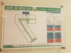
For our last blog post, we were told to find a wayfinding signage anywhere in Abu Dhabi with a ‘type crime’, explain, and suggest an alternative that will better serve the purpose. I wanted to explore this further outside of our campus, but project deadlines and final presentations all due in the same week restrained me from doing so. I walked around campus hoping to find a signage that I could write about, but they all seemed to do the job one way or the other; I would say that none of the escape and rescue plan seemed appealing and eye-catching however, due to the choice of colors and the layout of different elements, but the typography seemed to do the job. In the escape and rescue plan, sans-serif font was used which I believe was a good decision since the added elements in the strokes of the letters (serif) would have hindered the attention from the readers. Escape and Rescue Plan should really just be about displaying and naming the locations, and not about adding tones and mood through different typefaces. I also thought the labels of each locations in the building were way too small. The whole point of these safety/ escape plan signages is to help people at times of emergency, and making the font size too small to the point one can barely read the labels from a step away is extremely ineffective. While I had this analysis in my head, I thought about searching for signages that we often do not give much attention to but are crucial in wayfinding during emergency.
This assignment in particular gave me an opportunity to study all the signages around me with great detail and I decided to talk about the one I found by the stairs.
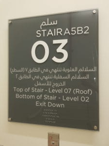
Sans-serif typeface- Gotham, was used, but I wanted to point out the alignment, kerning and the relative sizes that were problematic. First of all, the sizes. Sizes of fonts determine the hierarchy of information. In signages like this, I think it’s very important to bring the most important bit of the information forward and leave the less important parts behind. On the signage, Arabic and English are displayed with the same size, which isn’t wrong, but as you squint your eyes, you see a block of white blurb below the ‘03’. In case of emergencies like fire, it is crucial for people to distinguish the different languages on the signage in an instant so that they don’t spend their precious time trying to read Arabic instead of English from steps away in the smoke. To overcome this problem, adding a few lines of spacings in between the Arabic and English would have served its purpose better. However, I totally opt for the large, bold ‘03’ on the signage to help people notice it faster; after all, it’s the most important part of the information on the signage. In the beginning, I did feel that the ‘Top of Stair- Level 07 (Roof)’ and ‘Bottom of Stair- Level 02’ were unnecessary, but I feel that they are quite crucial as rescue teams can have a quick overview of the floor systems in the building (eg. No residents living on the top floor, and exit is on Level 02). Perhaps altering the weight of the texts could have done an effective job.
Secondly, the alignment. This isn’t the biggest problem with this signage, but I believe ‘A5B2’ could have been on a different line, perhaps right at the top of the signage. Having ‘A5B2’ right next to the STAIR is a bit bizarre to me (and it isn’t even aligned at the same line) but if it’s an absolute must, it would fit better right at the top. I would need some more explanations behind the design but if the stair itself is named STAIR A5B2, it would look better to have the words aligned in the middle, just like others.
The worst type-crime that this signage has committed is the kerning. Kerning indicates the relative spaces between the letters in typeface. On the signage, it’s pretty obvious to us that ‘STAIRA5B2’ is actually composed of two words- STAIR and A5B2. However, for people who are dyslexic, this can be a bit challenging since uneven spaces between letters can hinder their abilities to read. As mentioned before, although these signages don’t get the most attention on our campus, it is crucial to have the designs and layouts clear and simple so that people get the message they need without having to pay a lot of attention to the details.
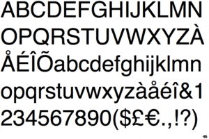
If I were to redesign the signage, I would fix all of the problems mentioned. In terms of the typeface, I would still keep it to Gotham since it’s NYU’s typeface. Changing the typeface of an Escape and Rescue Plan would be reasonable, but I think the signage is still representative of the buildings that belong to NYU, so keeping the typeface to Gotham would be a better choice. If I absolutely had to choose a different typeface, I would go with Verdana since it’s a very legible sans-serif typeface and there is a greater contrast in the strokes in Verdana Bold than Gotham Bold.
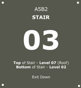
+ I didn’t have the Arabic version of Verdana so I left it out of the redesigned signage. Compared to the original signage, I would say the redesigned version is definitely more legible and therefore putting an Arabic dedicated signage of the same layout next to the English maybe a solution but again, I’m not as skilled and experienced in wayfinding signages so I’m not sure if it will be the best solution. Nevertheless, the idea still remains the same; adding more lines of spacing between Arabic and English so they are more easily distinguishable and adjusting the alignment, position and relative sizes to highlight the hierarchy of information.
