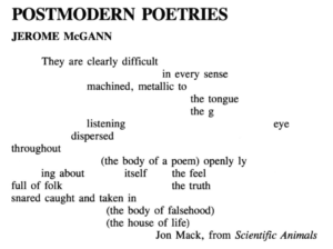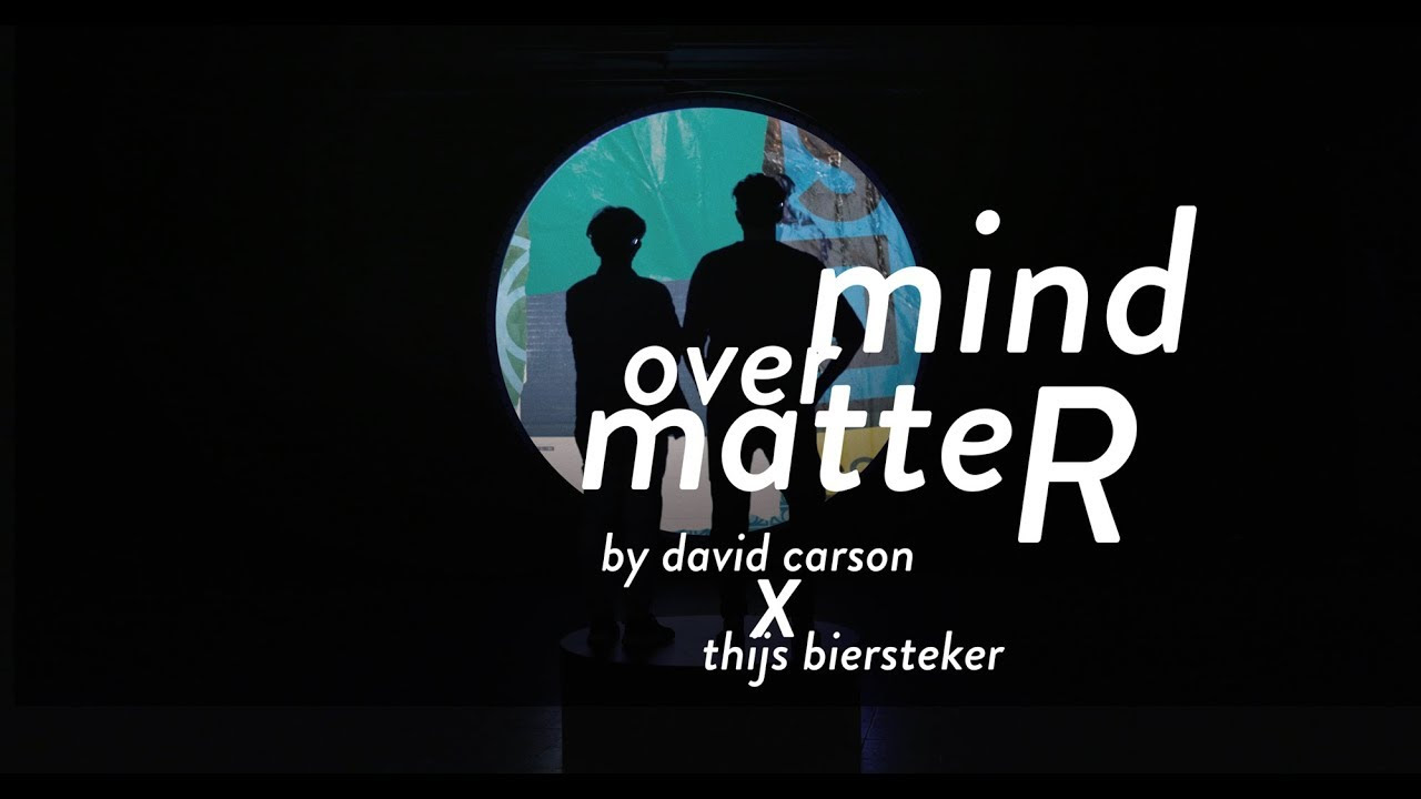
Admittedly, finding a case of type crime in the NYUAD campus has been no easy task. Many official signages and panels has been designed meticulously with good typography in mind. Gotham, NYU’s official type specimen is used extensively and with weights and the surrounding design elements achieving harmonious clean look. The usage of simple and clean sans serif brought about neoteric and sharp appearance while successfully accommodating humane warmth and transparency. Most importantly, the extensive usage of well made design identity availed effective delivery of information; one of the most important features of typography.
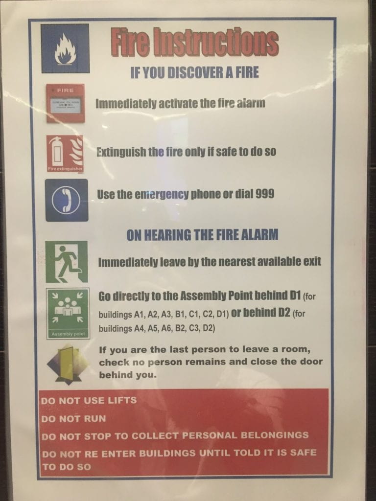
However, when I was wandering about in the Art Center, I was captured with glee to see a informational poster committing the most heinous type crime I have witnessed yet in this campus. Worryingly enough, the poster was a instructional one, directing users of the Art Center on what to do in case of fire. There are multiple type crimes committed in this poster and none are forgivable, considering the poster is to provide essential informations in time of dire emergency. Such signages and placards are to be designed with extreme care; easiness to read and digest the most crucial directions is imperative. How beautiful and fitting the poster is of next importance. The poster I found fail in all of these aspects.
First, there is no uniformity of typography present in the poster. I suspect that four or five different style of types were used. The titular line “Fire Instructions” is written in Impact Bold Condensed with a black outline and shadows. “IF YOU DISCOVER A FIRE” and “ON HEARING THE FIRE ALARM” lines are using Impact. “Immediately activate the fire alarm” and following directions are using Impact Bold Condensed without shadow or outline this time. In the bottom half of the poster, in the middle of the direction written in Impact Bold Condensed, Arial pops up for absolutely no reason. The last direction before the red box I suppose is written in Arial Bold. The texts in the red box is written in Arial Bold but in all caps. Using different typefaces in a same work requires careful deliberation. There need to be a reason when a typeface is changed in the same work; otherwise, the piece looks messy and unpersuasive, as it does in this poster. The sudden change from using typefaces in the Impact family to those in the Arial family is not justifiable by any means. It happens mid-sentence and is kept for the remainder of the poster even when the informations presented are in the same category as other informations written in different typeface. The lack of uniformity and concern for reasons of sacrificing the uniformity are the first sin this poster commits.
Secondly, the typefaces used here are hardly appropriate for the delivery of informations present. The most heinous crime this poster commits perhaps is the usage of Impact Bold Condensed for the directions WHEN THERE IS A FIRE IN THE BUILDING. Impact Bold Condensed does catch attention with its thick strokes and blunt look but catching attention is all it can possibly do. The condensed look which resembles a tightly packed sardines in a can or the infamous rush hour L-train in New York City metro, is a cancer in terms of readability. The condensed style of the typeface is achieved by narrowing the general width of each characters and increasing the x-height, which sacrifices the length of ascenders and descenders. These measures have one function and one function only; it is good for the economy —the more letters you can cram in, the better. What it sacrifices for the efficiency of space, which can also be achieved by sea of other measures that does not come with such heavy caveat, is the readability. The tightness of the type combined with minimized ascenders and descenders results in a creation of ugly and intimidating blocks of text that not only is hard to read and comprehend but also makes anyone not want to look at them at all. Moreover, the usage of bold and condensed typeface which enlarges the width of the strokes in each characters makes the typeface more awkward when paired with other typefaces. Especially, typefaces with thin strokes and stems such as Arial, another typeface used in this poster, looks out of place when paired with condensed types.
The usage of the Arial itself should be reflected upon as well. According to Anthony Cahalan’s list of designer’s choice of typography, published in Mark Batty’s Typographic Papers Series, Arial was placed fourth in the least liked typefaces for designers (qtd. in Garfield, 2011). According to Mark Simonson, this “shameless imposter” of Helvetica’s wise usage is attributable not to its beauty but to “pervasiveness of Microsoft’s influence in the world. (Simonson, 2001)” Perhaps, the poster could have benefitted from using a typeface other than something developed as a cheap alternative of a typeface that was placed second in the same ranking.
One good thing in this poster perhaps is that the artist did put into consideration of using different weights following the hierarchy of information. The title of the poster, the titular line, is written with black outlines and shadows. The subtitles for the directions (“IF YOU DISCOVER A FIRE” and “ON HEARING THE FIRE ALARM”) are written in all caps compared to following directions. The descriptions for the buildings to assemble at are written in different typeface from the main directions, while the general directions in the bottom, which supposedly were decided as not necessarily conforming to the subcategories of all capped directions are presented in a red box. However, the hierarchy present here with usage of different weights and all caps is inconsistent and not helpful in the quick digestion of the informations present. The last direction in the second subcategory has no reason to be written in Arial unlike all the other directions and title’s outline and shadows only serve a decorational function and sacrifice not only the consistency of the poster but also the readability of the information. The descriptions for the location of the assembly point also commits the same sin; they are bad for the consistency and fails to effectively deliver the context of locations in terms of the direction.
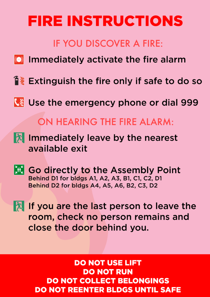
For these reasons, this Fire Instructions poster I found in the Art Center fails to serve its function of delivering crucial informations effectively in an urgent situation, let alone fits with other beautiful and aesthetically pleasing signages present in this campus. If I were to redesign it, I would use typefaces such as Frutiger, a proven type for effective deliverance of informations all over the world, and make each typefaces conform to each other in terms of hierarchy, to achieve consistency and effective rendition of crucial substance.
For instance, I’d use something like this.
Notes:
Garfield, Simon. “The 8 Worst Fonts In The World”, FastCompany. 28 Oct. 2011
Simonson, Mark. “The Scourge of Arial”, Mark Simonson Studio. 21 Feb. 2001.
