As I mentioned in the previous blog post, I am taking an Interactive Media course called the Temporary Experts that overlaps a lot with Types of Art and Yes, Logo in terms of its contents. In the last few lectures in the IM course, I was working on producing an advertisement or campaigns to promote and raise awareness in the overuse of plastics. As I was creating these posters, I was fascinated by how typography plays a role in evoking emotions from the audiences. Taking these courses together at once has really given me the opportunity to appreciate the significant roles that typography plays in bringing out the public’s attention. I can now relate to the very first reading assignment we had; the metaphorical analogy of typography being portrayed as a balloon that gives the text its shape-meaning. The texts carry different emotions and tones according to the typeface it is used to display them and I think it’s fascinating that we can all relate to it.
Typography is such an important element in graphic design and knowing how to bring out emotions through typography is such a useful skill to have as a graphic designer. So I decided to explore the common typographies that are used in websites and the characteristics they carry.
Personal and Human
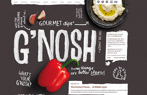
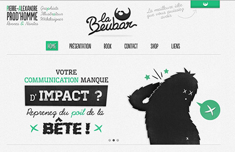
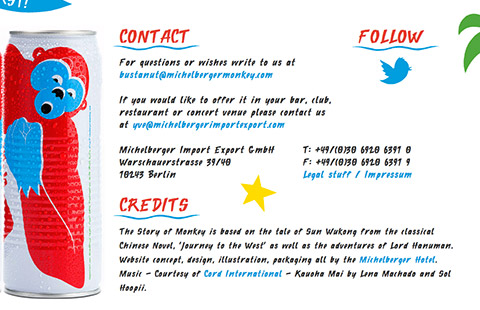
In order to bring out the emotions of ‘spontaneity, friendliness and authenticity’, script or handwritten typefaces are used. The first two are very good examples of nailing this correctly, but if you look at the third image, the script typeface is used all over the website that it reduces the legibility and readability. In order to create an impact, it is important for all graphic designers to be aware of the optimum size and context the typeface is used in, in order to achieve this.
Fun and informal
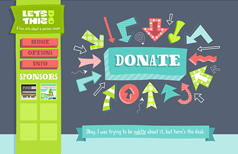
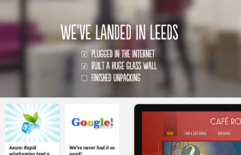
The wide typeface used in the first image shows happiness, humor, joy and exuberance. Similarly to the last example, this website was only successful in achieving this because the designer was aware of the context. A more consistent way of achieving this is shown in the second image. Irregular sans serif font is used so that the tone that is applied on the typeface doesn’t appear too formal yet too informal. Personally I think it’s more readable while having a friendly and easily approachable tone to it.
Formal
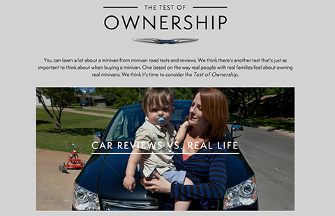
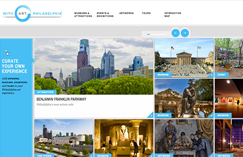
The mood to aim for when designing websites that should appear to users as more formal is seriousness, professionalism and credibility. In this case, using wide, irregular and bubbly typeface will be inappropriate. Most of the time, no more than 2 typefaces (usually the classic serifs and sans serifs) are used on the website to establish the consistency and the tone of formality. In this case, colors used on the website is also minimized to maximize the effects of hierarchy; texts that need to be emphasized.
The examples above specifically looks at the most common typeface personalities used on websites, but this is apparent everywhere, from logos to billboards and posters. Different typefaces used in different environments elicit different emotional responses from people; they allow users to personally connect to the brands.
There was an interesting experiment carried out by Rosalind Picard and Kevin Larson on the effects of typography on cognitive performance and how typeface affects reader moods. 20 participants were divided in groups of 10, and were left to read one of the issues of the New Yorker on a tablet device set in different typefaces for 20 minutes. Some were given the issues set with a proper typeface version, and some with badly typeset versions. The groups were randomly interrupted and were asked to conjecture how much time had passed since they started reading. This may be obvious but people had a positive mood experience underestimated the time. How obvious this may be, the experiment clearly showed the positive effect of good typography on the moods of the readers.
I am becoming more fascinated and appreciative of typography and typefaces as the days go by and I am glad that I’m beginning to look at signs and logotypes in a more ‘graphic designer’ way.
How Typography Plays With Consumer Moods: A Dance of Letters!
http://joogpot.eu/knowledge/16-webdesign/57-evoke-emotion-through-typography
Leave a Reply