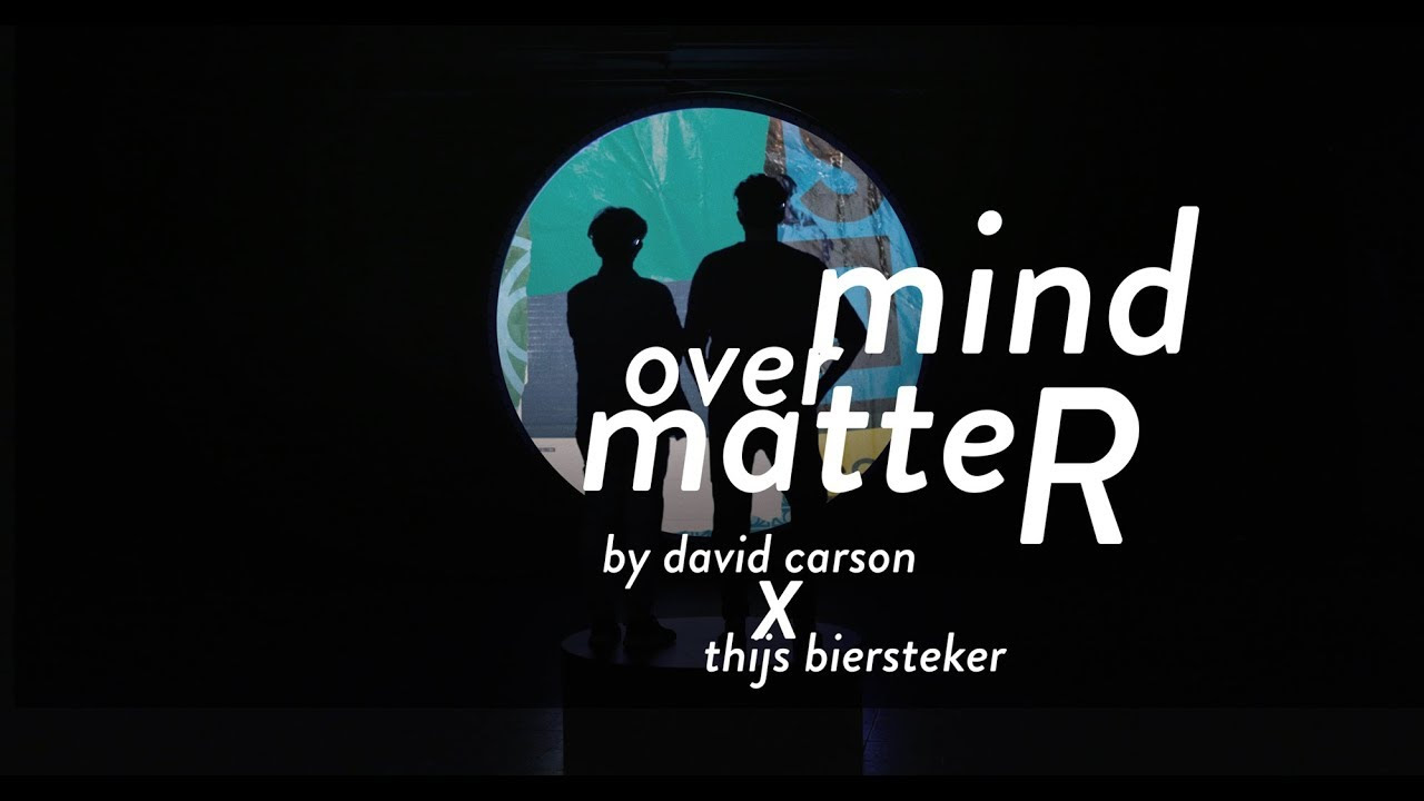
During the course, we have learned about the structure of typeface and how different aesthetics can be achieved through the manipulation of various components such as the existence of serif or kernings, the space between each types.
However, for me, the question that lingered through was why such differences can achieve a certain aesthetic that can be considered ‘good.’ This question perhaps will apply to all fields of art, and depending on the medium, the criteria will range. In the art of types, however, there are seemingly clear cut criterias that determines the aesthetics and the functionality of type. One of such basis would be the legibility of the typeface. Indeed, as typography includes not only aesthetical faculty but also a teleological one, of which the end purpose is delivering of information, how legible a type is can certainly be a yardstick in deciding whether the typeface is ‘good’ or ‘bad.’
Yet, when it comes down to the technicalities, even the seemingly solid criteria of legibility seems not so stable. For instance, the legibility of a typeface might be a mere product of popularity, rather than an inherent characteristics within the typeface. Zuzana Licko, a Californian type designer, had a theory that “you read best what you read most.”1 A heavy black letter type, for instance, was once considered more legible than a softer and less formal type, contrary to the current trend.2 Such change in the archetype of legibility proves that legibility is a fluctuating concept based on ever changing eye of beholders rather than on an inherent ‘essence’ of a typeface.
This view, I believe, connects to the postmodern beliefs of faculties highlighted by the lack of inherent essence of beauty. Fascinated by the idea, I looked more into what’s considered postmodern typography.
In order to properly understand the postmodern typography, one needs to, albeit briefly, examine its predecessor: typography of modernism. “The prevailing philosophy of typography at the time was to show letters in their most pure form,” Gail Davidson, curator at the Smithsonian’s Cooper-Hewitt National Design Museum noted.3 In the modernistic dogma that the ‘form follows function,’ clean and functional Sans serif, such as Helvetica epitomized the modern typography.

Postmodern typography would be born out of the rejection of the modernist idea that certain forms due to its inherent characteristics, are able to perform certain objective functions such as neutrality or legibility. “Of course the early modernists thought that they were being objective in their pairing down of the type so that it looked neutral, but in fact it wasn’t,” Davidson notes: “it was an expression of modernists”.4 Postmodern designer sought to deconstruct the elements that were believed to be fundamental. Strict adherence to clear cut rules and boundaries were questioned. Rather, designers began to experiment with type in a “non-spatial, non-linear process which abandoned the thoughts of a grid.” The focus was the viewer’s perception subjective and emotional, rather than rules such as readability. “Don’t mistake legibility for communication,” David Carson, a graphic designer famed for experimental typography noted.5
Such view is clearly visible in this work of Carson.

The sizing of types is inconsistent, letters overlap, and there is no clear rule for capitalization. However, the design fits perfectly with the subject line, which, I think nicely sums up the maxim of postmodernism: “mind over matter.” Matter is restricted by the form of which a metaphysical ‘mind’ is superimposed upon, whereas the mind, prior to taking its form, can have unlimited possibility. If modernism focused on the form and the matter in the form, postmodernism looks on the mind itself and efforts to evoke the matters in the mind, prior to the form.
Following are other works that exemplifies the notion of postmodern typography:


Notes:
- Simon Garfield, Just My Type, p. 60
- Ibid.
- Jess Righthand, Postmodernism’s New Typography (2010), Smithsonian.com
- qtd. in Hans Kleefeld, Impressions from David Carson, Famed Designed of Letters Tattered, Toppled and Tumbled.
Leave a Reply