• Skip to main content
  • Skip to primary sidebar
  • About the Professor
  • About the Students

NYUAD Types of Art Spring 2019

Archives for March 2019

March 28, 2019 by map938 1 Comment

A Short Introduction To the Life of Hermann Zapf

(Image Source: Weber,2015)

        Hermann Zapf, his goal in his life was “to create beautiful letters,” one of his students was quoted saying (Weber, 2015). It is well known that Hermann Zapf is one of the most admired and important calligraphers in history, creating fonts that would serve as a guideline and inspiration for many fonts to come. However, Zapf had not always planned to be a calligrapher, he started out dreaming to be an electrical engineer.

       The life of Hermann Zapf started in chaos. He was born into the German Revolution of 1918 – 1919 and the remnants of World War I. Unfortunately, misfortune did not end there, Zapf later found himself in widespread famine. Fortunately, the school that he was enrolled in and attended, provided meals. Much to his mother’s relief. It was there that Zapf found his interest the technical subjects of school. He found himself most intrigued by an annual science journal titled, Das neue Universum (“The New Universe”), At an early age, Zapf spent his days tinkering with electrical objects with his brother, building things like an alarm system for the house and a crystal radio. Even at this early age, Zapf had already started playing around with type, creating an alphabet in order to communicate with his brother in a secret language.

        Though he initially wanted to be an electrical engineer, due to a new political regime, Zapf was unable to pursue this dream. Fortunately, his teachers had noticed his aptitude for drawing and advised him to try and become a lithographer. However, even this proved to be difficult for the adolescent Zapf because in each interview, he would be asked political question and though he was complimented on his work, he was ultimately rejected. He found his first job in 1934 as a photo retoucher and began his four-year apprenticeship. He became interested in typography through the works of Rudolf Koch and started to teach himself calligraphy through books. As a calligrapher his most popular works were Palatino, Optima, Zapfino and Zapf Dingbats.

       Palatino was created in 1949 and is described as a detailed font where even “small details as the serifs were carefully scrutinized” (Hermann, 2016). It is an old-school serif font named after the gifted Italian writer, Giambattista Palatino.

       Optima is my personal favorite and is a beautifully designed, sans serif font which has such masterfully created variation in aperture that it almost hints at a serif.  It was designed in 1952 and released in 1958. It was created after Zapf was inspired by the lettering on an old Italian grave during a vacation. It was inspired by the Romanic looking alphabet on this grave and was later developed to be more of a display typeface.

       Zapfino is a complicated yet beautiful calligraphic typeface created to showcase the luxury and elegance that type is capable of displaying. It was initially designed in 1944 but due to limitations in type technology, it was released in 1998. One of the key aspects of Zapfino is that its lettering has multiple variations per glyph, each designed specially to complement its sister letters in specific compositions.

       Finally, Zapf Dingbats is a collection of glyphs and symbols that were popularized when they were used by Apple printers.
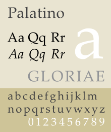
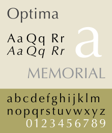
Palatino font sample.svgOptima font sample.svgZapfino.svgZapf Dingbats sample.tiff

(Image Sources: Wikipedia)

       Though Hermann Zapf has passed, his legendary fonts continue to influence the development of type to this day. Many will continue to be inspired and guided by his expertise and practiced hand.


BIBLIOGRAPHY

History Graphic Design. “Hermann Zapf.” History of Graphic Design, 2018,

www.historygraphicdesign.com/the-age-of-information/the-international-typographic-style/254-hermann-zapf.


Weber, Bruce. “Hermann Zapf, 96, Dies; Designer Whose Letters Are Found

Everywhere.” The New York Times, The New York Times, 21 Dec. 2017, www.nytimes.com/2015/06/10/arts/design/hermann-zapf-96-dies-designer-whose-letters-are-found-everywhere.html.


Zapf, Hermann. “I’ve been asked to tell you about myself and my types” (PDF). Linotype.

Retrieved 26 March 2016.


Filed Under: Uncategorized

March 21, 2019 by jsc717 1 Comment

Start to Finish

I had to write a blog entry for another class that Professor Goffredo teaches, which is called Yes, Logo. To sum it up, I basically wrote about the design processes in creating a unique logo that gives a brand its identity and meaning. Since I have to write another blog entry for Types of Art, I decided to explore more about the design processes in designing a typeface and how they differ from designing a logo.

  1. Design a brief

When designing a logo, designers usually get the design brief from the clients where the clients specify exactly what they want and expect. However, when designing a typeface, designers have to come up with their own design brief. They need to ask questions like where and how it will be used as these questions will allow the designed typeface to have a purpose. 

2. Make fundamental choices

Before designing a typeface, designers need to make some fundamental choices. They need to decide whether their designs will be a serif or sans serif font, if they will be of writing implements or geometrical shapes, and if they will be designed for academic writing or posters. For beginner type designers, it’s better to work with serif fonts because ‘the features that provide these typefaces [sans serif]  with their identity are much more subtle’.

3. Use your hands

Some people who are more keen on using computer softwares to initiate their designs as typographers might not like this but it is so much better and more time effective to sketch curves and shapes on paper. What’s surprising is that we tend to draw smoother lines and curves on paper than on software!

4. Start with ‘Control Characters’

Lowercase control characters are ‘n’ and ‘o’ and Uppercase control characters are ‘H’ and ‘O’. Designing these letters first will help the designers to set an overview of the typeface’s style, and bring other letters into harmony. In our studio hours, we worked on ‘adenos’ but ‘adhesion’ is also a good word to tackle except ‘c’ will replace the letter ‘s’ due to its complexity in designing. 

5. Move to your computer

There are different ways to go about it and there’s certainly no right or wrong answers but most type designers sketch a letter that they are satisfied with, trace it manually using a fine tip pen and scan it through a scanner to transfer the manual drawing onto the computer.

6. Choose your software and draw some letters

There are many type designing software like Glyphs and Robofont. Digitalize the scanned and traced letter by using Bezier curves. In order to work more accurately and precisely, place the points on the extremities of the curves on the letter form. 

7. Move into text view mode and test out some words

Using glyphs, try typing in some words and edit the shapes of each of the letterform to make them look great in harmony, and not just separate individual letters.

8. Scale it down, explore different styles and widths

The style of the typeface may look different when viewed on a large scale and on a smaller scale. This is when type designers experiment the most as they try out different styles and widths of the letterform to achieve the look they are looking for. Just like how letterforms look different when magnified and when they are looked from far away, try printing on a page to see how it really looks on a hard copy! You may notice some areas of your design that needs more refining that you weren’t able to catch on screen.

9. Add special characters and put it to usage!

This is the last step! Add the special character that will make your typeface complete and put it to usage.


The design processes when designing a typeface and logos are distinctively different. I think type designers have more freedom in exploring than logo designers the fact that they can come up with their own brief (but I guess it will be a different story when type designers get commissioned). Since we are in the process of coming up with designs and exploring different styles on paper, I thought it would be a great opportunity to know what is ahead in terms of designing and digitalizing our typefaces in the future. 


https://www.creativebloq.com/typography/design-your-own-typeface-8133919

Filed Under: Uncategorized

March 18, 2019 by zk612 Leave a Comment

Protected: A very short overview of Bodoni

This content is password protected. To view it please enter your password below:

Filed Under: Uncategorized

March 15, 2019 by John Choi Leave a Comment

On Times New Roman: Personal Reflection and Its History

Preparing for the midterm, I had an opportunity to delve into the aesthetics and the history of the Times New Roman. This one of the most ubiquitous typefaces drew my attention enough for me to pick it as the font of my choice to make type specimen during the class and to research it in preparation for the midterm examination, as it is the typeface of which initiated my interest in typography when I was still in high school. However, the interest with the subject was not with the affection towards the typeface; rather it was born out of rejection. Times New Roman was nothing but a boring rule forced on me, when all the teachers used to say “use standard margin, with 12 point, Times New Roman, double-spaced.” There was no reason as to why that was the standard; that was how it was to be done and the order, much like the look of the font, came with dogmatic authority. “That’s how you write an academic essay,” they said. I remember secretly using Garamond or plain Times, mainly out of spite, but also because they looked nicer to me.

I did not think much on it, but my further research on this typeface has taught me some lessons on why I might have felt that way in high school. Indeed, Times New Roman is the most basic typeface in legal or scholastic setting anywhere. It has been fixated as the standard to a degree where the usage of it has been even forced in some setting, especially with the MLA guideline suggesting—and some instructors requiring—the use of Times New Roman as the font to use. It also comes as one of the basic System Font in every devices and word processors we use.

However, some argues that the continued and wide usage of this font should be reconsidered in many instances. One example is Matthew Butterick, the author of our beloved Typography for Lawyers. He writes: “If you have a choice about using Times New Roman, please stop.”1 The reason for his argument is that the typeface is simply being overused as a mere crux born out of familiarity and deep entrenchment. I cannot agree with him more.

Nonetheless, in its inception, Times New Roman was born out of a quest for new and innovative needs of the time. The typeface’s history begins with the British newspaper The Times, which was in need for new a new font for its printed papers in 1931. Amid the criticization that the typeface it was using was “out-of-touch with modern typographical trends,” the news agency hired the criticizer Stanley Morison to create something better.2 The new typeface, designed with the help of the draftsman Victor Lardent, performed marvelously the function proper for its medium: the efficiency. The new typeface maximized the amount of letters that fit on a line and thus on a page, therefore minimizing the cost of printing.

Morison and Lardent achieved this feat using few but effective methods. First, raised the x-height of each characters. Without inherent changes in the ascender or descender height, but making the x-height elongated, each letters were able to form a narrow shape, making characters more suitable to fit more in a vertical column of the newspaper. Moreover, the kerning has been also narrowed, giving the typeface more condensed look, further making the type more ‘efficient’ for the medium. However, as can be expected, then the readability has to be sacrificed. Morison solved this problem by altering the shape of the letters; the thicker strokes of each characters, like the vertical lines in the “n,” were enlarged, thereby giving the letters a clear contrast against the backdrop of the paper.3 At the same time, the intersections of the thicker strokes were thinned, like in the vertical lines of the “n” where it meet the serif.4 Through such measures, Morison was able to both achieve the legibility and the economic efficiency of the typeface.

The result of the focus on the legibility and efficiency however did not directly correlate with the type’s aesthetic capability. As the purpose of the type was clearly a economic and clean way of delivering information, decorative measures were largely omitted and were sacrificed for the functionality. The result was an economic and unobtrusive typeface, that were not visible to the readers digesting the content and were efficient in cramming as many letters as possible while not sacrificing the legibility. Perhaps, it was the perfect typeface for the medium in the capitalistic world.


Notes:

  1. Matthew Butterick, A Brief History of Times New Roman.
  2. Meredith Mann, Where Did Times New Roman Come From?, 2014.
  3. Ibid. 
  4. Ibid. 

Filed Under: Uncategorized

March 9, 2019 by John Choi Leave a Comment

On Aesthetic and Postmodern Typography

During the course, we have learned about the structure of typeface and how different aesthetics can be achieved through the manipulation of various components such as the existence of serif or kernings, the space between each types.

However, for me, the question that lingered through was why such differences can achieve a certain aesthetic that can be considered ‘good.’ This question perhaps will apply to all fields of art, and depending on the medium, the criteria will range. In the art of types, however, there are seemingly clear cut criterias that determines the aesthetics and the functionality of type. One of such basis would be the legibility of the typeface. Indeed, as typography includes not only aesthetical faculty but also a teleological one, of which the end purpose is delivering of information, how legible a type is can certainly be a yardstick in deciding whether the typeface is ‘good’ or ‘bad.’

Yet, when it comes down to the technicalities, even the seemingly solid criteria of legibility seems not so stable. For instance, the legibility of a typeface might be a mere product of popularity, rather than an inherent characteristics within the typeface. Zuzana Licko, a Californian type designer, had a theory that “you read best what you read most.”1 A heavy black letter type, for instance, was once considered more legible than a softer and less formal type, contrary to the current trend.2 Such change in the archetype of legibility proves that legibility is a fluctuating concept based on ever changing eye of beholders rather than on an inherent ‘essence’ of a typeface.

This view, I believe, connects to the postmodern beliefs of faculties highlighted by the lack of inherent essence of beauty. Fascinated by the idea, I looked more into what’s considered postmodern typography.

In order to properly understand the postmodern typography, one needs to, albeit briefly, examine its predecessor: typography of modernism. “The prevailing philosophy of typography at the time was to show letters in their most pure form,” Gail Davidson, curator at the Smithsonian’s Cooper-Hewitt National Design Museum noted.3 In the modernistic dogma that the ‘form follows function,’ clean and functional Sans serif, such as Helvetica epitomized the modern typography.


https://www.imdb.com/title/tt0847817/mediaviewer/rm2742632192
Poster for Helvetica (2007) from imdb.com


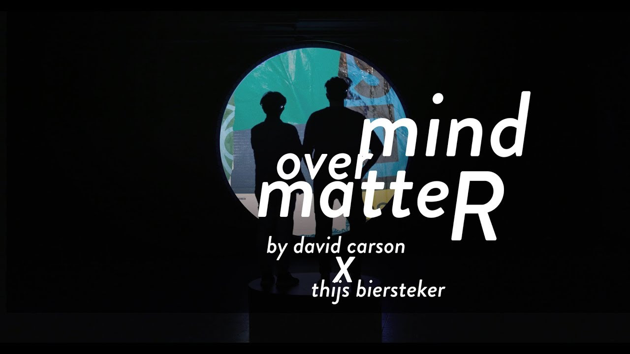
Postmodern typography would be born out of the rejection of the modernist idea that certain forms due to its inherent characteristics, are able to perform certain objective functions such as neutrality or legibility. “Of course the early modernists thought that they were being objective in their pairing down of the type so that it looked neutral, but in fact it wasn’t,” Davidson notes: “it was an expression of modernists”.4 Postmodern designer sought to deconstruct the elements that were believed to be fundamental. Strict adherence to clear cut rules and boundaries were questioned. Rather, designers began to experiment with type in a “non-spatial, non-linear process which abandoned the thoughts of a grid.” The focus was the viewer’s perception subjective and emotional, rather than rules such as readability. “Don’t mistake legibility for communication,” David Carson, a graphic designer famed for experimental typography noted.5

Such view is clearly visible in this work of Carson.

Mind over Matter By David Carson x Thijs Biersteker

The sizing of types is inconsistent, letters overlap, and there is no clear rule for capitalization. However, the design fits perfectly with the subject line, which, I think nicely sums up the maxim of postmodernism: “mind over matter.” Matter is restricted by the form of which a metaphysical ‘mind’ is superimposed upon, whereas the mind, prior to taking its form, can have unlimited possibility. If modernism focused on the form and the matter in the form, postmodernism looks on the mind itself and efforts to evoke the matters in the mind, prior to the form.

Following are other works that exemplifies the notion of postmodern typography:

Emigre, Issue 29, 1994. Designed by Ian Anderson


Fox River Promotion Booklet, 2006. Designed by Marian Bantjes.


Visuele Communicatie Netherland, 1969. Desgined by Wim Crouwel

Notes:

  1. Simon Garfield, Just My Type, p. 60
  2. Ibid. 
  3. Jess Righthand, Postmodernism’s New Typography (2010), Smithsonian.com
  4. qtd. in Hans Kleefeld, Impressions from David Carson, Famed Designed of Letters Tattered, Toppled and Tumbled.

Filed Under: Uncategorized

March 7, 2019 by jsc717 Leave a Comment

Helvetica, Comic Sans and Papyrus… Which one?

If you were to write a short cover letter for your summer internship on campus, what font would you choose?


Arial?

Times New Roman?

Helvetica?

Comic Sans?

Papyrus (below is the Papyrus typeface)?:

Image result for papyrus font  


Of course, if you weren’t in our Types of Art class, you wouldn’t really know the difference except for Times New Roman which you will most likely be choosing because it’s familiar to you. While taking this course however, I started to notice the key features of typefaces and wondered about why some of the typeface designs were more popular than others.

For example, Helvetica is one of the most popular typefaces while Comic Sans is the opposite in terms of its reputation. As a used-to-be-a-fan of Comic Sans back in my days when I used it for almost any document from my birthday invitation cards to my short essay submission, I decided to research what features of these typefaces appeal or appall to the audience.


Helvetica


Helvetica was released in 1957 and a lot say that marketing is what made Helvetica the Helvetica it is now; it was designed right at the right time. Helvetica took inspirations from old typeface designs but was new and refreshing. A lot of other typefaces took a similar approach by creating a modern look from the existing typefaces in the past, but they did not stand a chance in terms of marketing. Helvetica was very heavily marketed; its name was changed from ‘Neue Haas Grotesk’ to the much memorable name ‘Helvetica’.

In terms of its design, its simplicity is what made it impactful. As the nature of advertising in the 60s took its turn and people became tired of traditional and classical illustrations and script typefaces, Helvetica’s clear and modern yet having not much deviation from the old script made it look more neutral and bolder to replace it. Not only has the typeface made its way successful in marketing, but it was also released at the right time when there were cultural shifts and development in forms of advertisements.

Nowadays, we see Helvetica almost everywhere as it is the core typeface used by Apple. It became the symbol of typographic excellence to the point many graphic designers find Helvetica to be at the top of the typeface hierarchy. This is well supported by the phrase ‘When in doubt, use Helvetica’.

In other words, the popularity of Helvetica arose from its coincidental release during the cultural shift and its marketing strategy and not really from its design specifically.


Comic Sans


It hurts a little that I am writing about one of my favorite fonts. It reminds me so much of my childhood especially because I used that font in both my Korean IT class back in primary school and in my middle school IT class in Malaysia. Comic Sans to me is like a flipbook of my childhood. It looks like a neat handwriting, inoffensive and warm.

Back when Comic Sans was first designed by Vincent Connare to be incorporated in the speech bubbles of an animated cartoon dog for Microsoft Windows, he did not realize the amount of attention it would bring. He even stated himself that Comic Sans was developed for younger users and not for everyone. Unexpectedly, the typeface began to be used everywhere from formal documents, on signs, in advertisements and billboards until two typographers started a ‘Ban Comic Sans’ movement in 2002.


Moreover, unlike Helvetica which its design wasn’t the main reason for its popularity, Comic sans actually lack in the design features compared to many other typefaces. For example, its angular consistency and kerning is all different resulting in no cohesive flows. The typeface is now used in ‘memes’ and because it is often associated with such culture of making fun of the use of Comic Sans, not many people want to associate with it.


+Papyrus


Papyrus was designed by an illustrator Chris Costello who was paid 750 pounds in 1983 for the design. In one of his interviews, he said that he was inspired by the Middle East and biblical times. He sold the font to a British company that works with vinyl lettering shapes until the company began licensing its fonts for use in desktop applications.

Similarly to Comic Sans, Papyrus is hated due to its misuse and overuse. This took away the originality and the effectiveness of the design. One example of its popular use was in James Cameron’s Avatar and on May 23rd2017, Julio Torres from SNL tweeted:

Image result for julio torres papyrus

This post received more than 2100 retweets and 8700 likes in less than six months.


I learned that a lot of typefaces that appall to the audience are the ones that are misused and overused. They don’t follow the traditional rules and disciplines in designing typefaces which bother a lot of type designers and people.

I think it was interesting to learn through my research that designing typefaces is indeed a tough process which requires subtlety, practice, observation and discipline. I have learned to appreciate the typefaces and I cannot stop but to wonder why someone chose to use certain typeface for their posters on our campus elevators and on TV shows. Typeface plays such an important role in the tone it sets and the message it carries, like a balloon giving shape to helium; I am excited to experiment what kerning, proportion, angle and scale play in the first impression of a typeface in the upcoming workshops.


Filed Under: Uncategorized

  • Page 1
  • Page 2
  • Go to Next Page »

Primary Sidebar

Recent Posts

  • Protected: Type Crime
  • Protected: A preference that has not changed
  • Protected: Completing an incomplete typeface
  • Type Crime
  • Type Crime

Recent Comments

  • Vision 20 Ingredients side effects on On Typeface for Dyslexics
  • Goffredo Puccetti on A Short Introduction To the Life of Hermann Zapf
  • Goffredo Puccetti on Start to Finish
  • A WordPress Commenter on Hello world!

Archives

  • May 2019
  • April 2019
  • March 2019
  • February 2019
  • August 2018

Categories

  • Uncategorized

Meta

  • Log in
  • Entries feed
  • Comments feed
  • WordPress.org

Copyright © 2025 · Workstation Pro on Genesis Framework · WordPress · Log in