• Skip to main content
  • Skip to primary sidebar
  • About the Professor
  • About the Students

NYUAD Types of Art Spring 2019

Archives for February 2019

February 22, 2019 by map938 Leave a Comment

The Emergence of Script as a Formal Form of Writing

Lettering is an art form that is constantly evolving and adapting. According to Jennie Cohen, the Roman alphabet was one of the first western hemisphere scripts recognized for its commercial use. It was traditionally written in the “print” form in which each letter was individual and had spaces between them, a great contrast to modern cursive in which each letter is connected to the other. By around the 5th century A.D., there were appearances of lowercase letters that connected together, much like how modern cursive does.

CAROLINGIAN MINISCULE

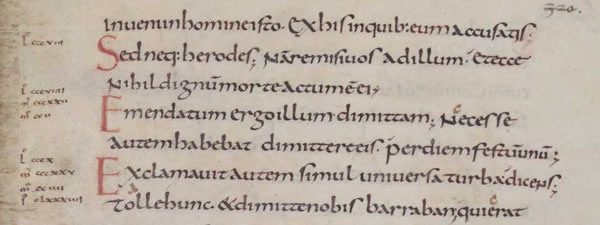
Source: Kualo. “Carolingian Minuscule.” Omniglot.com, 2019, www.omniglot.com/writing/carolingian.htm.

Soon there was the formalization of Carolingian minuscule by Charlemagne who had asked an English monk to create the typeface. Though it was not all connected, Carolingian minuscule had many connecting letters. In 1970, the typeface D’Nealian script was created and implemented in American classrooms in order to “ease the transition from print to a cursive typeface”(Cohen, 2012). In the 20th century, another writing style created by Charles Zaner and Elmer Bloser dominated elementary school classrooms.

D’NEALIAN SCRIPT

Source:https://schoolfonts.com/printnew/_CharSetDNCursive.gif

I clearly remember that when I was a kid, even as a homeschooler, it was part of our curriculum to have handwriting classes. Though I was first taught how to write in print, as I got older, my mother slowly started to introduce cursive writing to me. We were made to use books, worksheets, and homework to improve our writing. Even when writing our test answers or essays, we were made to write in cursive.

As I continued into high school and I was no longer made to write in cursive and I noticed that there was a significant drop in teenagers my age who used cursive to write. I too stopped writing in cursive and enjoyed the freedom to write in print. I was surprised to find that some people who had been able to write in cursive before, had forgotten how to write in the cursive form. Or alternatively, they would write in some hybrid of print and cursive. This, apparently, does not seem like an individual experience. A study of handwriting teachers showed that 37% wrote in cursive, only 8% wrote in print and 55% wrote in a hybrid of the two (Gladstone, 2103).

Recently, however, there has been an increase in the use of cursive again, not as a formal form of writing but as a decorative form. With the increase in popularity of diary decoration and bullet journaling. The youth are relearning how to write in the cursive for aesthetic’s sake. However, because it is now not used for a formal purpose, there has been a lot of variation in the use of script with alterations in the size, spacing, and alignment. Many contemporary artists are taking letters, making them their own and aestheticizing them as they wish.

Bibliography:

Cohen, Jennie. “A Brief History of Penmanship on National Handwriting Day.” History.com, A&E Television Networks, 23 Jan. 2012, www.history.com/news/a-brief-history-of-penmanship-on-national-handwriting-day.

Gladstone, Kate. “Is Cursive Dead?” The New York Times, The New York Times, 30 Apr. 2013, www.nytimes.com/roomfordebate/2013/04/30/should-schools-require-children-to-learn-cursive/handwriting-matters-cursive-doesnt.

Filed Under: Uncategorized

February 21, 2019 by jsc717 Leave a Comment

Law on typefaces in design and marketing

Before taking Types of Art, the phrase ‘Times New Roman’ didn’t resonate with me in any way. It was just a typeface that I was taught to use for my lab reports, essays and entries. I didn’t ask myself or many of the professors who told me to use it, why, and taking this course opened my perspective of approaching typography in many different ways; every time I’m on the lift on campus, I see posters designed by students, and interestingly enough, I have started to question why they had chosen such fonts and sizes with certain layouts, or analyzing if the typography on the poster is used as effectively as it could have been. Also, I started to pay more attention to the word ‘typography’ that when I found this interesting news article that was released in Korea about font copyrights, I thought I would share it.


Basically, a freelancer designer received an email demanding around $1000 worth of agreement money because s/he used 9 of the Korean letters in his/her work without paying for the license. According to the news, the designer thought the font design was released for free and therefore pleaded for a favorable handling of the issue by suggesting to pay for only the 9 letters, but was later rejected.


The article then went on about how it is important for people to be mindful when using downloaded fonts outside of copyright protected fonts, and that we should be careful about where and how it is going to be used. After reading this article, I wanted to learn more about it on a broader scale- law on typefaces in design and marketing.


Throughout the course, we have learned that typeface is a crucial key to transferring the message of the text to the readers, like a balloon that gives helium its shape (balloon the visual representation of a typeface and helium is the content of the text and the message it carries). As a student who is also taking Yes, Logo course which is a logo designing class that incorporates creating and redesigning logos for real, existing companies, I was surprised to learn that designers are not free to use any typefaces or fonts on logos or any of their designing products.


In order to do so, they would need a license to that specific font. The license comes with a description of how it should be used, either commercially or not, or restrictions on how many times a font can be installed in different computers. However, I was really interested to learn that in the United States, copyright law does not protect all typefaces! In fact, the law only protects scalable fonts and not the bitmapped fonts; scalable fonts are within a program or a software so the artistic design of the typeface in bit-mapped fonts is not protected. However, this is very specific to the US. Countries like Germany and England had allowed typeface designs to be protected by copyright since the 1980s.


Image result for scalable font


Since the copyright law for using typeface is dissimilar in different countries, it would be helpful to ask a few questions to ourselves when we are faced with a situation of having to use fonts on marketing material and commercial designs.


  1. Can I legally use the font?
  2. Can I use the font for my intended purpose?
  3. Can I sell or send a copy of the font to my client?


The answers to the first two questions are found on the license but to give more information about the third question, we are not allowed to do so for most commercial fonts; the client will have to separately purchase the font, or if not, they can vectorize the outline of the font and send it through. You may wonder if this is even legally possible, but from research, ‘an outlined font is not a font anymore’. I am a bit skeptical about this and can’t get away from the thought- ‘then why wouldn’t everyone just vectorize typefaces and fonts instead of paying for it?’ but I’m sure I’m missing some points and will do further research on this.


So far, Types of Art classes have left me with a lot of questions about typography in general, and I am very excited to unravel these questions in the upcoming lectures and workshops. Copyright laws on typefaces was one of many, and I am glad to have learned this aspect of typography and I hope this rather personal article helped you to do so too!


Filed Under: Uncategorized

February 19, 2019 by Goffredo Puccetti Leave a Comment

Test. Example of Essay.

The following is dummy text. How wood affects the sound in an electric guitar is a long debated topic among musicians. When one thinks carefully about it, it is actually quite surprising that there is even a debate. The sound of an electric guitar is not dependent in any significant way on the materials used for the body and neck of the instrument. Contrary to what happen in an acoustic guitar, where the sound is the result of a resonance induced by many components–among which, the quality of the wood is of paramount importance!–there is no material-induced resonance involved in the sound of an electric guitar; hence tonality qualities of the wood of the neck and body of the instrument are irrelevant.

The output of an electric guitar is actually an electric signal; its final sound happens only after some magnets called pickups generate a magnetic field and ‘pick up’ the alterations in it created by vibrations of the metallic strings placed above them. Those changes are transformed into small electric signals; they are significant but still too small to produce sound, so they are channeled through an amplifier and then eventually to a loudspeaker.
Given the electronic nature of the sound, it can be altered ad libitum using effects: delay, chorus, overdrive, fuzz and so on: the list is endless.
In simpler terms: the sound of an electric guitar has nothing to do with the natural sound produced when played as if it was an acoustic instrument. The presence of a TV or a mobile phone in the room will do more to alter the magnetic field of the pick ups than the material of the body of the instrument.
Everyone who has ever witnessed what a pick up switch or a pedal does to sound, instinctively knows this is true: wood is irrelevant in regard to the final output.
Given this elementary truth of science, it is fascinating to see how the milieu of electric guitar players is almost unanimously agreeing on the opposite: wood, they say, is–somehow, in some undetectable, indecipherable but still vivid way–a fundamental component of the sound of the instrument! One can find hundreds and hundreds of books, websites, interviews with famous players and guitar makers where woods are examined as more or less apt for their ‘tonality’ in guitar making. And 99.9% of the guitar players will tell you that it is fundamental to hear the guitar when not amplified, as if there were any meaningful relation between how an electric guitar sounds when amplified and when not. There are some who can tell you that certain guitars have a specific sustain because how much they weigh or how the weight is distributed. Some insist that even varnishes or protective coatings determine noticeable differences.
They are all wrong.

Artists can be excused if they mix the playability of an instrument with the output: a beautifully polished maple neck, or a lovely time-induced patina, or a pristine rosewood fretboard might indeed be of utmost importance for individual players. And they might well have very valid reasons to back up their feelings on playability, but that has nothing to do with sound: in a controlled experiment, with all other things being equal, no musician will ever be able to discern the sound of an electric guitar made with a certain wood instead of any other material. But of course, we can forgive artists: their passionate involvement with the instrument, with its craft, is what make them capable of creating art; every guitarist who swear about their beloved guitar having that specific tone because of its paint, or wood, must indeed be excused. They’re blinded by their love for their art.

People who should, perhaps, be less excused are the writers of technical magazines and the guitar manufacturers themselves. It might be argued that they would do a better service to the community by, say, reviewing the quality of material in cables and amplifiers, giving proper credit to these fundamental components of the final sound, rather than indulging in never-ending, scientifically meaningless, debates on the veneer on the fretboards, or paints on the bodies, in articles where, and I quote “tonality of the combination ash+rosewood is results in more tonal brightness compared to the maple-mahogany combo”. Fact is that there is no such thing of tone wood in electric guitars.

In the Tech Talks page of their website (https://www.fender.com/articles/tech-talk/do-different-woods-affect-your-electric-guitar-tone) the producer of some of the most sought-after electric guitars  in the world answers to the million dollar question « Do different woods affect your electric guitar tone? » –perhaps settling it, albeit unwillingly:
Their answer starts by acknowledging that it is “a debate that has waged on among beginners and advanced players for a ling time”, “a muddy situation, as there are vociferous defender on each side of the issue”. And then they add: “those who do not believe wood affects a guitar’s tone point to the physics of how an electric guitar works” (emphasis is mine)
Indeed. Yes. That’s what we all should do. In order to establish the plausibility of a physical fact in the physical world, we should all point to physics of how things work. Nothing else is required. But for some reasons–reasons, alas, that science alone cannot fully explain–so many of us refuse to do so.

Filed Under: Uncategorized

Primary Sidebar

Recent Posts

  • Protected: Type Crime
  • Protected: A preference that has not changed
  • Protected: Completing an incomplete typeface
  • Type Crime
  • Type Crime

Recent Comments

  • Vision 20 Ingredients side effects on On Typeface for Dyslexics
  • Goffredo Puccetti on A Short Introduction To the Life of Hermann Zapf
  • Goffredo Puccetti on Start to Finish
  • A WordPress Commenter on Hello world!

Archives

  • May 2019
  • April 2019
  • March 2019
  • February 2019
  • August 2018

Categories

  • Uncategorized

Meta

  • Log in
  • Entries feed
  • Comments feed
  • WordPress.org

Copyright © 2025 · Workstation Pro on Genesis Framework · WordPress · Log in