Tristan Liu
Contrast


Concept
The concept of my work is contrast, using colors to the two extremes. In society, I think the era is leading us to be more harmonious, from wearing clothes to the building newly designed. If a person wears both red and green, or both yellow and blue, seldom people will think the match is beautiful. But I think contrast is a kind of beauty, so I want to use my camera and Photoshop to show that.
Process
Image I
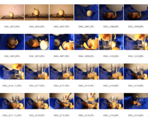
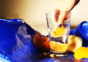
The initial photos I took are about two girls playing on the swing toys. I tried to use their clothes to make a contrast with the black background, but taking pictures of humans seems too difficult and the contrast is not so obvious. So I begin to take pictures of items. I first wanted to take pictures of a still pear and a blue bag, however, when my friend took an orange from his room for me, things suddenly changed. Instead of pear, orange became my leading character. The orange color and the blue bag really contrast with each other and when we put on some light, it is more beautiful. I thought the picture is still too dull, so we found a tissue and put it under the blue bag to create some ups and downs, which is more complicated in composition and the mountain-like shape makes the picture more beautiful.
Image II
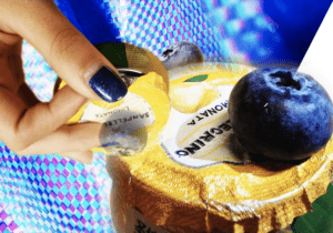
When I finally decide to choose which photo will be my first image, I began to collect more elements of blue and yellow (or orange). I need contrasts, but I don’t want to use orange and blue bags again. While searching for fruits I found blueberry, so this became my leading character. After taking these photos, I begin to add elements into PS. Because the yellow bottle is very big, so I make sure that I will let it stay in the bottom right to create a solid foundation. Because I want to create a feeling of running through, so I add another small yellow bottle and that girl’s hand with the blue nails to create a line through the whole paper. Then I begin to add some small blue parts, which are blueberries. I used three blueberries to create a triangle, and the virtual-actual degrees vary from each other to create more graduations. After finishing all of these, I think the image is still dull. So I enlarged the blue bag, made some special effects to let it looks more cyberpunk, and added to the image as the background. I intentionally left a white triangle background, thus creating a new layer and making the image have more content. Thus, a colorful contrast is done. It echoes the first image, for they both used yellow (orange) and blue, which made contrasts. Also, the composition is to some extent similar. They both have a long item to traverse the whole paper, in image one, it’s a blue bag, while in image two it’s a yellow bottle. Thus, I created contrast in the similar, which I think is a great idea.
Conclusion
In the class, professors pointed out that my work can have a more responding relationship. for example, I can add another small white triangle at the bottom left to create an echo with the upper right triangle. I really like my second image. if I have more time, I will work on the first image. I can have a better light when taking photos, I can use the camera more skillfully, at minimum, not to lose focus in almost half of photos. I can also find a better place to create better contrast, not just took photos in a common space in the dormitory.
Contact sheet
