Title: TBD
Description:
- A lino print project that shows interaction with self – focuses on self judgement. Development from my last project
- A mixed media project that incorporates traditional lino cut print, laser cutting, and sewing. The project aims to show the hardships one may face in terms of confronting their own feelings to themselves. It shows the artist’s habit of avoiding personal experiences, history, and emotions and losing a sense of self.
- “Two panel comic” – reading from left to right
Ideation Prccoess:
- I first wanted to make a book — a zine sort of a type. I had never explored this medium before, so I thought it’d be interesting to try out. I also wanted to make it more ‘interactive’ by making into a flip book. With the users having to physically flip a section of page to reveal the next page, I thought the element of shock would be greater. I also wanted to explore mimicing a conversation between the art and the audience without verbal words. The audience is ‘asking’ the book by flipping the page, and the book responds by revealing the next page.
- I wanted to lasercut lino blocks instead of engraving it because I thought hand engraving 20ish tiny lino blocks would’ve been very time consuming and difficult.
Initial Protoypes:
- video to finished zine:
- https://drive.google.com/file/d/1ksjtAAPyPF6WC0BVJnXFgcklHLQbP967/view?usp=sharing
- I used colored paper, ink for stamping (not print making), waxed red yarn, and laser cutter to make this project. The book has 4 chapters:
- 1 – Limbs
- 2 – Upper Body
- 3 – Lower Body
- 4 – Poem
- Below is the link to my thoughts/organization of this project:
- https://docs.google.com/document/d/1k9m8jIOct9oQa88pge8H72dwRodecPRo2epekVJbAg0/edit?usp=sharing
Harships; Pros/Cons:
- I did not like the fact that the ink stamps made the book very messy looking. I did get feedback saying that users actually liked the messy look. People said the accidental finger prints made it look more hand made and personal.
- I also wish that the cover was a hard cover so that it looked more put together.
- I did enjoy book binding. I think this was a good exploration step I took towards the final project. I’m glad I have these tools in my toolbox for my future projects.
Change of medium:
- After this exploration, I decided to change the medium (kind of). I still wanted to incorporate print making because I really love traditional medium.
- This time, I wanted to make a bigger project (physically).
Inspiration:
https://docs.google.com/document/d/1QSLO6E7Gn1sCOIVAJO4A0YuLQqk-WYOzIyaBCFMOotY/edit
- one of the initial designs: https://drive.google.com/file/d/1usGFxYUYzQCIYc82MQ5onx4PyndkEykU/view?usp=share_link
- After many drafts and thoughts, I decided on my design, which is the following: https://drive.google.com/file/d/178SCivbtCeFjSmL0E4Mm5VmKb6ZZIdtn/view?usp=share_link
Prototypes/Progress:
- laser cutter – rubber setting, 35/100, rester, run it twice
- version 1:
- lasercut once + hand engraved afterwards
- left a lot of residue, burn marks, and a lot of ashes
- line is too thin to show
- lasercut once + hand engraved afterwards
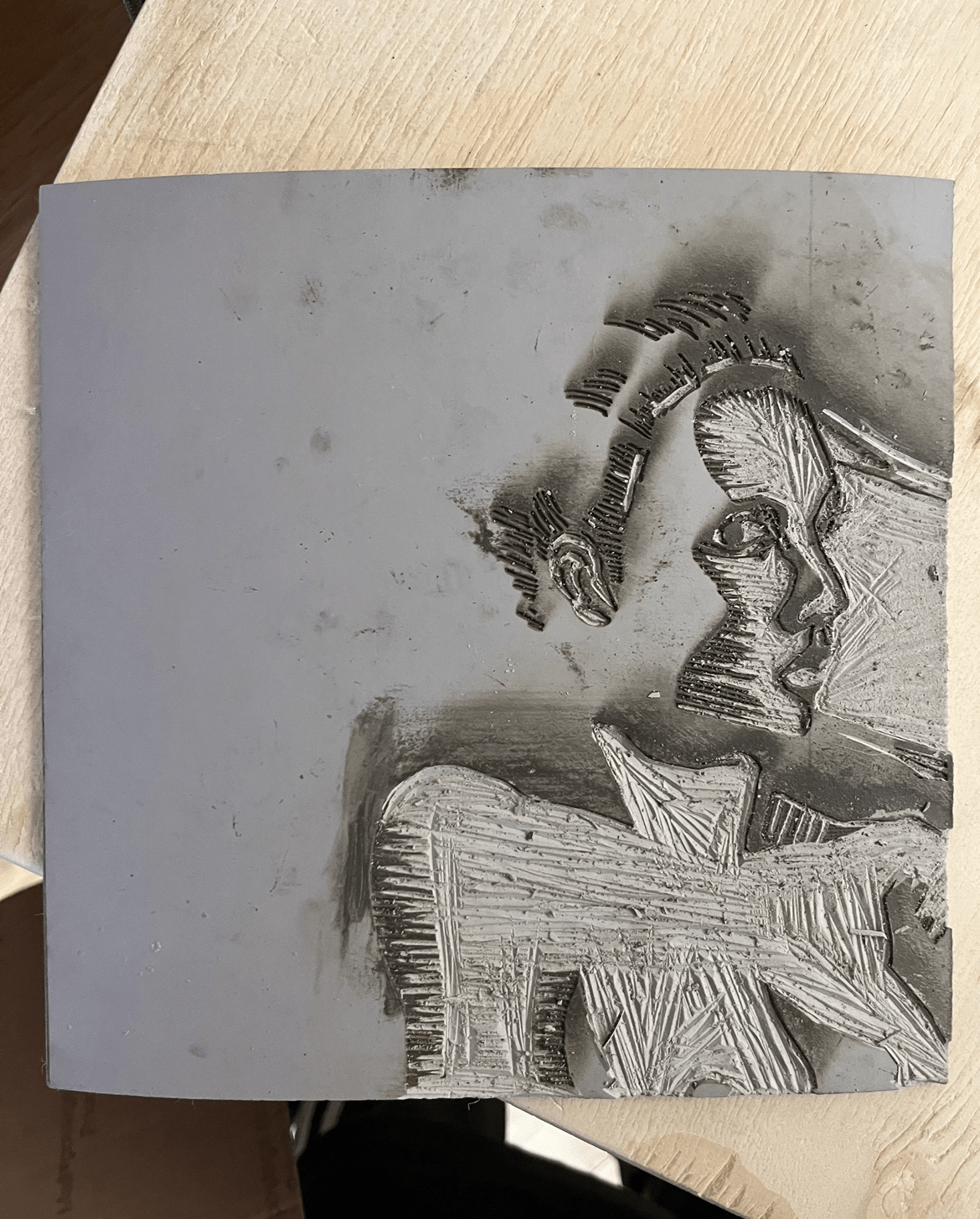
- what it looked like when I ran it through the lino press:
- https://drive.google.com/file/d/1LBbyuoFvjakAFleOYvb7GUc41xCLTq7e/view?usp=share_link
- version 2:
- lasercut once, lines were still too thin to show after adjusting the lines on procreate/illustrator.
- Sadly, I lost this lino block and could not get a picture 🙁
- version 3:
- lasercut twice only.
- Below is what it looked like on paper:
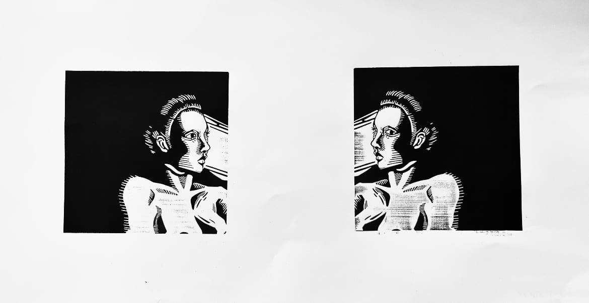
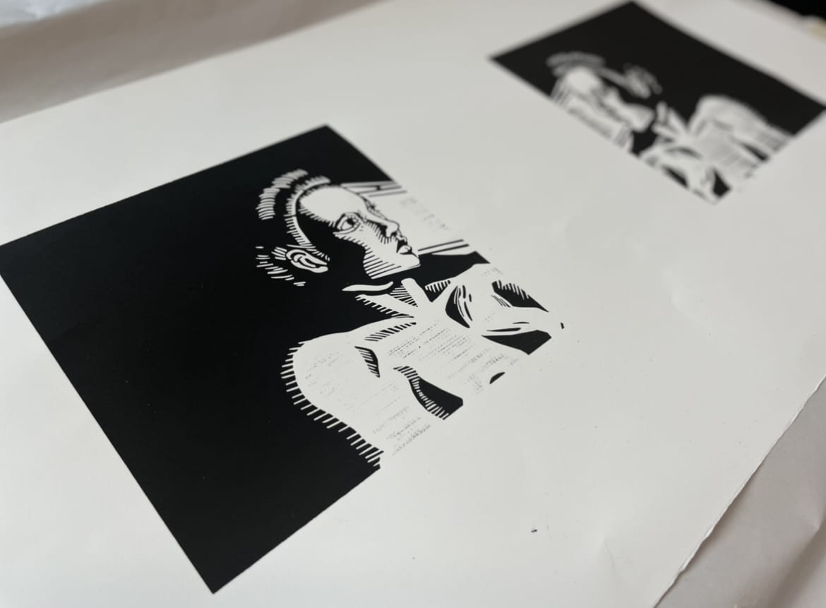
- produced 8 copies!
Harships:
- many many illustrator files/procreate sketches – export + import from different apps make the width of the storkes change. However, the limiation of the laser cutter is that the stroke has to be 1pt for it to engrave. This was difficult to work around and there was a lot of triar and error.
- running out of linoleum – multiple Blick runs. Battleship Gray lino are the only lino blocks that can go under the laser cutter. However, this lino type was out of stock in many Blick sights, even when their website stated that it was instock in person.
- People in my house school also did not like that I was cutting linoleum. Although I had been approved by the Shop manager to cut lino, people were still doubtful and called the shop staff on me a few times to stop me.
- It was also hard to perfectly align the two linoliuems onto the paper. I had done a legistration for the paper with rulers and precise measurements, but the two blocks still ended up not perfectly aligned.
Final:
- I wanted to focus on symmetry because it’s the same person (myself) – it’s like looking at a mirror – a form of self reflection. I am looking at myself while also avoiding myself.
- It also metphoarically shows one sidedness of my sexual/romantic experiences – shows non verbal ways of communication that i always opted for because I could not say the word “no” in many instances. The gaze away shows different kind of ways to show discomfort that’s not verbal.
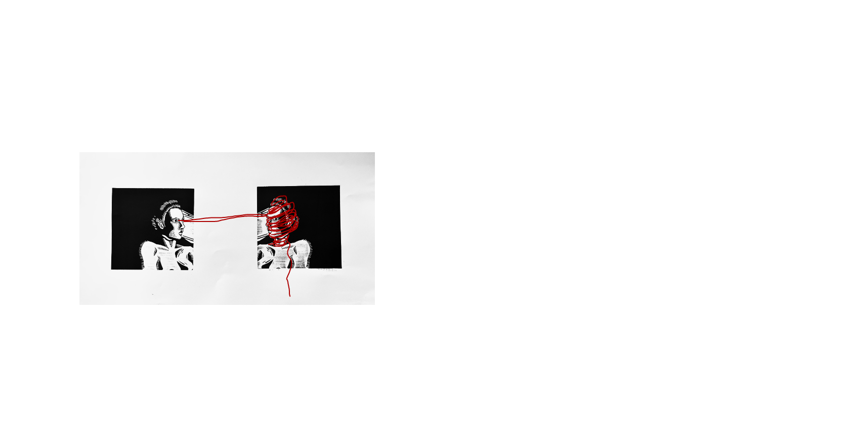
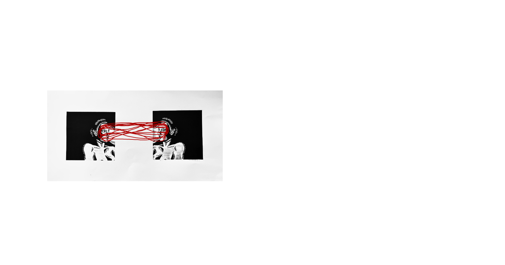
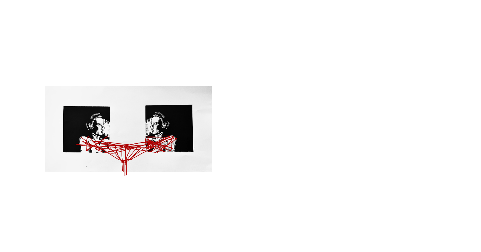
- I also want to add red strings to finish the project – strings will function to show the tension of this interaction (more explanation below).
What I liked/How I feel about the project:
- was happy to combine two things I enjoyed.
- Technology and hand sewing – interesting mix
- love studio art
- love physical interation/piece
Future Steps:
- I need to think about how to install it – multiple prints at once? or just one? how many strings?
- user test more
- red string ideas:
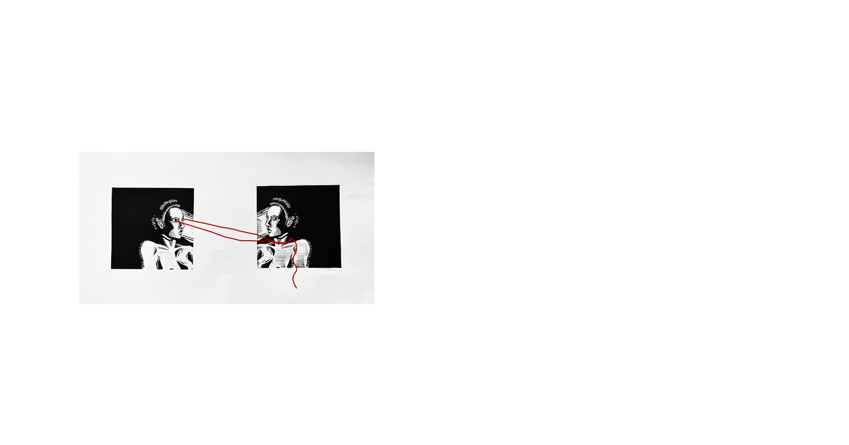
- book form (plus mock up of how I want to show this project?) – https://drive.google.com/file/d/1Xa-oXCOqU_cpFOpLFq-nJqOBQXKHoPY-/view?usp=sharing
