Best Lover By 88rising & BIBI: https://open.spotify.com/track/0iWFz0Q5Qha9bx325ocFWq?si=2f36bdd1131146f0
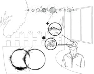
The song that inspired my Sound Visualization Project was Best Lover by 88rising and BIBI. I chose this song as it instantly brightens my mood every time I listen to it. Aside from the lyrics, the music was smooth, bouncy, and light with ripple/echo effects. With noise-cancellation headphones, it’s like you’re in space where sounds loop around you which is why I embedded of what looks to be galaxy esque loops. Although my design may seem a little disorganized, the way the music was composed is also random as it introduces new sounds and rhythms to every other beat. Most of the backtracking alongside the artist produced soft sounds, therefore I steered away from hard jagged shapes. Most of the designed used were falling off the page as I wanted to reinforce the idea of a spatial dimension as it cannot all fit into one page.
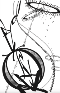 Gestalt Principles Used
Bottom left circle
-
- law of similarity and proximity
- repeated same letters and overlapping to create gradient effect and unison
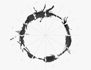
Circle of Z’s
-
- Law of Pragnanz and closure
- Z rings are only attached to one part of ribbon-like structure
String of letters across the board
-
- law of continuity and closure
- line is meant to fall through the big ring on the bottom
Creating the one black square design taught me to keep things simplified as we had a scarcity of paper in that project.
Personally, this project had some difficulty. Thus, there were failures and successes. The failure was keeping the draft as the final draft. Although I had the big picture in mind, I stuck with the designs I had already inputed into Adobe. As a result, my first attempt at the visualization was much more chaotic and random. In general, I felt a little lost working on this project, but after an office hour with Professor Zhang, I did more brainstorming and came up with this final design. It was suggested that I be careful with the fluidity of the whole piece and repetition of designs. I think it’s better now that my design is more minimal to convey a cleaner message to the viewers. The comfortability ties into how I feel about the song.
If I were to do this project again, I would like to add more to the background and fill in empty spaces. I would also like to explore more of the tools Adobe Illustrator has to offer as this was my first time working with it. I’m sure there are many cool features that can elevate my work.
