Stress
Tina Xu


The overall concept for my Diptych is academic pressure on college students. I want to create a photo that depicts the heavy stress students have every day. Not only is college academically tough, but there are also high expectations from friends and family as well. Everyone wants to be successful, but when there seems to be never-ending homework, exams, and projects, it’s difficult to always be motivated. Over time, overworking turns into burning out. The once intriguing idea of learning now becomes dull and lifeless. It is merely a task, a to-do list checklist. We, as students, want good grades, social life, and to pursue a career we love. This unrealistic perfection is what causes many students to deviate from their true selves. To be simply put, school is stressful. Sometimes assignments are due, so we sleep late. We’re constantly running our lives through the 11:59 deadline. When does it end? After graduation?
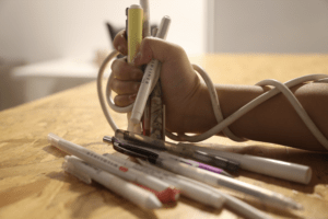
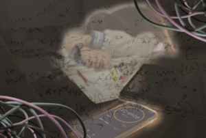
The images contrast as the top one shows the point of view from others, while the bottom image shows the point of view from the individual. Visually, the colors are contrasting too as there is night and dark. I hope for other to see the heaviness and tension in the second image. It may seem pretty and simple from the outside point of view, yet we are still trying to hold it together. The wire represents the expectations that’s bounding us to expectations. Even with their obligations, we still try to hold on as tight as possible to those achievements. Nonetheless, some things still slip away from us. The second image shows the complexity of school life and the ever-chasing 11:59 deadline. The wires in the second image show the personal endeavors of the individuals, but as academics take out, they start to dull and fade away.
Image 1: I had a light shine from the back of my hand to show a spotlight effect and put on an exaggeration. I also used the classroom wire to tie around my hands.
Image 2: I used a semi-transparent background and overlapped it to create a messy background. Overall the image is dark, but then I cropped myself and the phone to focus on the subject. I also added the wires and changed the hues to show dullness. As the phone has a glow, I also added a light in the back to show a glow effect as well.
If I were to add improvements for this project, I would work on taking more clear photos. I think I should have experimented more with the lighting and features on the camera. I would also like to play around with Photoshop more as many of the features are still foreign to me.

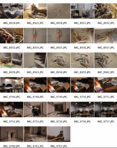
Contact Sheet
Leave a Reply