TINA CHEN, EXPLORE : THROUGH THE DECADES
PROJECT DESCRIPTION
EXPLORE : THROUGH THE DECADES
2023
Interactive Art
ELEVATOR PITCH
Explore attempts to create a museum gallery/time machine like website where the user can travel through the decades of the Chinese dynasties and see all that these time periods holds. From inventions to important historical figures to fashion, Explore introduces all aspects of the dynasties to the audience.
ABSTRACT
Explore is a stimulation of a time traveling website where the user can ‘travel’ through time through the scrolling of the pages on the website. It is a website that attempts to contain all the aspects of China’s dynasties and to showcase it in an engaging and interactive way through the mechanisms of scrolling and hovering. The choice of which dynasty and what aspects of the dynasty shall be seen and explored lays in the hand of the audience and through these explorations they are also capable of making comparisons among different dynasties as they scroll up and down.

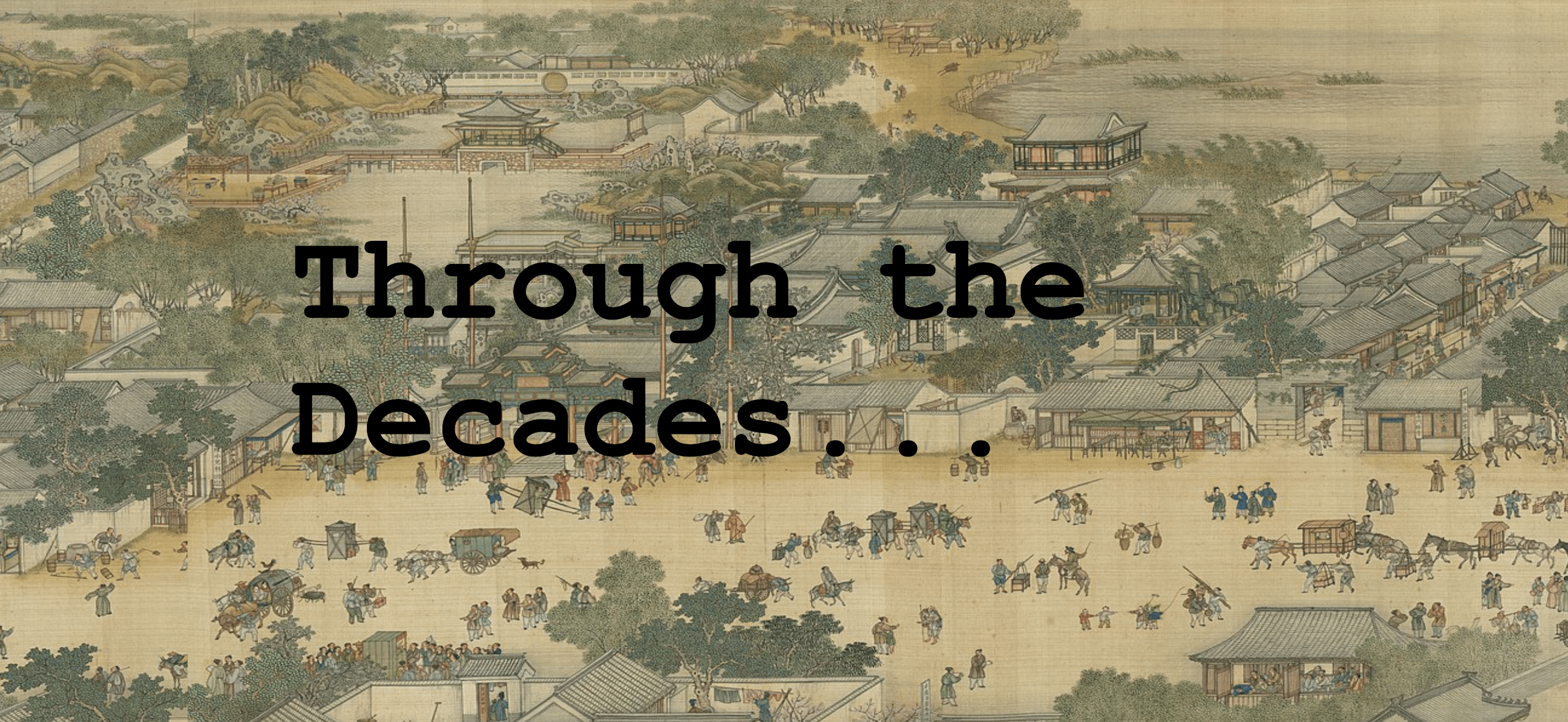
Upper most part of the website/the title
Part II
1) Process: Design and Composition
The initial idea for the website was to have the user click icons that corresponds to each dynasty and then have the page jump to whichever dynasty the user chose. However, after relaying my proposal ideas to Professor Marcela, she suggested that the simple act of scrolling up/down/left/right is a better option as it is a better storytelling technique. I think the use of scrolling to tell the story of the dynasties really simplifies my website for both the user and myself as the developer as I don’t have to implement as many html pages as I would have if I sticked with my original plan. To add more interaction to the website I incorporated little captions and unless the user hovers over the caption, they would not be magnified for the user. This not only saves “space” but also it does not affect the layout of the boxes. Moreover, I underestimated the amount of research that I would need to do in order to fulfill my hopes of having all the main dynasties on my website. The website would be more complete if I were able to incorporate all the dynasties that I had initially planned to include. On the flex boxes that requires a lot of information, I used a p5 sketch for each of them that had a slideshow of all the information. That way there’s no resizing of information needed on the flex boxes in order for the user to view the content.
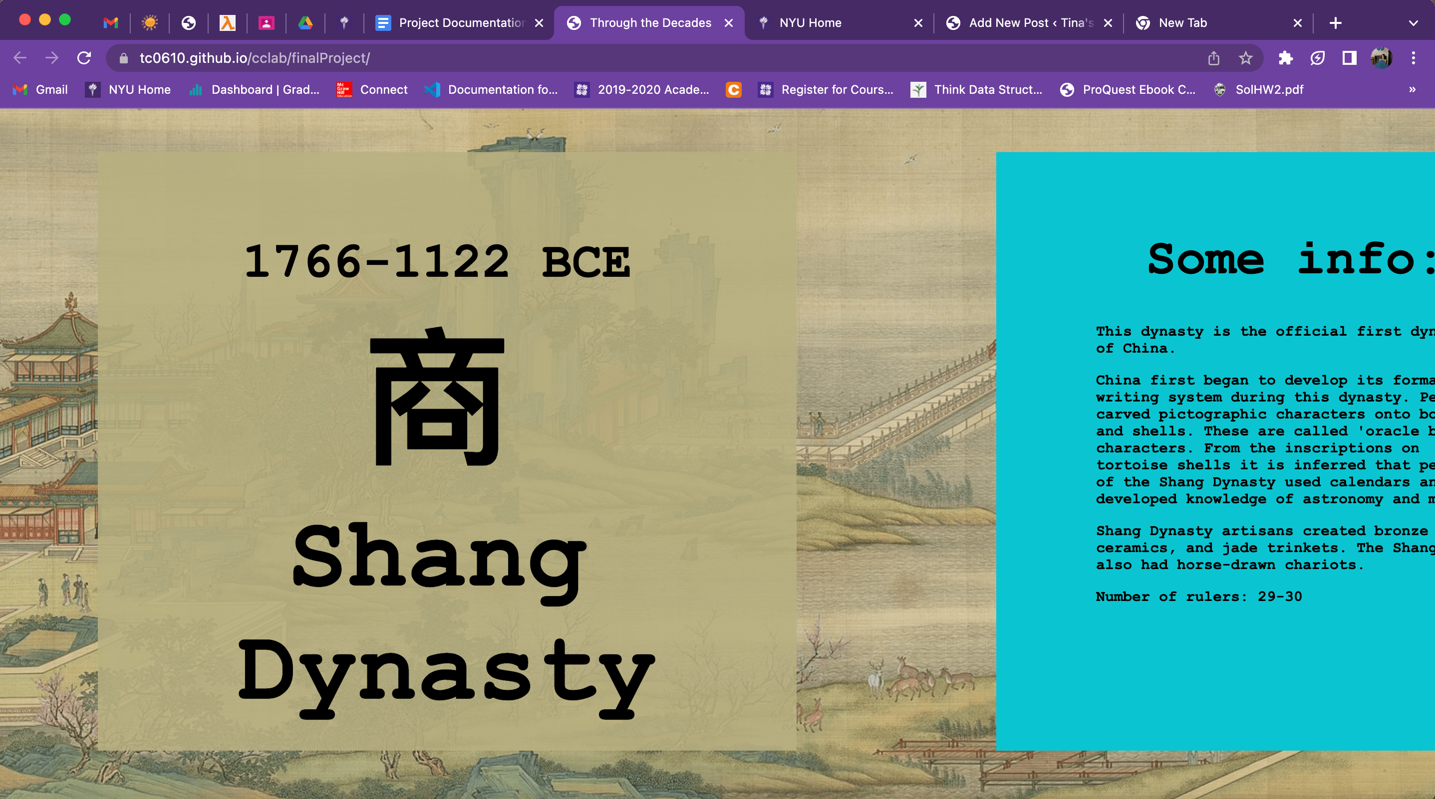
 First page of every dynasty
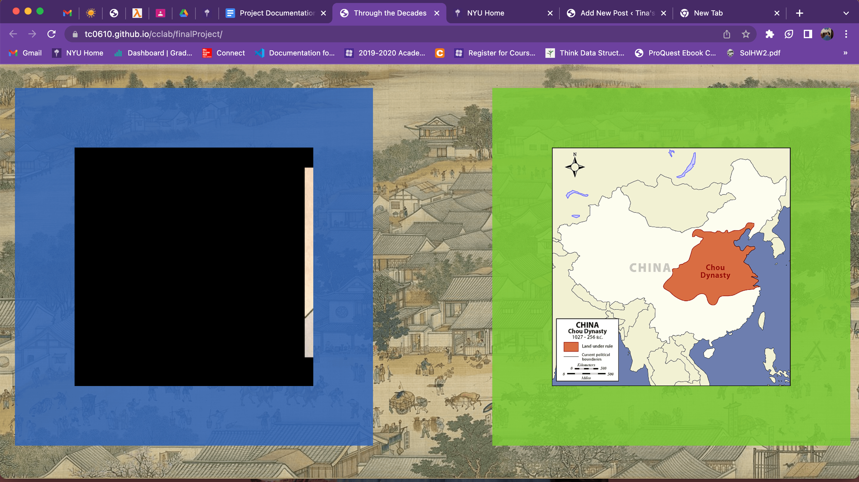
The boxes that contained a slideshow of important people (left) and territorial map

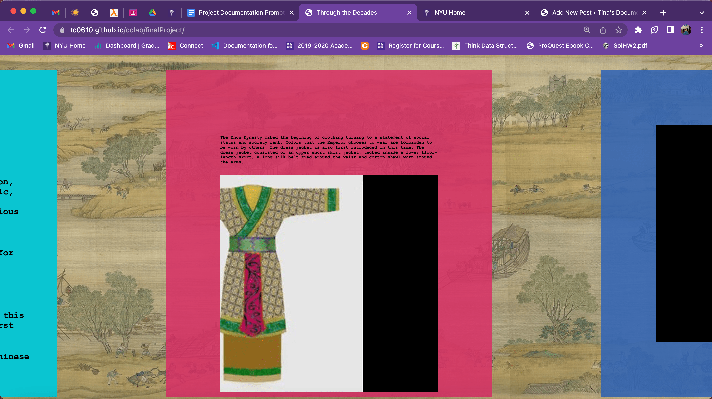
The box with a slideshow of fashion and the mouse-hovering caption
2) Process: Technical
The first challenge I faced was how to make the horizontal scrolling affect. After doing much research, I was introduced to the concept of flex boxes. Hence, for each dynasty I designed the website in such a way that they each had their own div box that contained all the flex boxes for each of the categories. In this way I was able to fulfill my plan of having the user scrolling up/down/left/right. Moreover, I was faced with the challenge of how to create a p5 sketch that ‘scrolled’ through a massive painting. I had wanted to use the painting the 清明上河图(Along the River during the Qingming Festival), but it was a massive painting. The ultimate plan was that I downloaded 22 parts of the painting and then had the p5 sketch load the individual parts as an object of a Pic class that I had implemented which would be in charge of moving each part of the painting out of the canvas to create the affect of a moving background. I also used this technique on some of my other flex boxes as a slideshow of the information I wanted to showcase. My biggest challenge for this project was the researching. As mentioned earlier, I had underestimated the amount and time needed for the research aspect of this project which lead me to have to size down on the amount of info I was able to provide for each of the flex boxes of the dynasties. If I had more time I would like to improve the overall aesthetics of the website as the flex boxes didn’t really match my theme of ancient China and also implementing different ways to show my content rather than using just p5 sketches with slideshows.
3) Reflection and Future Development
In terms of visuals, I am satisfied with what I have achieved. The scrolling affects and the addition of using a p5 sketch as the background along with the music really sets the scene of immersing the audience in a ‘traveling back in time to ancient China’ type of experience. It is quite accurate to how I had imagined the visuals to be like back when I was brainstorming ideas. Due to time constraints I was unable to incorporate more dynasties onto the website, however if all the dynasties were incorporated I’d feel like the website would be more complete. There’s definitely a lot of researching work that needs to be done in order for this website to be polished and finished. In addition, I feel like there’s a lack of interactivity. I would love to use a p5 sketch for each of the first cubes of the dynasties and have the audience ‘scratch’ open the boxes to reveal what dynasty they are currently exploring. Overall, as my first official attempt on Web Development, I am satisfied with all the techniques and skills I have acquired and applied on this project.
Leave a Reply