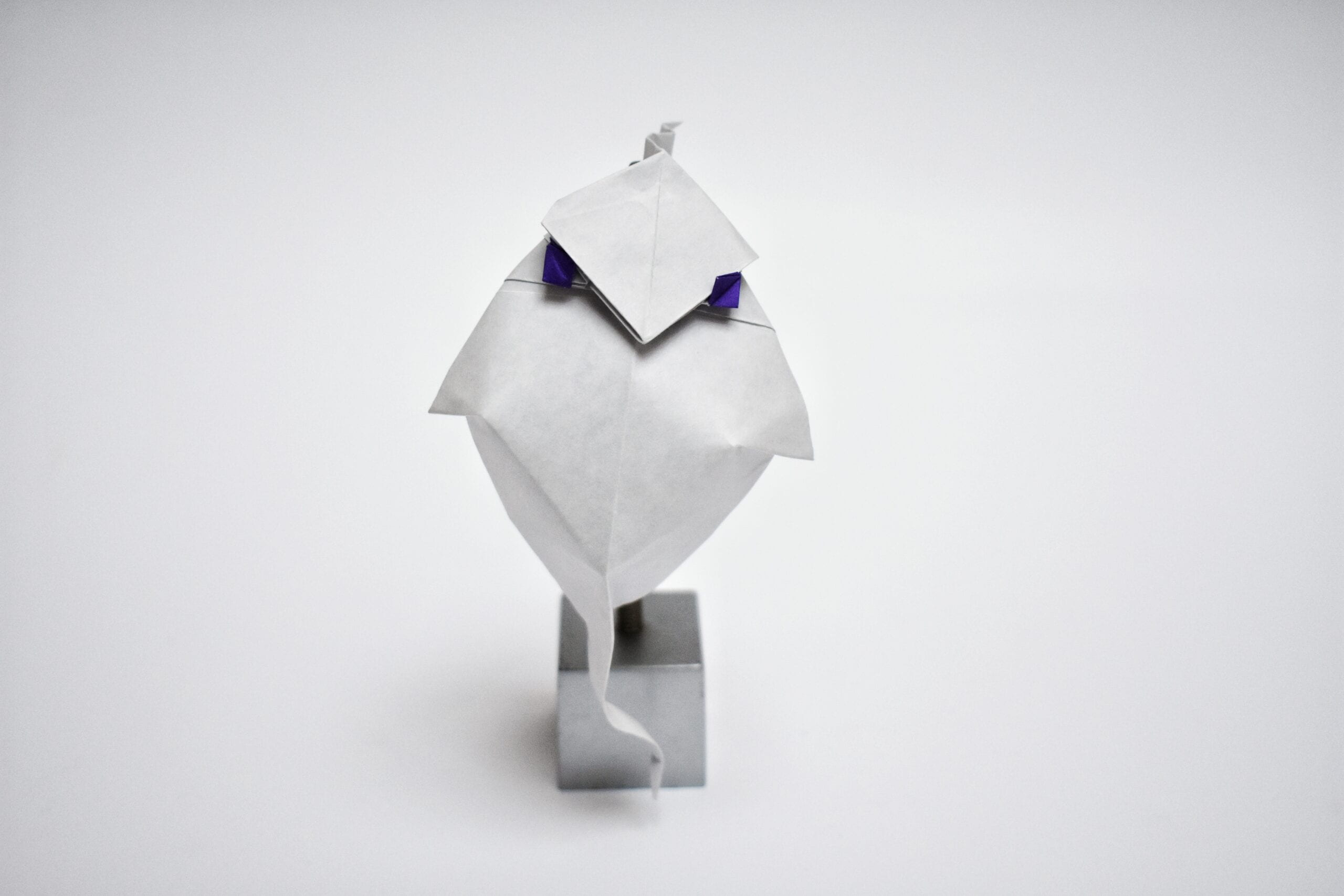
Gnome


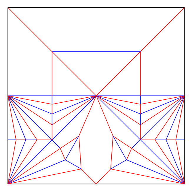
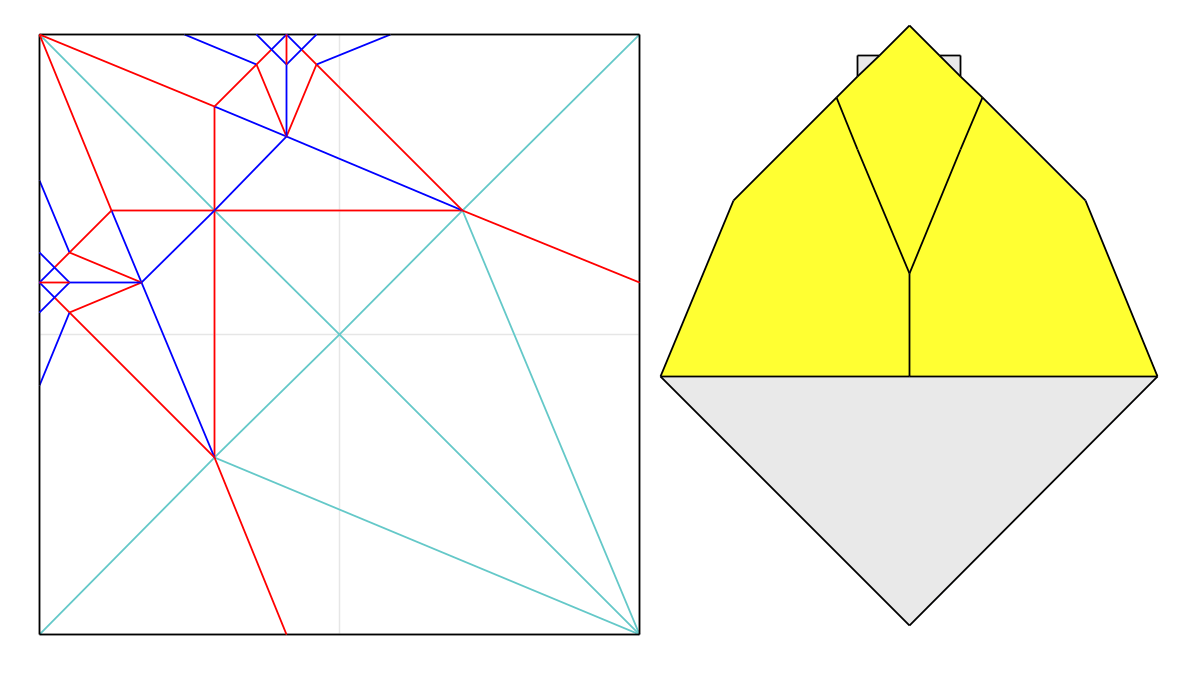
         This is actually quite a late post, the original design was completed almost two months ago. Nonetheless, I intend to explain as thoroughly as possible the process of its design. (Above can be found the crease pattern, as well as a collapse sequence for a simplified base. More detailed instructions can be found published in the 2024 OrigaMIT Convention Book.)

         After folding Riccardo Foschi’s sitting gnome, I found the layer build-up to be quite significant, and was unimpressed by the final size of the model relative to the starting sheet. Desiring a gnome with greater detail, and to my great chagrin, finding no such model existing, I set out to make my own.

        The first enterprise was to determine the desired features. As I lack the patience to make sketches of the intended form, I simply decided that I wanted a round nose, a full beard, eyes, ears (very important), the characteristic pointy hat, all four limbs, and something for the gnome to sit on.

        I had previously explored a structure for faces from a bird base. While chowing down lunch, I realized I could flip the structure upside down. I could use one corner of the bird base for the gnome’s pointy hat, one for the beard, and the other two for the ears. The central flap would be split to make the nose and brow.

        This solved the issue of how to obtain the gnome’s most defining characteristics quite rapidly. In my sloth, I fitted the head into a 3×3 grid, and slapped together some basic 22.5 molecules to fabricate arms and legs.
The downside of this structure was that the bottom right corner of the paper was unused. This was a fairly sizable amount of paper. In addition, I disliked the relative stubbiness of the arms and legs. If I could shift the leg flap towards the bottom right corner of the paper, I could elongate the leg flap while absorbing some unused paper. I fiddled around with 22.5 degree structures and proportions for a day or two with no success.

At this point, fed up, I returned to the thirds I had previously, and added some elements to shift the 22.5 degree creases into diagonal pleats terminating at the bottom right corner of the paper.

A quick Elias stretch produced long legs and some extra paper that, as I eventually learned, could be folded up to close up the seam (a seam is the region where edges of the paper meet, exposing an unintentional color change).

After collapsing I realized that I needed to thin all the flaps.

Which I promptly did.

At this point I was rather satisfied by the base, and my excitement almost eclipsed my dismay over being unable to use a structure fully based in the irrational proportions of 22.5 degrees.

Here is a picture of my first test-fold of this base.

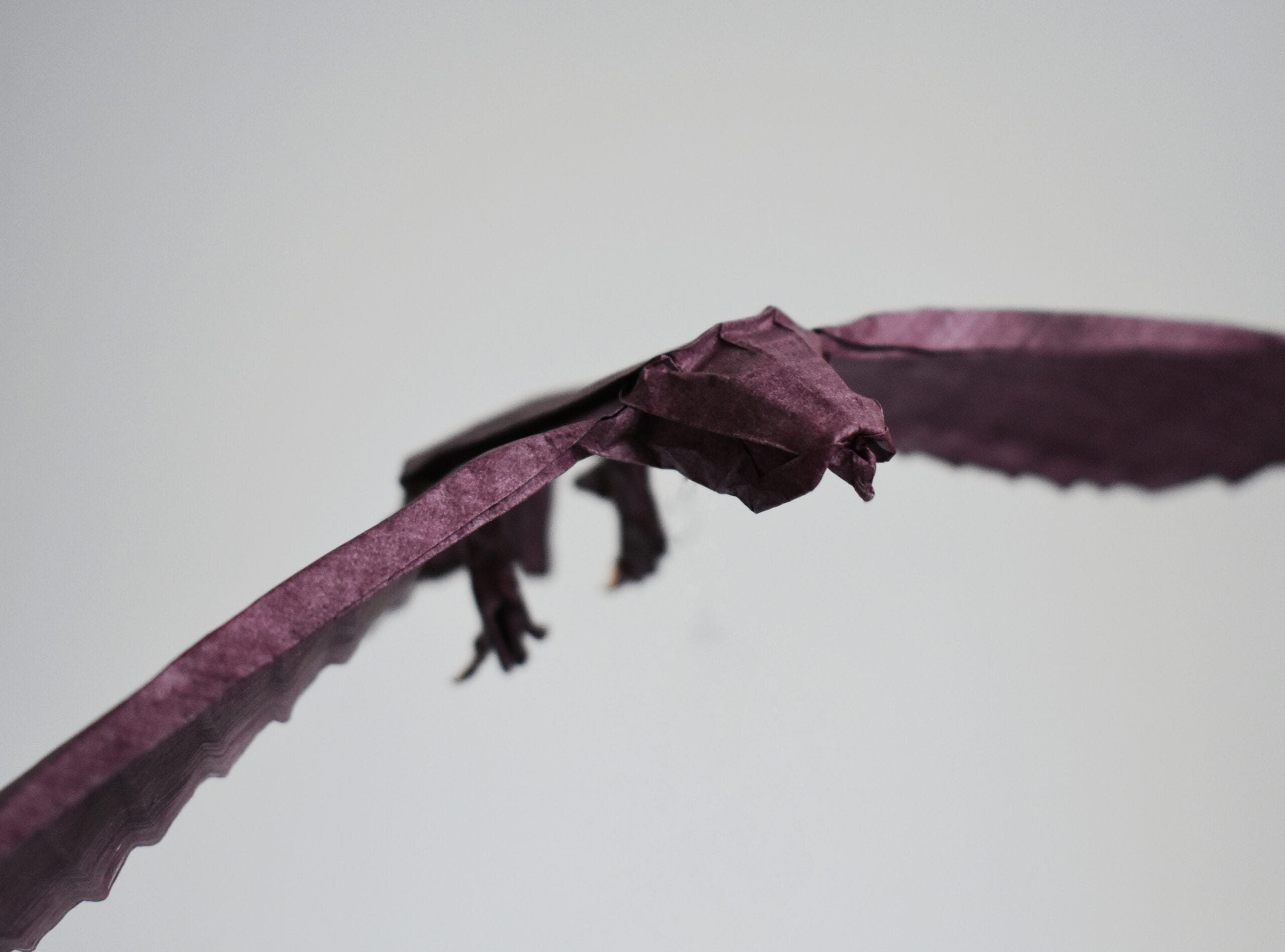
I made a sheet of burgundy double tissue, and figured out the shaping more or less as I went, with the aid of two test folds. As I had not added a mouth structurally, I struggled with finding one that was of the right size and that was not too cartoonish.

I settled after much dilly-dallying with a simple pleat, which makes him look rather sullen, in an amusing sort of way. (Imagine a minute gnome glowering at you. ‘Tis more entertaining than intimidating.)

Cockatiel


         This is probably my most sophisticated design (at publication date) from a structural standpoint. I began by creating the head through doodling with paper. I knew that I wanted color changes on the beak and the cheek spots. The beak would be a flap from the middle of the paper, and the cheek spots would be from the edges.

         My first prototype used book symmetry (this line of symmetry can be found by folding adjacent corners to each other, as opposed to diagonal symmetry which can be found by folding opposite corners to each other). The issues were several. The model was highly inefficient, with the head taking up the whole top edge of the paper, leaving very little paper for a body. Secondly the paper build-up was significant, making the head rather thick. I immediately had the thought to use diagonal symmetry instead. The advantage being that 22.5 degree modules can be treated as tiles and easily shrunk along a diagonal axis, with all the edge flaps remaining on the edge.

This was quite straight-forward. I had a prototype in my hands within minutes. The next step was more arduous. I had to find a way to place the creases of the head on a larger square and add creases to get the paper to fold flat. I started by choosing how large I wanted the head to be relative to the larger square.

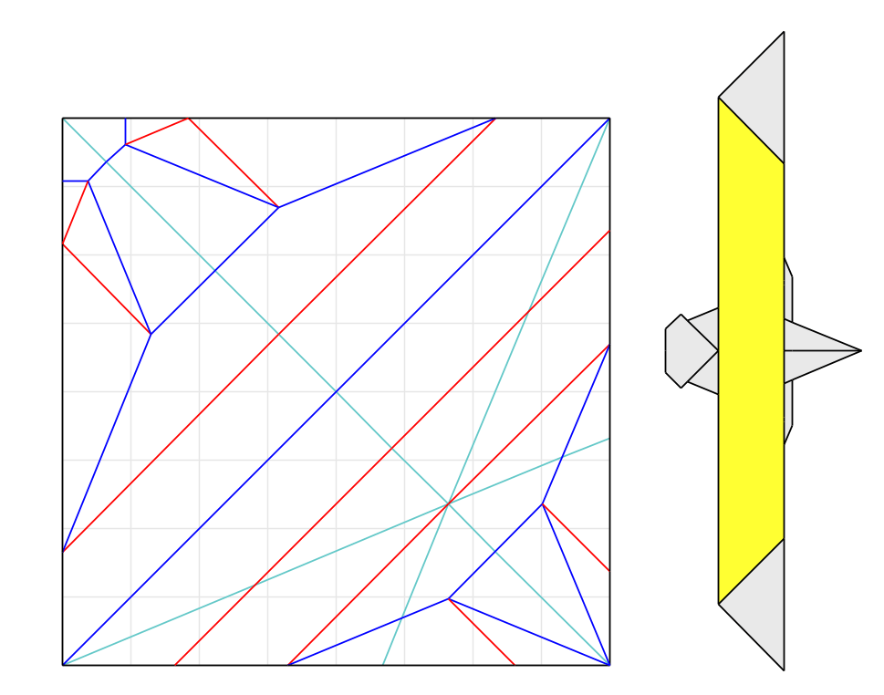
The reference I chose (shown in turquoise) is commonly referred to as a Kamiya reference (after the eminent Japanese designer who popularized it). I then extended the lines in the head as far as they could go, to create a net of 22.5 degree creases.*

After adding a few more lines to the net so that not all of the creases end up at the edge….

I then have enough lines to create a flat-foldable crease pattern.

The next challenge was to add wing detail, legs and a tail. My first thought was to place the tail (the longest flap) on the corner opposite the head, the legs somewhere on the edges adjacent to that corner, and make the wing detail from the remaining corners.

This seemed to have not left me enough space for legs, and besides, the points of the wing detail were too close to the seam at the belly, and didn’t lie on the back as the tips of the folded wings of a real cockatiel do.

Alright. Wrong direction. A moment of stagnation.

Then it suddenly hit me. Why make things complicated for myself? Simplicity is best. I could use a similar flap arrangement and shaping method to what I had used in my pheasant design. I removed the Kamiya reference, and fitted the inner corner of the head at the center-point of the square. It was simple enough to use the same creases I had from before to make the paper lie flat.

The next thing was to get back the fish-base arrangements of flaps, shown in turquoise. That wasn’t hard, but looks unusual on the crease pattern.

At this point I was done with any work on the crease pattern, and just needed to refine the shaping of the model. (Which was the most enjoyable part.)

*This method of creating nets is also touched upon by Tetsuya Gotani in the chapter Improvising with 22.5 from his book Origamix. It is also covered by Hideo Komatsu in a series of articles in the Tanteidan Magazines. Admittedly, both of their sections focus more on using the net to orient 22.5 degree molecules. As I needed less flaps for the model, I used the lines of the net themself to make the model lie flat. I am also aware of a number of designers who use this method, though we all use different names for it. I prefer the terms net or web over grid, as the lines tend to run in all directions at a number of angles, and do not create congruent atoms (Meguro Toshiyuki’s term for any region of paper completely bordered by creases).


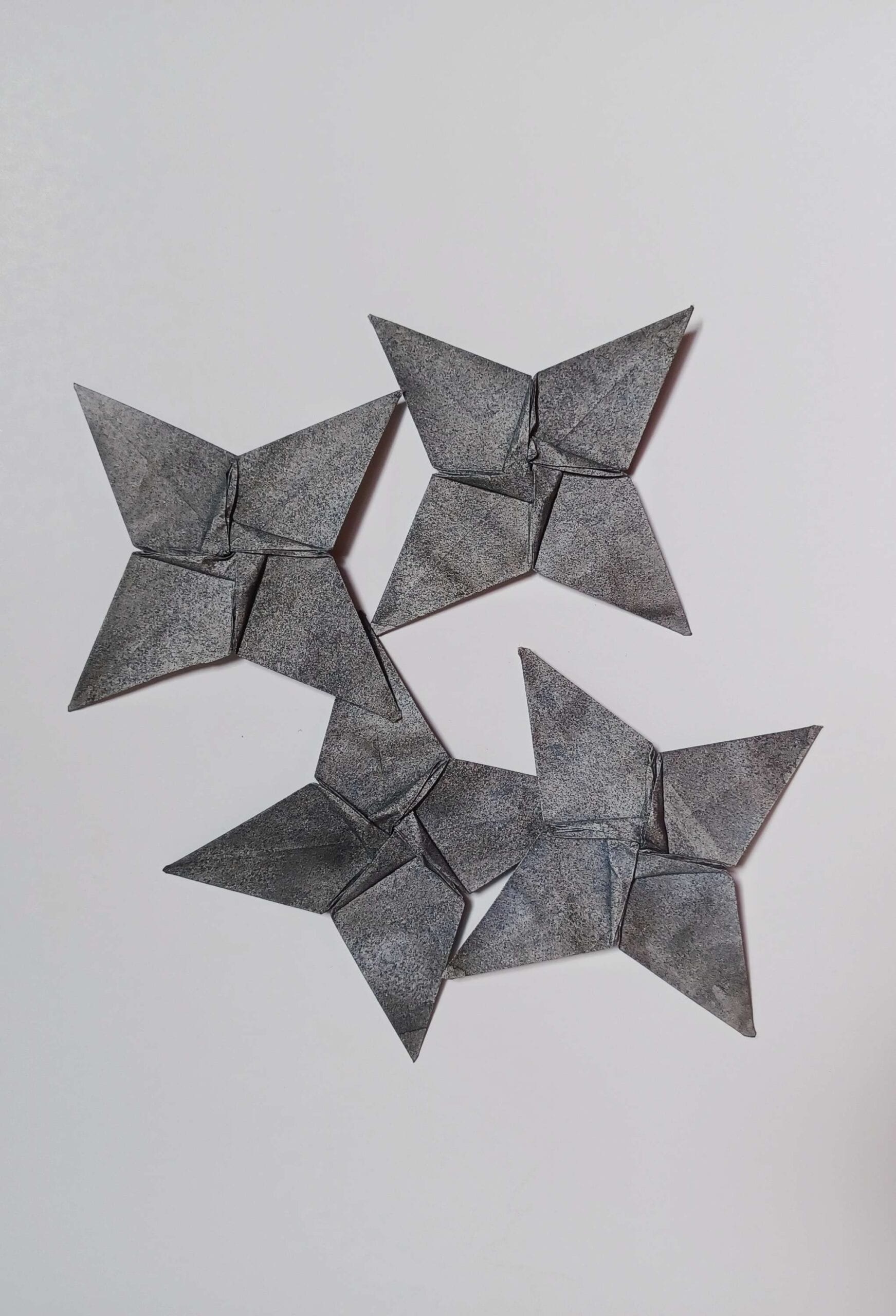
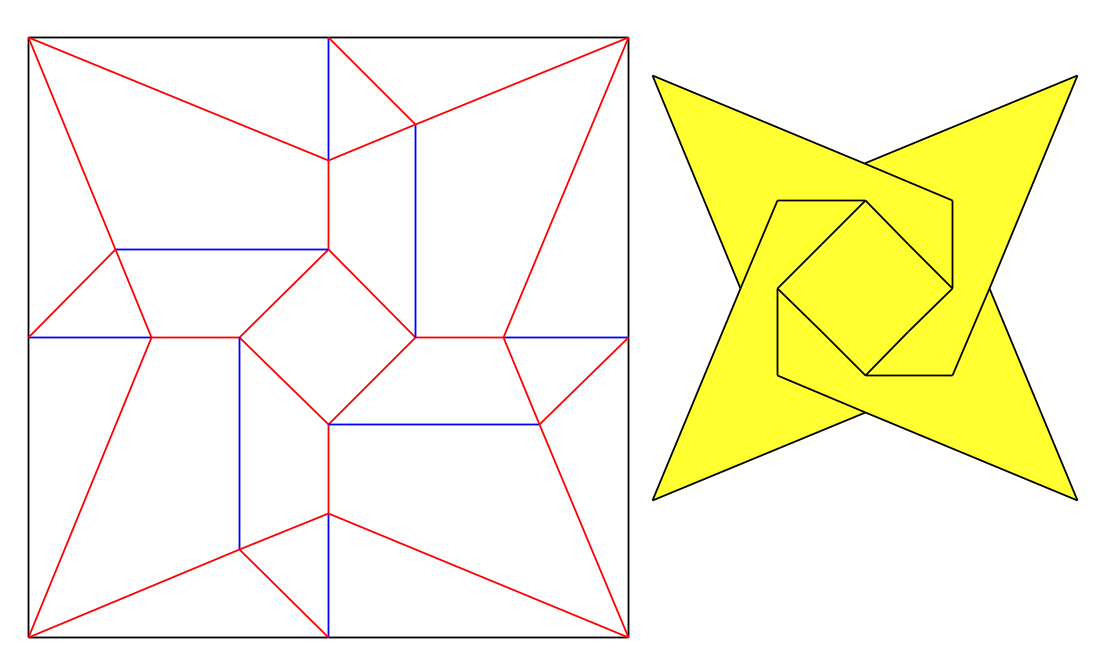
Star Bowl

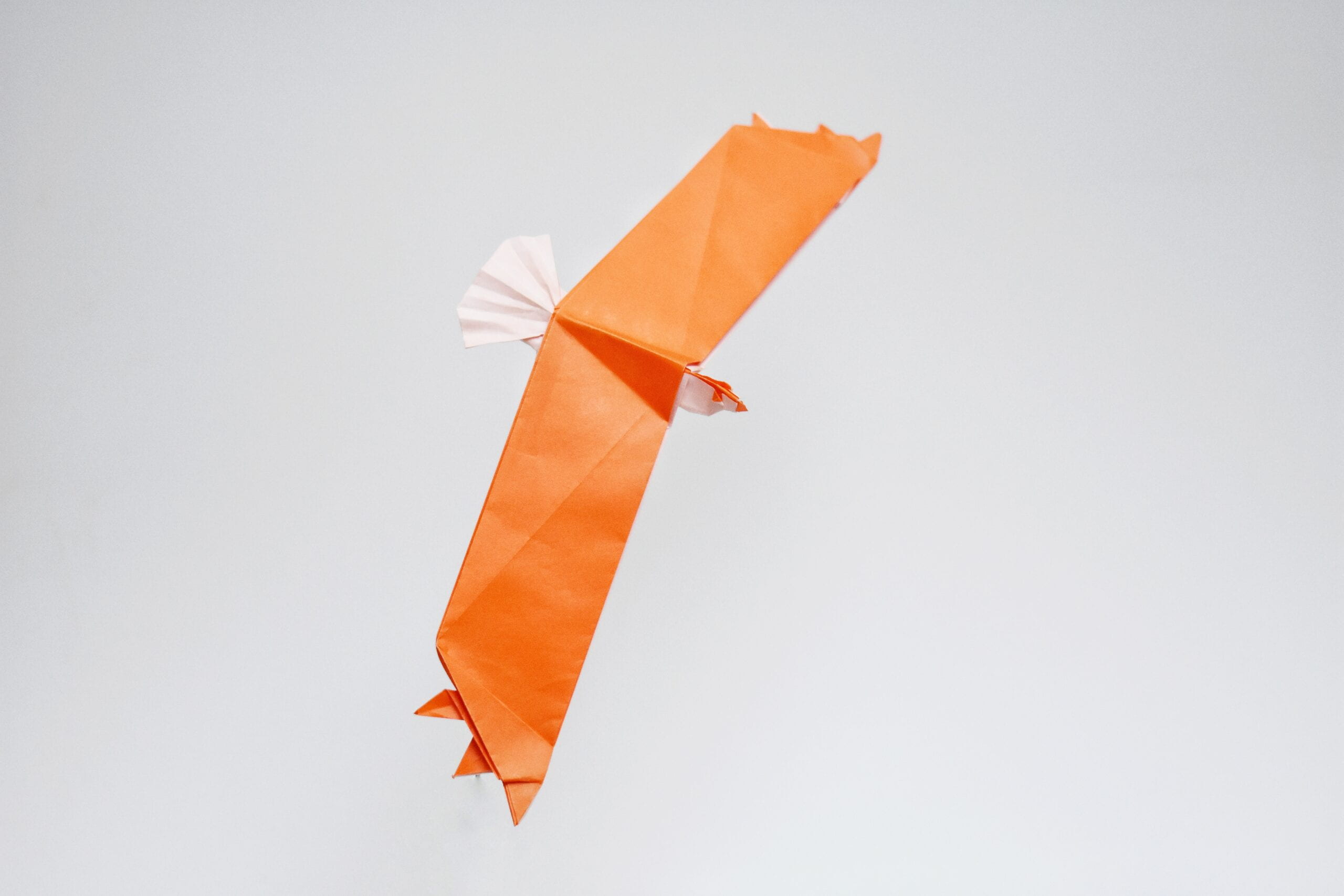
A fun practical model. Was messing around with the base shown above, and it came out quite quickly.

Magic Frog

Typically, color changes in figurative origami models are created by unwrapping a flap or a similar procedure. The idea for this model was to create color changed wings for the frog by creating small flaps at the center of the model, and having them poke out of the seam where the edges meet. This creates a color change that is not at the edge of the paper (depending on how you conceptualize it). Very technical, I know. Unfortunately, this model was not well received, and while I am rather fond of it, I also believe that it cannot be viewed from any angle other than the one pictured above without becoming less endearing.

As a side note, while the structure was intended to be a hybrid base, the 22.5 degree lines at the head did not quite align with the 45 degree boxpleating lines. As such, there was some mushing at the transition to get the model to lie flat. If I ever make a redesign, I will most likely fix this.

Armadillo


Like the Chubby Ghost, this model was designed as part of a challenge. My main fixation was with achieving integrated pleats for the armadillo’s bands. While I think I achieved that nicely, there’s no sequential way to fold the model, (the only method is to precrease everything and then collapse) so there won’t ever be a video tutorial. To get the legs of the model, Elias stretch the long flaps at the corners (this can be done through a series of squashes,) then fold behind the remaining triangle of loose paper. You’ll also want to spread squash each of the pleats on the back symmetrically and sink one half. This procedure will double the number of bands. Have fun folding!

Recursive Blossom


This design was a rather coincidental discovery while trying to figure out one of Shuzo Fuchimoto’s designs. I had an idea and immediately cut a new hexagon to try it out. I later learned that the recursive portion of the Recursive Blossom is identical to the recursive version of Shuzo Fuchimoto’s Petals (CFW 85) independently discovered by Michal Kosmulski, Andrew Hudson, Edward Minstretta and now me.

While you do have to completely unfold the model at every level, I find the folding process rather methodical and relaxing.

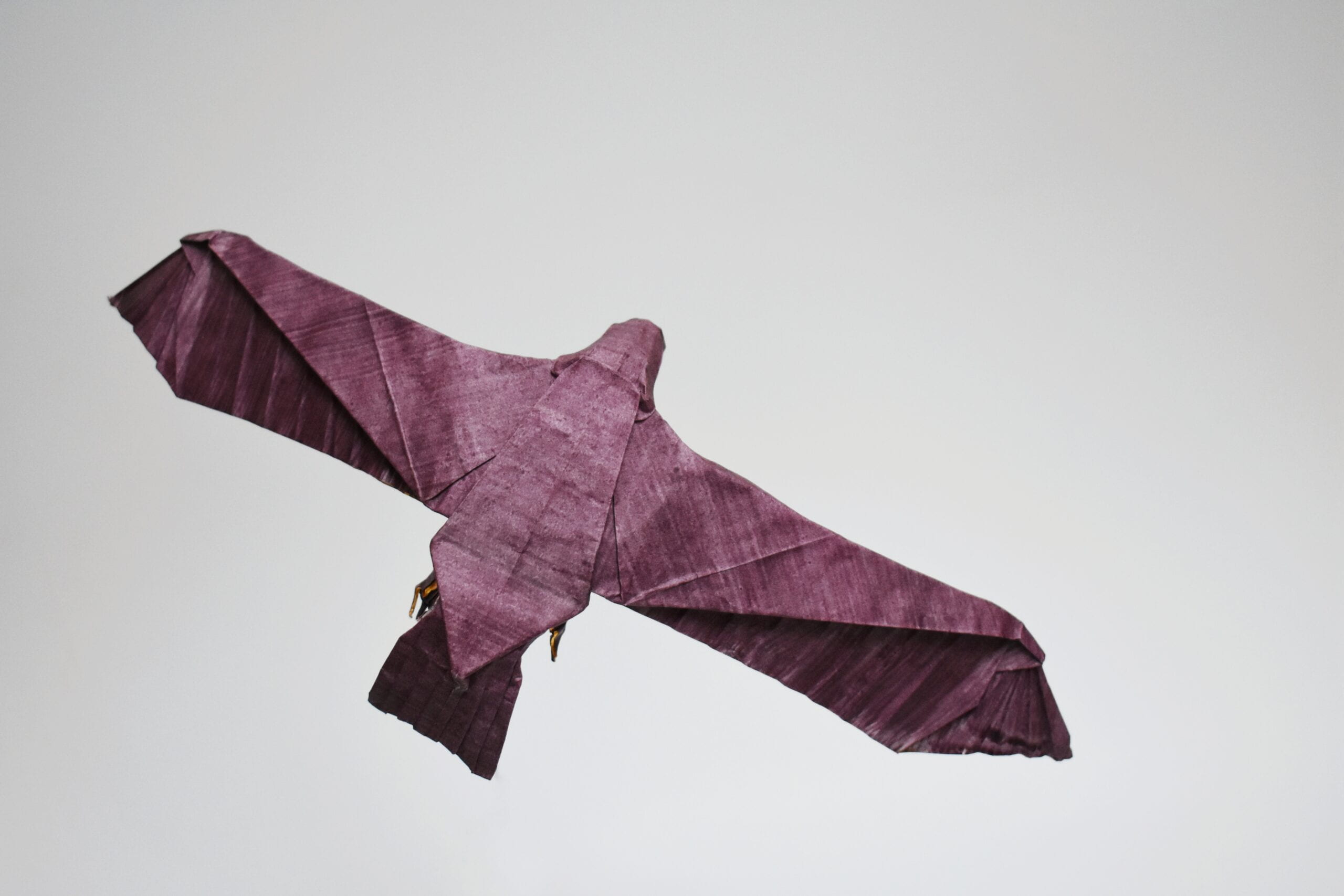
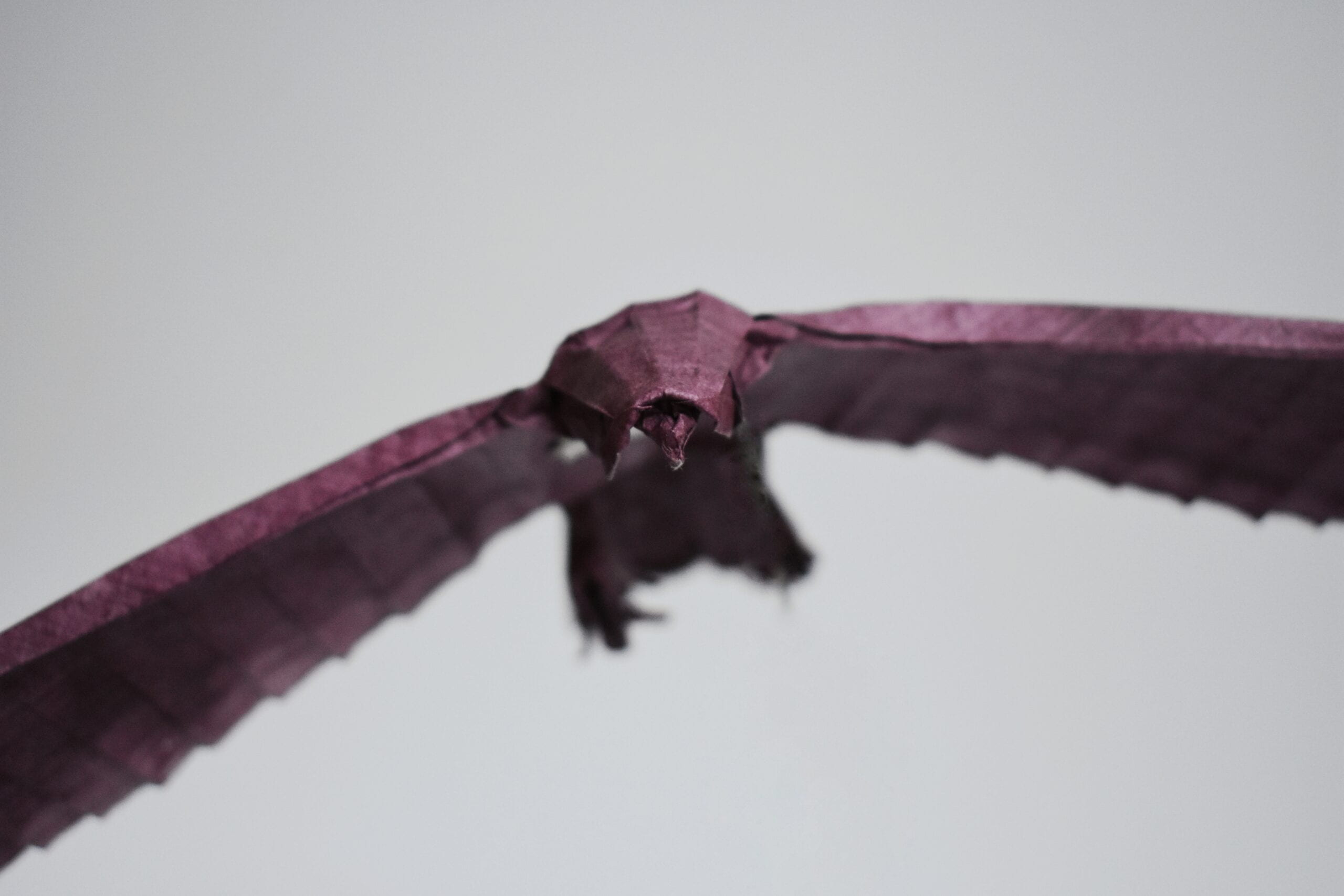
Bald Eagle

It took several attempts to get the current version of this model, and I now find myself pretty happy with the result. The model has the primaries at the tips of the wings clearly represented, as well as a detailed head and well proportioned tail.

Chubby Ghost

This model was designed as part of a month-long design challenge I partook in. The subject was predetermined, and the process was fairly straightforward for me. After a couple of testfolds I had successfully rendered a chubby ghost. I think it’s adorable, though it looks a little hawkish.