In this post, I records feedback gathered from the critique on Monday and my thoughts and reflections on the Forgetful Machine.
Overview: the on-site effect of the installation
Overall, the Forgetful Machine runs properly in terms of logic: when no one is present in the camera range, the video/image starts to destort. However, I had a hard time setting up the environment for blob detection and put every window at its proper position, and it was even harder when I did it under others’ curious observations.
Because I was worried about blob detection, I didn’t realize that I didn’t have blob tracking windows minimized. These two windows seemed to provide the wrong guidance to the viewers as they display constantly changing visuals, which attracts people’s attention from the videos, images, and effects to the webcam.
The class generally didn’t get the ideas of memory and forgetfulness, but some reported that they could see the installation was about time and the visuals were somehow related to their movement.
Feedback from the viewers
- More screens (e.g. 4 screens) in a different layout (e.g. 4 screens in a circle)
- Make the installation bigger in scale
- Hide the webcams
- Position the screens at eye level
- Choose media that better lead people to the concept of memory
- More media that are relatively similar, or centered around the same topic
- Bonus reaction of the installation to a particular action of the viewer
- Display the wrong time to enhance the theme of forgetfulness
- Use media as hints for interaction (e.g. time projection on the ground as both peotic symbols and clues to lead people walkt towards a certain screen)
I created a Google Form to learn more about the viewers’ insights on the Forgetful Machine and I have some questions for the viewers. I will update the results and my analysis in this post upon collection of more responses.
Interactive installations are delicate
When reflect on my process, I realized I might have overestimate the robustness of my installation. The logic of my installation should work fine in theory, but there are several more factors to consider during implementation. The biggest factor is the lightings in the environment, which directly affect the blob detection.
Initially, I wanted to use face detection but failed after several tries. Max 8 gives me the error below everytime when I import a cv.jit.face or other computer vision objects. Even the cv.jit tutorial patches cannot work.

I’m not sure what’s wrong, but I’m guessing it’s due to the length of the path being too long, or the Chinese characters in the path. However, I didn’t find a way to change where the cv.jit package is installed. Therefore, I switched to blob detection. In the future, I would like to still use other computer vision modules instead of blob detection because face detection filters out more noise. Maybe I will consider using a Kinect for face or figure detection, which worked stably in an interaction projection I previously created.
Moreover, I felt that I shouldn’t reset my installation at the beginning of the critique. My intention was to let the viewers experience the installation from the beginning when no video or image was distorted. However, my reset seemed to mess up the window location and blob detection. It was kind of hilarious that I kept resetting my installation during the critique and people thought my series of actions were part of my installation. In the future, I will never reset my installation during a showcase unless really necessary.
How to convey the ideas
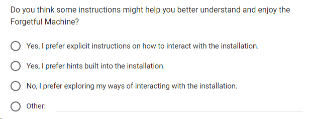
Before the critique, I’ve thought about whether to give guidance to the viewers. Compared with explicit instructions, I think it may be interesting to see how the viewers explore their ways to interact. Therefore, I didn’t give any instructions during the critique.
During the critique, people were actively testing the installation with their presence and movements, but they seemed confused about the relationship between their actions and the installation’s behavior. Upon analysis, I found that it may be due to several reasons:
- As mentioned earlier in this post, the blob detection windows I forgot to minimize have confused the viewers.
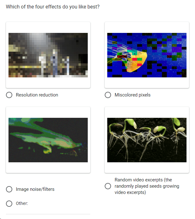
- There were many things going on at once: there were three looping videos and one images with different information, each with a different effect and mode of restoration upon detection of humans. As a result, the viewers cannot immediately observe the changes in the media (the four effects). Since I didn’t give instructions, people crowded in front of the two screens, which made the blob detection harder and the relationship between actions and installation’s behavior more obscure, as they didn’t know if an effect was triggered by themselves or another people in the crowd.
- The installation is designed in a way that the media only destort when people are absent. I learned from Ri’s comment that this logic is counterintuitive yet interesting, so I decided to keep this logic.
To sum up, it seems that the main problem lies in the choice of media and how they were showcased. This brings me back to LadyK’s suggestion: to use media that are relatively similar, or centered around the same topic. Another suggestion was to not automatically loop the videos, which can also help reduce the chaos. Some suggested to choose other media to convey the concept more clearly and I agree, but as mentioned in my previous post, I’ve had a hard time finding the right media to showcase the “memory” that people share in common. Therefore, I put the question below in my Google Form.

The feedback and my observations also make me reconsider whether I should give some sort of instructions before interactions. Therefore, I put this question in my form:

To “measure the distance” between what I wanted to convey and what was conveyed by the installation, I asked the following questions to learn about people’s first impression on my installation:


I also asked about the favorite effect to see if I need to adjust any of the four effects.

Set the scene
Since the Forgetful Machine is about machines, I changed my initial plan of projection to using monitors for media display. Overall, I appreciate my experiment with the monitors because it allows me to see its strengths and weaknesses. Compared with projections, monitors are easier to set up because they doesn’t require keystone adjustment. On the other hand, monitors tend to be small in scale so have limited ability to build up an immersive environment with more visual details.
I learned a lot about scene settings from the feedback and other people’s installations. LadyK’s suggestion of using media as a hint inspired me a lot, as I realized it is possible to include several forms of media in one installation (e.g. screens and projections). One of my favorite installations, created by Kevin and Ziye, impressed me with its scene setting. Based on my observation, the high-level logic of that installation was simple: 1) the projected content was changed every time when turning the pages on the table, and 2) the audio started to play when a person was in front of the table. However, they have collected very powerful media to convey the stress of exams, and the carefully curated scene really adds to that stressful feeling. Another installation that impressed me was by Ri, which was a small tent with many things to explore inside like tiny brochure, screens, and projection. I love how the scene is set up: although it occupied only a small space in the room, it was somehow immersive and different from the surroundings.
Then I reflect on my process of designing the installation. I love coding, and I very much enjoy coding in Max to create attractive visuals. However, what I want and need to learn more about is how to set the scene to help convey my ideas. If I design more installations in the future, I will consider various equipment available, and make better choices of media.
Summary
Seeing people interacting with my installation is truly helpful. It functions like beta-testing in software engineering, from which I see clearer the limitations and boundary of my work. For example, it was after the critique that I realized that my installation performs better when only one or two people are in front of it. I also learned about the “bugs” in my installation, which mainly lies in the media. With the feedback and the critique experience in mind, I have become clearer about the direction in which I need to work harder in the future.
My attitude towards my work has also changed. Before, I wouldn’t think much about iterations of my work after submission. This time, after a brief period of confusion upon the critique, I was able to objectively reflect on the Forgetful Machine. I started to see its potential to become better, and I am eager to make that happen. While it is just my midterm project, I would like to further develop it in the future.
