Mindful Illumination – Midterm Project
MINDFUL ILLUMINATION
– Sylvia Trujillo – Gottfried Haider
1. CONTEXT AND SIGNIFICANCE
Having previously completed a Group Project concerning an interactive artifact, the previous research and insights I gained during the process inspired and helped me when it came time to brainstorm and create my Midterm assignment. By providing me with experience of working together with a team, I developed a better understanding of effective and innovative ways to approach the challenge of unifying the varied ideas of different group members. Not only did different perspectives and diverse experiences allow me to think more creatively, but it also expanded my perception of the possibilities of interactive art and how users can engage with different components of it.
Some previous projects and interactions that I researched during the development of this assignment are the Mindfulness app on the Apple Watch and The Sound Chart created by Nicholas Melendez. These triggered my understanding of interaction, and my definition of it by making me ponder concepts such as; how would viewers react to different colors and how would they associate them with sound and emotions, in what ways do visuals influence you to complete actions without the use of words, what is the user’s response to signals, and do we subconsciously complete actions when we see certain visuals? For my original assignment proposal, I wanted to build a project that would explore the connection that our mind makes between sound and sight through interaction that is fostered by musical expression and visual art. My partner was interested in constructing a meditative tool that would use lights and alarm sounds to help guide the user through breathing techniques in order to help them reach a meditative state. In the end, we ended up pursuing the latter idea, but still integrated some small aspects of the former to create an overall stronger project. Overall, we wanted to discover how we can make visuals affect our emotions in the ways we want?
What makes our project unique is that it combines health and art. Moreover, its significance is to help those who are facing stressful situations by creating a relaxing environment in which they can separate themselves from stressful factors in their lives. It accomplishes this by completely isolating the user and fully engaging all their senses into the experience so they can fully be separated from stress and anxiety inducing factors. Even though our project was took inspiration from already existing technology like Apple’s Mindfulness app, we took it in a different direction, and expanded on the idea by combining both of our designs and developing an artistic system, in order to foster a more engaging and relaxing environment that would add to the experience, as well as make it more interactive for the user. The target audience for our project are those who are dealing with stress. We wanted to create an interactive way of meditation to help users relax and lower their rapid heart rates by encouraging them to take deep breaths. I think there is a wide range of people that could benefit from this, from stressed out students, to those suffering from insomnia, and the interesting interface with lights could appeal to younger kids, even helping them to concentrate too.
2. CONCEPTION AND DESIGN
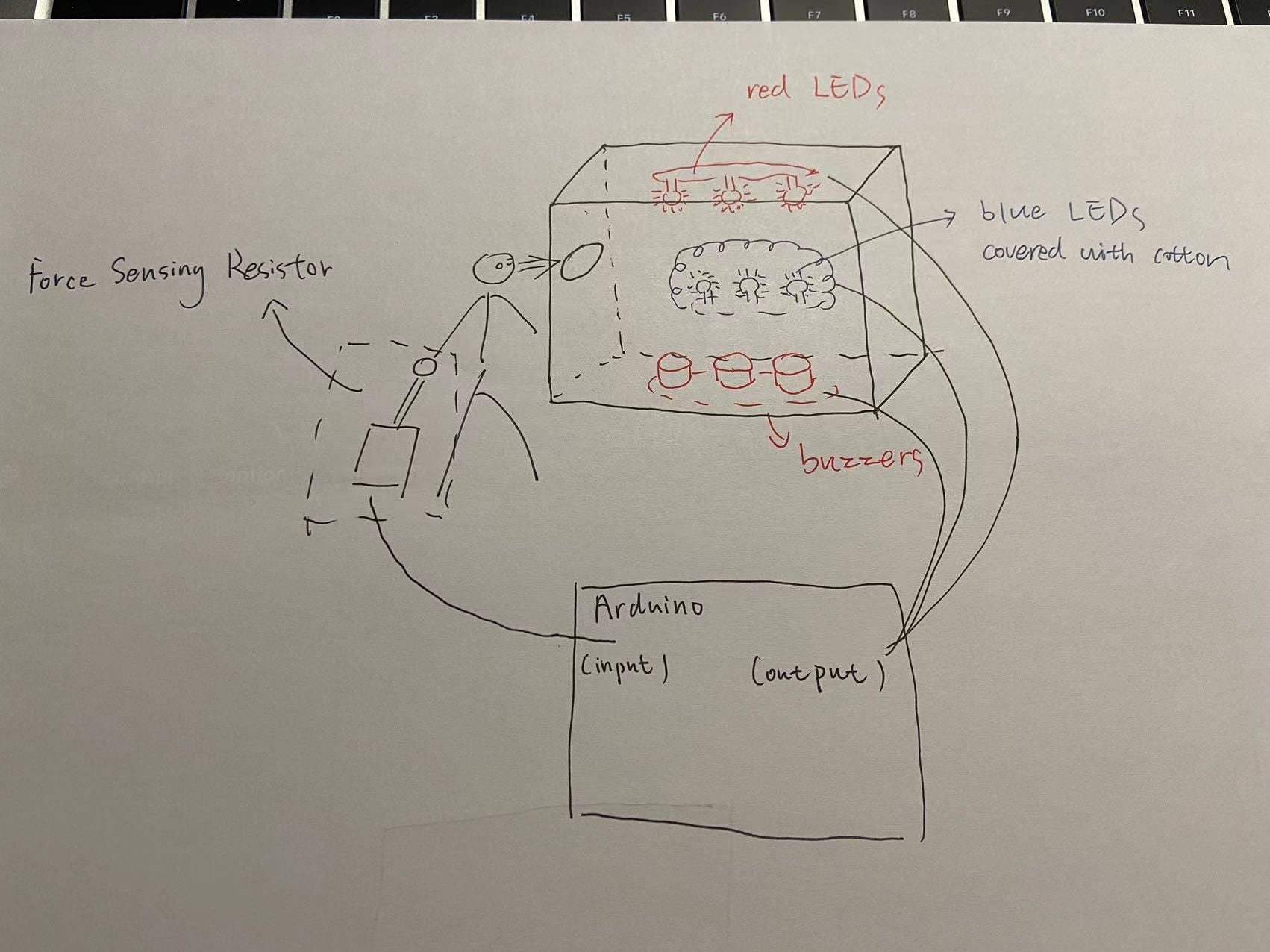
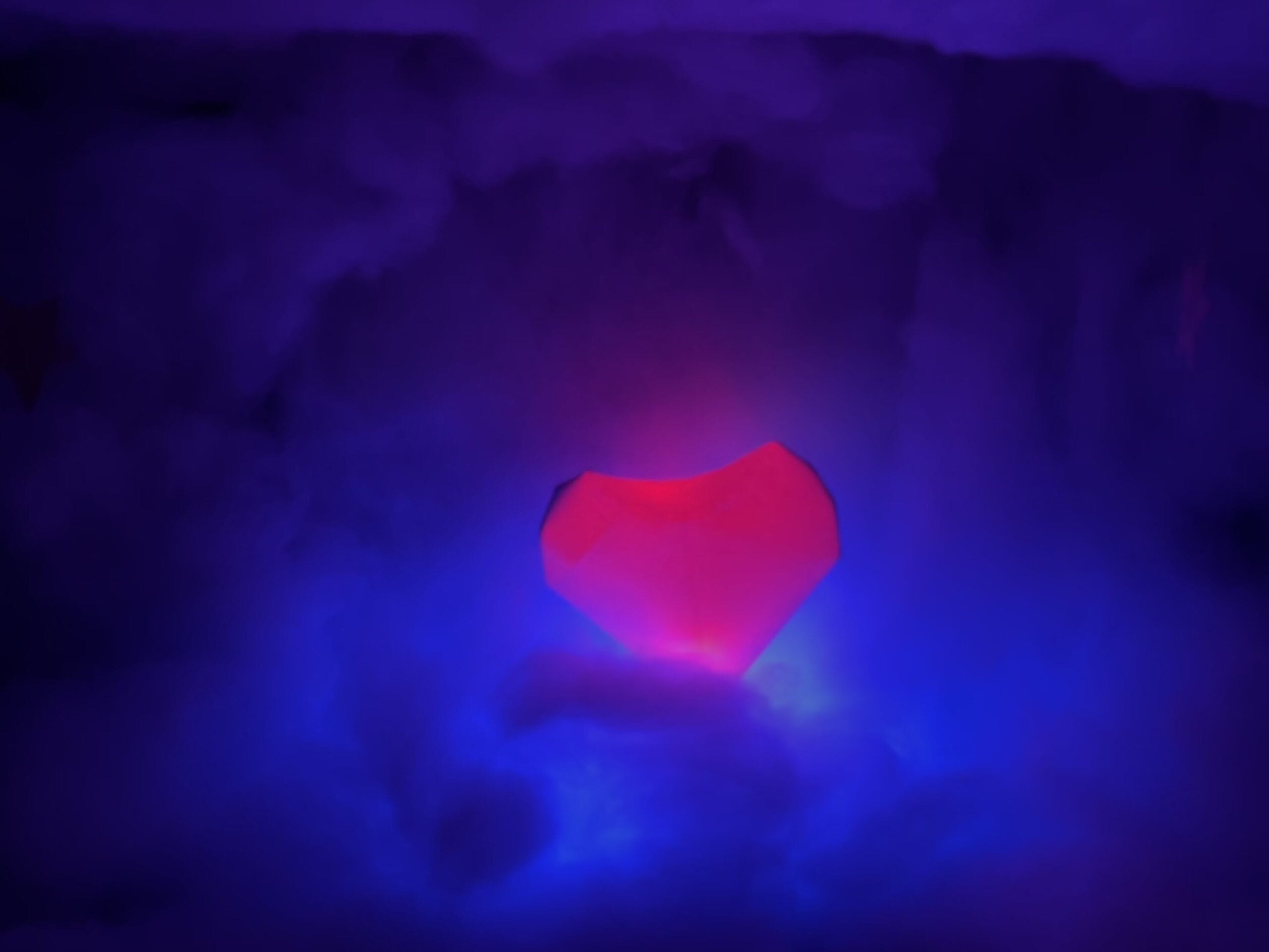
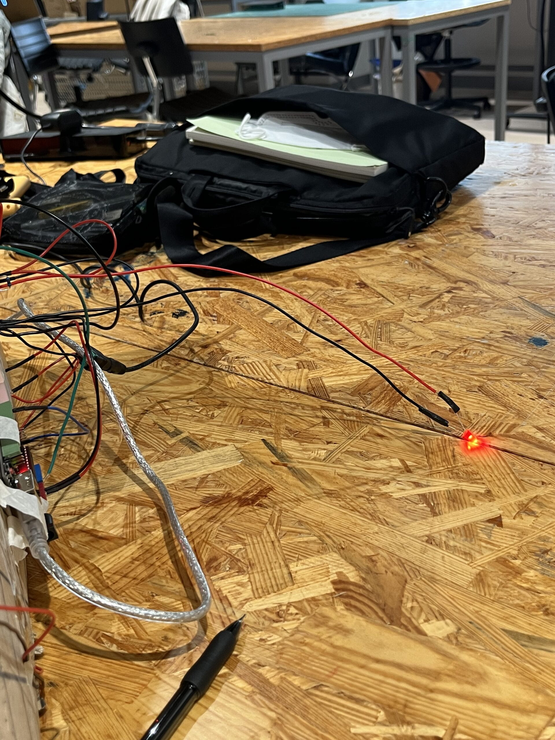
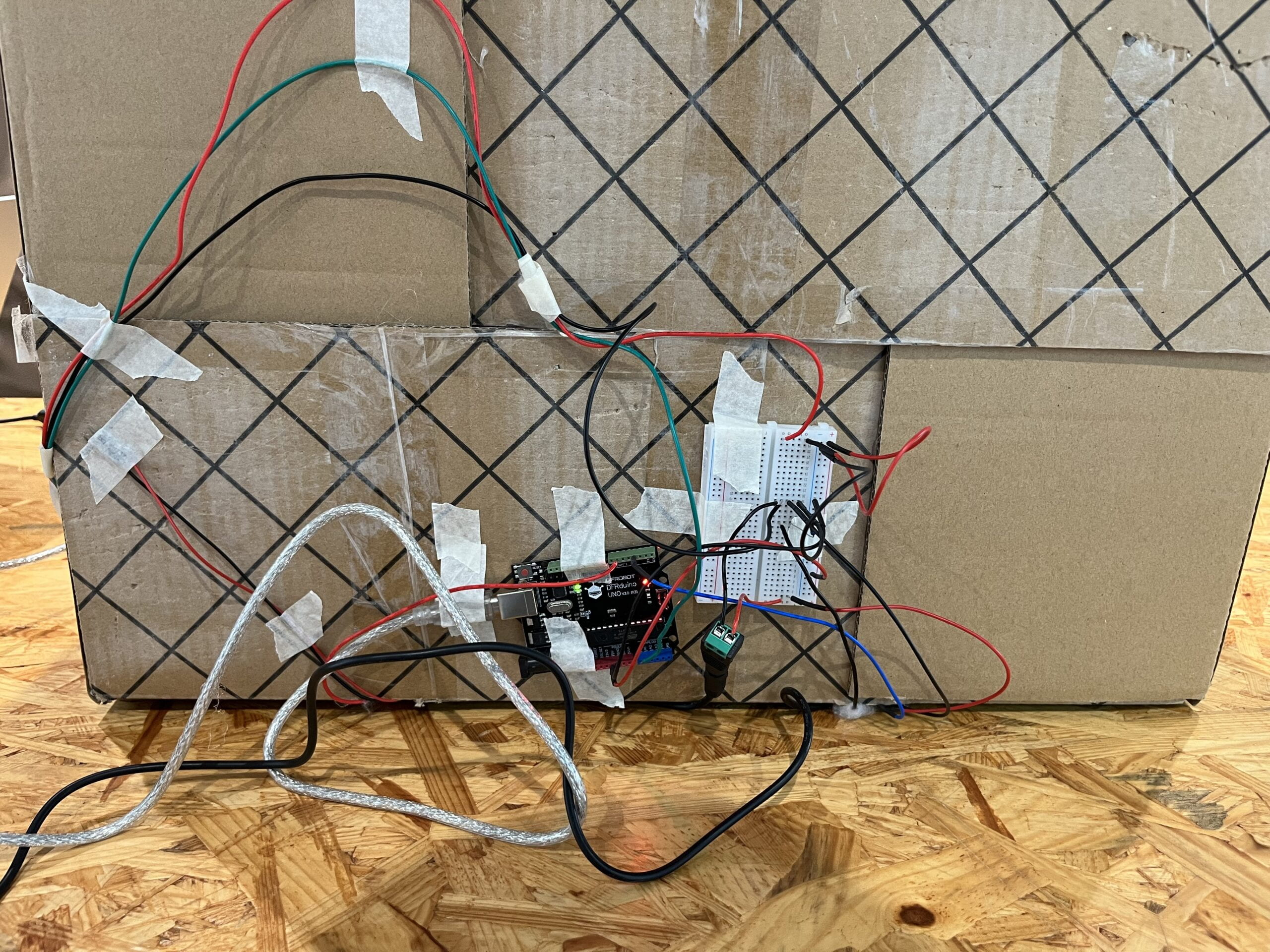
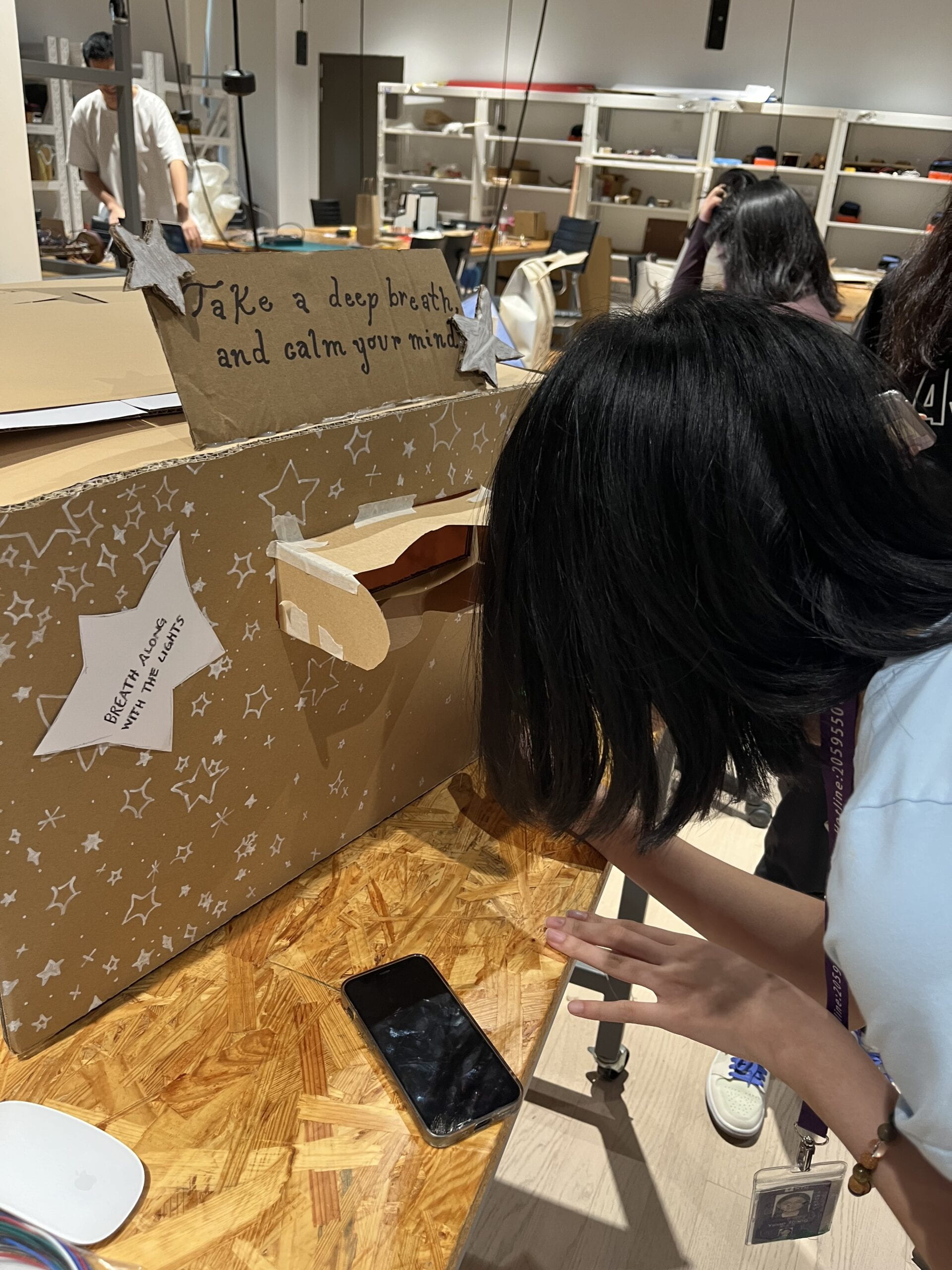
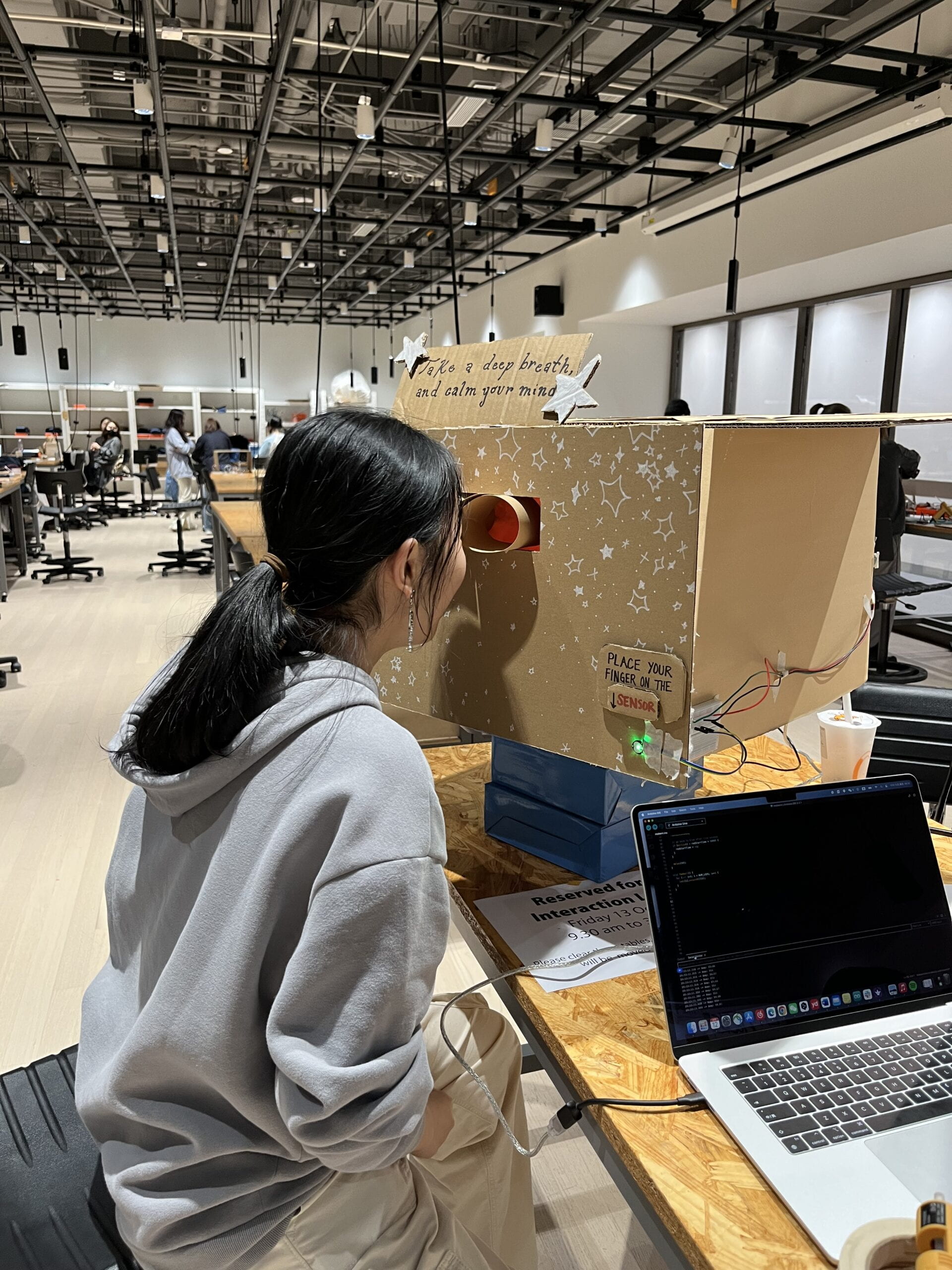
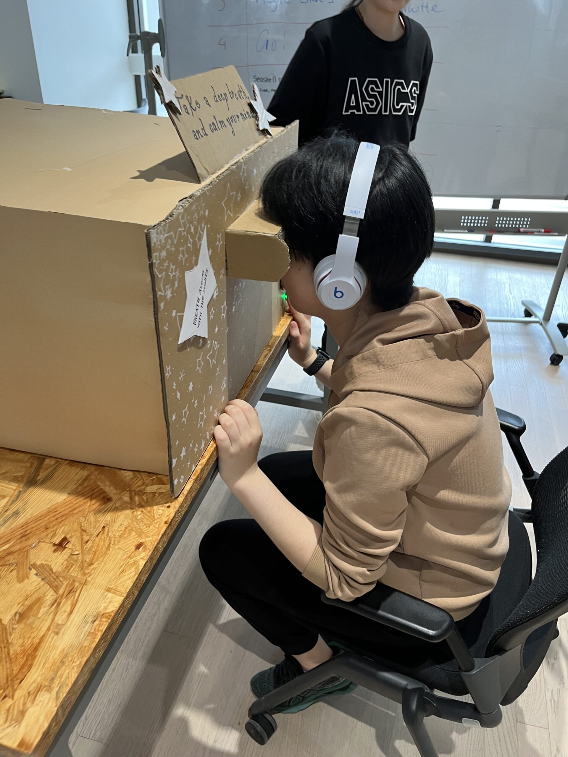
Some ways in which my understanding of how users would interact with our project informed certain design decisions we made such as the choice of visual designs and additional components that would help enhance the overall experience of the user. For example, the pattern that the lights inside the box would follow, as well as their color. Because people tend to naturally associate red with wrong or not good, we made it so the color red would show when the user’s BPM went above a determined “bad” threshold. In contrast, since bright lights and cool tones are often seen as peaceful and relaxing, we had them appear when the user’s BPM began to lower to a more “relaxed” average. Additionally, because we often follow something that is moving and subconsciously sync up with some movements, we had our lights moving in a circle to promote slower breathing patterns. Overall, we also wanted to also create a relaxing environment where they could focus, so we decorated the inside accordingly to not distract the viewer too much, and added headphones that would play music. In order to accomplish this we used a variety of materials. Some materials we used included cotton, arduino components, cardboard, NeoPixel RGB LEDs, small LEDs, paper, string, glue, a computer, and headphones.
The criteria to select these materials was what would most effectively achieve the purpose and function of our project. These were best suited for our project’s purpose because they helped promote user engagement and interaction without making anything too complicated. This was better than other materials due to the simplicity but still clearly conveyed our ideas. During our development of ideas and the user testing, there was a lot of helpful feedback we received. Some options that we contemplated on adding and changing were the threshold that would determine the color of the lights, maybe adding more things inside the box to better guide the viewer, as well as adding more visuals and signs. However, in the end we opted not to construct our project in the way we did because it best aligned with our project’s intent and helped keep the use of our project more intuitive.
3. FABRICATION AND PRODUCTION

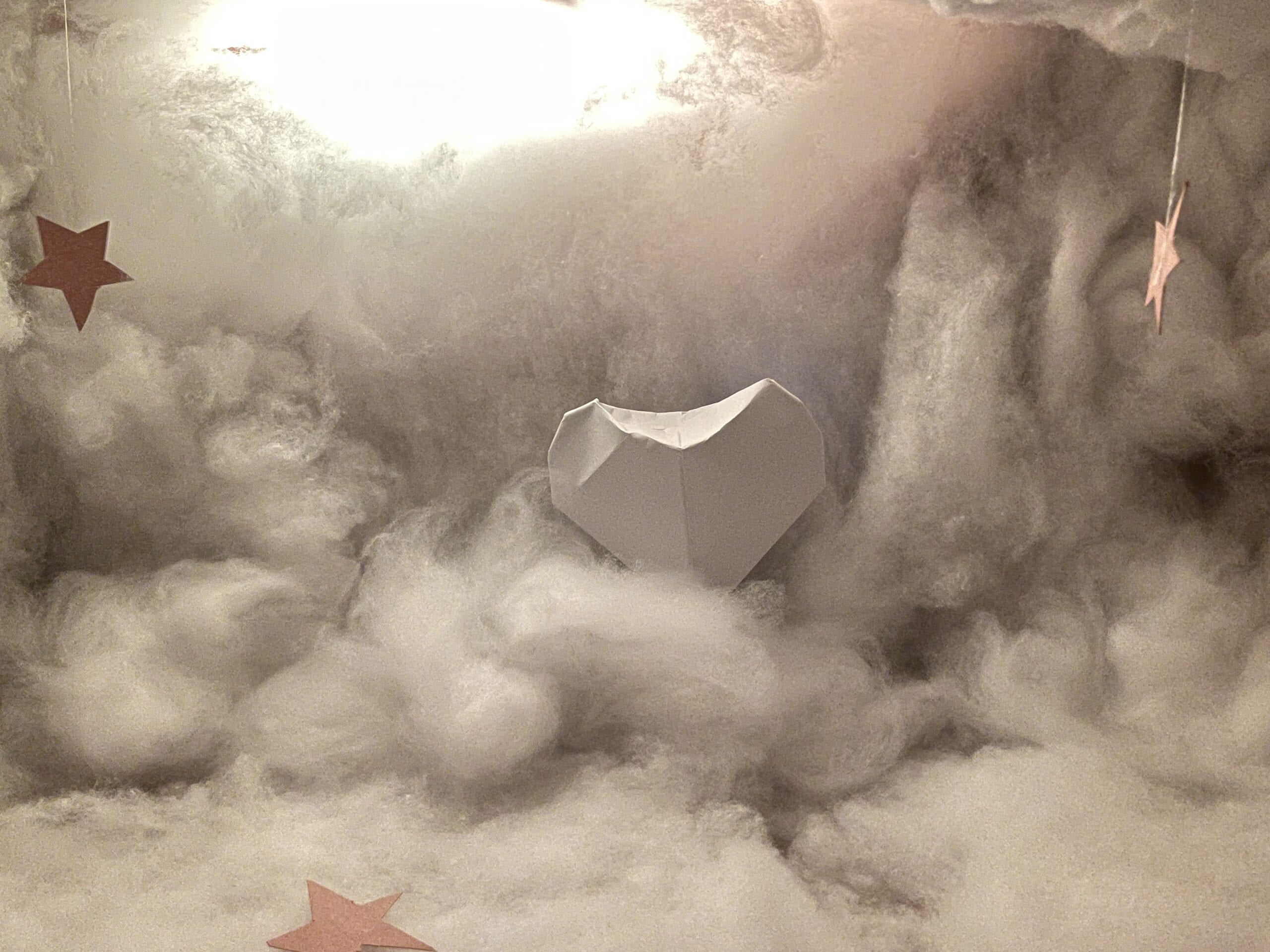
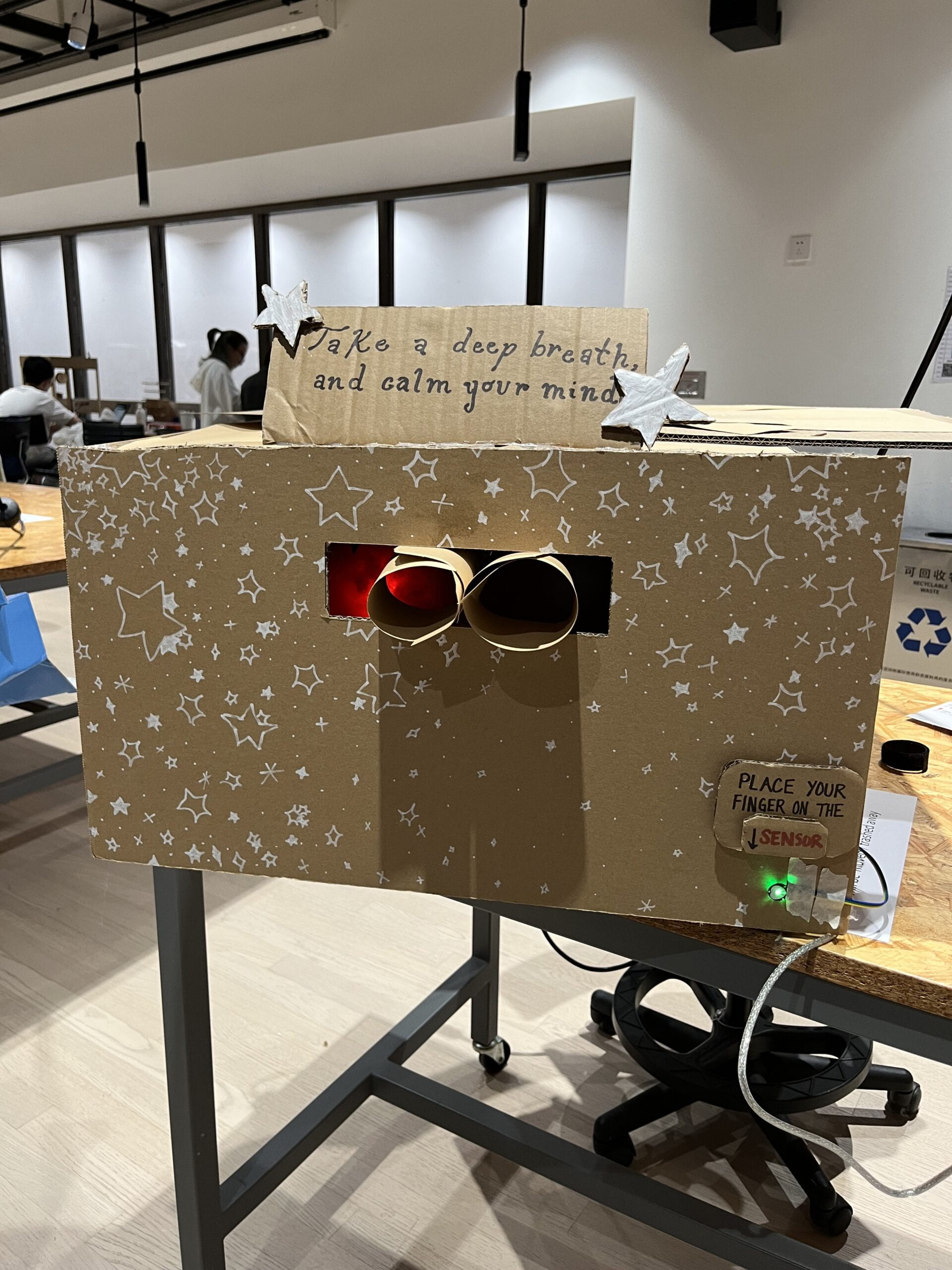
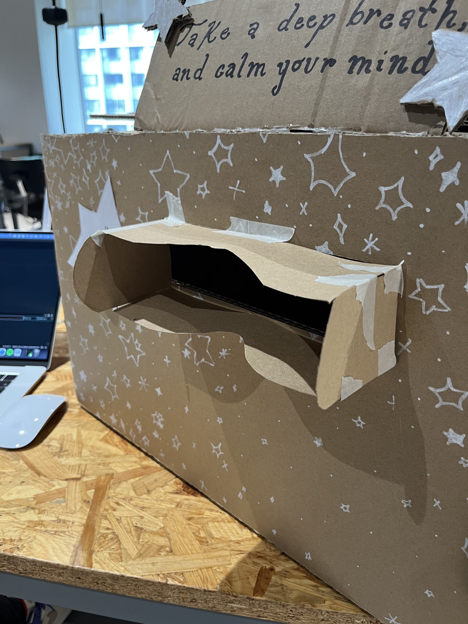
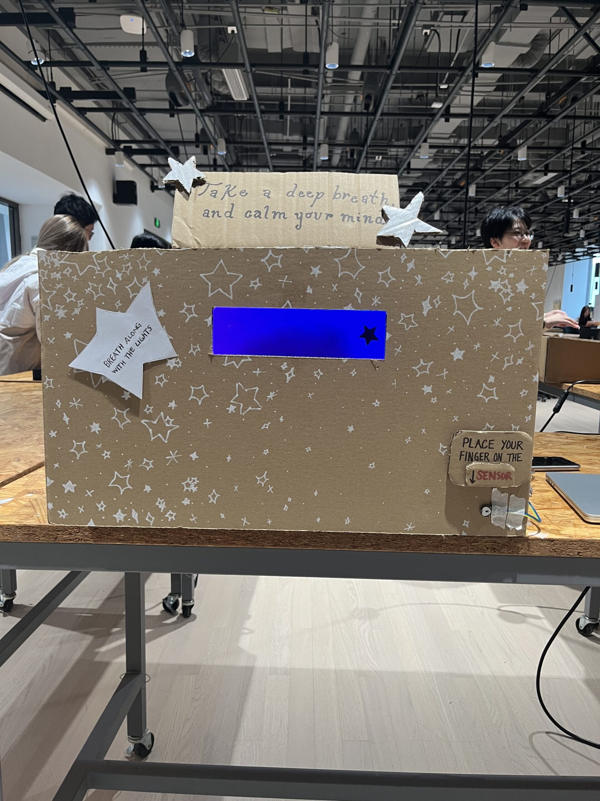
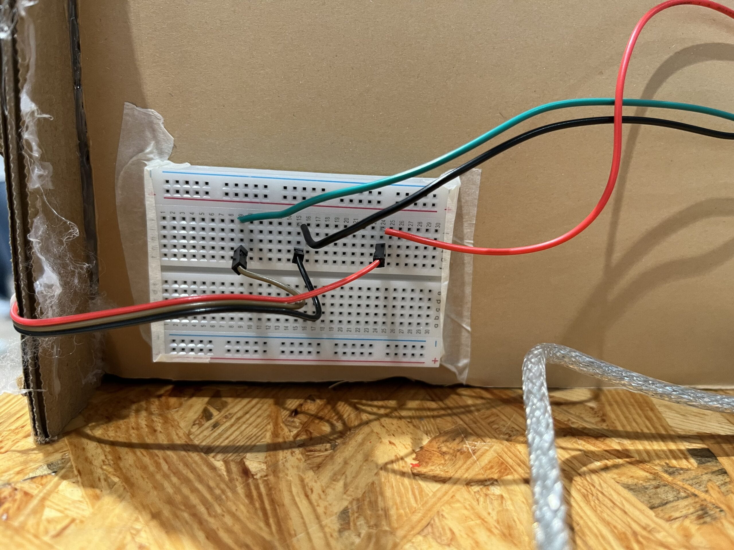
The most significant steps in our production process were the code and the construction and connection between all the different components. The failures we encountered mainly stemmed from the sensor that we chose to use. The Pulse sensor was often very inconsistent with its readings and despite using three different ones throughout our construction process, we still faced wavering results in BPM readings. Additionally, our original plan for light patterns on the NeoPixels was too difficult to incorporate designs requiring certain amounts of time in delays, and therefore the readings from the sensor were slowed down due to all the accumulation of delays. In the end, we had to simplify our code and attempt to find an appropriate threshold to set our sensor to for clearer pulse readings. On the other hand, the successes of the project were that despite some inconsistent readings, the code correctly worked in the ways that we intended and the lights matched the data provided by the user. Most of the user testing volunteers also found the project to be pretty intuitive even though it was based on more complicated concepts. They also agreed that like our intent, the environment created was very peaceful and relaxing.
The contributions and roles I personally made to the process and project along the way were mainly in concept design and coding. Even though we had not learned how to code many of the components we wanted to add, professors and learning assistants helped us a lot. We referenced the future slides of 6.1 for time & state, and 9.1 slides for serial communication. Although my partner and I worked together in all parts of the project process, I found that I spent more time coding and they spent more time in the physical assembling of the box. Nevertheless, we always made sure to make all decisions together and constantly ask for feedback from each other.
I believe the User Testing Session was very successful and helpful. The User Testing influenced some of our production decisions like creating a clearer viewing section, making the environment darker, adding music, and adding a visual inside the box that would show the viewer their pulse in a not too distracting way that also would blend in seamlessly. Although some were effective, others we were unable to add due to material and time restraints. Also, for our project’s goals, some of the production choices suggested were not necessary or made the interaction more complicated than it needed to be.
Code:
| #define USE_ARDUINO_INTERRUPTS true #include <PulseSensorPlayground.h> #include <FastLED.h> PulseSensorPlayground pulseSensor; #define NUM_LEDS 64 #define DATA_PIN 3 #define Pin 6 CRGB leds[NUM_LEDS];// Variables int bpm = 0; float avg = 0.0; long redStartTime = -1; int curLed = 0; // for red and blue phase uint8_t curHue = 0; // for blue phase int curDir = 1; // for blue phasevoid setup() { /** * Configures the Pulse Sensor and sets up the Serial Monitor, also blinks the LED when a heartbeat is detected. * This was adapted from a the tutorial found here: * https://pulsesensor.com/pages/getting-advanced */ Serial.begin(9600); pulseSensor.analogInput(A0); pulseSensor.blinkOnPulse(6); pulseSensor.setThreshold(504); pulseSensor.begin(); FastLED.addLeds<NEOPIXEL, DATA_PIN>(leds, NUM_LEDS).setCorrection(TypicalLEDStrip); FastLED.setBrightness(150); // fine because using external power supply }void loop() { /** * Takes the raw BPM data collected by the sensor and finds the average to print on the Serial Monitor. * This was adapted from a the tutorial found here: * https://pulsesensor.com/pages/getting-advanced */ bpm = pulseSensor.getBeatsPerMinute(); Serial.print(“Raw: “); Serial.println(bpm); // do some averaging on the bpm avg = avg * 0.95 + bpm * 0.05; Serial.print(“Avg: “); Serial.println(avg); // go to red phase if pulse is above threshold /** * If average BPM is above the set threshold the lights will turn red, and if it is below the lights will turn a variety of colors. * This was adapted from a the tutorial found here: * https://fastled.io/ */ if (avg > 90.0) { redStartTime = millis(); } if (redStartTime == -1) { // blue phase leds[curLed] = CHSV(curHue++, 255, 255); curLed = curLed + curDir; if (curLed >= NUM_LEDS || curLed <= 0) { curDir = curDir * -1; } fadeall(); FastLED.show(); } else { // red phase leds[curLed] = CRGB::Black; curLed = curLed + 1; if (curLed == NUM_LEDS) { curLed = 0; } leds[curLed] = CRGB::Red; FastLED.show(); // go back to blue after five seconds if (millis() – redStartTime > 3000) { redStartTime = -1; } } delay(50); }void fadeall() { for (int i = 0; i < NUM_LEDS; i++) { leds[i].nscale8(250); } } |
4. CONCLUSIONS
Overall, the goal of our project was to help users relieve stress and lower anxiety through slowed breathing, reduced heart rate, and a calm environment. I think our project did an effective job of achieving this because users confirmed that when interacting with our project, they felt very engaged and relaxed. These results also align with our definition of interaction because it requires constant user interaction and engages all the senses of the viewer for a fully immersive experience.
Nevertheless, the project results also do not align with my definition of interaction because there is still a very low level of interactivity demanded from the user, and due to some sensor issues the project would still run even if no one was interacting with it at the time. Still, based on both my definition of interaction and my expectations of our audience’s response, ultimately our audience interacted with your project by inputting data through the sensor, which is then processed by the Arduino, and provides an output through the lights it shows. The user then views the lights, processes them, reacts to the components, and outputs a result through the way in which their BPM is affected.
If possible, a way in which I would improve our project if we had more time would be to have better production of the physical box, spend more time to develop the light patterns, and attempt to find a better sensor so that BMP readings are more accurate. Some values I learned from setbacks and failures were to always keep trying and ask for help, as well as take breaks. If we were ever stuck on anything it was good to take a step back and gain a clear and different perspective. Some takeaways from our accomplishments are that even if something sounds too complicated, approach it in steps and don’t be afraid to try things you are unfamiliar with. Even if something doesn’t seem possible there are many resources to help guide you and support you throughout the process.

