This section is to respond to questions from students only. To comment on an Assignment, please go to the respective assignment (scroll up)
Explaining Sales growth
1.Calculating the variance
To calculate the variance, delta, or difference follow this steps:
1.Begin with the end. Compare the sales of Period 1 with Sales of Period 2. For example, if sales in 2021 were 100 and in 2022 were 120, the variance is 20.
Then, try to find out what were the drivers for that change of 20. You need to identify four drivers that add up to 20, by following the same process.
2. Companies changing the way that they report
For Disney, I tried to compare their Revenue in years 2021 and 2019. I found that Disney changed the format of P&L. Could you please suggest how to compare the Revenue?
Let me try to respond to your question and then add more on what would be the best way to go about it
Companies frequently change the way they are organized, which makes historical comparison much harder. Here is how to solve the Disney comparison
1.Begin with the end: you need to identify 4 different buckets for the sales change
In 2021, you have the data displayed into 2 main buckets:
Disney Media and Entertainment Distribution
Disney Parks, Experiences and Products
2.What you want to do is to identify 2 other buckets that are big. Linear Networks in the new reporting is similar to Media Networks in the old reporting. Isolate that as the third bucket. Then try to find a fourth bucket that is similar in both periods. The difference will be “Other”
Having said that, the disadvantage of doing this way is that this would be an “accounting” sort of explanation. It would be much better if you were to first look at the growth in sales from 2019 to 2021, and then try to find the main drivers by doing research on Disney. For example, the streaming business is likely to be an important driver. What you could do is separate that as one of the drivers, and then try to calculate the difference for other segments. If you do that, please make sure that: 1)your total sales numbers tie with what is on the annual report 2) the drivers you identify are not double-counted.
3.I did not want to use the same example you showed us in your video to show the sales growth from 2018-2019, but after looking at previous years, 2018-2019 has the most increase in sales growth reflected. Will that be ok to use even though it will reflect the same as your example in the video?
Yes, you can use the same periods I used in the video.
The objective of this assignment is for you guys to learn how to explain the change in sales growth from one period to the next. You could also use other drivers, such as regions of the world.
4.Finding the drivers of Sales growth in the Annual reports
I’m basing this off of McDonald’s 2018 and 2019 annual reports. Total revenues:
McDonald’s 2018 Revenue = 21,025 billion (rounded up to 21.03 billion)
McDonald’s 2019 Revenue = 21,077 billion (rounded up to 21.08 billion)
So these two values would be the outermost columns for my waterfall. With an increase of ~50 million in-between.
Yes, the difference will be 0.05 Bio. You will have $21.03 and $21.08. It’s better to keep it in Billions to make the point that “it’s a rounding.” For 2020 vs 2019, it’s a whole different story.
I’m also struggling to find 4 or 5 drivers since McDonald’s annual report does not break up their reports per product and they lump all international markets together.
Acquisitions seem to be grouped and I found foreign exchange (forex). I’m struggling to understand where I would find volume and pricing.
Is it possible for this assignment to take some of the waterfall columns from the annual report and estimate the others based on research? Or if it’s mixed is it better to just estimate based on research to be more consistent throughout the assignment?
It’s a pity that McDonald’s doesn’t disclose volume figures. The current CEO once worked at P&G. Hopefully, investors would get more transparency in the future about the number of units sold.
Regarding Pricing, we could use the BigMac index as a proxy, but even if we do all that work, there is no transparency about other drivers. We could replace Acquisitions with “net number of stores”, but we would still be missing other drivers of growth.
Your best bet with the numbers provided may be to use the regional/or by type method instead. We have data for 3 regions and for 2 methods/type of business (company-owned and franchises)
I’ve downloaded all these numbers to Sales growth template v5 and added slide 7 to the deck. It looks like this (if you want to use it). Those files have been uploaded to resources so others can use them as well
5.About the waterfall
Watch a video I made with step by step instructions here:
https://nyu.zoom.us/rec/share/7E35KqB96pZrOQXtaZ9yAvsdYRb4dSWiSPKSR4_5Qp3G15es0hQrPuM05Gx9lcHh.YBksx0Syf0ET57j2?startTime=1601060959000
I have encountered a problem with my homework. Now I need to convert excel to waterfall in PPT, but when I copied the blue part of the data in excel and paste them to the waterfall template in PPT, I found that all the data became 0. I try it many times, but the waterfall can not formed. I’m not sure if there is a problem with my excel or my operation? I attached my Excel to the email. Please enlighten me further. Thank you very much.
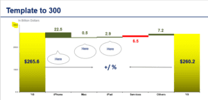
This is what your data looks like:

There are 3 reasons why you may be having trouble:
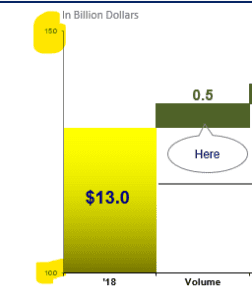
- The range of the axis
In your case, the sales range from $266 to $260, but the scale of the axis is set to 10-30

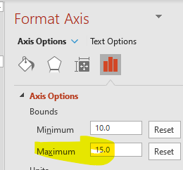
Please change the scale of the axis to a maximum of 300 To do this:
1.Stand on the axis
2.Right click on it
3.A format axis will appear in the right-hand side
4.Change the range to a maximum of 300, with an interval of 100

The chart will then look like this

Next, we need to change the order of the data
2. Order of the data
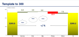
We need to list the changes in decreasing order for the colors to be automatically updated in proper order. This will also make it easier for the reader to see. Swap the order of Service and Iphone
Your chart will then be ready to use and it will look like this:

3.Not copying data as values
When you copy the data into the Powerpoint, make sure to copy it as value.
If this solves the problem, please let me know.
6. When I’m pasting my excel (orange & yellow table) results into the template in PowerPoint, the result returns zero every time and thus ruins the whole waterfall.
There are 3 reasons why you may be having trouble:
- The range of the axis
In your case, the sales range from $21 to $13, but the scale of the axis is set to 10-15
Please change the scale of the axis to a maximum of 25 and a minimum of 0. To do this:
1.Stand on the axis
2.Right click on it
3.A format axis will appear in the right-hand side
4.Change the range to a maximum of 25, with and a minimum of 0
Next, we need to change the order of the data
- Order of the data
We need to list the changes in decreasing order for the colors to be automatically updated in proper order. This will also make it easier for the reader to see.
Your chart will then look like this:
Finally, change the color for Media Networks and Studio to red (right-click on it and change data point) Then the chart will look like this:
3.Not copying as values
When you copy the data into the Powerpoint, make sure to copy it as value.
If this solves the problem, please let me know.
7.When transferring the data from the excel sheet to the waterfall template, the data seemed to transfer but two of the lines in the waterfall were not drawn (fragrance and haircare). Each of these categories had the number 0 but no line was drawn below or above it. However, I noticed with my “other” column, though it read as 0 when looking at the data on excel it actually was 0.02, so there is a line even though it still says 0.
I went ahead and changed the “upper box” number on both fragrance and haircare to 0.01 and now it shows a line. Is that incorrect to do? I just wasn’t sure of another way for there to be a line drawn to represent 0.
The reason why PowerPoint doesn’t draw a line is that the value is zero. These are the solutions
- The safest way would be to change the cell in the orange box to a number greater than zero (0.01 or higher). That way you leave the formulas unchanged.
- Yes, you can also do what you did
- The other way to do it is to manually draw a line. Too much work in my opinion.
Leave a Reply