Access Link: here
Access Link: here
Film: Parasite
Scene: The plan to get rid of the old housekeeper
Scene link: https://www.youtube.com/watch?v=NfnUxezKcu0
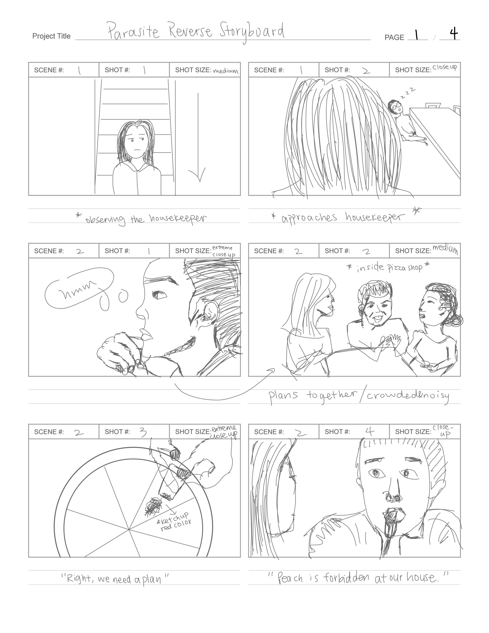
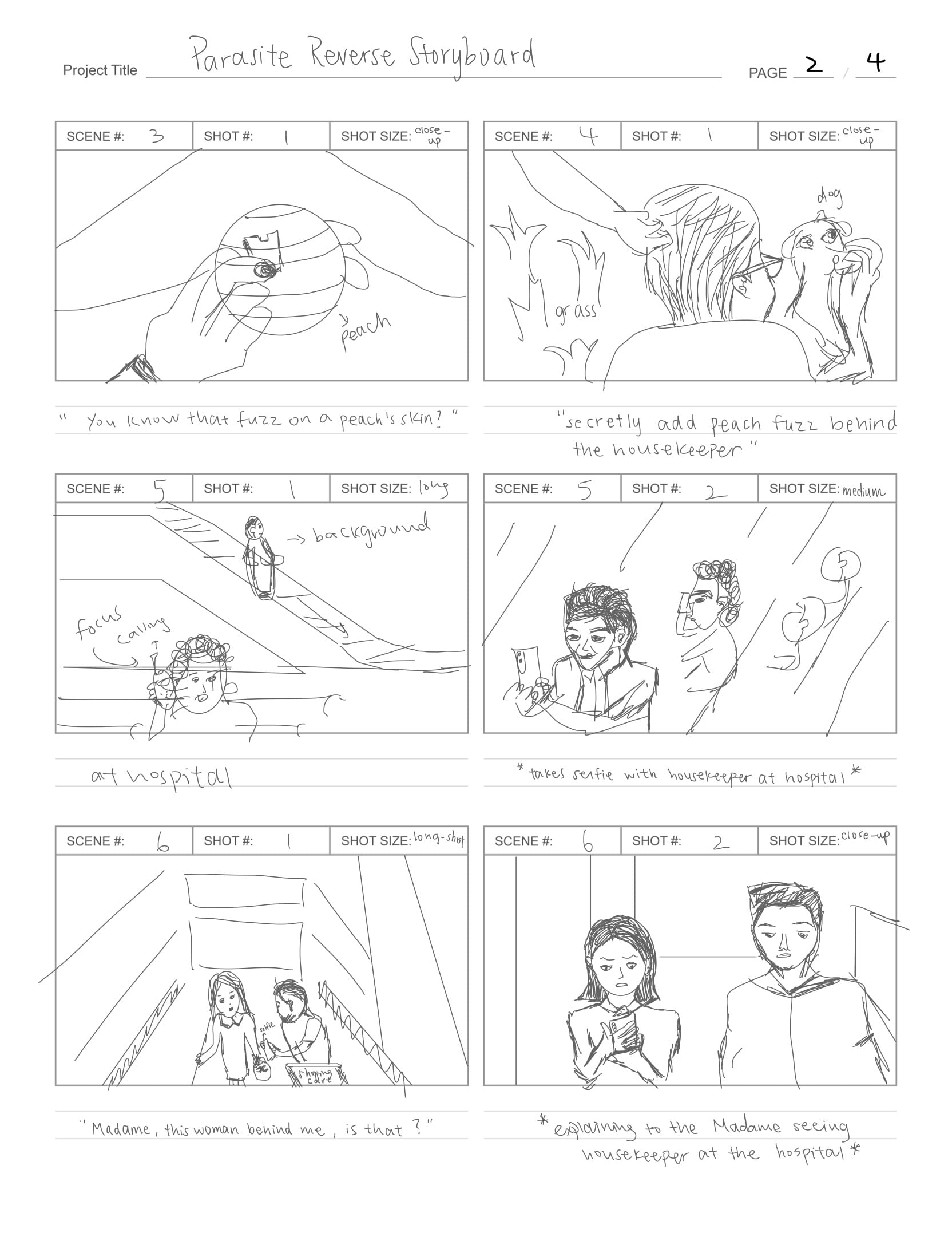
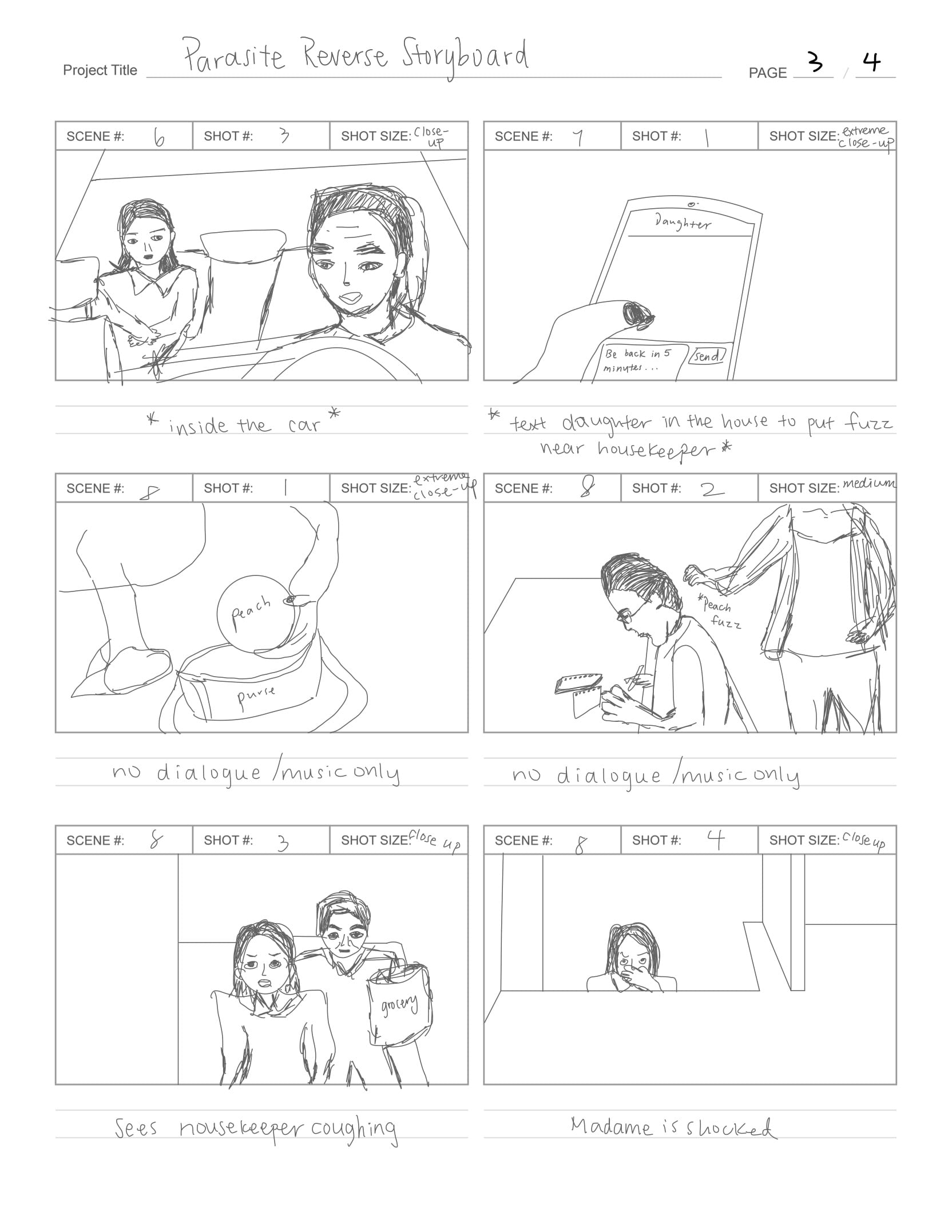
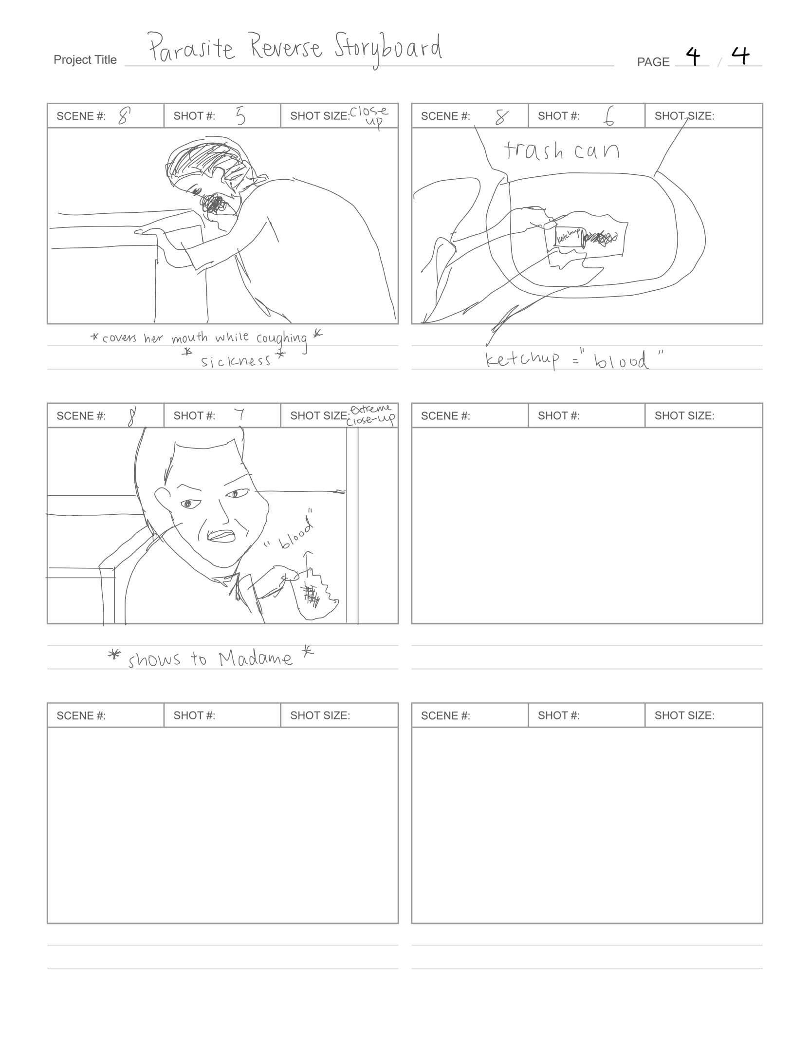
Project Reflection
The memory that I have chosen for the assignment is when I was a kid hearing my dad cooking for me after coming back from school. This cooking routine was a large part of my youth memory because when I was younger, I’ve always never thought about how much effort and to work it is to cook different dishes every day, especially when cooking Chinese-style dishes. For the sound file that I submitted, I focused on the actual sounds of the memory in order to straightforwardly convey what’s happening to the audience. I planned for my soundscape to show solitude, growth, and adulthood responsibility. However, for the resubmission, I plan to focus more on the feeling aspect of my father, showing the rushing movements and his mood being in a hurry.
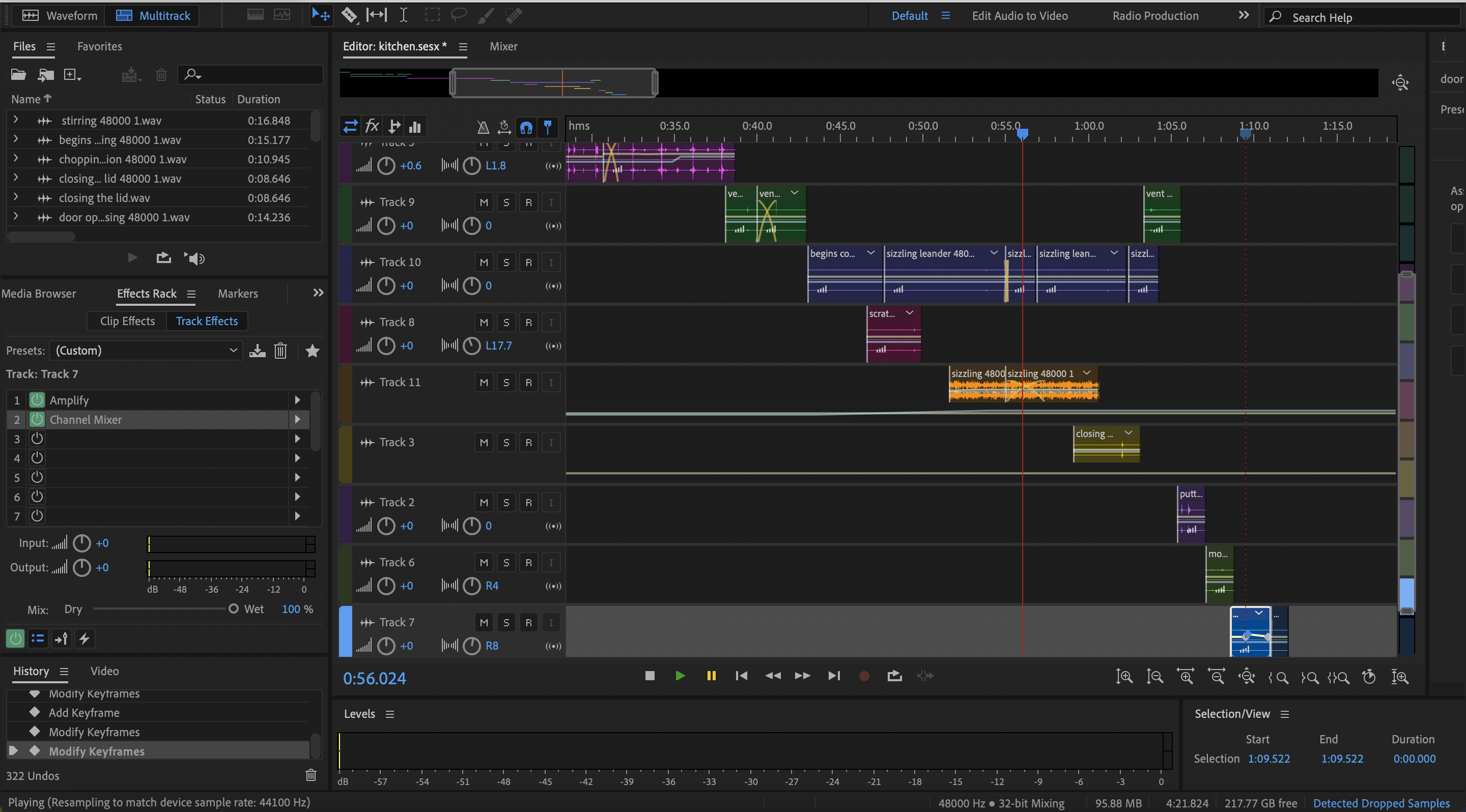
When collecting sounds for this project, I experimented with creating different sounds that I hear when people cook, including footsteps, ventilation, chopping, slicing, cutting, water dripping, putting plates on the table, and finally opening the door to wait for me to come back from school. When recreating these sounds, brings me back to my childhood when my family would cook for me every day, unlike now in college where I learned how to cook for ourselves. For most of the sounds, I placed the Tascam recorder at a fixed spot close to where I created the sounds. Overall, the only problem I encountered was the sounds being too light the first time I recorded them, I then turned up the volume on the side of the recorder and retried recording, but it was too loud. So I had to readjust to find a fitting volume level for my sounds when editing them in Audition.
As for my editing process, I wasn’t sure what effects exactly I should add to convey a mundane and mature feeling. As previously mentioned, I adjusted the DB level for my sound clips because some were extra loud while some were very light sounds. I amplified them a bit and I also played around with panning and only heard some sounds on the left and some sounds on the right to create a more realistic kitchen environment. I also changed some sounds’ volumes to gradually increase but it didn’t show up well in the final soundscape clip. Some learnings I have after editing on Audition would be to explore combining the sounds instead of putting most sounds in sequence, with one after another.
If I had more time, I would improve my project’s sounds to be more surprising to the audience and less obvious. By this I mean to add more surprises and keep the audience engaged because my clip was edited to be in a very sequential manner and the audience could guess what the next sound would be. This doesn’t very much convey a feeling to the audience. On the presentation day, I received feedback as the sound was too realistic and there wasn’t much anticipation of wanting to know what was happening from the sound clip. I agree with this comment and I will note this when I re-edit the sounds as I plan to play around with merging them and as well as adding repetitions of sounds to make it more interesting to the audience.
My work in Adobe Audition:
Response
The significance of authenticity and representation of the media that I consume on a daily basis plays a big role in shaping my view of the world and following up with what’s happening. Consuming what is true is something that I prefer rather than trusting what might have been made up of, where the source is unreliable. This reading said about how sometimes documentary forms create false intimacy and even false presence, so media like this will lead people into building wrong knowledge caused by misinformation.
The role of a live broadcast would be to provide a moving and lively image media source that tells truth to the audience and allows the audience to imagine in their head something that they might not be able to imagine through a still photograph.
Photo Diptych Project Ideation & Reflection
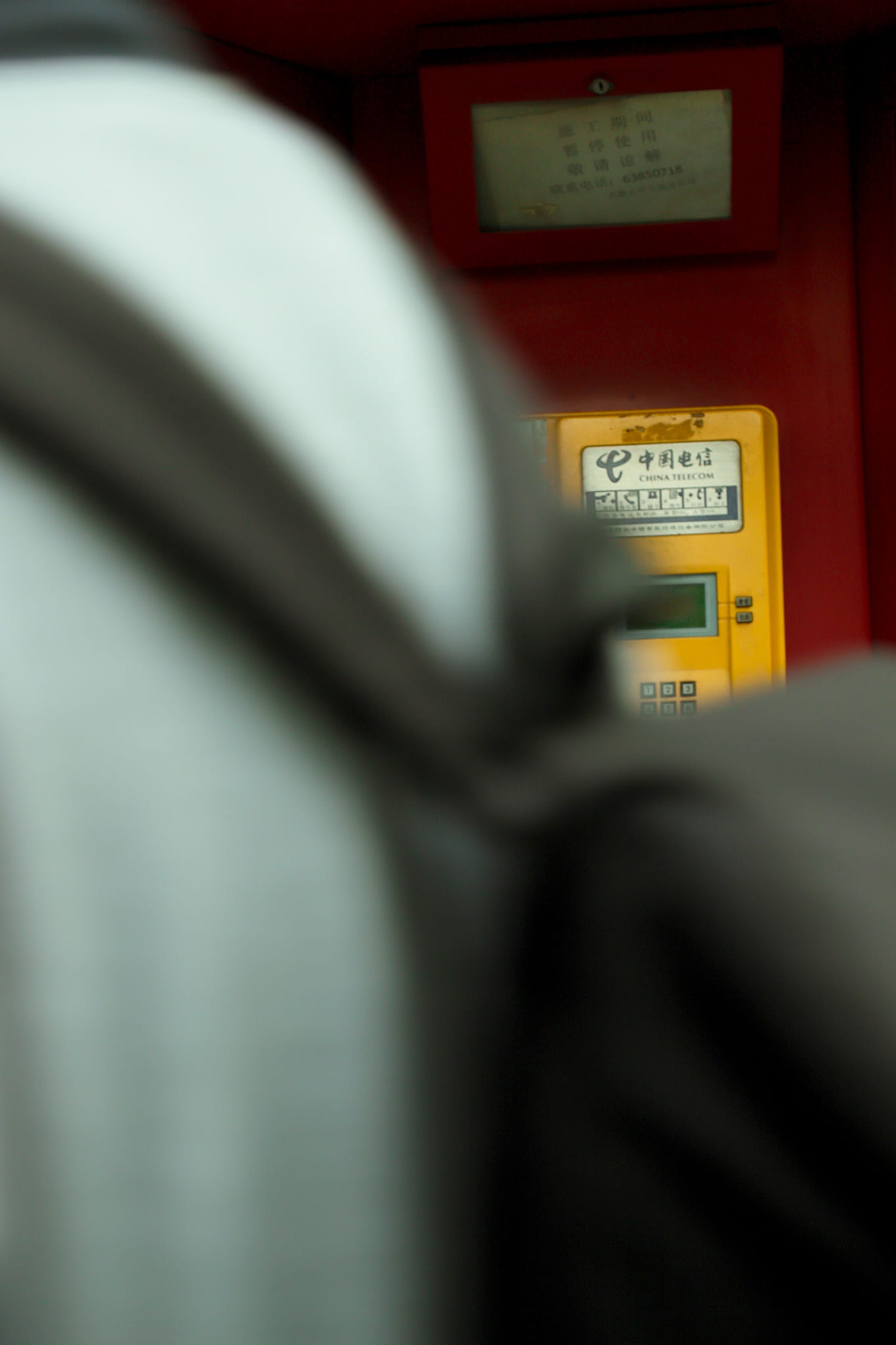
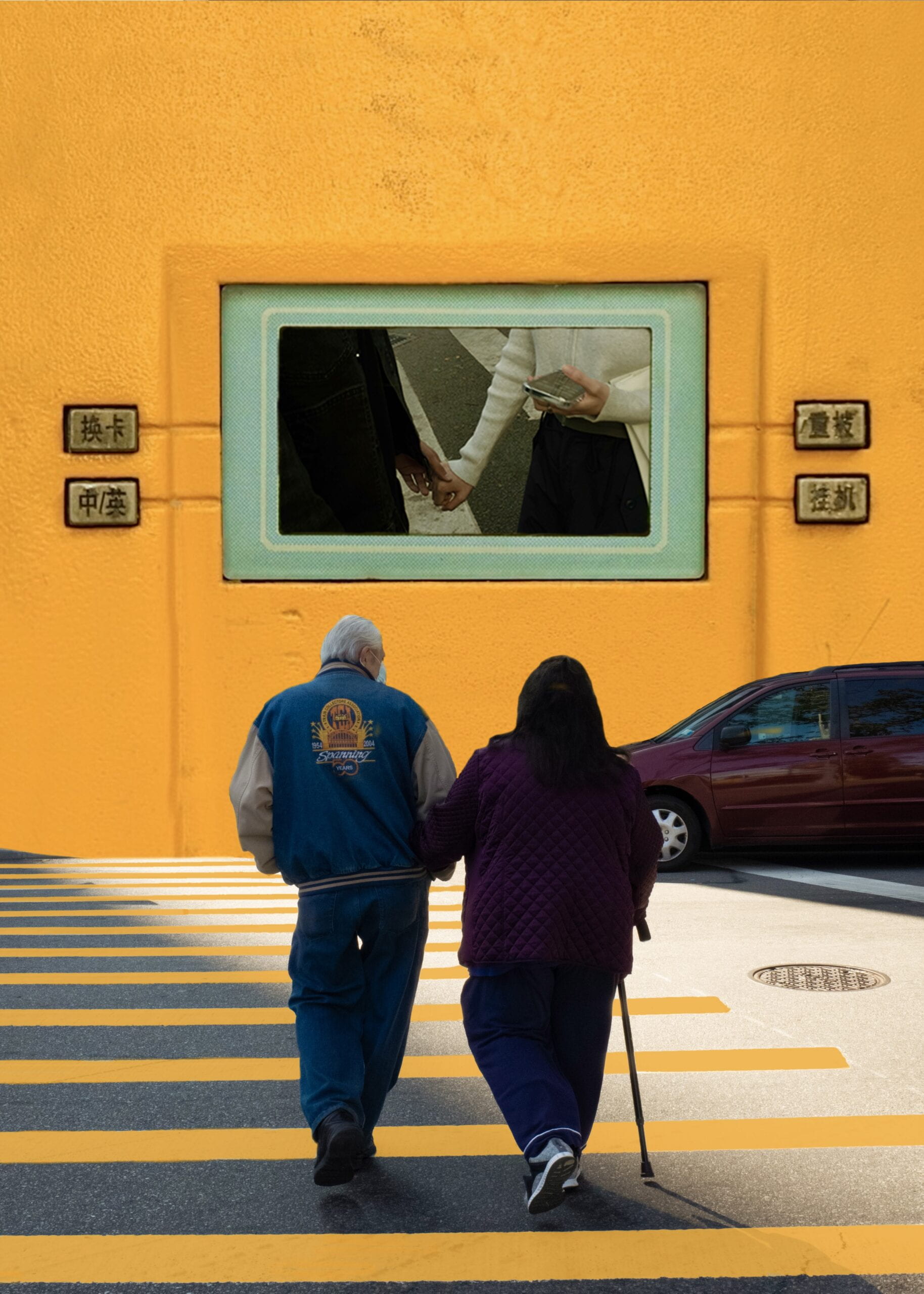
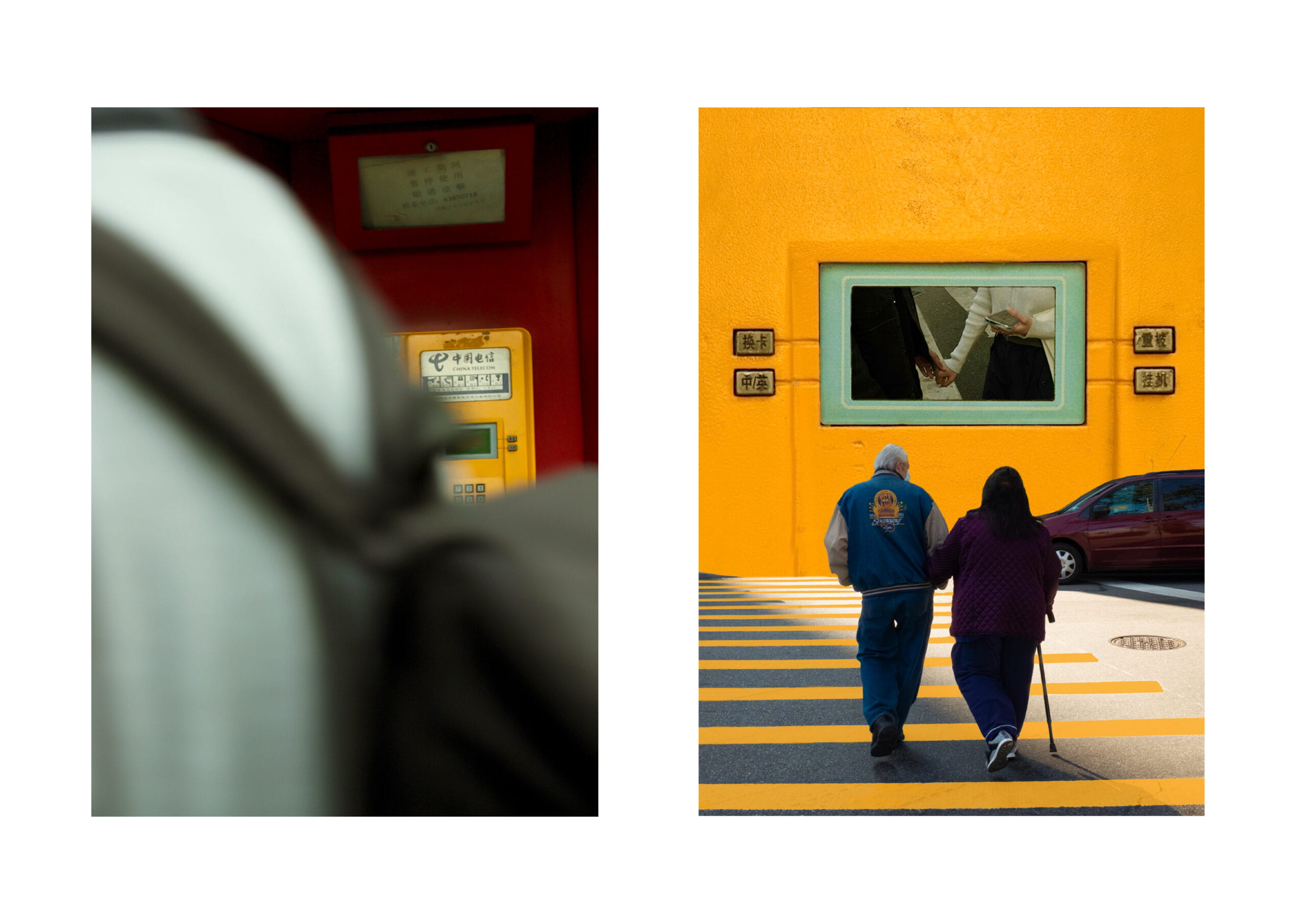
My original concept for my diptych is to take pictures of anything that reveals uniformity, whether it’s the same patterns or same character movements. The photoshopped image would consist of adding unexpected color combinations to objects that don’t usually go together. After taking pictures and putting them together onto the contact sheet, I decided to change my concept for the diptych to create mystery and peek into the past of one’s life in a cinematic style. For my first photo in the diptych, I selected a photo of someone quickly passing by an old fashioned telephone booth. For the photoshopped image, I used a close-up photo of the telephone stand and added photos I took of an old couple walking and a young couple holding hands. These two paired images relate to one another as the telephone booth symbolizes the passing of an era and how it’s almost eliminated by today’s society because nowadays people use smartphones and rarely use telephone booths. However, in the old people’s youth, these telephone stands were commonly used. In a way, the telephone stand symbolizes looking back at the time that has passed.
In staging and photographing part I, I looked around the streets of Shanghai of objects that represent uniformity and have history behind it. While walking on the streets in Puxi, I came across these telephone stands that people always pass by and its colors caught my eyes. I took photos of it from different distances and angles, with people and without people. The final photo I picked for the project only shows a partial view of the telephone booth in the composition and the overall color is very muted to portray a cinematic effect:
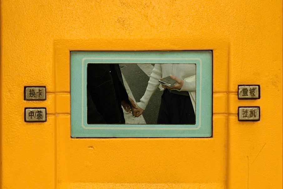
In creating the part II image, I really want to work around this close-up photo of the telephone stand because I see possibilities in masking the center screen display to reflect the 20th century Shanghai street scenes. I realized that this may be too simple and I want my photoshopped image to have more layers. I thought that perhaps I can incorporate a photo of couples walking into their past, that’s shown on the telephone screen display. So, I first added masking to the telephone screen display and changed it to displaying a young couple holding hands:
Then I merged that photo with a photo I took of an old couple passing the crosswalk holding hands. I also changed the colors of the crossings to yellow so it matches with the color on the telephone stand and creates an effect that they are walking into the world inside the telephone stand:
During the process of creating the diptych, the most significant steps I have taken would be choosing a photo to work with from my contact sheet. There are many shots from my contact sheet that I like and there are many different ideas and possibilities I have in mind for each of them. What led me in picking my final selection for the Part I photo is because it best matches the themes of a diptych, which is that one photo cannot be completely understood without the other and I feel that this image best represents the mysterious vibe I was pursuing with the telephone booth. I also really liked the close-up photo of the booth because of how perfectly the patterns and grids are symmetrical and it’s really giving off Wes Anderson style. So I decided that I have to use this in the second part of the diptych for sure.
If I have more time, I would improve on fixing some details in the photoshopped photo and making it more creative instead of simply masking, but also explore more effects and make it more “photoshopped”!
Contact sheet: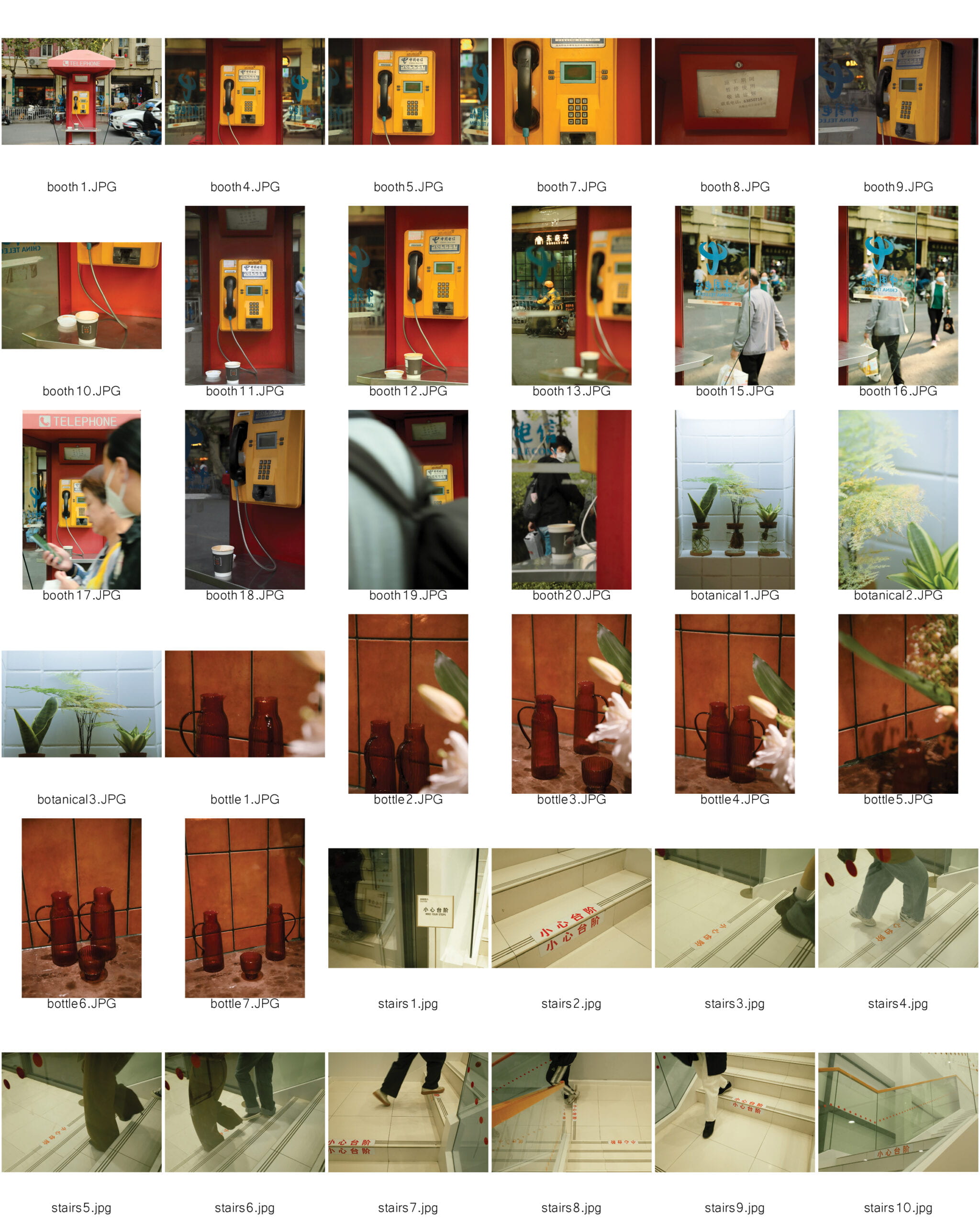
Diptych:
The piece of memory that I decided to pick for the memory soundscape project is a casual day in my life during my third-grade summer break. This part of my memory represents a large chunk of my childhood memory of me actively having fun with my friends downstairs of my home within the compound while my family cooks dinner in our home. The relevant sounds found in this memory are the wind chime hanging by the balcony window, children’s noises such as shouts and laughter, noises from biking, the wind blowing on trees and plants in the compound, cooking/splashing water bubble sound, opening door and closing door sound, and footstep sound within the home. This is what represents a casual afternoon/evening when I was younger and the idea behind this memory is a stress-free child enjoying her time as a kid. The sounds all come together to express indoor and outdoor movements.
By “fluidity of the digital”, Ritchin means that with the advancement of technology, the mechanical age is now being replaced by the development of digital photography. In the mechanical age, there was no such thing as manipulation software. In the digital age, however, according to Ritchin, “the reader, unable to detect the alterations, can be deceived most of all.” Essentially, people become unsure if photographs are reliable when it comes to a method to document public and private events with all the genetic modifications whereas in the past, the photographs often count as historical evidence with reliability. Retouches in the photos can be done to pursue a certain intent, leading the viewer away from what may have been the reality. Ritchin gave an example of this using the Time’s magazine’s manipulation of O.J. Simpson’s mugshot, photographed by the Los Angeles Police Department in 1994. Time’s magazine manipulated his mugshot and lifted it to the level of art, “with no sacrifice to truth”, according to Ritchin. Not only the issues of reality and the altering of history have made the Time’s magazine’s action problematic, but the act of manipulating a photograph with a particular intent beneficial to themselves is a problem that lies in the digital age.
Photography is capable of capturing reality to a great extent, in comparison to texts and books, but in my opinion, digital media in the format of videos is more capable of capturing reality than photography. Photographs can be easily manipulated by people because they’re 2-dimensional still images. However, there are movements in videos so it’s more obvious to tell when it has been manipulated, such as when people cut the clips and merge them together into one video. Whereas in texts and books, it’s more so up to the interpretation of the individual who is reading it to brainstorm the image that the texts/books create for them, whereas images are clear evidence to look upon instead of on one’s own imagination.
The overall concept for my Diptych will be based on uniformity and similarity.
For the contact sheet, I plan on taking photos of different things that has the same movements or the same arrangements. They are either objects that are the same sizes or people that have the same movements. I want to focus on colors in my photographs and emulate cinema/film-style photographs.
As for the second image, I plan to manipulate it by collaging the different colors from the uniforms into one figure. I plan on extracting unexpected colors from the first image and manipulate it using the colors so that some elements of the image has like a blurry mosaic effect.
Overall, the two images create a quirky and funny effect because for the photograph, I hope to capture funny coincident snapshots. The two images will complement each other to convey the concept of coincidence.
Title of the Music: Don’t Leave Me This Way
Artist: Tomppabeats
A Little Reflection
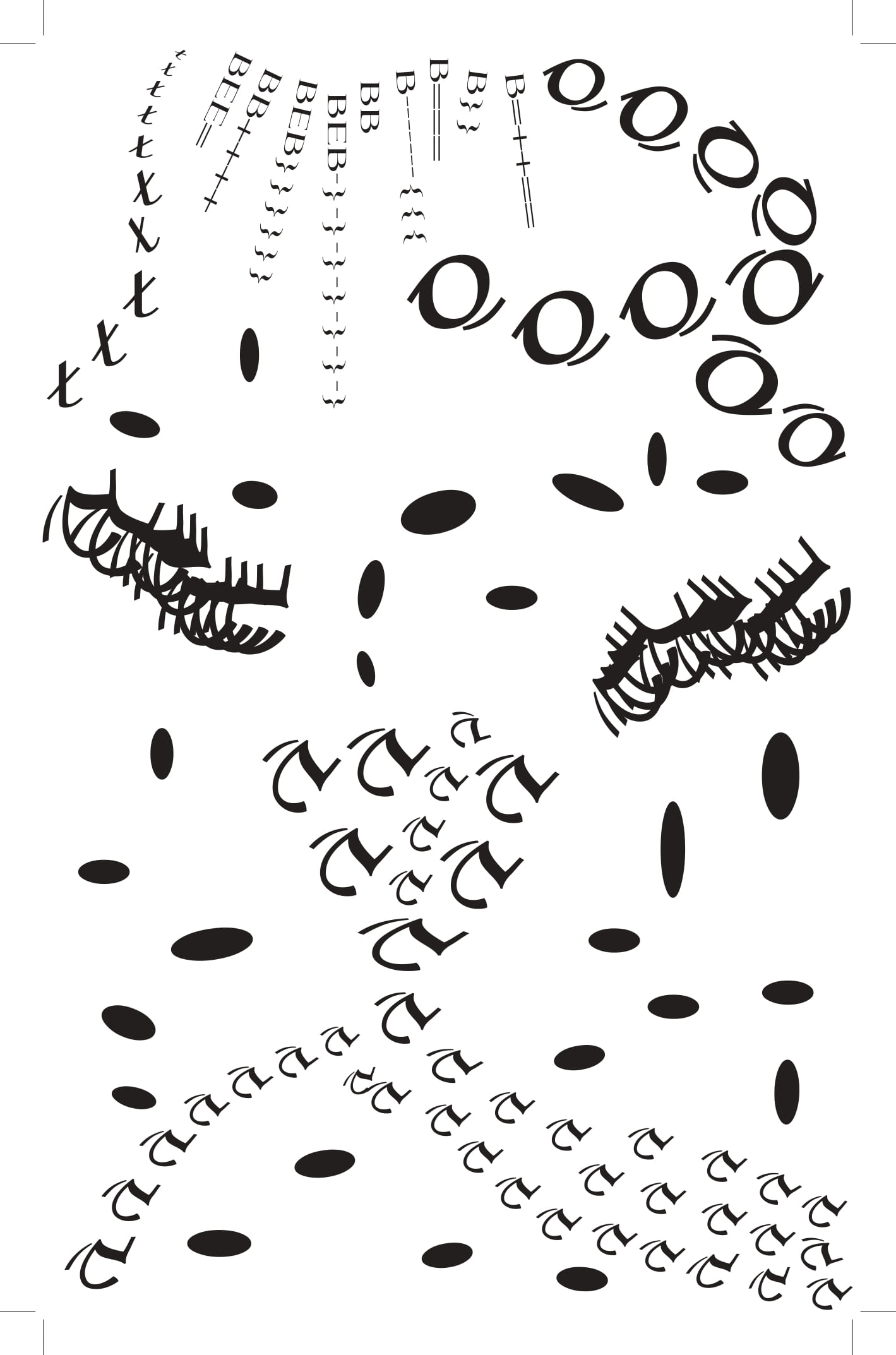
For this project, I began my inspiration by re-listening to the music over and over and imagining multiple scenes that I imagined when I listened to the rhythm. From the rhythm, I imagined water flowing, birds flying and chirping, bell ringing occasionally, and last but not least, door slamming. For the piece I submitted for mid-critique, I submitted a piece with some general ideas of what I hope to achieve through principles of similarity and continuity. In my Black Square Assignment, the elements were built on one another instead of planned all at once and all flowed together and connected. For my final design, I added more elements to create a closure in my design and make all the elements flow together instead of having them be too apart to achieve a concept of different sizes of elements flowing together at the same time, like how it appeared in the rhythm. Also, for the design, I chose to use light strokes for the majority of my design to pursue because the rhythm in the song is very light and soft.
During the design process, the most significant steps that I have taken would be creating an effect of something cohesive that falls apart to pieces with the upside-down letter “v”. This was the first idea I thought of for this sound visualization when I first heard the door slamming noise near the end of the music. I find this design to be successful because it expresses my feeling of door slamming and everything falling apart perfectly. Although this idea remains the same throughout the mid-critique and my final design, I decided to switch it up a little after the mid-critique to make the composition more interesting. I also find that the continuation of the letter “t” on the upper-left corner of the design getting smaller and smaller is very successful in shaping my design because it conveys a relaxing and chill feeling to my composition. As for failure, during the mid-critique, my design was mainly composed of three separate major elements that all use similar Gestalt theory principles without each of them connecting to each other much. So, for my final design, I connected the two elements on the upper-left corner and upper-right corners with the letter “B” and different directions and amounts to emulate the continuous up-and-down effect reflected in the rhythm. Upon making the flow more smooth from top to bottom, I realized that the top part of my composition is too heavy compared to the bottom part of the composition because of the differences in stroke sizes. I then added black dots in different orientations and sizes made of the letter “o” to fill out the negative space towards the bottom half of the composition and make the flow of the different elements more natural.
If I had more time, I would improve my project by incorporating more Gestalt theory principles. I recall that Professor Ian commented on my design not being coherent enough from the top and the bottom of the composition and perhaps I can choose to incorporate letters I used from the top of the composition in the bottom of my composition and vice versa. I think that’s a great idea that I can do to improve the overall flow of my composition.
Here’s my design for the mid-critique:
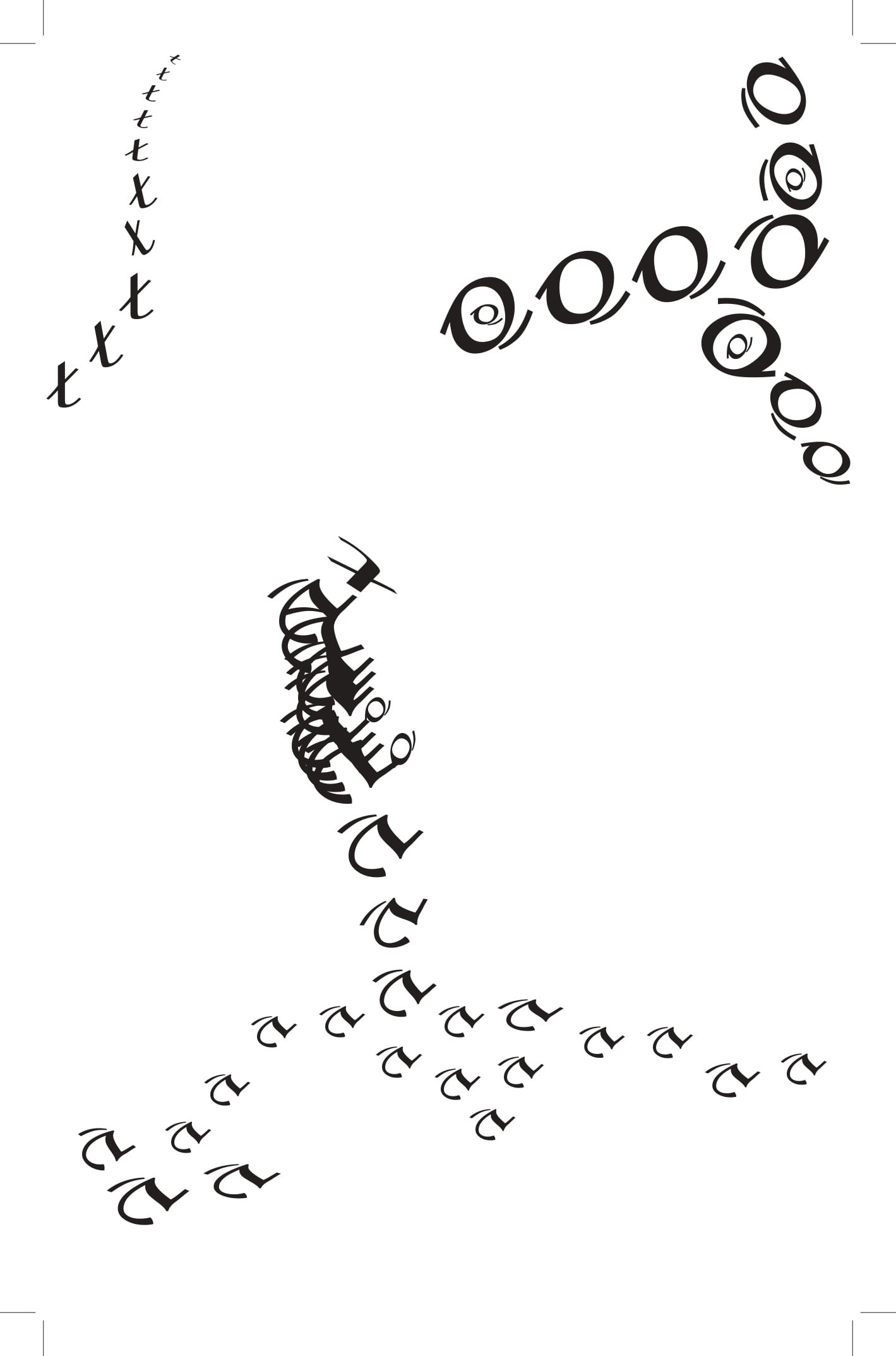
Here’s my final design for this project!
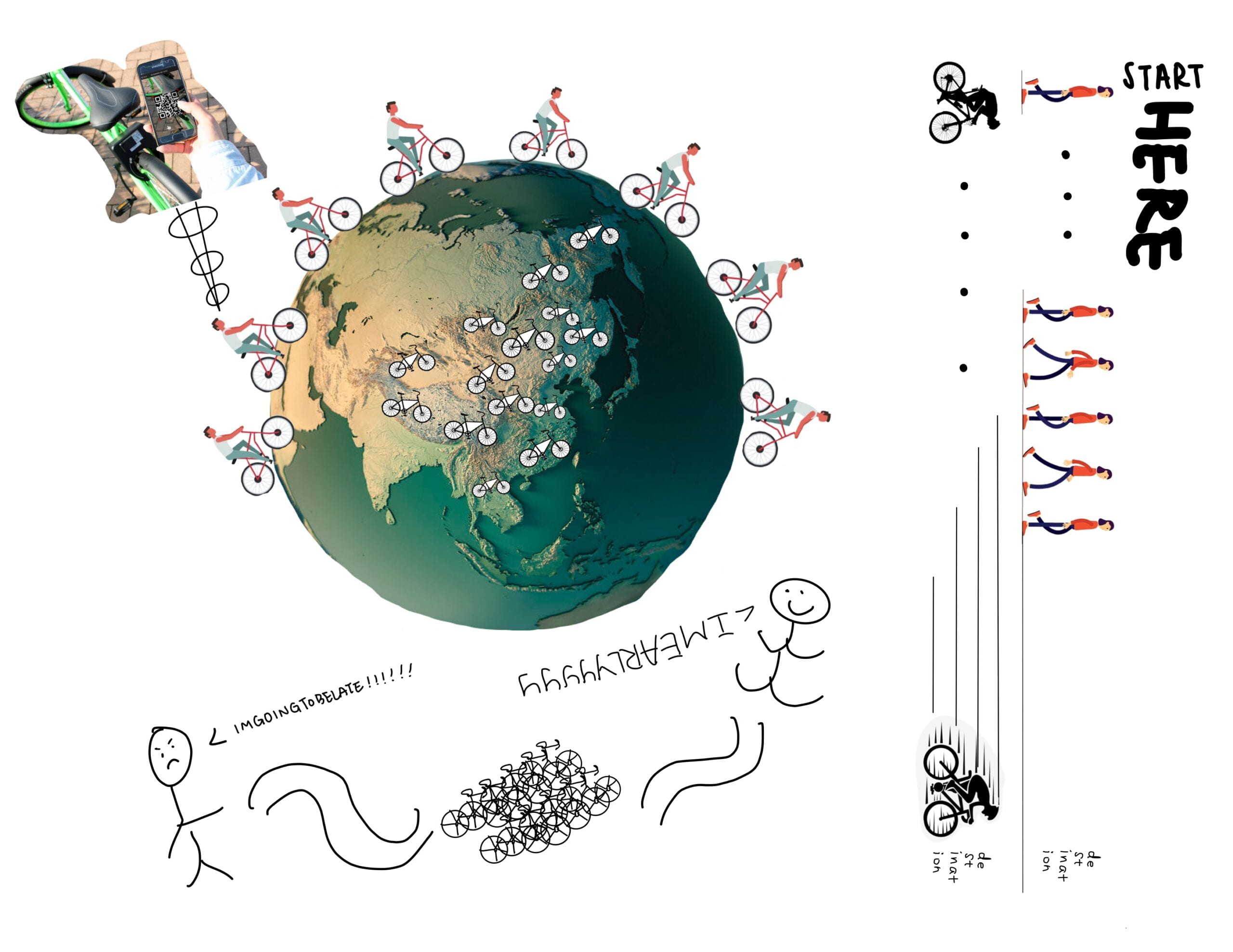 What we choose to explain to the heptapods is how the bicycle-sharing system works. It is a commonly used means of transportation in our daily life, which the heptapods may never experience. Generally speaking, it’s a shared transport service where bicycles are available for shared use by individuals for a short-term at low or zero cost. It’s getting popular in the human world mainly because it provides a sustainable alternative for short-distance trips and a solution to “last mile problem”. This is somehow difficult for heptapods to understand as they may have their unique means of transportation.
So above we collect a few images to make it clearer for heptapods so that they can get a basic understanding of our bicycle-sharing system. From the reading “Story of Your Life”, Ted Chiang mentions that in heptapods’ language system, a noun is identified as subject or object based on the orientation of its logogram relative to that of the verb(13) and sentences are not in fixed pattern but actually seemed to be whatever number of semagrams a heptapod wanted to join together(16). In our image, we communicate this by creating the verb “start” in one orientation and nouns such as “here” and “destination” in another orientation. In the bottom of the image where the stick figure speaks, the sentences are written with no spaces between the words and opposite orientations. On the right side of the image, we expressed our understanding of the intent of bike sharing, which is the “last mile problem”. By making a comparison between walking and riding an easily accessible shared bike, we are trying to show that bikes help us move faster in short distances. Meanwhile, we try to imitate the heptapods’ writing system so we write continuous characters in different orientations to show the movement in a sensible way. In the middle image, by contrast, we have different bicycle spots on the whole earth. The first image introduces the use of bikes and when it comes to the middle image, we try to show the special point of sharing by exhibiting the bike symbol in different parts of the earth. An image of earth may be easier for them to understand as they come to earth from somewhere in outer space so they should have a glimpse of the whole earth before landing. These different spots on earth show the common application of the bike sharing system in different countries of earth. On the left corner we have another image to explain how we can access a shared bike. It’s clear to see that someone is using a phone, which would be possibly considered as a man made tool by heptapods, to scan the QR code on that bike. This action differs from using our own bikes so it can be better for heptapods to understand the concept of bike sharing. In general, we want to exhibit the great invention of this bicycle-sharing system to heptapods and give them a general idea of how we humans travel between different spots, through which they can understand more about our daily life.