- The Voice From The Deep
–A calm gift to lockdown group life
–Find the Voice from your inward world
- Introduction:
- “The Voice From The Deep” is a project offering users experience back to the natural word and inner calm. In the experience, users can freely tailor their own sounds conbinations while enjoying the visualizations.
- It consists of a P5 canvas in JS, and two html page with CSS. Besides, there are links to the Github and WordPress page~
-
- [background] As for me, it is quite hard in dorm to avoid noises from others, especially from those talking inside or outside my room. Later, I found that some special sounds like white noise, sounds of raining…can greatly cover others voice. During my experience, I enjoyed the sounds of rain, wind, insects most, and they are all from the nature. Consider the lockdown situation, we’ve been far away from the nature for too long. Furthermore, the life furing lockdown somehow make people depressed and stressful, easy to get loss. So I came up with this idea to bring me and my audience back to the nature world, also to help myself and users find the inner world.
- Intructions:
- 1. Click anywhere(mainly on the square canvas) to stir the silent world;
- 2. Click the direction board to add new elements
- 3. Click new element and move it around. Click again to place it.
- 4. Scroll OR stretch the webpage to experience different feelings with different background colors.
- 5. Click “RESTART” to restart.
- tips: the maximum of elements is 3, considering too many sounds playing together might be disturbing.
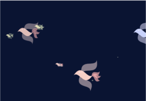
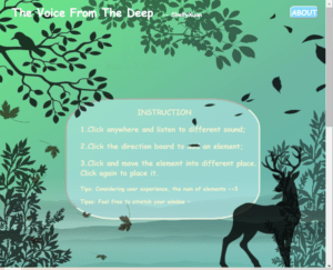 main page(first sight-instructions)
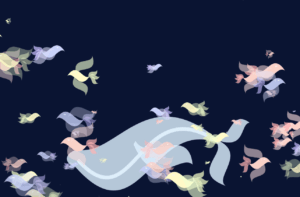
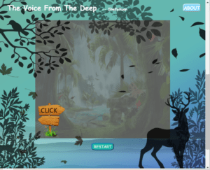 main page(scroll down-the P5 canvas)
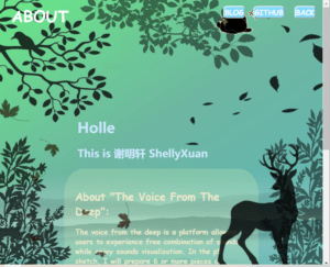
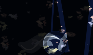
- ABOUT page(first sight-click the “ABOUT” button at the main page)

- main page(scroll down-full window size of 14-inch laptop’s Chrome)
- Reflection
- 1) Process: Design and Composition
- 1 . Overall
- The inspiration originally came from the experience of lockdown life. As was mentioned above, I decided to make a webpage that we can listen to some natural sounds and even can keep them looping together as a learning background.
- 2. The HTML page
- The overall visual design came from two scenes inpressed me a lot:
 ->This is a scene from the film Le Petit Prince that left a deep impression on me once it appeared on the screen in theater, when I was in the middle school and went out before an important exam with my mom:D (I was curious about the technique of this scene. Later, I searched for this technique and got the answer–stop-motion animation, actually–but finished with paper model.
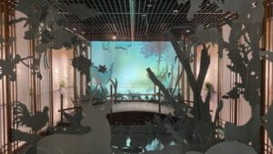 <-One showroom of an exhibition about The Book of Songs. I visited it with my childhood friend (we know each other for time almost as long as my life) during the Winter Holiday in 2022.
- They inspired me the layout of the html page and also the feeling of “the deep”.
- 3. The P5 interaction
- I decided to make a webpage that we can listen to some natural sounds and even can keep them looping together as a learning background.
- Thinking about how to make users interact with canvas for different sounds, I came up with two plans–one is to make a timeline; the other is to devide the canvas into areas. Since the former might be confused to my users, I picked the latter.
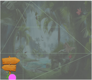
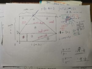
- After that, when thinking about how to play sounds. I first wish my audience click certain areas to play looping sounds. But later I came up with an idea that make visual elements that can be moved by mouse, and one-sound playing is controlled by checking whether there is an element in correspongding area.
- It, actually, was such a long and complex process through drawing, trying, revising :/
- Besides, I gained an inspiration from the process–add some short sounds that respond to mouse click on spare place of the canvas. It can be a prelisten step to the looping sounds tailoring, from which users can also do free and interesting exploring and make some guess of areas’ meanings. Moreover, short sounds responding make the stable statue(whether background sounds looping or silence) stirred!!!
- 2) Process: Technical
- One of the most challenge part must be the canvas design and logic explorations.
- I calculated much to devide the canvas. Additionally, in order to make the canvas easier to change its size, I located all elements(borders, direction board) with percentage of “width””height”!!!

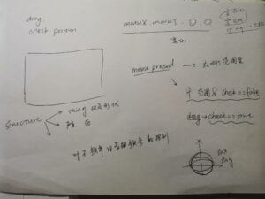
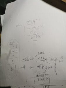
parts of my draft paper(about logic design)
- Another challenge is the design and coding of “element” visualization.
- the link to “ripples”
- https://editor.p5js.org/ShellyXuan/sketches/kd2–BdJp
- the link to “wind”–showing floating leaves
- https://editor.p5js.org/ShellyXuan/sketches/5IXFkx8u3
- it’s totally about p5 coding. Hard works were done to adjust animations.
- For example
class Ripple {
constructor() {
this.speed = 0.5;
this.blue = [];
this.rad = [];
this.weight=[]
this.width=10
for(let i=0;i<4;i++){
this.rad[i]=10*i
this.weight[i]=abs((i+1)/2)
}
}
display() {
push();
noFill();
circle(0, 0, 60);
//leaves
for (let i = 0; i < 4; i++) {
push();
stroke(255)
strokeWeight(this.weight[i])
circle(0,0,this.rad[i])
pop();
}
}
move() {
//water visualization
for (let i = 0; i < 4; i++) {
this.rad[i]+=this.speed
this.weight[i]=abs(i-this.weight[i])
if(this.rad[i]>90){
this.rad[i]=0
this.speed-=0.1
if(this.speed<=0.2){
this.speed=0.5
}
}
}
}
}
With times of attempts, I finally made circles of ripple change the weight and speed in every loop.
- An unexpected but reasonable problem of HTML pages: when the images in html cover some of the P5 Canvas, every time I dragged the circle to play loopingsounds, the photo thumbnails will also be moved together and sometimes images would be openned in a new webpage.
- So I found this solution. Finally, I muted all the html element, making them unseletable and unmovable.
- .noselect {
-webkit-touch-callout: none;
-webkit-user-select: none;
-khtml-user-select: none;
-moz-user-select: none;
-ms-user-select: none;
user-select: none;
} - An interesting problem about the HTML page
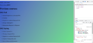
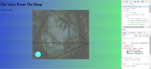
different appearance of two html pages with the same css style setting
- With the help of Google search and Professor Leon, I understand the repeating block of background color was because the short content of “body”. Additionally, the repetition was probably because it was “background-image: linear-gradient(328deg, #3555cb, #60b8b7, #6eb6a2, #6ae887);“
- The solution of it:

- html, body {
margin: 0;
padding: 0;
min-height: 100vh;
background-image: linear-gradient(328deg, #3555CB, #60B8B7, #6EB6A2, #6AE887)
} - That was “magic” haha
- Later, as the content getting more and more, this”min-height: 100vh;” can be took off.
- One thing worth mentioning: it’s quite interesting to play with img setting.
.img01{
position: fixed;
left: 80%;
top:90%;
transform: translate(-50%,-70%);
this stuctue can place elements at the middle of the window by chanding all numbers into 50(not including plus or minus). It’s similar to the “translate()” in p5.js such that the element will only respond the new “starting point” rather then simply left/top/right/bottom border.
opacity: 0.8;
z-index: 10;
}
.img02{
position: fixed;
right: 72%;
top:30%;
transform: translate(10%,-70%);
opacity: 0.8;
z-index: 10;
this structure can also be applied to every elements in html page. With it, we can organize the order of element(A is over B while under C). Position must be set, no matter what content of it is. The bigger the value of z-index is, the more the element is in the upper.
}
.img03{
position: fixed;
left: 80%;
top:40%;
transform: translate(-40%,-70%);
opacity: 0.8;
it is the peremeter of transparency.
z-index: 10;
-webkit-filter: grayscale(100%); /* Safari 6.0 – 9.0 */
filter: grayscale(100%);
filter: brightness(0%);
This structure can make img change the grayscale and brightness, finally become layering cucoloris with adjusted peremeters.
}
…
.img08{
position: fixed;
left: 52%;
top:0%;
transform: translate(-50%,-12%);
opacity: 0.5;
z-index: 10;
-webkit-filter: grayscale(100%); /* Safari 6.0 – 9.0 */
filter: grayscale(100%);
filter: brightness(0%);
}
- 3) Reflection and Future Development
- It’s the second time to make a ‘big’ project. Situation has been changed completely by the Covid crisis. Everything went under pressure. Luckily, there always helping hands from professors, LAs, and my friends; hard work has never been absent. Such a tired but interesting journey finally comes to the end.
- As my current “users” (Professors, classmates, friends) suggested and I personally came up with, there is large room and bright future for improvement.
- One thing I personally want to do, is that makeing volumes controllable. It can be overall controlled by html button/slide button, as was suggested. But I’m thinking about make the volumes of each element changing with their position–add “map(x1, x2, 0, 0.8)”, x1, x2 refer to correspongding border line’s position.
- According to one of my friend(IMA great student!! Sad to have the following semester without seeing him), regarding to the size of window, the size of Canvas is considered to be changable with window streched. So I located all elements(borders, direction board) with percentage of “width””height”!!! And the next step is how to make the canvas larger if the window size is larger than certain value; also, how to make the canvas smaller if it’s opened on small-width device like cellphone. Besides, the black img elements can also be better placed for bigger device(this user’s computer is of 16-inch size haha)
- Other possible improvements includes adding more visualization corresponding to sounds(amount, meaning, frequency, volume change…), designing more interactions with html elements like black images(deer, branches, flying leaves, thickets…), and so on.
- Everything to be continued~~~
- So, generally, it was a great and valuable experience, especially during the Shanghai 2022 Spring Lockdown situation. Thanks to the imagination of nature giving me energy, inner calm, and also much inspirations. The practice and exploration of Creative Coding will be continued…
- Wish me a great creative programmer in the future!!!





 .
.