IN OUR OWN IMAGE

The “fluidity of the digital” was stated as  “One could say that we were entering ‘the post-photographic age’ in the sense that the fidelity of the mechanical age was being replaced by the fluidity of the digital” in the original article. Which means that the mechanical age is replaced by the digital age by removing the originality of an images. As technology developed, photography also grows into a different medium. The existence of technology such as, computer and photo editor apps makes us easier to manipulate pictures. This made the writer view a photographer as “image designers” the writer couldn’t present their own image. For example the picture below:

Photo manipulation | Hankeylorna's Blog

The manipulation gives more attraction to the viewers as it has a dark feel towards it. The editor edits the picture according to her article as her article is in a dark theme. 

Even though photographs can prove to the world that an event happened without being subjective like interviewing a witness, photographs can easily be manipulated. This manipulation over photographs gives a perspective that our pictures are insufficient and unreal. Hence, video, the recording of moving visual images, is more capable in capturing the reality.  The reason is that photographs only capture one occurrence while videos can catch multiple occurrences. While video captures more aspects such as, voices, gestures, settings and facial expressions. Although, videos can also be edited, but videos are harder to be edited than images. Books aren’t a reliable resource since, people can make up stories with their imagination. Words and texts are too subjective.
DIPTYCH CONCEPT

Back in my childhood years, I really liked taking pictures of mini figures. This flashback gives me the idea to apply it on my Diptych Project. I decided to choose a playful and fun theme for this project with the title of “It’s Time for Breakfast Kids”. Mini figures will not be the only object in the set but I’m thinking of a cereal bowl, cereal box and milk. The cereal I’ll choose is Fruit Loops. Why? Back to my initial project theme, playful, the addition of Fruit Loops will create a more colorful and vibrant picture. So, the picture can also be eye-catching for children and fun for them to enjoy breakfast. 

I planned to make some kind of an advertisement for fruit loops combined with the mini figures. I liked to skip breakfast back in my childhood years. So, this advertisement is designed to persuade children to have breakfast as it is the most important meal. I’ll try to make it more vibrant and attractive to children.

SOUND VISUALIZATION PROJECT

The song I chose is an orchestra of the song “Padamu Negeri”, a national song from Indonesia. This song was composed by Kusibini in 1942 to symbolize nationalism and the love for Indonesia. The symphony gives me the feeling of pride and respect for the country. Throughout the song, it gives the sense of an angelic choir. Below I put the link to the music: 

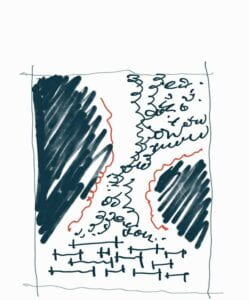
This is the sketch of the design and my ideas before going to illustrator. 


-FIRST DRAFT-

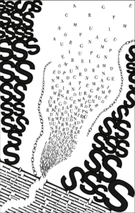
I chose the letter ” I “ as the voices of the choir are really bold and courageous. The letter “ I “ is standing upright which depicts the people of Indonesia who stand upright to respect their own nation. The letters in the middle represent the voices of Indonesia. It’s not a random letter that I picked, but all the letters are from the title of the music itself. I organized them that way to make it float like the angelic voices that give the feeling of floating. Beside the floating letters, I inserted the ‘O’ that represents elegance. The angelic voices also give us the surroundings of cathedrals and castles that have a lot of amazing carvings. 

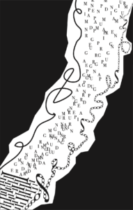
The critique I got on the first meeting are, the letters in the middle need some flow and use the gestalt theory of proximity. The second one, the black area on the side makes the design really narrow and replaces the black area with a letter.

-FINAL DESIGN-

In the final design, I change the arrangement of the letter ‘Is” that shows Gestalt theory of closure. The reason behind this is I want to make the letters seem like going out from a tunnel. I also rearranged the letters in the middle and used the expansion system and the Gestalt theory of proximity. To replace the black area, I had chosen the letter “S” to give the design a flow. Also, it doesn’t take up so many spaces to make it not narrow and in some way an open space. I also deleted some letters “O” to give space.  

PIONEER PLAQUE

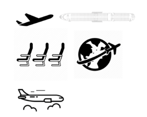
For the Pioneer Plaque, me and my partner chose airplanes to symbolize traveling and movements. First I would like to explain what an airplane looks like. Explaining things to heptapods needs to be in the simplest way possible to make it easier to understand. So, I decided to insert the airplane icon on the top left corner. This depicts our kind of transportation for traveling and how airplanes look like. Before the heptapods know deeper about our airplanes, they need to understand first how airplanes look like. 

On the top right corner, I included the top view of an airplane with the seating arrangements inside. Showing them that the shaded part of it is where us humans will be located during transporting. It is also important for them to understand that it’s not an individual transportation, it carries more than one person. This gives them an idea that humans are social creatures. Next, on the bottom left corner I zoomed in on how the seats inside of the airplanes look for them to understand better how the shaded part actually looked like.This explains to them that the passengers are placed coordinately. 

In the bottom right corner, It’s our earth where we live and the transportation. This shows the airplane moves; it doesn’t stay in one place, it moves, and brings us into a different place. The arrow or the line included in the picture can make the heptapods understand better about moving and different places. In the last picture, I would like to explain that airplanes fly into the clouds. They don’t stay on the ground. 

Reading Responses: Story of Your Life

After reading the book of Ted Chang, Story of Your Life, how Aliens communicate is really different from how humans, us, communicate. Aliens produce fluttering sounds that can’t be understood by humans. A reason for this is because Aliens are using sound that the human vocal tract can’t reproduce and human ear can’t identify. While humans talk by producing sounds that are composed of consonants and vowels or called phonetic. In learning the sounds of the Aliens, we need a sound spectrograph. Other than that, the most effective way of learning new languages is interacting with a native speaker. The way Aliens write their language is also different from how humans write. Their pictographic appearance was logographic and not alphabetic. This means that heptapods’ language didn’t appear to be writing but it is similar to drawing a picture or graphic designs. “A sentence is written by joining the logograms by rotating and modifying them” (11).  Human written language is classified into “glottographic” while aliens pictographic is classified into “semasiographic”. It conveys meaning without reference to speech.

The simplest way of communicating in humans is talking. Talking is the act of exchanging information and expressing feelings. This is performed by our mouth and the sound is produced by the Phonatory System, also known as the larynx or the “voice box”. Other than using our mouth to communicate, we have our hands and feet to perform gestures, drawing and writing.  Other human body parts can also be involved in communication. Facial expression is one of them. Aliens communicate by their “Heptapods”, they looked like “a barrel suspended at the intersection of seven limbs.” (5) They use their limbs to make gestures. The fluttering sound produced by a puckered orifice at the of the alien’s body

Hello world!

Welcome to Web Publishing @ NYU. This is your first post. Edit or delete it, then start creating your site!

Online help is available via the Web Publishing Knowledge Site (wp.nyu.edu/knowledge) and the ServiceLink knowledge base (www.nyu.edu/servicelink). Through ServiceLink, you can find step-by-step instructions, as well as tutorials.

Digital Accessibility

As content creators who create and publish text, images, video, and audio, you must adhere to the NYU Website Accessibility Policy (https://www.nyu.edu/digitalaccessibility/policy) when creating and publishing digital content.

Web Publishing-specific Digital Accessibility Best Practices and examples of how to ensure your content are compliant are available at https://wp.nyu.edu/digitalaccessibility

If you have additional questions, contact the IT Service Desk for assistance. Support is available 24/7/365. For more details, visit www.nyu.edu/it/servicedesk.