The song I chose is an orchestra of the song “Padamu Negeri”, a national song from Indonesia. This song was composed by Kusibini in 1942 to symbolize nationalism and the love for Indonesia. The symphony gives me the feeling of pride and respect for the country. Throughout the song, it gives the sense of an angelic choir. Below I put the link to the music:

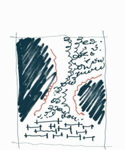
This is the sketch of the design and my ideas before going to illustrator.
-FIRST DRAFT-

I chose the letter ” I “ as the voices of the choir are really bold and courageous. The letter “ I “ is standing upright which depicts the people of Indonesia who stand upright to respect their own nation. The letters in the middle represent the voices of Indonesia. It’s not a random letter that I picked, but all the letters are from the title of the music itself. I organized them that way to make it float like the angelic voices that give the feeling of floating. Beside the floating letters, I inserted the ‘O’ that represents elegance. The angelic voices also give us the surroundings of cathedrals and castles that have a lot of amazing carvings.
The critique I got on the first meeting are, the letters in the middle need some flow and use the gestalt theory of proximity. The second one, the black area on the side makes the design really narrow and replaces the black area with a letter.
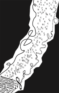
-FINAL DESIGN-

In the final design, I change the arrangement of the letter ‘Is” that shows Gestalt theory of closure. The reason behind this is I want to make the letters seem like going out from a tunnel. I also rearranged the letters in the middle and used the expansion system and the Gestalt theory of proximity. To replace the black area, I had chosen the letter “S” to give the design a flow. Also, it doesn’t take up so many spaces to make it not narrow and in some way an open space. I also deleted some letters “O” to give space.