Categories
"five obstructions" by Jørgen Leth & Lars von Trier communication lab

“five obstructions” by Jørgen Leth & Lars von Trier

What are the precise rules of each of the obstructions?

  1. to remake the film in Cuba with no set, and with shots lasting no longer than twelve frames. he must answer the questions posed in the original film.
  2. to remake the film in the worst place in the world but not show that place on the screen. also, Leth must play the role of “the man”. the meal must be included, but the woman should not be included.
  3. to repeat #2 in Mumbai or to remake it in any other way. 
  4. to remake as a cartoon. 
  5. to remake the film so that the film is made by von Trier himself, however, carries Leth’s name as a director. moreover, Leth must read, in his own name, the voice-over that von Trier wrote.

How does Jorgen cope with the obstructions?

Jorgen effectively completes all the challenges, except for #2: he misunderstood the prompt and had to redo/replace it as the #3 task. i believe his approach is rather intriguing, experimental, and interesting. he manages to align with all the requirements, along with embodying something new and refreshing.

What is the effect on the movies he produces? 

i believe that all of the movies have a common subject: the “perfect human”, who inevitably appears profoundly boring and uninteresting as he has no imperfections. all movies have pretty much the same idea and plot (as intended) and they all isolate the viewer into this “perfect”, boundless, and idle reality that indeed highlights how our dynamic, sometimes chaotic even, the imperfect reality is what essentially makes us perfectly human. 

Other thoughts cross your mind while watching.

i would always think about how much time each movie took. how much production/idea development did it require him to come up with these. moreover, i was wondering if the challenges imposed by von Trier were somehow connected with certain ideas or were they mere prompts that he randomly assigned. were they related to something greater than a set of tasks? i am, myself, still trying to connect the dots regarding these thoughts, planning to read about this movie a bit more, so that i could answer these questions.
Categories
"the uncertainty of documentarism" by Hito Steyerl

“the uncertainty of documentarism” by Hito Steyerl

Steyerl talks about how the “unbroken belief” of the documentary form is challenged. What does Steyerl mean by this? Certain movies and films are based on a true story.  How does truth inform fiction? How might fiction inform the truth?

by discussing the extent to which one should rely on documentaries when composing the idea of the events they depict, Steyerl notes how documentary footage is essentially an embodiment of one’s expression, how it is able to provoke the “uncertainty” that might or might not lead one to the truth. by describing this form as an “unbroken belief”, he highlights the rawness of footage, alongside the fact that despite its authenticity, it eventually might be a belief, not truth. this means that notwithstanding the genuineness of documentation, it still conveys the impression of the reality, not the reality itself. 

as for the movies and films that are based on a true story, in my opinion, despite the truth that the plot and/or characters might carry, it should be still regarded as an interpretation, an expression of the events, not the truth itself. i believe that any kind of film/movie still embodies the opinionated perspective of the director, along with the interpretation of characters (even if based on reality) by actors. hence, even regardless of all, they strive to illustrate truth, reality-based works are essentially “based” on the truth, not the truth itself. surely, it creates the “presence” of a viewer in those events, however, it is just a false presence that is achieved by mastery of acting and directing, depicting emotions. fiction makes it possible to portray numerous details and impressions that help the viewer to engage with the events on a personal level, which, essentially already gives the freedom of interpretation to anyone who is witnessing the documentary. therefore, at the same time fiction contributes to the depiction of truth, as well as is reinforced by the truth itself.

What is the significance of the authenticity and representation of the truth in the media that you consume on a daily basis? What is the role of a live broadcast?

in my opinion, the authenticity of the events i read/watch materials about is quite important. for me, it is very important to understand what was happening in reality as clearly as possible. i read the news every day, and relying on independent publishing companies is essential to compose my own perspective regarding what is described. besides, i love documentaries, especially those that incorporate various points of view on the topic described as it guides me through the experiences and expressions of different individuals, which, once again, allows me to make my own mind up, being aware of the variety of opinions.

Categories
communication lab projects

final stage: diptych project

“two sides of one city” by Anya Zhukova

final version of the diptych

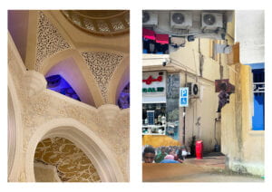
when I was first brainstorming about the concept to settle for in my diptych, I realized that the most engaging one for me would be to incorporate something that would relate to a social/cultural issue. moreover, given that diptych is a great form of digital media to convey ambiguity (as there are two pictures), I ended up choosing the idea of how city has two sides: luxury, clean (the one government is trying to always put forward) and austerity, poverty. portraying this contrast is what I was aiming at. one picture incorporates the richness and beauty of Sheikh Zayed Grand Mosque – one of the main sightseeings in Abu Dhabi (AD) and religious epicenter of the city – and the other part of the diptych displays a collage consisting of several cut-outs of other, less “pretty” parts of AD. both diptych elements complement each other, creating both contrast and a wholesome overview of this city. 

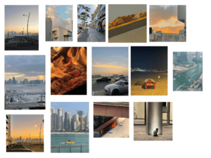
as for the process, my contact sheet (displayed at the bottom of the post) consisted of the pictures I was taking over the weekends, however none of them, from my perspective could achieve displaying the luxury that I wanted to embody. so, I decided to change the place and realized that there is no better place for displaying a luxurious side of AD than the Grand Mosque. so I went there with my phone camera, took quite a lot of pictures of walls, carpets and chandeliers. various angles, ISOs, focuses and lightnings were supposed to give the freedom in creating the second part of the diptych first and then choosing the first one from a pool of undertaken pictures. the picture I settled for has complimenting colors (yellow & blue) along with having this quite interesting accent on the blue part almost in the middle of the picture. it is not only aesthetically pleasing, but also positioned the way that it “has” to have something in continuation to the right with it. then, I decided to move on to the second part. in my opinion, the best way to incorporate somewhat chaotic, unsystematic and “dirty” is to create a collage. for that I used selection tool (to select the needed parts) and curves (to balance the colors). after composing the collage I also decided to play a bit more with the color (using curves) so that both diptych pictures align with each other. voila! 

draft of the second part of the diptych

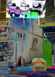
when editing the second picture for the first time, I, at first, decided to play with the curves a bit more to see how the textures could work together (the picture below). but then I realized that this saturation would not work with the first part of a diptych as it would draw all the attention to itself. I had two options: either I replace the first image or I experiment with a more subtle color palette for the second one. as I really liked how the first picture incorporates the luxury and I didn’t know any place in AD that I could such colorful pictures at, I decided to settle for the second option: changing the collage. and, as seen in my final version, I did that. overall, I am quite satisfied with my work. i believe that it delivers the message and aligns with the requirements. I could definitely invest more time on working with composition in my collage or/and take a picture of something a bit more interesting for the first one (that would display my skills in photography abit better). but that is, already a different story. 

contact sheet
Categories
“story of your life” by Ted Chiang communication lab

pioneer plaque assignment

walkie-talkies has been around since World War II. it is one of those inventions that is incredibly wide-spread. me and my partner decided to try and create a plaque that could explain what this object is used for and how does it look. 

as for my plaque itself, i decided to depict the signal coming from one walkie-talkie to another as waves, cause I thought that is something that any creature with any sense of space of direction. even though the waves have a certain destination that they are flowing at, there is no embodiment of space. moreover, i believe that placing two faces on the left and right side of the “canvas” eliminated the necessity to explain how human body works. i decided not to highlight the fact that people hear with their ears or speak with their mouth (it can be seen however is not essential to the design).

speaking of the object, i figured that elaborating on the exact shape and how the system works is not necessary: the main point is that it receives and delivers the “waves”. i also highlighted the difference between two walkie-talkies by changing the second one’s color. this points out that there are, in fact, two objects that are involved in the process.

as for the depicted humans – or to be precise, their heads – i have chosen to use different skin colors and also leave just the outline of their faces in order to create as vague representation of human appearance as possible. this, in my opinion, is more representative of the variety of nationalities and races that we, as a humanity, have. furthermore, I illustrated different genders that is also contributing to this idea of depicting inclusivity. 

i believe that this plaque also does not have any relation to time or the way people speak. this also is supposed to give a freedom of interpretation to the aliens regarding the way people speak or comprehend information. this lack of definitive mechanism, i guess, is the best way to actually explain something. 

overall i am quite satisfied with my design, however there are some things that I could have done differently. for example, i could have depicted a whole human body so that the aliens understand how people look in their full height. moreover, I could have created an illustration of how the walkie-talkie is structured inside and how people are perceiving sounds. but that is a totally another story.

Categories
"in our own image" by Fred Ritchin communication lab

“in our own image” by Fred Ritchin

  1. What does Ritchin mean with the “fluidity of the digital”? Give an example of digital imaging/digital photography that exemplifies this.

by “fluidity of the digital” Ritchin highlights the wide range of ways to manipulate the digital image, especially if viewed in contrast with the film/paper photography. for example, a “digital artwork” created by merging two images together by Alex Goljakov.

Whale dreams Collage, Digital Art / Computer Art, Illustration, Photography by Alex Goljakov - Artist.com

  1. Reflect on the extent to which photography is capable of capturing reality; and compare it to other media (technology) (e.g. text, video, virtual reality, books).

from my perspective, photography is one of the mediums that, if needed, is definitely capable of depicting reality. surely, unedited video or books might be a bit more elaborate on that as they tend to carry a more information – wether it’s written or visual – however photography certainly remains a way to do that. in my opinion, digital photography that was manipulated to the extent where the perceived imagery is completely different from the originally depicted object or scenery should not be regarded as photography – it should be digital art. virtual reality, following the same logic, should be also referred to as digital art.

photography, to my mind, is a depiction of the moment: something that a person could see with their own eyes if they were there. any further editing, with or without the use of technology should, by the definition, moving the image to another kind of art making practice. 

speaking of staged photography, however, i still believe that it, as long as not manipulated in any editing program, should also be considered photography as it depicts, even though carefully chosen and, one could say, “fake” reality. it is still, despite being intentionally outlined, an embodiment of reality. 

the revolutionary approach to digital photography that we have been observing for decades now is changing the way we perceive images. in my own experience, i unconsciously started doubting every picture i see. this made me realize how much my perception of how images are created changed.