Categories
rapid prototyping weekly design discussions

10 principles of good design by Dieter Rams

First, I would like to confess that I do not entirely agree with Dieter Rams. Yes, as an appreciator of somewhat minimalistic and functional design, I prefer the kind of design Dieter Rams describe as a good design. However, I believe that sometimes very useless designs might bring joy to people just by having high aesthetic value (in their opinion).

That being said,  feel like a lot of the products developed by Newson and Rashid possess this aesthetic value that is one of the main reasons why people might want to buy their products.

Rashid has a very distinctive style that largely relies on bold geometric forms and saturated colors (and their combination). 

Marc Newson, while also having quite bold approach to colors and shape, seems to have a bit more experimental approach to shape (a lot of liquid-like, elegant shapes). 

From that perspective, both designers have a very high aesthetic value to their creations. 

As for the rest:

  • Innovativeness

I believe both artist embody a relatively innovative technology (where it is appropriate). I found it really hard to evaluate their products using this parameter.

  • Makes a product useful

I believe both designers probably make their product useful. At least for me nothing stood out as terribly unusable.

  • Understandable (User friendly)

By the looks of it – yes. But I believe this criteria could only be approached if the product is tested by yourslef.

  • Unobtrusive

Here, according to the design pricnciple, both designers fall short sometimes. The principle states that: “Products fulfilling a purpose are like tools. They are neither decorative objects nor works of art. Their design should therefore be both neutral and restrained, to leave room for the users self-expression.”

Which is not really the style of most of the products by both designers. A lot of other designs are much more “restrained and neutral”.

  • Honest

Pretty sure that in the reality of capitalism this is almost not feasible.

  • Long-lasting

Again, probably have to test it to actually comment on this one.

  • Thorough

Plenty of details in the products. However I would say that it would be wrong to say that NONE of the products have anything excessive. I am sure some of them have details that are just there to add to the visual value.

  • Environmentally friendly

Highly doubt that!

  • As little design as possible

Again, I believe there are a lot of things that could be “less” in both designers’ works. 
Categories
rapid prototyping weekly design discussions

Karim Rashid

Write your post this week on your opinion of Rashid’s work. How would you describe him as a designer? What from your research is your favorite and least favorite piece of design work from Rashid?

some notes:

In their discussion, Rashid says that an object should exist only if it better our life. He also talks bout how the best designs are the ones that can serve both poor and rich, a person of any culture, any gender. Democratization of design. He talks about the importance of functionalism.  “Things stick with us if they effectively serve us”. Below-the-line design is the design that we don’t even think about. Ergonomics! Also how “designer” is associated with fashion. They also talk about how design is inseparable from technology. This ultimately means that design inevitably leads to innovation. It is far from only style (the visual component). And the idea that every person is born creative.

It was a very interesting conversation from my perspective. I mostly agree with the view that a good design is something that every person can use. However, I would like to add that there should a be bit more appreciation towards the objects that are aimed at not fully-able people. Of course, some designs are so genius that they are accessible to anyone, however, if such design doesn’t exist and a designer is not coming up with it, it should be admired that a certain object does not focus on fully-able people’s experience. 

As for the idea that almost everyone is born creative, I believe it is indeed true. And I really resonate with this notion. And I most certainly agree that the way children are raised could affect the extent of their creative thinking. I believe it is not only a matter of education and developing a particular framework of design thinking, it is also about being free to express yourself and not being threatened by others’ expression of themselves. I believe it is not coincidental that a lot of artistic and creative people are very confident in wearing bright clothes or having a relatively “loud” personality. It is because they are fine with expressing themselves, which gives them the freedom and peace of mind that further helps them in their creative process.

As for Karim’s designs, I generally liked them. As I like to do, I connected his style with Keith Haring. Something about these shapes and lines and patterns just comes together for me as a “colorful Keith Haring”. It s also quite similar to Marc Newson’s designs as they both designed so much stuff from so many industries. Apparently, that’s what a lot of designers do. 

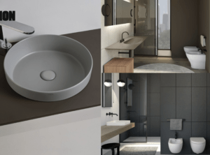
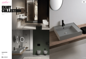
My favorite piece that I noticed on his website was this (Ceramic collection)Maybe the reason is that I’ve been looking at a lot of interior designs lately and this matte texture and the appropriate color (from my perspective) was something that has drawn my attention. I just like matte stuff. 
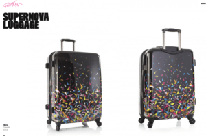
The least favorite thing would be:

yeah. from my perspective it just looks ugly. It kind of fits into his aesthetics though (the patterns and the colors) however it just doesn’t appear nice to me. I would not buy this suitcase. plus, it is not very noticeable in the airport. I would expect a bright pink color (just from the perspective of functionality and his aesthetic). 
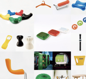
Categories
rapid prototyping weekly design discussions

Mark Newson’s designs

Write your post this week on your opinion of Newson’s work. How would you describe him as a designer? What from your research is your favorite and least favorite piece of design work from Newson?

I believe Newson takes an interesting approach to color, shapes, and techniques of manufacture when thinking about his pieces.

He designs so much stuff: from airplane’s first-class interiors to bunk beds and kitchen utilities. He also designs luggage bags and perfume bottles (in collaboration with Louis Vitton). Pens, vases, furniture, you name it! 

I wouldn’t say that all of his works represent the same aesthetic, however, it would be only fair to mention that a lot of them do. I would also notice that his aesthetic reminds me of some of Henry Matisse’s art with its colorful weird fluid-like shapes. (especially if you look at Newson’s earlier works).

He mentions:

  • travel 
  • Australia (culturally embedded habit of travel)
  • jewelry! the least esoteric (they taught skills much more than in other arts departments)
  • scale!!!! for him, it is a very big thing in his designs
  • he believes that there is a universal approach to designing stuff, so it does not really matter what exactly are u designing, the approach is what matters. different scales, and different materials, but the same process.

I believe that the idea that every designer should be preoccupied with the idea of creating something that would sustain the test of time is very interesting. Indeed, a lot of designs we use in day-to-day life were invented quite a long time ago. Of course, some of them were also reinvented and “polished”, however, their functionality and purpose generally stay unchanged. 

The matter of scale in design is also something we discussed in regard to prototyping. Really, if you think about it, designing something that is appropriate to the scale is quite important, in the early stages as well, as allows a designer to gain comprehensive feedback from the audience (in terms of usability and some features). 

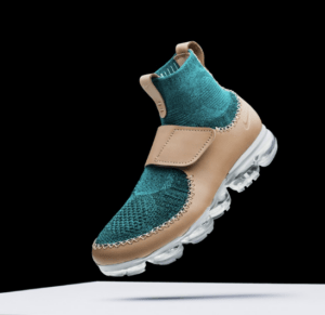
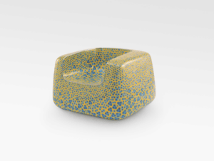
My favorite invention that is listed on his website is probably in between these two:

and

Categories
rapid prototyping weekly design discussions

Good Design & Beauty

Both Richard Seymour and Don Norman are prolific designers in their own right. In the videos for this week’s assignment they speak about emotional design, telling stories about products and experiences and how they affect us emotionally. For this week’s blog post write about your thoughts on their ideas of emotional design. Give an account of emotional design that you connect to in your own life.

It was very interesting to me to hear about the experiment with the students that if suggested the box of candy were able to solve the problem, while people who were put under pressure were not as this pressure made them anxious and prevented them from thinking outside the box. 

Hence, appropriate design might actually encourage creativity. 

  1. Visceral (beautiful, neat) : good font and color (also pretty car)
  2. behavioral (control, UX basically, sensual feeling) : teapot
  3. reflective (no control over what you do, however looks over and tells you some feedback) : attention-attracting car

Do you think beauty? Or do we feel beauty? Thats an interesting question to me. Because sometimes I notice that when, for example, using my iPhone with all the smooth transitions or when browsing through beautifully and intuitive websites I find myself almost “feeling” the beauty of the design.

The example of the slowly going-out lights: feels natural, feels nice. The cinema! The sense of anticipation is exciting! This observation was so eye-opening. 

Some notes:

Poignancy: the triggering of a strong emotional response

Pathos, triumph: something new, excitement

Intrinsic & Extrinsic beauty

“We see things not as they are, but as we are.” –  i found this quote very interesting as it indeed seems like we do subconsciously tend to find things in design that we would sympathize with, things that would make us feel excited through anticipation on just visual appeal. Design could be indeed more beautiful if it resonates with something we find important in our lives.

Categories
rapid prototyping weekly design discussions

Torpedo Proof Chair

What insights did you gain about this product and how perception of the artifact has changed over its history. What surprised you about this product. Find another artifact that has followed a similar path by deviating from some of its original intent. 

As I have already heard about this chair and seen it (once I saw the real one and the others were replicas ofc), some information that was shared on the podcast and in the article was already familiar to me, so there weren’t many things that surprised me that much; however, I didn’t not know that it undergoes such a long (77 step process). Of course, these chairs are known for being basically indestructible for about 150 years, however I though it is mainly about the shape (ofc it is as well about the shape but I thought it is mass produced anyway).  That this chair is simply fascinating in terms of its utilitarian shape and material that serve the purpose perfectly. Plus the “curved butt divot” is what makes is relatively to sit on! I believe without it would be very uncomfortable. I am not sure if the Navy Chair was a pioneer at that, but regardless, I believe that without it, chair would not be as successful as it was, even in replicas terms. 

It is kind of sad that the original costs that much and I believe that is clearly gatekeeping that should be rethought by the company. I believe they could invest more into expensive and precise material to actually automate the process and then in a couple of years when the machinery bills are less actually decrease the distribution price. 

And I believe that if the chair was intended for a mass-use and was quite popular (would be much more popular if the price was lower), it should not suddenly become a designer piece. If designers want to use them – they absolutely should, but that shouldn’t affect the price. 

On the other hand, I appreciate the recognition of good design and always like to see some deviations or reimagining of a certain “classic” design in different designer collaborations. It is always interesting to look at. 

As for another artifact that underwent a similar path, I found this article that lists 15 inventions that were originally developed for military. Sometimes, the way to use some of them were discovered by accident, e.g. Microwave oven:

Microwave technology was originally used as a radar to help locate enemies during World War II. The ability of microwaves to cook food was discovered by accident. While conducting research on microwave radar technology, an engineer at defense contractor Raytheon Co. noticed that a candy bar in his pocket had melted. This led to the realization that microwave equipment could be repurposed to heat and cook foods. Later that year, Raytheon filed the first patent for a microwave oven. The first commercial microwave was manufactured in 1954 and was about the size of a refrigerator. Today, more than nine in 10 U.S. households own a microwave oven. The technology is one of many military inventions that have shaped the American kitchen and kitchens worldwide.

more info here: https://www.usatoday.com/story/money/2019/05/16/15-commercial-products-invented-by-the-military/39465501/