music: “I Saw Her for the First Time” by Dr. Dog

by Anna Zhukova
the process
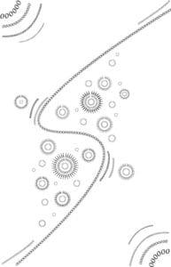
the idea behind this project was to depict the atmosphere of the music, utilising only letters (text tool) in Adobe Illustrator.
for me, the struggle i faced was the choice of the song as I firstly was trying to find something like R&B as it seemed easier to me to convey all the soft beats and melodies, however later I realised that it was too complicated for me to choose the right shapes and curves as I got the feedback for my first draft. the music I chose was “Mrs.” by Leon Bridges:

from the feedback I also realised that the reason behind having multiple letters should be the variety of voices, however in my draft i did that unintentionally, which was the first issue. also, i kinda misunderstood the assignment and used gradient on the sides. besides numerous mistakes, i really liked the way circles shaped by the letters were interacting with the overall composition. moreover, i believe that the flow created by the curved lines of letters. so even though I decided to start from scratch when creating the final version, I adapted some of the elements that I came up with during generating this draft:
- circles constructed with letters
- “flowing” lines
- different fonts
for the final draft I have chosen a song that has a very beautiful and gentle melody, subtle tempo and a steady voice. in my design I was trying to reflect all of this elements, as well as the idea of the song: the feeling of falling in love.
speaking of the final draft, there are some details that I would like to elaborate on a bit more:
- “undone” circles (small gaps between letters): i decided to leave a tiny space between the first and the last letter on the path to maintain this light atmosphere. I used similarity to show that they represent the same thing.
- flowing lines to reflect the nice and subtle melody and the idea of experiencing a very soft and soothing feeling towards the loved one.
- differently sized circles were used to portray the sound of violin at the background as it brings out a certain liveliness and vibrancy to the composition
- the flowing lines do not lead to the corners so that they are not excessively emphasised. i also used similarity to show that they all represent the flow of the voice and little high notes the artist takes.
- differentiating boldness of the letters to make the composition more vibrant.
from my perspective, most of my intentions worked out perfectly, however I have some suggestions on how I could make the design a bit better: i could have rotated the circles so that the gaps don’t align with each other to create a coherent line. that would eliminate the unnecessary repetition. overall, I am quite satisfied with the way this project worked out. I loved the process and the experimentation I’ve done. of course, there is no limit to perfection, so I am planning to continue experimenting with this kind of medium further on my own. might be posting some of my explorations here 🙂