Categories
communication lab projects

visual metaphor: stuck

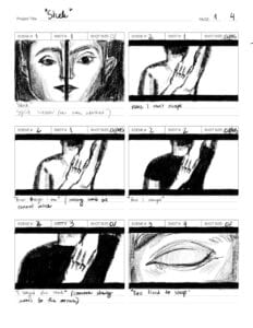
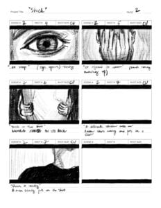
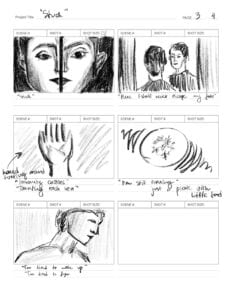
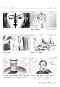
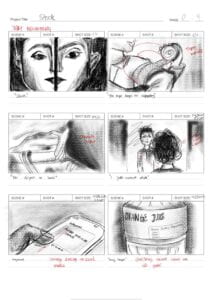
throughout the days of me and Clarissa working on the project, we have chosen to stick to the initial plan and idea, dividing the poem into 4 parts and shooting the scenes for each one: me for the second and fourth part, Clarissa for the first and third one. our storyboard was developed to reflect the overall atmosphere, and, of course, reflect our idea of visual metaphor. 

in this blogpost, i won’t be talking much about the concept as we have described it in the proposal (it has not changed), however there are few things i believe i want to summarize. 

our concept revolved around body dysmorphia experienced by men, which is a highly stigmatized topic as of present days. the poem read by 4 men in the background talks about a feeling of being stuck, whereas the visuals introduce a series of scenes that suggest that the depicted men struggle with a feeling of being stuck in their bodies. videos allude to not being able to embrace one’s body, depicting men scratching, rubbing their skin, changing their eating habits and much more. 

i believe that the choice to include 4 men has played out quite decently as that signifies that this issue is what a lot of the males are facing, however still feeling alone and isolated when facing it, sometimes not being able to express their feelings. it as well allowed us to use the split screen and convey this looping composition. 

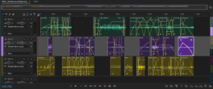
throughout the process of recording the videos and sharing them, we have encountered quite a lot of issues. some of the videos that I shared turned out to be overexposed when opened via Clarissa’s computer, whereas the files on my computer and phone were completely fine. moreover, even though on my computer the files were not overexposed, the fact that the scenes were shot in different locations, they were inevitably different in terms of lighting. both of these problems we have tried to overcome by adjusting the exposure and black points in Premier Pro. in addition, I had to retake couple of scenes so that the quality and lighting would look a bit better (we have not agreed on how bright our scenes should be, along with whether we turn the video in black&white colors on our phones or in the app, the significance of which we have learned in the process). on the bright side, me and Clarissa have the same phone, which helped us in achieving a continuous quality throughout the video. 

in terms of editing, we have decided to share with each other the way each part is put together from the raw footage. we didn’t intend to do that at the beginning, however later realized that it would be better to do that as the sequence created by a person who had a certain idea in mind when shooting the raw footage, would make much more sense, opposing to the sequence that is put together by someone who had no idea what the raw footage might mean. 

as for the audio recording, the scheme was pretty much the same as the video. we had to do the de-noise effect as my audios had background noise and i could not find a place to record that would avoid that. nevertheless, i believe we could have rerecorded the audio one more time or add the background noise for Clarissa’s audios to make the audio throughout the video more consistent, however I believe that the slight change has only helped us in highlighting the difference between the depicted characters, however uniting them together visually. 

i am very happy how split screens have worked with out idea. i believe that they have enhanced the delivery of our concept, highlighting the significance of the issue we are touching upon in the film, creating the loop that adds to this idea of being “stuck”. 

i believe that we have done a great job collaborating. our plan and workflow went smoothly as we managed to communicate on time and share our footage and audio. i believe the fact that at the very beginning we have divided our work in halves has helped both of us put considerable effort into developing and improving the parts we were accountable for. 

i can surely say that it was one of my favorite projects in this course, i have improved my skills in communication, video and audio recording, video and audio editing. it was quite a wholesome experience and i am very happy i have learned quite a lot throughout not only this project, but this course overall. 

the link to the video: https://drive.google.com/file/d/1z84fy3UOHQwqtjAd3J-wuN9ucEetP1x8/view?usp=sharing 
Categories
communication lab projects

visual metaphor: proposal

  • Project Title: stuck
  • Team Members: Clarissa, Anya
  • Concept | Storyline:

poem by Jimmy Solanki

Stuck

The tape keeps on repeating

No disgust or hate
I just cannot relate
Anymore
Any longer
Stuck
Here I can’t escape
Even though I ran
And I changed
I stayed the same

Too tired to sleep
Too afraid to dream
Stuck in a bowl
A delicate stream holds me
Down to sanity
Stuck
Here I can’t escape

Tried courage
Valiant I was defeated
My dreams won’t let me in
Stuck
Here I shall never
Escape my fate
Insanity cackles
Taunting each vein
I’m still running
Too tired to wake up
Too tired to fight
Stuck

  •  What’s the story abou? – A person being stuck in their own body that they don’t like
  • What kind of style/aesthetics are you going to pursue? – sad atmosphere, close ups, emotional details
  • What equipment are you going to use when shooting the movie? (cell phone, DSLR camera, sound recorder, stabilizer..) cell phone, stabilizer, sound recorder, lighting
  • Which locations will it be shot at? When is it? Day time/night/unknown? Why? house, either, indoors as the struggles we incorporate are internal and people that face them usually are honest about the feelings when they are at home, alone
  • What are some challenges you might encounter and how will you prepare? fligning videos from different locations together
  • How will you collaborate? How will you divide work? (Gantt Chart)
  • storyboard draft

  • chart
Task Owner Start Date Due Date Duration PCT of Task Complete
recording voice narration clarissa & anya    30th april 1 hour  
shooting 1 clarissa   29th april 2 hours  
shooting 2 anya   29th april 2 hours  
exchange of shootings exchange through google doc   29th april    
shooting 3 clarissa   3rd may 2 hours  
shooting 4 anya   3rd may 2 hours   
exchange of shootings exchange through google doc   3rd may    
compiling the voice recordings anya   2 april    
Categories
communication lab projects

memory soundscape

concept

my memory soundscape’s concept revolved around my memory of waking up in my grandmother’s house in the summer as a kid. this house is located in the countryside, essentially in the middle of nowhere, so there is always a feeling of being completely distanced from the rest of the world. every day i would wake up because of microwave noise as my grandmother would forget to turn it off due to her bad hearing and memory. i would monotonously pass through the rooms, witnessing various sounds that other residents in the house would make, along with weird, somewhat spooky sounds that the wooden house makes, take a shower and return to my grandmother’s room, begin to write her “good morning” and talk to her via pen and paper.

for my soundscape, i decided to create a sequence of these events, recreating my experience, embodying numerous sounds, reflecting this spookiness and, at the same time, repetitiveness of my mornings there. i thought that composing the sounds in the sequence is the best way to convey my idea as that perfectly highlights the idea.

process 

most of the sounds that i used, i recorded in my room and outside. most of the sounds are self-explanatory, recorded with the use of objects they are supposed to represent. one sound that i would like to elaborate on is the sound of a cord attached to the blinder. i used it to change it, with some effects, into almost “scary” sounds that could be heard in the background later. moreover, i have added a couple of “echo” effects so along with adjusting the “pan” so that the sounds take place in the composition. speaking of the “pan”, i manipulated it a lot to recreate the space more accurately: footsteps and my actions are usually in the right headphone, whereas the things that i witness are coming from the left side. that effect allowed me to help listeners in experiencing the memory exactly as i experienced it. 

when recording the audios i have faced the issue of the noise that could shade the main sound. i had to rerecord many audios because of that or apply the de-noise effect. moreover, when i started experimenting with the effects, i tried utilizing the most “spooky”, “scary” ones to create a proper atmosphere for the sounds, however at some point i realized that i started using too much of those and the soundscape became too saturated (and it was not intended by the idea). so i decided to reduce the amount of effects i had, however it that was noted in the feedback i received as well. 

conclusion

overall i am quite satisfied how my project turned up. i believe i managed to depict the memory quite successfully, along with utilizing tools of the program. however, referring to the feedback i received, i should have probably give a bit more thought regarding intensity of my soundscape. indeed, i believe i should have include a bit more gaps/pauses so that the listeners would have some time to “breathe” and not get tired of listening to the sounds. i would definitely change my soundscape in that direction if i could, but aside from that, i am quite satisfied with my work.

Categories
communication lab projects

final stage: diptych project

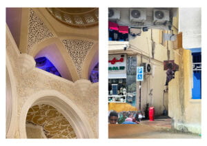
“two sides of one city” by Anya Zhukova

final version of the diptych

when I was first brainstorming about the concept to settle for in my diptych, I realized that the most engaging one for me would be to incorporate something that would relate to a social/cultural issue. moreover, given that diptych is a great form of digital media to convey ambiguity (as there are two pictures), I ended up choosing the idea of how city has two sides: luxury, clean (the one government is trying to always put forward) and austerity, poverty. portraying this contrast is what I was aiming at. one picture incorporates the richness and beauty of Sheikh Zayed Grand Mosque – one of the main sightseeings in Abu Dhabi (AD) and religious epicenter of the city – and the other part of the diptych displays a collage consisting of several cut-outs of other, less “pretty” parts of AD. both diptych elements complement each other, creating both contrast and a wholesome overview of this city. 

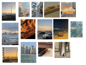
as for the process, my contact sheet (displayed at the bottom of the post) consisted of the pictures I was taking over the weekends, however none of them, from my perspective could achieve displaying the luxury that I wanted to embody. so, I decided to change the place and realized that there is no better place for displaying a luxurious side of AD than the Grand Mosque. so I went there with my phone camera, took quite a lot of pictures of walls, carpets and chandeliers. various angles, ISOs, focuses and lightnings were supposed to give the freedom in creating the second part of the diptych first and then choosing the first one from a pool of undertaken pictures. the picture I settled for has complimenting colors (yellow & blue) along with having this quite interesting accent on the blue part almost in the middle of the picture. it is not only aesthetically pleasing, but also positioned the way that it “has” to have something in continuation to the right with it. then, I decided to move on to the second part. in my opinion, the best way to incorporate somewhat chaotic, unsystematic and “dirty” is to create a collage. for that I used selection tool (to select the needed parts) and curves (to balance the colors). after composing the collage I also decided to play a bit more with the color (using curves) so that both diptych pictures align with each other. voila! 

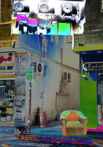
draft of the second part of the diptych

when editing the second picture for the first time, I, at first, decided to play with the curves a bit more to see how the textures could work together (the picture below). but then I realized that this saturation would not work with the first part of a diptych as it would draw all the attention to itself. I had two options: either I replace the first image or I experiment with a more subtle color palette for the second one. as I really liked how the first picture incorporates the luxury and I didn’t know any place in AD that I could such colorful pictures at, I decided to settle for the second option: changing the collage. and, as seen in my final version, I did that. overall, I am quite satisfied with my work. i believe that it delivers the message and aligns with the requirements. I could definitely invest more time on working with composition in my collage or/and take a picture of something a bit more interesting for the first one (that would display my skills in photography abit better). but that is, already a different story. 

contact sheet
Categories
communication lab projects

1st stage: diptych project

diptych is an artwork that consists of two parts, each of which contribute something unique to the story conveyed in this piece of art. it means that only by seeing both of those parts put together a viewer will be able to perceive the artwork in a wholistic way. 

for my own piece, i am thinking of several ideas that i would like to try: 

  • withholding emotions (where one part of the picture would be a happy face, or some happy emotion and the other would be a sad one)
  • different sides of one city (one very luxurious scenery and then some kind of less privileged part) for the second one i might manipulate colour to emphasise the dirt or something like that
  • the palm of a hand from two sides that would embody some idea also. maybe for the second one i might create a collage of things that i would “put” in the hand. 
  • two parts of the interior? 

not sure yet which part of the diptych would be a photo, i guess that would depend on the idea that I would settle down for. in photoshop i am probably going to manipulate colour/filters to better emphasise the contrast between the pieces. also i am thinking about adding something in the background if that is going to be suitable for the artwork.