“two sides of one city” by Anya Zhukova

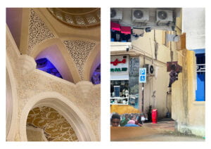
when I was first brainstorming about the concept to settle for in my diptych, I realized that the most engaging one for me would be to incorporate something that would relate to a social/cultural issue. moreover, given that diptych is a great form of digital media to convey ambiguity (as there are two pictures), I ended up choosing the idea of how city has two sides: luxury, clean (the one government is trying to always put forward) and austerity, poverty. portraying this contrast is what I was aiming at. one picture incorporates the richness and beauty of Sheikh Zayed Grand Mosque – one of the main sightseeings in Abu Dhabi (AD) and religious epicenter of the city – and the other part of the diptych displays a collage consisting of several cut-outs of other, less “pretty” parts of AD. both diptych elements complement each other, creating both contrast and a wholesome overview of this city.
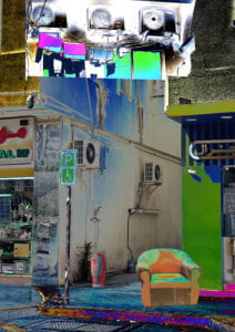
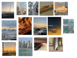
as for the process, my contact sheet (displayed at the bottom of the post) consisted of the pictures I was taking over the weekends, however none of them, from my perspective could achieve displaying the luxury that I wanted to embody. so, I decided to change the place and realized that there is no better place for displaying a luxurious side of AD than the Grand Mosque. so I went there with my phone camera, took quite a lot of pictures of walls, carpets and chandeliers. various angles, ISOs, focuses and lightnings were supposed to give the freedom in creating the second part of the diptych first and then choosing the first one from a pool of undertaken pictures. the picture I settled for has complimenting colors (yellow & blue) along with having this quite interesting accent on the blue part almost in the middle of the picture. it is not only aesthetically pleasing, but also positioned the way that it “has” to have something in continuation to the right with it. then, I decided to move on to the second part. in my opinion, the best way to incorporate somewhat chaotic, unsystematic and “dirty” is to create a collage. for that I used selection tool (to select the needed parts) and curves (to balance the colors). after composing the collage I also decided to play a bit more with the color (using curves) so that both diptych pictures align with each other. voila!

when editing the second picture for the first time, I, at first, decided to play with the curves a bit more to see how the textures could work together (the picture below). but then I realized that this saturation would not work with the first part of a diptych as it would draw all the attention to itself. I had two options: either I replace the first image or I experiment with a more subtle color palette for the second one. as I really liked how the first picture incorporates the luxury and I didn’t know any place in AD that I could such colorful pictures at, I decided to settle for the second option: changing the collage. and, as seen in my final version, I did that. overall, I am quite satisfied with my work. i believe that it delivers the message and aligns with the requirements. I could definitely invest more time on working with composition in my collage or/and take a picture of something a bit more interesting for the first one (that would display my skills in photography abit better). but that is, already a different story.
