Categories
creative coding lab project b

reflection

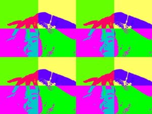
Anya Zhukova “!MIRROR”

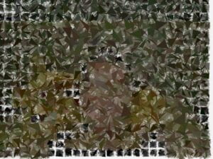
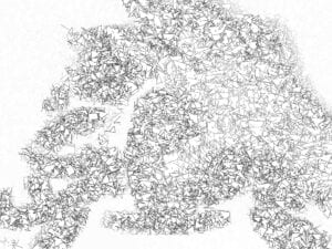
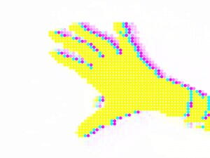
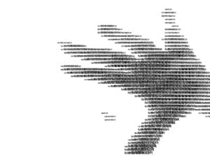
A set of web camera filters inspired by different art movements and aesthetics.

The first filter is TEXTIFY!, which allows the user to input their own text and see it displayed in a creative way. The second filter is WARHOL!, inspired by the famous artist Andy Warhol and his bold, colorful pop art style. The third filter is POP!, another pop art-inspired filter with bright colors and patterns. The fourth filter is VERTEX!, which utilizes real colors from the video to create a unique and dynamic effect. The fifth filter is SKETCH!, a black and white vertex filter that creates a sketch-like effect on the video.

I had a lot of fun exploring the possibilities of video-manipulation. As it was my first time working with video, I do believe I have reached a satisfactory level of understanding of various techniques and fun things that could be done in p5.js in this area.

For further advancement of the project, I outlined some things:

  • wrap the filters around a united concept
  • instead of “s” for save, I can consider adding an actual button to do that to amplify the user experience
  • adjusting filters so that they work regardless of the light conditions in the room
Categories
creative coding lab project b

proposal

Here is the link to my presentation: https://docs.google.com/presentation/d/1w4JQ_xjsYq2J1bqI-PzReNiuJ7tysnhQXVq7ZfVuS40/edit?usp=sharing 

I decided to go on with the plan to use video as my input source. I am going to create a scrollable interaction with the material and create a !MIRRORED environment. The inspiration for the aesthetics of it I will take from the works I listed in my presentation.

Categories
creative coding lab reading responses

new media art – introduction by Mark Tribe and Reena Jana

  • The text is from 2007. Almost 15 years on, describe your (updated) understanding of New Media Art in comparison to how the author defined it back then.

I believe that due to advent of numerous modern technologies the way New Media Art is created changed quite a bit. Even now, when looking through some of the works I have noticed that I really did not want to read Times New Roman text that lacks structure and is styled in a weird way. But then I realized that it was the way everything on the Web looked back then, including the art pieces. However, I believe that such themes as surveillance, fake internet identities as well as the exploration of the digital footprint left by almost all of us is still quite popular, if not pressing, in the modern age. As author looks at it, New Media Art is art that explores the relationship between traditional forms (of visual art particularly) and emerging technologies. Some artists started using the Web and other technological tools to create art instead of just utilizing them in a utilitarian way.

To be honest, I am not sure if that could be as effective right now. I very much understand the idea behind this quite interesting technology-art relationship back then, however right now I don’t think in the modern age, when literally anyone with a computer and an internet could learn the basics of creating websites and coding, the execution of ideas mentioned in this book would be as effective as it was back then. I believe we live in a such weird time when everyone is at the same time so connected and disconnected, which makes it a bit hard to surprise people with the browser-based artwork.

  • How do you think the conception of what New Media Art is or can be has changed since the text was published. Think of new technologies, apps, dominant themes, and media that have come to be dominant in our lives after the text was published. 

Again, I believe that as the technology evolves, artists are going to find more and more ways to express their ideas. I believe that also the concept-based art is going to be the dominant force, rising poignant and important issues of our current lives.

__________________________________________________________

The first Net Artwork I would choose is “Mouchette.org” (1997) https://mouchette.org/

It is an interactive website that is presented as a web page belonging to a “nearly 13” girl. But as you go on to interact with the website such themes as sex, violence, death and identity manipulation arise and in the end it kind of becomes clear that it is not created and led by a 13-year-old. Or is it?

The artist was revealed much later, it turned out to be Martine Neddam. Since Mouchette.org she has created two more fake identities, one of which is David Still (you can use the website to send an email to someone using his identity https://davidstill.org/). I didn’t find much information on the artist herself, but I think that might be intentional.

I absolutely LOVE how her works contribute to this internet identity discussion as well as, specifically in Mouchette.org case it also touches upon how unsafe and surprising the Web can be. I also really like how the website designs reflect the ideas that she talks about (e.g. flies). But yeah, I believe that it is an excellent example of deploying emerging technologies to provide commentary on a certain issue/debate. 

__________________________________________________________

The second artwork I decided to choose is Olya Lialina’s Online Newspapers (2004) http://art.teleportacia.org/exhibition/online_newspapers/

It is a webpage that features various newspapers from around the world, interspersed with GIFs. There are five different newspapers from different parts of the world including Germany, USA, etc. 

This artist caught my as as she was mentioned in the book because she is also Russian. Moreover, she was a part of the net.art movement. Her most prominent work is listed to be My Boyfriend Came Back from the War, which is mentioned in the text. But as I looked through her portfolio, the Online Newspaper work caught my eye in a but different way.

I really like how this work explores the boundary between seriousness of the newspaper medium as well as fun GIFs. I believe it also really fits into the context of that time as GIFs were almost like todays meme stickers: everyone was using them all. the. time. And it was fun! So, why not? Also, I might be reading too much into this, but I also see a certain mockery on the media in this work. Specifically, I believe that it almost makes the viewer realize that the only thing that they actually look at are the GIFs, not the text, which is quite interesting to think about and reflect upon. 
Categories
creative coding lab recitations

sketch gallery page

Here is the GitHub-powered page: https://zhuanya28.github.io/creative-coding/11r-sketch-gallery-page/ 

  • How can orderly file name convention (html files, css files, images, etc.) prevent errors when building a website?

Good naming really helps when developing a website because it really helps manage the styles as well as the relationship between pages and files.

  • When would you want to use classes, when IDs?

IDs are used for a more general cases as well as very unique ones. I usually use classes (especially multiple classes at the same time).

  • Which limitations did you run into in the styling of your page?

A bit too hard to create pretty transitions (animations).

  • How does editing and styling a text in (WYSIWYG) text editor, such as Microsoft Word, compare to writing HTML? What are advantages of each over the other?

One of the benefits would be is that it is happening on the Web with HTML. However, when editing in Microsoft Word we have no-code interactions 🙂 it also has mistakes highlighted there.

  • Explain how different web technologies come together in your webpage. How is writing HTML or CSS different from writing p5.js (JavaScript)?

Again, I feel like p5.js has way less opportunities when it comes to working with text and vector-based objects & animation. But p5.js has cooler animations 🙂

Categories
creative coding lab reading responses

long live web by Tim Berners-Lee

  • The author mentions beneficial and “ill effects” of the Web. Describe two examples of these effects from your own experience on the web. 

free (mostly) access to basically ANY information: the web has made it easier for me to access information on a wide range of topics from anywhere in the world. whether i want to learn a new skill or research a topic, the web is always there, ready to help.

as an international student, and as someone who moved a lot, i really benefit from the ability to have my family and friends accessible to reach via social media.

  • In your own words, describe the concepts below, contrast them to one another and, if possible, share associations from your own experience on the web.
    • Universality and Isolation

universality refers to the idea that the web should be accessible to everyone, regardless of their language, ability or location. isolation, on the other hand, refers to the idea of being disconnected or separated from others. the web promotes universality by providing a platform that connects people from all over the world. isolation, on the other hand, can occur when people become too reliant on the web for communication and use it as substitute for real-life interaction

    • Open Standards and Closed Worlds

open standards refer to a set of protocols and standards that allow different devices and applications to communicate with each other. closed worlds, on the other hand, refer to systems that are designed to be self-contained and do not interact with other systems. the web is based on open standards that allow different devices and applications to communicate with each other. closed worlds, such as proprietary platforms like Apple’s ecosystem (iTunes was mentioned in the text specifically as an example), limit the interoperability and flexibility of devices and applications.

    • The Web and the Internet

The Web and the Internet are often used interchangeably, but they are not exactly the same thing. The Internet is the underlying infrastructure that connects devices and allows them to communicate with each other. The Web, on the other hand, is a collection of documents and resources that are accessed through the Internet using web browsers. So, basically, The Web is built on top of the Internet. 

  • The author talks about his visions for “the Web in the future”. More than 10 years after this text was published, identify the elements of his vision and discuss the ways in which they are (or aren’t) still present in today’s web. Feel free to also point out issues that have since arisen (e.g. the idea of “fake news”), and discuss how they might relate to the author’s vision.

in the “Web in the future” Tim Berners-Lee envisioned a web that was more personalized and intelligent. He also envisioned a web that would promote openness, collaboration, and social responsibility. while some aspects of his vision have been realized, such as the development of personalized content and improved collaboration tools, other aspects such as the prevalence of “fake news” and misinformation have become major challenges for the web. in many ways, the web has become more commercialized and less focused on openness and collaboration. however, there are also efforts underway to address these challenges, such as the development of new tools and technologies to combat misinformation and promote responsible use of the web.