PROJECT 3 REFLECTIONS AND DOCUMENTATION
It is interesting to know the journey to choose my data set was very explicit in a way that pushed me to delve into a project which is not only visualizing a data set rather giving a powerful message at the same time. I experienced this pandemic first hand on my own as well as that of my family. This project was not only an academic exercise but more like a self exploration closely touching on my own experiences and analyzing how effectively the covid has been dealt with by different countries . The search for accurate information gave me some sense of things to come since it represented only one among other trials to be faced by the project’s goals.
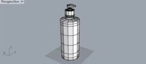
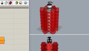
The challenges began when I started reading the instructions for Project 3, and I recognized that the very first data set I chose had a lot of null values and due to that there is a possibility that my outcome is not very accurate so I had to see more than a 100 datasets before finalizing the data set by kaggle on Covid-19. Covid-19 has touched every aspect of our lives, including mine and my family severely but at the same time it was quite difficult for me to choose the best starting point for defining my project particularly in a real life setting . More so, if I had to select any of the household items that could be linked to the project. At first, my thought was to construct an outline which contained the sanitaries but after viewing my definition, I realized how difficult it was to understand the information. My definition was influenced so much by the confounded items as the visualization developed, it was engulfed with ancillary data and consequently its originality was overshadowed.


To be honest, this realization turned out to be a great milestone on the way to a much deeper symbol — the solitary tree beyond my window during quarantine that died of negligence without nurture. A symbolic portrayal of loneliness and endurance that moved me to see the information on Covid-19 in the form of tree trunks where every stem tells its own tale of an individual’s fight for survival.
Then I realized the sense of it as an object is not effective, I then reflected about covid 19 experiences as I remember seeing a tree outdoors everyday. Almost after one month passed the tree faded away as nobody could pour the tree water and after discussing it with Marcele, I decided to visualize the trees.
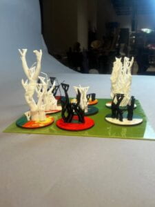
Now, in one tree we only have 8 branches in which every branch would represent one country and the deaths would show the density while the tree branch length will depend on the length of the population but after the meetings with Marcele I realized that an effective visualization can only be created if I have a tree for each country and then add them all into one acrylic. So what I did was to create separate tree but using the cases,deaths and population,


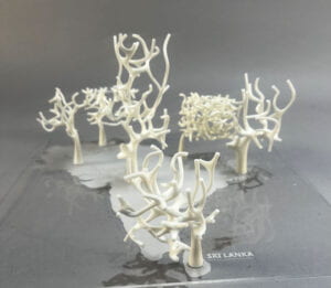
By incorporating the feedback to the project which I received in the class, I endeavored to make it more realistic and removed the support for all to stand on their own merits with some changes in the grasshopper definition. After working on the file, I decided to give it a more realistic setting which would be easily printable. This is where I began using the raisin printer (the raisin printer takes about 8-9 hours per file). Later, I employed the transparent acrylic and I used the laser cut for engraving south Asia’s map. We tried a few times but the acrylic was bending but when the trees were attached to the acrylic it became more straight. Once I had all the trees ready after that I used the acrylic glue for some of the trees but that almost ruined my nails because I had recently got my nails done (acrylics) so after ruining a few nails I started using a hot glue gun which was equally effective as the acrylic glue for my project.
Contemplating future directions, the project stands as a symbol which gives a strong message representing many different directions and one of the ways to look at this would be the socioeconomic situation of every country and how they handled it. It shows how personal development goes hand in hand with the developing complexity of the project, and not simply from an unborn idea to an elaborated image. In future, enhancements will be geared towards achieving greater realism as well as deeper user engagements that match the emotional impact contained in this visual narration as compared to what is conveyed by the facts expressed herein.

In this project I also learnt some important lessons such as that every visualisation is not to be seen by its beauty and when we are visualising the data it is much more important to see that if the message of the project is being successfully communicated rather than the asthetics and the asthetics come with the project itself but it should definitely not be the aim of the project otherwise the essence of the project will be left in between!
Another important thing is that my forest uses white color to show the grief. We could see from different country data sets that how bad they dealt with the Covid-19 and here it is a open ended question ; was the country’s preference economic development of the country and do they think that it more important than the life of the innocent people!! How many measures were taken and followed by the people. My question here is open ended after providing a ground visualisation of how a plague can effect our populations this gives us insights to think about how important it is to address the issues timely
Concept development
The primary motive behind this project was to physically portray an embodiment of the invisible, namely the effect of covid on forests. This forest consists of trees which act as tall symbols that signify how each country in the region had been hit hard by this virus during the pandemic. In the early stages, the concept took form through a fundamental challenge: visually represent abstract data on COVID-19 case and death.
Thus, the solution became the materialization of numbers that were visually perceived, something that one can look at from various aspects. They were this bridge – their branches, which differed with fullness, transported every fact, converting it into a private and real one.
I aimed to create a story of a road taken by the pandemic, depicting both the present and its development. Their trees, including the different types of trees which grew in different structures, were able to show some demographic indicators such as densities, health care capacity, and socio-economic status behind the spread and mortality rate. The ‘forest’ of data was more than about a beautiful look; it was about telling stories and how some trees looked like could narrate the pandemic in certain countries.qpoint From a room with a view of a fading tree, an idea blossomed: give the static data a pulse so that each ‘tree’ reveals its story of strength or weakness. The feedback loop was crucial. Through several design iterations, and conversations, the visualization was condensed down to its core elements. The search for this balance between making art and giving truth a voice became challenging; ensuring the message made sense as well as it can be bold enough.Through collaboration, critique, and continuous refinement, the project evolved into what it became: the visualization device to communicate complicated information using the art and empathic language. It acted as a link between the logical and the emotional, enabling one to comprehend the magnitude of this global scourge on a personal level.
It is in this regard that the ‘3D Data Forest’ serves as a wake-up call. The data may be rooted in tragedy but the knowledge obtained leads to growth and resilience through preparedness and cooperation towards future crises.

Future Improvements and Usage of grasshopper
In my project if I have to do all over again. I will try to make sure to have a thorough plan from the start so that it gives me more time to play with my components and playing with the components can often times result in some interesting projects! Grasshopper is very multilingual it doesn’t only understand one language rather many languages in addition to its own components language such as C script, python etc. Hence, this nature of grasshopper allows users to make advanced projects and bring many different parts together and I am sure when different parts will come together some very interesting things can be formed but it is important to know that in grasshopper even though different language scripts are parents but still it is limited as the syntax we can use is only of rhino but it is not very hard to understand it it a user is fluent in rhino and the scripting language. Anyways coming back to the point I feel like the plugins are really helpful but it might get better if they are already installed in the default grasshopper and the way grassshopper components website has information for every component similarly if they have it installed in grasshopper by default it will make the user experience much more easier but I still think my project was able to do a good job and in the future I would like to use tree sloth in more details. In the future projects I would also like to spend more time on design rather than just the concept.
Here is my grasshopper definition:


