Shanze Fatima Javed
Week 4 – Project 1 Reflections
When I first started to work on Project 1, the initial complexities felt overwhelming. However, adopting a “go with the flow” attitude, I commenced by gathering data. Often, when presented with a myriad of options for an assignment, the first challenge lies in choosing a topic. Project 1 allowed such breadth, inviting us to analyze any element within our environment.
As I delved into the assignment’s parameters, I sought a subject intrinsically linked to my daily life. Calories had always intrigued me. While I had often intended to track my caloric intake, daily distractions invariably sidelined that ambition. This assignment, fortuitously, became an avenue to finally delve into this data. However, our task wasn’t confined to mere data logging in an Excel sheet. We were to formulate a hypothesis and explore it across 3-4 temporal dimensions. With this in mind, I hypothesized the overarching influence of hydration on our body. I ventured to examine the interrelation between hydration levels/ water consumption, and two metrics: calorie intake and step count.
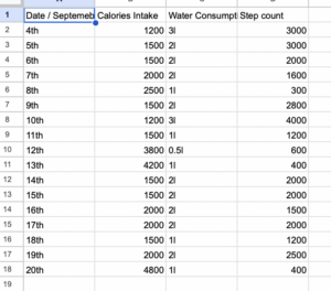
To my astonishment, the results deviated significantly from my anticipations. I had braced myself to confront certain unhealthy patterns in my lifestyle. Yet, the data visualization starkly highlighted a far more detrimental reality. Beyond academic purposes, this revelation underscored the pressing need for a lifestyle overhaul on a personal level.
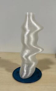
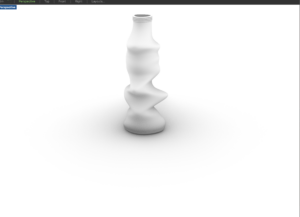
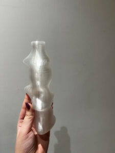
Transitioning to the visualization phase, while I recognized the mandate for data representation, assimilating various dimensions posed a conundrum. My initial inclination veered towards crafting a bottle design. However, manifesting this concept proved more intricate than envisaged. My innate drive for aesthetic appeal somewhat clouded the core objective of accurate data representation. Initial designs fell short of my expectations. Contemplating an average-based approach, I sought guidance from Professor Marcela. She reoriented my perspective, emphasizing the primacy of data clarity over aesthetic allure. With her insightful input, I sculpted a project that lucidly articulated my findings. Translating data into a tangible form brought its set of challenges. The bottle, symbolizing hydration, seemed an apt choice for representation. Yet, finding the equilibrium between aesthetic allure and data accuracy was an uphill task. Early designs, while visually appealing, missed capturing the data’s essence.
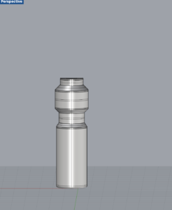
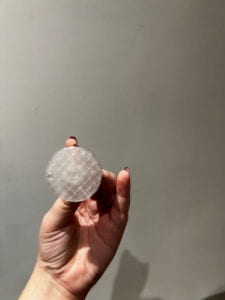
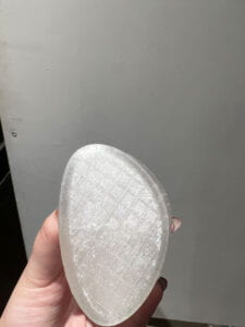
Subsequently, I grappled with the coaster design. My first iteration was visually striking but didn’t align with the project’s core objectives. The coaster’s primary role was to delineate various dimensions. Prioritizing simplicity and clarity, I reimagined a more straightforward design.
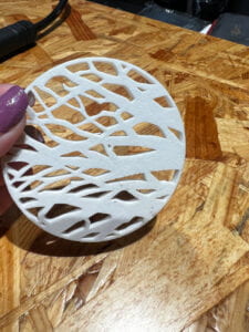
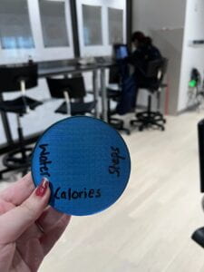
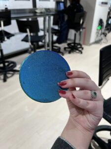
Progressing to the project’s culmination, our tasks pivoted towards Rhino 3D modeling and familiarizing ourselves with 3D printing. This phase was particularly illuminating, not just for the technical prowess it demanded but also for the integration of our earlier findings into tangible models.
The iteration 1 led me to a very weird experience as I sent the output to the printer but the printer just kept on building into a circular object which was not like my design so I sent my output again to the next printer and then it worked pretty better but because I didn’t use the support it was not very fine.
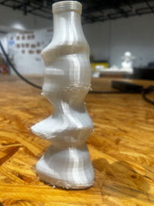
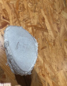
Iteration 3 stood out remarkably in my journey, primarily because of the meticulous approach I adopted this time around. From the get-go, I was determined to diligently adhere to every step of the process, aiming to mitigate any oversights or errors that might have arisen in previous iterations.
What made this iteration particularly interesting was the outcome: a cap designed exclusively for me by Bamboo Studio. It wasn’t merely about the end product but more about the fusion of my detailed input and the expertise of Bamboo Studio.
I believe in the talk by Alberto Cairo I was able to understand it is not just about showing the data but comprehending “the grammar of graphics” with axes, colour encodings, and other visual details. At the same time, annotations are a very important element that acts as guidelines for pointing out the significant data points. Visualization is a good technique of reasoning and exploratory data analysis, as it portrays itself as a skill similar to writing. Still, one must be mindful not to overcomplicate matters as well as maintain the proper representation of uncertainties such as error bars.
The podcast/videos resources served as a pivotal compass in guiding and reshaping my understanding of data representation. The discussion on feminist data visualization emphasized not just the “how” but also the “why” behind data representation. It urged me to think critically about whose stories were being told and whose were possibly overlooked. This perspective was vital in ensuring that my project wasn’t merely a clinical representation of data but carried with it a nuanced understanding of its broader implications. Furthermore, the talk by Professor Alberto Cairo was instrumental in bridging the chasm between theoretical knowledge and its practical application. It underscored the significance of tangible data representation, pushing me to consider how individuals interact with and derive meaning from data. These resources were more than just references; they were the theoretical anchors grounding my project with examples of visualization.
Reflecting on Project 1, the learning outcomes were manifold. Beyond acquiring proficiency in Rhino 3D and leveraging 3D printers, the project was a deep dive into the essence of data visualization. It was interesting to observe how, when guided with precision and clarity from the onset, the 3D printing machines can translate a design into a tangible piece. It underscored that, when effectively visualized, data narratives should effortlessly unravel, speaking volumes without necessitating verbose elucidation. Beyond the technical skills acquired in 3D modeling and printing, the project was a mirror reflecting my perceptions, biases, and aspirations. Every iteration, every design decision, bore the imprint of my evolving understanding of data’s role in our lives. There were moments of doubt, especially when the data didn’t align with my preconceptions. Yet, these very moments became inflection points, driving home the realization that data, when visualized effectively, could be a powerful agent of change.
Future advances in my model will also focus on expanding the scope of data representation, delving into multidimensional datasets, and exploring innovative mediums for visualization (including grasshopper). Another future addition, I would like to make would be to integrate the user-inputs where the user can input their values for calorie intake, step count and water intake and then a shape exclusive according to the persons consumption of different values. For example, Another critical aspect will be actively seeking feedback, ensuring that the designs remain inclusive and accessible. The aspiration is to make data not just seen but felt, turning numbers into narratives that resonate.
Project 1 was more than a culmination of weeks of work; it was a transformative journey. From the initial intrigue surrounding hydration to the tangible 3D visualizations, every step was a lesson in the power and responsibility of data representation. My data visualisation helped me realise many important aspects which made me realise how unhealthy my lifestyle was which was represented by my water bottle. It reaffirmed that while technology and design are indispensable tools, it’s the stories that data tells, the truths it reveals, and the conversations it sparks, that leave an indelible mark. As this chapter concludes, it’s evident that the exploration of data’s vast landscape has only just begun.
