Shanze Fatima Javed
Week 2
We started our second week of classes with the session dedicated to honing curves and surfaces in the second week of classes, things got exciting.Learning effective manipulation involved delving into the nuances of editing these elements.
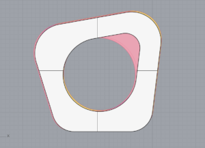
From here, we began an intriguing adventure into the realm of 3D modeling. Tutorial sessions led by Professor Marcela on YouTube. By practicing different methods and using different dimensions, we gained hands-on experience to produce three-dimensional objects during the session. With the tutorial progression, our skills in 3D modeling became more refined, granting us greater insight into this intricate field.

Podcast Review:
A true eye-opening experience for me was listening to the podcast “Feminist Data Visualization with Catherine D’Ignazio”. Thought-provoking and inspiring, Catherine shares her views on data visualization via a feminist lens.
Far from neutral, one key concept that emerged was data’s importance. Numbers and charts don’t tell the whole story; there are human elements at play when it comes to data collection and presentation. According to Catherine, recognizing and combatting those biases will help to break down the barriers created by stereotypes and inequalities. A call to action demands awareness and responsibility on the part of all data professionals.
Data visualization that caters to feminism – fascinating. By raising questions about whose viewpoints are taken into account and whose are left out, it forces us to think deeply about how data is collected and interpreted. Catherine showcased the “Dear Data” project through which two women shared hand-drawn data visualizations to demonstrate how data can have a personal and subjective dimension. Showcasing the human aspect of data was at the forefront of Catherine’s presentation. Catherine’s demonstration displayed just how humanizing data can be when individuals share their personal perspectives. Catherine emphasized the significance of acknowledging the emotional layers of data by showcasing the “Dear Data” initiative led by two females who exchanged intimately drawn data visualizations. Catherine demonstrated how illustrations can convey complex information in an emotionally engaging manner, bringing forth the humanity behind statistics.
By approaching data with a critical eye, “Feminist Data Visualization” pushes us toward an inclusive and fairer data terrain. Data visualization goes beyond mere tech skills; it shapes our grasp of the world & fosters positive reform. Data reflects who we are as a society, so we must handle it with responsibility and inclusion.
A potent means of communication, data visualization is to me. Effectively communicating intricate concepts relies just as much on visual appeal as it does clarity of message presentation. A narrative device connecting statistics to comprehension is what (storytelling) is. With data visualization, insights may be communicated, patterns found, and wise judgments made. For example, The consumption of the coffee over the weeks was just numbers in the data until the visualisation was made – the coffee cup speaks for it itself
Bias prevention in data collection and visualization is critical. Warping the facts, bias causes incorrect assessments. Data visualization should be done without predetermined ideas to ensure fairness and precision. Data integrity relies heavily on bias prevention.
Mutually exclusive they are not, beautiful and practical data visualizations. Complex data becomes more understandable through beautiful visuals, which engage and inspire. A purpose should be served by the beauty, enhancing understanding instead of diverting attention from the message. Striking a balance between the two is key