Shanet Yang, One Summer Day, Joe Hisaishi

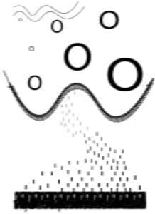
The concept behind my design was to show the different parts of the song as they played an integral role in the progression of the song, as well as plot line and development of the character, which was something I wanted to display. In my design, I wanted to convey a story which is why I found it important to have all the different sections work together but show signs of contrast at the same time.
Furthermore, my design reflects Gestalt theory because on the placements of different letters and shapes, it would portray movement. The previous projects such as the One Black Square influenced my design because I had to be strategic in placement but also use the negative and positive space to convey my meaning. Without the background of the black squares, the usage of space would not be as effective because you cannot rely on colors to convey your message, and can only be done with the
placement of black and white letters. The different principles I explored when designing my poster was similarity, proximity and symmetry.
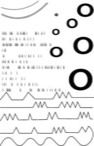
The first step I took in designing my poster was listening to the song and drawing anything that came to mind when I heard the song. After the initial listen, I would piece together the different elements and see if it would fit the song. The drawings I would make ranged from curves, lines, and circles and in the end, I would piece together the distinct sections I heard while drawing some repetitive elements to represent the repetitiveness in some parts of the song. When I was satisfied with my sketch, I would ask my peers what they felt and saw in my poster without letting them hear the song to see if the picture can portray my meanings without any context. However, for my first draft, the message I wanted to show and what my peers saw were quite different. The mid-critique influenced my design decisions significantly and I ended up redesigning my poster for the final critique. During the mid-critique session, I was told that it resembled aspects of a military as my usage of “k” reminded them of morse code. This was quite contrary to my intention which was initially placed for the resemblance of rain. Because of that comment, I also reconsidered the usage of zig zags because I thought it was not representative of the soft melody that was used throughout the song. The first picture shown above was what I had for the mid-critique. In the end, I designed to place the different elements closer together and would use some of the same letters in different sections so it would not look as separated as it did in the first draft. Finally, I turned all my zig zags in to soft waves because the song itself is really flowy and soft.
finalsound3 (A3 printing format)

In conclusion, this final poster helped me visualize the song way better than my first draft, and my peers were also able interpret it similarly. Given more time, I would change the black letters on the bottom to something more wavy so that the poster is more visually balanced with the waves on the top. In addition, I would also experiment more with the features of illustrator and the printing as well since the final print was a little different that what I had on my computer.