Author: Santiago Hernandez
Bites and Blooms
What I have decided to work on for my final project is a set of flowers. It is mostly common knowledge that roses have thorns, and they are not the only example of a plant with self defense. Nevertheless, we consider flowers to be beautiful. So, to juxtapose this, the data I wish to embed into these flowers are venomous snakebite data. I personally love snakes; I see beauty in their evolution and design as well as in their danger. However, I am in the minority when it comes to this, so displaying data about snakes on something that is more universally loved may help in understanding snakes to be more than what they are feared for. You might say that using bite data is not exactly the best way to do this since that is exactly what everyone fears. I think, however, that it suits the flower concept perfectly. You shouldn’t manhandle flowers or you ruin them. You also shouldn’t touch them if they are dangerous. But they are still beautiful when observed from a distance, regardless of if they are dangerous or not. Snakes to me are very similar. You would never see me handling a cobra, but I still admire their nature. If we looked at snakes the way we looked at flowers with thorns, then maybe we would see a lighter more gracious side to them.
Grasshopper Exercises – Nov 14
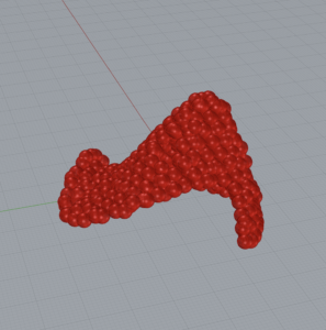 The exercise was pretty easy to follow and we learned another method to making textured surfaces via grasshopper. By using the circle packing function, we can add to an otherwise boring texture.
Following along with the video was mostly easy. The guys in these videos can be a little fast, though. They run through these tutorials as if they are teaching people who are already proficient and completely familiar with the software. Besides that minor thing, it was a useful tutorial.
I can see how this can be applied to a data-displaying object. Imagine different data being represented by different textures, for example. Using this function, you can great gradual and minute changes in surface that are different than if you were to use something like the other functions we have worked with so far in the course.
This has given me a new angle with which to look at my potential project. As an artist, I am a huge fan of applying texture to augment a piece. With this, I can create something that integrates data through texture.
The Five Obstructions
I think the biggest takeaway from this film is what we are capable of achieving creatively when we are forced to push the boundary of the status quo. When we are pushed to do the unconventional we can create marvels.
I think this is the case in everything related to art or anything we as humans create. For example, when I am working on any art piece, I ask myself, “How can I make this in such a way that nobody can ever replicate it?” Inspiration from others is important, but individuality and your mark are critical to anything we create.
These mind bending situations also allow us to explore techniques that we wouldn’t have thought to use otherwise. In many cases, achieving the unique requires using unique methods. Your tools may be different than others’, the temperature could affect your work, the sun could be shining at a different angle; all these things and more are factors that contribute to creating not only a unique work, but a masterpiece you can be proud to put your name on.
Soundscape – Lifedrive
Grasshopper Assignments Week 7
1.
2.
3.
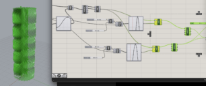
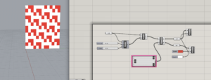
Exercise 3 was actually the easiest to follow because the guy in the video seems to know how to teach. The other guy skips over details and it’s hard to follow him.
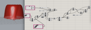
More importantly, the “vases” that I iterated were based on the third assignment. I wanted to make a hybrid of 2 and 3, but for some reason there were errors that I don’t know how to fix in 2.
Nevertheless, my iterations were different based on both the external and internal shapes.
The first and third focused on manipulated the sin wave that defined the outer edge
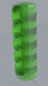
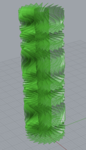
The differences are subtle, but I’ve learned that it’s the little differences that can really pop once printed.
The second iteration was more interesting. By shortening the height and manipulating the parabola that manipulated the center, I was able to achieve a very different iteration.
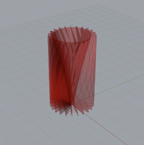
I simplified the outside to accentuate the interior. The result was a very different shape with the same graphs.
Santiago’s Hairbrush
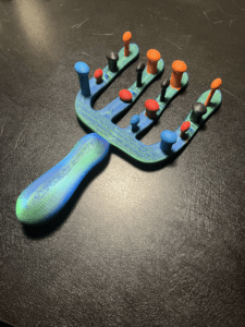
After coming about two weeks late to the class, I was presented with a chance for a project that reflected something about me. It didn’t take long for me to land of a specific topic
The Task
The mission was to gather data about some facet of my life to then be able to visualize in a three-dimensional object. I landed on my hair. More specifically, how it looked. I shower every morning and had noticed that it looks and feels different depending on how I wash it. I wanted to get to the bottom of how to make it look its best, so the decision was easy.
Data Collection
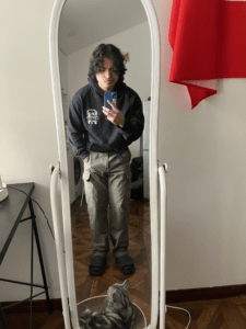
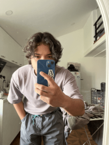
The first question I asked myself was what data I was going to collect that could be useful. I don’t have any scientific equipment to work with so I decided on 4 qualitative metrics: hair volume, frizziness, itchiness (on my scalp), and scent. These would each be measured on a scale from one to ten, with ten being the most of that category.
Over the next two weeks I monitored my washing procedure during my two showers a day (one in the morning and one at night). I realized quickly that I did one of four things each time: washed with shampoo and conditioner, washed with just shampoo, rinsed with just water, or nothing at all. I didn’t follow any particular pattern, which in hindsight would’ve been a good idea. However, I cleaned my hair based on how I had felt the previous day, and I was still able to get a comprehensive list of qualitative data.
Predictions
The results are more or less what I had expected. I went into the project with a vague sense of what was better for my hair based on things various people had told me, and I had also made some superficial observations myself over time.
I initially believed that my hair would look best without washing at all since this allows the natural hair oils to vitalize my hair and scalp without any disturbance.
I use conditioner on and off at times because I’m never really sure if I see any benefit to using it. When it came to predicting what results it would give, these were the ones I honestly looked the most forward to.
Concerning the other two washing methods, I assumed they would be lower down in terms of favorability. For the majority of my life I shampoo’d my hair just about every day until a couple of my friends told me I was destroying my hair. I’m not sure if I noticed any remarkable difference when I switched tactics, so this project gave me a golden opportunity to visualize exactly what it was that was changing and to what extent.
Results
The results turned out largely as expected. My hair looked its best when left on its own for about a day. However, more than a day and my head would start to get itchy. It didn’t exactly smell great after a few days either, which makes sense.
Using shampoo and conditioner came in close second. While volume on average was lower than days where I did nothing to my hair, the level of frizziness was the lowest. In addition, my hair smelled best on those days.
Washing with only shampoo turned out to be the most favorable in terms of itchiness, as it scored lowest out of the four methods. I think I can attribute this to the fact that conditioner can causes dry skin on your scalp, and the removal of it from the process made it a non factor in terms of itchiness
Using just water to rinse my hair gave me the most average data out of all of the methods, with no metric standing out in particular.
Overall, the best methods to use were using shampoo with conditioner or doing nothing at all to my hair. They generated similar results, with the former being less voluminous but feeling healthier and the latter looking the best in terms of volume while sacrificing in terms of frizz and scent compared to the former.
The Hairbrush
The object that I chose to display my data in the end was a hairbrush. The “bristles” would show the four metrics, while the stalks they stood on would determine with washing method I used.
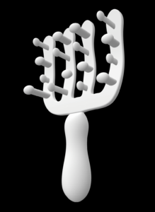
When it came to modeling the actual object, I took heavy inspiration from the toothbrush tutorial that we looked at in our class. The initial shape is similar: a tool you hold in your hand. As such, the handle was more or less the same but bigger. The part that was a little more challenging was the brush part of the hairbrush.
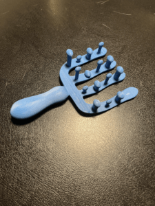
I had some issues when printing the object. The first iteration came out almost perfect with the only real issue being how small it was. The biggest issues came when I wanted to print the larger version. I wanted it to be smooth and comfortable in the hand, so I went for a low nozzle height. I failed maybe 4 times before the plastic didn’t tear itself apart. Even then, the bottom of the handle still came out a little frayed.
I painted each metric to correspond to a color and the end product looked pretty funky but also fun.

Conclusion
I thoroughly enjoyed this project and it game a chance to express myself in an unconventional way, and it gave me the chance to visualize an issue that I have been trying to solve. For future projects, I think the newfound knowledge in the fine-tuning and troubleshooting of the 3D printers will probably come in handy the most so that the next thing I make is a step forward in terms of my ability.
New Perspectives
I am pretty new to the whole 3D modeling scene. However, I am aware of the almost limitless possibilities that come with the technology. I’ve seen printed cars, complex tools, and even food.
However, I never thought past the end product. And even when I was exposed to 3d printing in college, I still only saw it as a means to an end in its most basic form. At this point in time, though I can see it in a new light.
By designing a process vs an object, you create an environment in which we as human beings cannot feasibly operate in or on. Creating millions of small calculations, permutations, or other seemingly simple tasks is not the best use of our minds or our time. But by creating a roadmap for a computer to follow and letting it take care of the fine tuning, we extend our potential beyond the humanely possible.
The shift in how we can design things is monumental, and its implications are astounding. As said in the video, our entire world we create for ourselves could look very different in the near future.
What’s funny is that as I am writing this, I already have experience with this entire concept. A few years ago as the final project for Interaction Lab, I created a visualization. On the screen were three shapes. Exactly what form they took was dictated by an algorithm, whose variables were manipulated by a user with a physical controller. Shapes created were different each time and even a different sound was emitted when the shapes changed.
While that was a simple example of the topic, remembering it has given me a better understanding of where this kind of thinking can lead in the future
Contact Sheet and Diptych Ideas
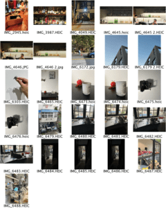
To start, I took a variety of photos instead of focusing on any one specific subject. This was I could narrow it down to something I think I could work with.
I went around my neighborhood as it is where I thought I could find the best potential subjects. I’ve lived there for a couple of years now, and I had some spots in mind.
The first seven are photos I took in some of my favorite bars. The bottles in a bar are arranged not just for looks, but also for ergonomic reasons. Being able to grab a common mixing bottle is more important than showing off something top shelf. I thought this organization could provide something usable in my project.
I took some architecture images to contrast the interior pictures. It wasn’t until I received some feedback that the direction of the lines or the reflections in the building picture could be used in interesting ways.
However, what I think I want my diptych to be is something along the lines of what’s in the third row of images. I like working with lighting and playing with space using lighting, so I think for my project I will use a photo that provides a stark value contrast with one of these third row images.
Sound Visualization End Blog
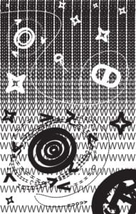
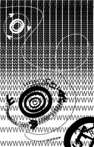
SOMEWHERE BEYOND OUR UNIVERSE is a visualization of what I experienced when hearing one of my favorite songs for the first time, as well as my very first Adobe Illustrator work.
The song I used is called GERONIMO! by the Korean artist DPR LIVE. DPR LIVE is part of a larger group of artists and producers called DPR, or Dream Perfect Regime. The people under DPR are all some next level music and video producers, and the music they make beggars belief.
The first time I listened to GERONIMO! I was going through a miraculous experience. It was as if I could hear every note and instrument and sound that was used to create the song. I could see myself going on a journey through the atmosphere and into space, passing stars and planets on my way.
The Background
I wanted to create the black background of space without using a flat black background. Specifically for two reasons: 1) I wanted to emulate stars in the far distant background and 2) as you go through your journey, the space around you gets brighter and brighter. I figured that I needed a shape that offers both a lot of positive and negative space, and ‘W’ fit the bill perfectly. To generate that brightening effect, I lessened the stroke and spacing between rows of W’s to gradually shift the work from negative to positive space. The objects that are then placed over the back layer also follow the shift.
Stellar Objects
Throughout the song, there are shifts in beat, flow, etc., and I chose to represent that with a variety of stellar objects such as stars and planets. To help with the definition of space, I made some objects appear bigger than others. In addition, I included stars that were closer to the viewer.
Letter Choice
When it came to picking what letters I wanted to use, I chose those whose sounds I heard in the music. V’s, O’s, H’s and U’s are prominent throughout the piece.
Direction
The last thing I want to point out is the path of the ship that helps to direct the viewer’s eyes through the work without missing anything. The song takes you through this adventure and ends in a huge crash, so to simulate that I lead the viewer into a black whole.
Technique
The song sounds futuristic, so I used a modern-looking font. In addition, I tried doing the most I could by keeping it relatively simple so that the work could be clear.
My first iteration was really not much different from my final, it was me more or less figuring out what I was going to depict in the final work.
