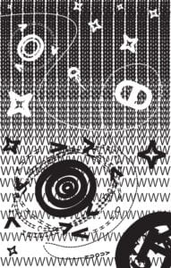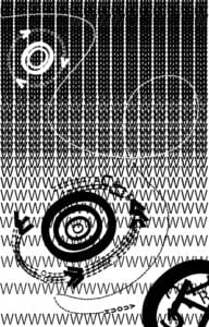
SOMEWHERE BEYOND OUR UNIVERSE is a visualization of what I experienced when hearing one of my favorite songs for the first time, as well as my very first Adobe Illustrator work.
The song I used is called GERONIMO! by the Korean artist DPR LIVE. DPR LIVE is part of a larger group of artists and producers called DPR, or Dream Perfect Regime. The people under DPR are all some next level music and video producers, and the music they make beggars belief.
The first time I listened to GERONIMO! I was going through a miraculous experience. It was as if I could hear every note and instrument and sound that was used to create the song. I could see myself going on a journey through the atmosphere and into space, passing stars and planets on my way.
The Background
I wanted to create the black background of space without using a flat black background. Specifically for two reasons: 1) I wanted to emulate stars in the far distant background and 2) as you go through your journey, the space around you gets brighter and brighter. I figured that I needed a shape that offers both a lot of positive and negative space, and ‘W’ fit the bill perfectly. To generate that brightening effect, I lessened the stroke and spacing between rows of W’s to gradually shift the work from negative to positive space. The objects that are then placed over the back layer also follow the shift.
Stellar Objects
Throughout the song, there are shifts in beat, flow, etc., and I chose to represent that with a variety of stellar objects such as stars and planets. To help with the definition of space, I made some objects appear bigger than others. In addition, I included stars that were closer to the viewer.
Letter Choice
When it came to picking what letters I wanted to use, I chose those whose sounds I heard in the music. V’s, O’s, H’s and U’s are prominent throughout the piece.
Direction
The last thing I want to point out is the path of the ship that helps to direct the viewer’s eyes through the work without missing anything. The song takes you through this adventure and ends in a huge crash, so to simulate that I lead the viewer into a black whole.
Technique
The song sounds futuristic, so I used a modern-looking font. In addition, I tried doing the most I could by keeping it relatively simple so that the work could be clear.
My first iteration was really not much different from my final, it was me more or less figuring out what I was going to depict in the final work.
