Final Project Doc Blog: part one
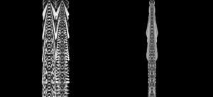
after meeting with professor moon with my initial first sketch of my project. To bounce around some ideas. I significantly iterated over that first sketch: In the beginning I used some weekly sports activity data for males and females in Saudi Arabia and produced this sketch:

It was an interesting result, however the connection between it and the data is abstract/unclear; in other words, the data has no apparent significance. Especially if I am going to show data about my country, it makes less sense to continue on that route.
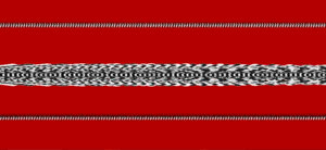
In the final version of the sketch, I was way more satisfied with the result. I used the data for males and females to be represented as peaks and valleys in the top and bottom row respectively, and the middle row is the mix between the two. The reason I presented the sketch in this way is to imitate the Saudi Cultural interior tent cloth weave. I thought that would be a smart design.
