Michelle Hua – We All Fall Down
B)
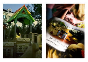
My concept for my diptych was “horror movie aesthetic”, specifically based on the contrast of dark/unsettling atmosphere and child-like subject matter. My first image is of a figure standing on a play structure in a yellow dress and hair over her face, with the style inspired by the film The Ring. For my second image, I was provided with several interesting references about horror imagery across different artists and cultures. Ultimately, I went with one of my earlier ideas of a storybook in a playroom, with the image in the storybook inspired by the nursery rhyme “Humpty Dumpty” (Side note: After showing my friends my diptych, I discovered that only my American friends were familiar with “Humpty Dumpty”, and only one or two Chinese friends had even heard of the rhyme or character, which I felt was an interesting culture shock). I made the colors very warm compared to the first image, but added a few unsettling elements: the morbid storybook, multiple figures with the yellow dress, and dark shadows. I tried to create an image that looked warm or even cozy from afar, but became stranger and scarier on closer observation.

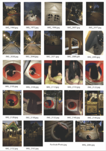
Photo Contact Sheet Pictured Above
C)
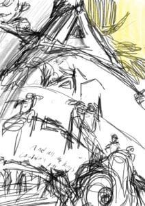
I originally had two concepts, one about the relationship between life and death, the other about unedited versus composited photos. However, I was unable to check out a camera before the photo deadline, which meant that all my photos would have relatively poor resolution and lighting. These circumstances led me to change my concept to my current horror one, as grainy photos and low lighting are often used in horror aesthetics to create a sense of fear. I took the photos at a playground next to the Jinqiao dorms, using myself as the subject. Because the yellow dress was a key attribute of the subject, I chose my diptych photos out of the ones I took that most prominently featured the yellow dress. For my composite photo, I first made a sketch based on my chosen photograph to try to make a similar composition. Afterwards, I took the photos using a camera of the individual components that I needed to assemble the image. I originally used the gaussian blur filter on most of my composition to try to draw focus to the storybook; however, after the critiques, I decided to remove the filters. I also drastically changed the lighting of my original photograph in order to make the figure of the photo more clear.

Composite Photo Sketch Pictured Above

Original Diptych Pictured Above
D)
If I had more time, I would retake my photo with better lighting and equipment, and likely different compositions as well. Knowing my final results, I would probably try to determine what I wanted my diptych to look like first, then take all my photographs with a strong idea of what I want the final product to look like.
