Song:
Eleanor Rigby (Cody Fry Cover)
Highlights:
Full song:
Visualization:

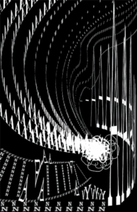
For my sound visualization project, I chose to create my piece based on the song “Eleanor Rigby”, covered by Cody Fry. The orchestral nature of the song gave it a feeling of sophistication, and the constantly changing energy of the song gave it a sense of movement rather than complete steadiness. To convey these emotions, I decided to use sans serif fonts rather than serif fonts throughout the piece. The song starts off soft, with the beat being the main melody for the first few seconds. This beat persists throughout the first half of the song, save for a few brief sections. The instruments keeping the beat also changes with the song, but in general, this beat is consistent through the first half of the song, keeping it somewhat “grounded”. An excerpt of this beat can be heard in the first few seconds of the “Highlights” audio. To represent the more solid, constant feeling of this beat, I used the letter “N” to form two straight lines at the bottom of the piece. The first minute of the song is entirely instrumental and establishes a few key emotions I wanted to express in the piece: mainly, the sense of mystery and the sense of grandeur. I decided to use a black as the ground and white as the figure, primarily to convey this sense of mystery. This first minute also features several quick, shaky notes accenting the beat, and introduces the motifs before the vocals begin. I continued to use the letter “N” to form the curved shape at the bottom, again, due to the relative prominence of the beat, but now arranged to show the sense of movement that the melody creates. I also used the letter “A” to represent the accent notes. The “V” and “Y” pattern at the bottom represents a series of notes that stood out to me, which can be heard at 0:05 of the highlights audio, or 0:08 of the full song. The instrumental section ends with, to me, the sensation of an explosion: the lead up of the brass, the few seconds of silent anticipation, before exploding into the vocals. (Highlights audio: 0:08-0:18) To represent this, I created the shape of an explosion using as many letters necessary to create a solid white area with a jagged silhouette. To offset the chaos of the shape, I also surrounded it with “C”s to create a shockwave or dust cloud effect, either way, to soften the edges of the shape and make it more coherent. From the explosion bursts lines created by “A”s, to represent the feeling of grandeur created from not only the vocals here, but also other moments throughout the song. I chose the letter “A”, since this letter is associated with sounds of high volume and intensity, such as high notes in opera or screaming. Later, the song grows quiet and more somber, and the pacing of the notes become uneven as well (Excerpt in Highlights: 0:19-0:28). I let the “A” lines fade out and become wavy to represent this change in mood. This also helped create an illusion of depth, to further add to the scale of the piece and increase the sense of grandeur compared to the fainter lines. I used lowercase “s”s to form the fainter lines to add to the sense of unevenness. The piece eventually builds back up, ending with a high note (Highlights Audio: 0:29-0:34). I again used an “A”s to represent this note, and since I also associated it with a feeling of sharpness, I elongated the “A”s to appear more sharp as well. I curved the elongated “A”s from the back to the front, to connect it to the fainter lines and to draw more attention to what I think is the centerpiece of the song and the visualization: the explosion into sweeping music.