Visual Metaphor Documentation

The concept of the project was inspired by one of Taylor Swift’s songs called “daylight”, and it demonstrates the process of someone from being depressed to embracing the world and appreciates the beautiful details of life. Initially, the idea of doing something related to depression was brought up by my partner, and I thought it is a concept worth working on, so we ultimately decided this theme. While we were discussing what content to present and how, I mentioned the song daylight and my partner thinks it’s very suitable for the project so we incorporated this song as part of our project. When we are discussing what metaphor to use for the expression of depressed feelings, we realized this could be a theme that’s easy to get cliché. Some metaphors are too common and dull while others might be hard to convey the idea. 

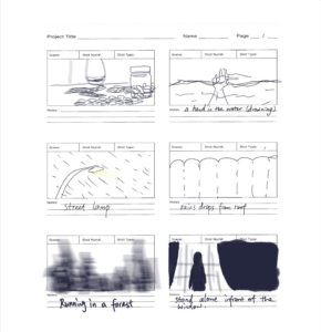
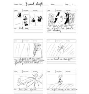
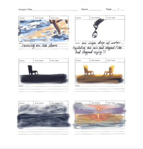
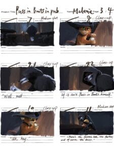
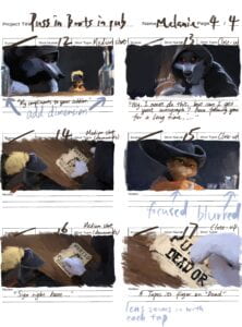
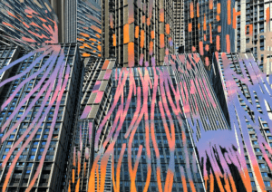
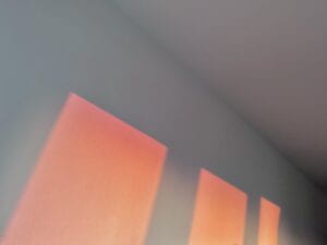
We first looked through some similar themed videos and analyzed the shots for inspiration. We drew the storyboard based on some rough ideas, most of which were not realized in the final video but gave us useful clues of what to work on in the following process. What we got from the storyboard is the idea of comparison, specifically the comparison of color. We thought this is an easy-to-comprehend metaphor and a method that leaves us with enough creativity as well.

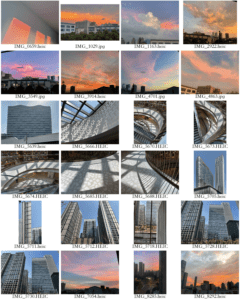
One of the challenges that we faced was not able to realize the storyboard. It was hard to get the props and shoot them in the corresponding location and we couldn’t have the suitable weather for certain images either. So later we had to shoot scenes that doesn’t require props and use some copyrighted free videos as alternatives.

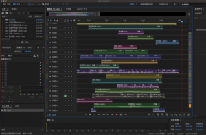
My partner did most part of the editing. This is also one of the problems that we have encountered, because ideally, we would both do some parts of the editing, but Premier is not like Google doc where you could work on it simultaneously, so it was hard for me to help out with the editing later on. I did the voice over for our video. I thought this would be an easy job, but then I realized it was extremely hard when you try to do it in your dormitory without an external mic. No matter how hard I try there always seems to have background noise and I could easily blow the mic when talking. And to avoid recording the sound of pressing button was also annoying.

We want to use Taylor Swift’s song Daylight, there are some narrative voice over.  Also, we will record our own voice sound.“I cannot control myself. Everyone looked worse in the light. There are so many lines that I’ve crossed unforgiven, My head is not always sober, but my world is quiet.I don’t know what’s wrong with me. I feel like an elephant took a foot out of my chest. I want to escape, I lost my passion, I hate the sound. It reminds me that I am still alive. I am still alive. Life shouldn’t be like this, it should be Like daylight, It’s golden like daylight, I gotta step into the daylight and let it go, Just let it go, let it go, I wanna be defined by the things that I love, Not the things I hate, Not the things that I’m afraid of, I’m afraid of, Not the things that haunt me in the middle of the night, I, I just think that, You are what you love” (We will record the last sentence ourselves to enhance the volume and emphasize it. ) We wanted to document the story of a depressed girl. There are many depressed people who are subjected to external cynicism and fall into self-doubt. They can feel sad and lonely. So we wanted to express that we can give them a helping hand and encourage them to step into the sunlight.

Daytime(We want to shoot the sunshine as the symbol of recovering from the disorder) Maybe in the park, the girl can run in the sunshine. Night(Dark colors usually  symbolize loneliness and sadness) She can be sitting alone by herself in the corner of a room. We often use rainy days and dark clouds to express people’s bad moods, but these metaphors are a bit too old-fashioned and cliché, so it is a challenge to express people’s bad moods in a creative way. We can use different forms of water and yarn to represent her emotions. We will use different things to make the starting and ending part have some connections and contradictions.

Storyboard

Many of my friends say the storyboard I drew looks exactly like screenshots looking from afar, so I want to clarify that these aren’t and it took more than a whole day to draw all of them. I drew it this neat is because a) it is easier for me to start a drawing with blocks of colors rather than lines and b) I really love drawing and used it as a opportunity to relax and have fun.


Memory Soundscape Documentation

My soundscape was inspired by my experience of evening sessions on a rainy day but it can also be interpreted as anything that displays as a process of going through disturbance or difficulty and eventually conquering it. The main aspect I wanted to convey was the sound combination of both outdoor (wind, rain, trees) and indoor elements (pen, paper, desk, bottle, footsteps etc). Because this is a series of sound that I often experience in high school and something that I think most people could relate to, plus it is also a concept that can demonstrate the time and spacial difference through sound, so I think this is a memory suitable for the project.

For outdoor elements, I incorporated the sounds of wind, noise of cars on the streets and many different types of sounds of water. I first experimented with water as I recorded sounds from taps, shower, water pouring out of buckets, sprays of water falling on plastic bag and even boiling water. Initially I thought the sound of sprays on plastic bag would be most similar to the sound of rain but then I realize the sound of boiling water actually sounds most authentic. To recreate the sound of wind, I used the recording of the noise of cars rushing by on the street. I was going to abandon that recording at first, but it worked surprisingly well in imitating the sound of a rainy day. And because I also wanted to create the sound of extremely strong wind blowing through corridors and widows, I tried to imitate the sound myself by whistling in a low tone and it also turned out to be useful recordings. Also, I discovered to recreate the sound of heavy rain drops slamming on glass widows by scratching uneven plastic surface and had a great time collecting these different sounds.

Indoor elements were a lot easier in comparison as I could just create the sounds I need directly. I recorded sounds that can commonly be found in a classroom, such as turning pages of books, chairs scratching the floor, doors and widows opening and closing, people walking around, squeaks of thermos bottles and the sound of pressing the tip of a pen. Interestingly, I did not plan to make the pen-pressing sound a main element that would be audible throughout the entire one minute, but as I was editing I noticed it is great for indicating the pace of the soundscape and making the changes in emotions more obvious.

There were also some challenges that I’ve faced during the process. For starters, the two days that I was able to record with devices borrowed from ER were depressingly sunny and windless (since it has been raining the several days before), so I had to recreate the sound of a rainy day by trying out different sounds that has nothing to do with rain and not knowing if they will work int he end. Also, the devices ER gave me seems to have some small issues because there is always a very uncomfortable sound that resemble a electricity leakage when I plug in the shotgun and it is very loud with no way of getting rid of it. Eventually I have to give up using the shotgun and record using the Tascam directly. As a result, I have to always be very careful with how I hold it to avoid making unwanted noises. It was also very difficult to find somewhere quite enough around the residence hall as we live right next to a highway haha.

On the day of presentation, after I’ve explained my inspiration and concept for the project, one of the classmates commented that I should add some voices of people talking if I am recreating a scene of an evening session from high school. Actually this element was on my recording list but because have spent most of my energy trying to create the sounds of a rainy day I had forgot all about it and when I realized this I had already returned the devices back to ER. But after further consideration, I think it is actually better not to include these chatting sounds for two reasons: One, the sene of a evening session on a rainy day is only the inspiration, but my job is not to recreate it like a bad writer who includes everything that it had done and happened in a journal, Two, there are already plenty of different sounds in this one minute especially during the middle and the second half. Adding more elements might make it sound messy and confusing. Additionally, I don’t want my project to be too concrete to an extent that everyone is able to picture almost the same things in their mind. Sure, I can explain to them what I have in mind when I am creating and listening to it, but I definitely don’t always get to do that with everyone and I want the audiences to have their own interpretation. Adding human voices would just make it more concrete and limit the room for imagination.

The Uncertainty of Documentarism

In the age of digital reproduction, documentary forms have become an important part of the contemporary economy of affect. The need for objective, institutionally guaranteed, even scientific integrity is successfully being replaced by the desire for intensity. In the article “The Uncertainty of Documentarism”, Steyerl discusses the uncertainty of documentary images in the digital age, using the example of CNN’s live broadcast during the invasion of Iraq in 2003, and argues that these low-resolution images, which bore little resemblance to reality, seemed authentic because of their lack of focus and uncertainty. She thinks that documentary images are powerful because there is no more unbroken belief in their truth. Their uncertainty reflects the precarious nature of contemporary lives and the uneasiness of any representation. The article concludes that the truth of these images lies in their expression rather than representation, reflecting the stage of visuality increasingly defined by images where one can see less and less.

By “unbroken belief”, Steyerl is referring to the idea that documentary films and videos are typically assumed to represent objective truth or reality. However, she also says that this belief is not always accurate, as documentaries can be constructed and edited in ways that shape the viewer’s understanding of the subject matter. She suggests that this “unbroken belief” in the documentary form is being challenged by contemporary artists and filmmakers who are exploring the ways in which truth and reality can be manipulated in media.

When a movie or film is based on a true story, the filmmaker is usually trying to represent some version of the truth. But because the story is being told through the medium of fiction, the filmmaker has more control over how the story is presented, which can lead to manipulation of the facts or selective emphasis on certain events or characters. Similarly, when a work of fiction is inspired by real-world events, it can influence how people understand those events and shape public perception of the truth.

The authenticity and representation of truth in media can have a significant impact on how people understand the world around them. Misinformation or distorted representations of the truth can lead to confusion, misunderstanding, and even harm. On the other hand, accurate and authentic representations of the truth can help people make informed decisions, form opinions, and act in ways that are beneficial to society.

A live broadcast is a type of media production that is transmitted in real-time, often through television or internet streaming. Live broadcasts can be used to deliver breaking news, sports events, concerts, and other types of programming that require immediate and simultaneous access for a large audience. The role of a live broadcast is to provide an authentic and immediate experience to the audience, allowing them to feel as if they are part of the event as it unfolds. Additionally, live broadcasts can help to ensure that the information being delivered is accurate and up-to-date, as there is no opportunity for editing or manipulation.

5 Obstruction of Perfect Human

For the first obstruction, only 12 frames is allowed to be used, thus creating a quicker and more intense feeling. Compared with the original version which was presented in a black and white empty room, the one recreated in Cuba is more colorful, filled with much more elements, reducing the sense of nothingness and adding a touch of exoticness.

In the second obstruction, the background is more immersive and lively than the original version as it is shot in an out door setting. The transparent screen filtered the crowded environment and the camera was fixed, simulating/intensifying the sense of being watched and examined.

The third obstruction, Leth did not want complete creative freedom because in some ways that is more difficult than being given obstructions or rules to follow. More freedom means more options, more options means less guidance, and relying on your own creativity. However, returning to Mumbai would have possibly been dangerous, so he had to choose the option to have no rules; he remained in Brussels to film. This version features a split screen which was a new development from his previous explorations 

The fourth obstruction, which was also my favorite one, was referencing the visual effect/style of cartoon or animation. Using contrast color like green&red, orange&blue, with low purity & brightness to create a surreal sensation, making a clear line between real and imagination. This made the image more surrealistic and dreamlike with a lot of movements are abstract imagery and shifting perspectives. The voice-over is also surrealistic, with a disjointed and fragmented narrative that adds to the overall sense of disorientation and unreality. Also, it applied techniques like repetition and delay to stress the movement of the perfect human. Extracting specific scenes, using close-up technique, and present it in a small frame in the fullscreen image. For instance, revealing the face gradually, showing the process of making a perfect human which shows the nature of the perfect human. The dynamic camera angles create a sense of exaggerated energy and expressive movement. Additionally, a lot of words in some scenes and with multi-angle camera language which is metaphorical. In my opinion, the use of animation allows him to create unreal scenes that would be impossible to capture in live-action movies.

Lars von Trier already made the last obstruction, and Jørgen Leth does nothing except for being the director, which made him completely unprepared. He had to read scripts, which were announced as his opinion but actually was written by Lars von Trier. The narration goes on with shots from the production process of previous movies and conversations between Jørgen Leth and Lars von Trier.

My Memory for Soundscape

The memory I want to recreate in the diptych is an evening session on a rainy day. Where I come from, it sometimes rains heavily in autumn, and it would always form an interesting contrast: indoor, everything is very quiet that only the clicking of pens and the sound of turning pages can be heard, outside, the wind is howling the rain is slamming on the window glass. 

Often, a rain storm would happen in the middle of the middle session, and when it is a really dramatic one, some classmates would start whispering and heads would turn to look outside the widows. But after a while of fidget, there will always be someone to stand up and close the widows, and the evening session would go back to normal, back to a quiet space where you can only hear the sound of the pen scratching the paper, people swirling open their thermos bottles to drink water, zipping up zippers, clattering of pens in pencil bags, doors opening and closing, pulling tissues out…

I want to pick this memory is because there is a process and difference in space that could be represented simply through sound, and I think it is also an epitome of our school life in high school, how we are always studying despite various distractions and we would study no matter how bad the wheather is.

Diptych Documentation

The name of my project is “scraps of sky”, and the main concept is the relationship or the balance between celestial views/lights and artificial elements presented by high buildings.

The sky in a metropolitan city like Shanghai is often blocked by skyscrapers, but the ever shifting lights above us can still manage to seep through these walls of concrete by creating reflections or spots of light both inside and outside of human constructions, creating beauty even when we payed little attention to it.

The first picture captured rays of sunlight slanted through the windows of a big shopping mall and spilled on the floor. In here, what we see is the combination of celestial light and artificial objects. The grain of the marble floor and the neat pattern of the balustrade represents the the artificial elements in the project, and the vibrant colors on the floor created by morning light is a representation of the scattered beauty of morning sky.

The second picture is the reflection of sky on a glass-covered building. For this picture, I used “mask” to create the effect of lines colorful that are colors from pictures of the sky, integrating two layers of photos together.

The relationship between the two photos is that: 1) the shapes of the elements that represent the sky are modified by the buildings 2) and shown on the background of artificial constructions, 3) and they all ave very vibrant colors. In the first photo, the rectangular lights and curved shadows echos with the square buildings and colorful lines respectively, and like most of the pictures layered under the second picture, it was taken in the early morning, when the colors of the sky is most vibrant.

Before I had stated to edit my photos with Ps, I had planed to carve out several rectangular windows in the collage of tall buildings to reveal the college of photos of sky like the picture showed here. But then I realized it would look a bit weird since the rectangular widow would not align with the lines and silhouette of the buildings, so I eventually gave that idea up and started experimenting. And because when I was learning the tutorials on Ps I remember there was a useful tool “mask”, I just started playing with it and discovered that I can achieve a drawing like effect with it. So this is how my final photo diptych looks like and I was satisfied with how it turned out because it was better than my original plan for the project.

There was one problem during the process though, with is I had so many pretty pictures that I’ve taken before of the sceneries of sunsets and sunrise, but because I only had limited space so I could only pick a few. If I had more time to work on this project, I would probably make the lines in the second picture more clean and artistic, because I didn’t have a digital plate to draw on and could only use my mouse to draw those lines, they look rather rough up close. But I did my best by using what I have I liked the result. Here is a picture of my contact sheet and my final diptych look for reference.

Concept for Photo Dyptic

The overall concept for my photo diptych is the combination or the balance between celestial view and metropolitan construction (which often blocks celestial view). 

For the first picture I plan to use something similar to this one:

The light of the rising/setting sun is shaped in a rectangular shape by widows, coordinating with the typical silhouette of city buildings. The problem with this picture is that the background is too plain and empty. Hopefully in my final project I will be able to get a picture in which the sunlight is projecting onto a background that represent elements of city or artificial constructions, which provides a stronger connection to my concept of the project. The first picture is mainly to convey an idea that even in a highly urbanized environment we are still able to find the beauty of nature. 

For the second picture (the collage), I want to utilize the stiff and organized shape of buildings that we see everywhere in Shanghai as the frames for pictures of  sunset/sunrise glow and probably put them in the order of time (i.e. sunrise — noon — sunset). This can be a representation of celestial views of different days, implying that instead of one random day with beautiful sunset/sunrise, there is actually a lot more moments of beauty in small details and appreciation of nature in cities, as long as we take the effort to look for them. 

I would probably use photoshop simply as a tool to compose and touch up the colors of the photos. There’s still one concern is that whether I should also present the change of time in the first photo and, if yes, how would I do that.

Thoughts on In Our Own Image

In the foreword of the book In Our Own Image by Fred Ritchin, he mentioned an interesting phrase called “fluidity of the digital”. After finishing reading both the foreword and the last chapter of the book, my interpretation of what he meant by this phrase is that compared to conventional photographs, digitals or digitalized images have a much bigger flexibility in ways to depict and present objects, therefore it opens up a bigger passageway for creativity as well as constructing and conveying imagery information.

Here is a picture that found which I think illustrates Fred’s concept of “fluidity of the digital”.

In this photo, most objets can also be captured by a convectional photograph. But in a digital image, we would have the ability to combine multiple elements and reconstruct them and eventually create a new image that otherwise would be almost impossible to display in a non-digital photo.

Fred admits that there are downsides to the malleability of digitals. For instance, a digital image might be considered “fake” because it can be potentially already been changed and modified according to the creator’s will. And for viewers who had not seen the original image, it is often hard for them to differentiate the artificiality of what’s been presented and thus causes the lack of trust from the public on this type of media. However, Fred argues that just because a conventional photograph is usually characterized by its “fidelity”, it is far from conveying what is real and certainly does not represent the truth. Imagery language, just like writing, can draw information from different sources and articulate the relations between them. Therefore, the true value of digital images is that it, if its potential explored, could provide us with more new worldview differing from the visible reality that conventional photography otherwise could not. So the importance of incorporating the form of digitals is that , in Fred’s words, “offer flexible and expanding possibilities in both the analog and the digital environments” instead of leaving photography as something “monolithic”.

Comparing with other medias such as videos, books or even virtual reality, I think one of the advantages of digital images is that it is more direct and efficient in terms of conveying information while maintaining the feature of allowing much creativity. Videos focus more on changes of image through time, books requires imagination of both the creator and the viewer, virtual reality emphases on an immersive experience of the receiver of information, they all have their own unique features. But because of the similarity between digital and conventional photography, we need to take more effort to fully appreciate the potentials and value of digital image.